Mobile websites are already a trend these days since most people always want to stay connected with the internet even if they do not have access to a desktop computer. Like designing a full website that is seen on a desktop computer, the mobile version of a site should also be user friendly. Aside from the design, it should be instilled on one’s mind that the user’s should always be considered first. It is important that the mobile website is user friendly in order for them to access information easily. It has to be a lot easier for them to browse the site and view its contents when in mobile.
When one considers the users, there is a greater chance for more visitors to check the mobile site because they won’t be spending too much waiting time for it to load or to find what they want to see. It is then effective and could reach its goal in reaching the target audience, even those who are in mobile. Since most websites are considering having a mobile version, we will be giving some valuable tips for those who are planning to design one. So, today, we will give you some points to consider in creating a mobile website that is user-friendly. Read on the tips below so you will be guided.
1. Prioritize usability.
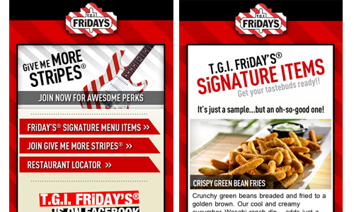
Site: TGIFridays
Your mobile website will be useless if it won’t consider good usability. Above all, you should pay attention to how the users can access and interact with your mobile website. You have to see to it that they can see all the contents, the buttons are large enough to be clicked and they can navigate it easily. Having good usability is a manifestation of a successful mobile website.
2. Limit information.
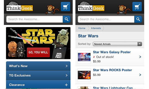
Site: think geek
Take note that a mobile website is a lot different from a website viewed on desktop. So, do not place all the information that you have in your full site because it would not look good on mobile. It will only crowd the small space for mobile browsing. Some of this info might not even be useful for the users anymore. Include only those that are very important to avoid clutter and to satisfy the clients that they can immediately get the information they want.
3. Use enough white space.
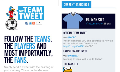
Site: My Team Tweet
This is important in order to make it easy for the users to read and look at the site’s contents. Have enough breathing space for every element especially for a small space in a mobile website. If you make it look crowded, it would not be user-friendly. Your user might even have a headache and might be irritated to what they can see. So, do not cram and clutter your site. Make use of enough white spaces around the site’s elements and contents.
4. Do not over-design.
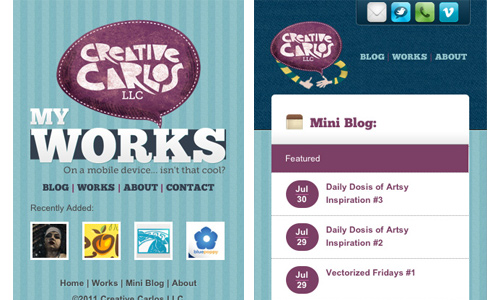
Site: Creative Carlos
Over designing also makes the mobile website look crowded. It would look heavy to the eyes and if you place too much images, it might even load for a long time. A simple mobile website is better that an over designed one. Instead, one should focus more on how the users can access the site and what information should be placed in it.
5. Allow users to visit your full site.
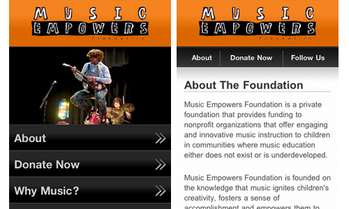
Site: Music Empowers Foundation
Even if they are looking at a mobile version of your site, the users might also want to see your full site. So, include a link for them to see it. There are really users who are curious to see the full site or might want to access some information that is only seen in the full site. This would be helpful for them especially if they really need it.
6. Categorize clearly.
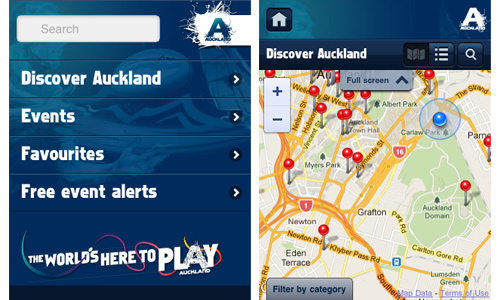
Site: Auckland 2011
Since, the mobile version only includes the important parts of the site, it would be like creating a smaller version. It will only become effective if you have categorized everything well so that the user can just click on a certain category in order to get to the information they need. Be sure that you have clear labels for the categories and that you have the right contents under it. This will make the site easier to navigate.
7. Place images that load easily.
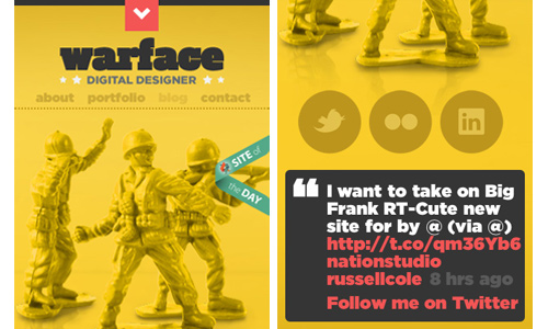
Site: Warface
Nothing would be more irritating than a mobile website that loads for a long time. So, if you have images in it, make sure that you have resized it so that it won’t be too heavy and wouldn’t eat up much loading time. Remember that small screens need small images so that it can be viewed well.
8. Do not use po-pups.
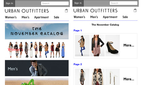
Site: Urban Outfitters
It would be irritating for mobile users to suddenly see something that would come out from the site even if they are not asking for it. Remember that most mobile users visit sites to have immediate access to information. If you use pop-ups, it will discourage them to look into the site because it eats up their time. So, avoid using them. Instead of getting new users, it might just drive them away. Some users cannot wait for the site to load, how much more if they see a pop-up first before they can see the exact site.
9. Have good navigation.
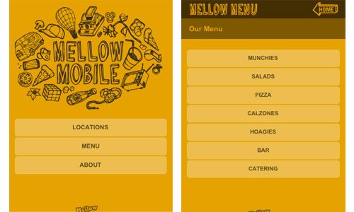
Site: Mellow Mushroom
Navigation is very valuable when it comes to a website. Same is true with the mobile version of the site. Part of considering good navigation is by placing important buttons like the Search bar and the contact link at the top of the page or on other conspicuous areas. Doing that will make it a lot easier for the users to get to places in the site that they want and to grab information that they need. Of course, you should include other navigation buttons that are also seen in your full site.
10. Use consistent branding.
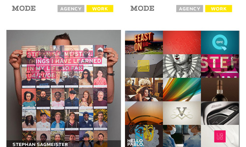
Site: Made by Mode
Bear in mind that your full site and your mobile website are just the same sites. Only that you are making a mobile version to create a unique mobile experience to mobile users. So, use the same branding. This means that you should make use of the same colors, font style, mascot and others. If you use another one, it will make the site look like another website. Let it be user friendly by not confusing the readers on what they are seeing.
It’s Your Turn Now
It is indeed important to create a mobile website that is user friendly. Doing that would increase the chances of more mobile users to visit the site and it can also be helpful to the users especially when they really need to get something from your website. How about you? Have you designed a mobile website? What are the things that you always consider in making one?


Emm.. A beautiful collection, and especially the website of warface