Homepage is the first page of a website that usually comes to the eyes of the users. It loads when users get to a website and one would see vital information regarding the site from the homepage. The homepage is like a book cover or the front page of a magazine which tells those looking at it what they can see inside. That is why, a good homepage design is very important. One may notice that every homepage is different. It is unique for each site which is also part of their online branding.
Designing a homepage is not simple because there are certain things that should be reflected in it. The way one designs the homepage also greatly affects how the visitors may respond to the site. If you are unable to create an effective homepage, you will not get the audience that you are aiming for. So, for today’s tip, we will give you some points on how you can achieve an effective homepage design that can help you increase traffic for your site.
1. Determine the website’s purpose.
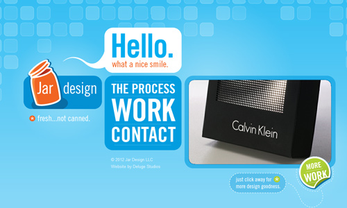
Site: Jar Design
Without good understanding of the website’s purpose, you will not be able to create an effective homepage design. Hence, it is important that you have listed the purpose of your site. Remember that your homepage gives the first impression to the users. So, be sure that you will be able to relay your site’s purpose at first glance. Let the audience know what your site is from the homepage so that they will be guided while they are on your site.
2. Tell what the site is about.
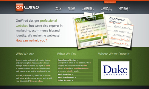
Site: On Wired
Aside from the site’s purpose and goal, one also needs to let the users know what the website is about. It would even be better that you design it according to what it is. This way, it would be very easy for the users to determine the kind of site you have. One look would let them know that you are a website for a chocolate company or for books or an online portfolio of a designer.
3. Have a consistent navigation.

Site: Real Visuals
Either for a new visitor or a returning visitor, one has to use a consistent navigation. This would be advantageous for both kinds of visitors. Doing this will guide them to where they will be going next. Of course, they won’t merely be staying on the homepage all the time. They would explore the site so they can learn more from it. A good navigation can help users go around your website easily. You have to place that in your homepage.
4. Establish your branding.
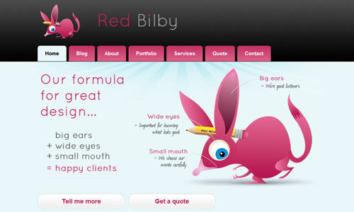
Site: Red Bilby
Of course, this is very vital because your site will not stand out from the rest if you do not have branding. The design alone is already branding. Then what you place there is also part of your online branding which includes the logo, the site name, the mascot, the colors, the font and others. Everything in the homepage is part of your branding. Be able to establish that well with the user’s first glance.
5. Place the necessary contents.
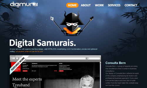
Site: Digimurai
Of course, a homepage will not be considered a homepage if you fail to place the necessary contents into it. These are the components that every user will expect to see on a homepage because most or all websites have them. These contents are the website name, logo, site tag line, navigation menus, search bar and sometimes the contact information. You can add other contents that you think are needed to be placed in your homepage because it varies from one homepage to another depending of the type of website.
6. Know how to treat a new visitor and a returning visitor.
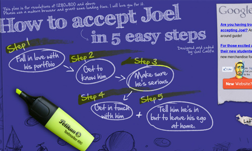
Part of designing a website is for you to think of how you will treat the visitors you have, both new and repeat visitors. You have to see to it that the new visitors who haven’t seen the site before will be impressed with what they see and will come back. You also have to see to it that the visitors who had been checking your site every now and then will still return by having interesting contents. Consider that in your homepage design.
7. Use good content.
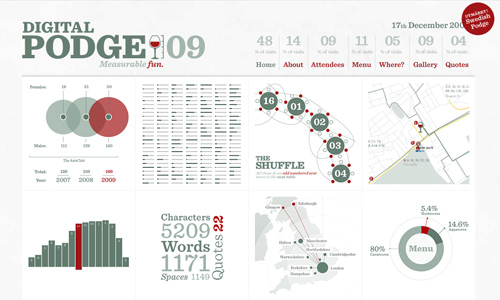
Site: Digital Podge
It is not just the looks that matter but what they read in the homepage matters more. So make sure that you will use good contents. Think back to what your site’s goals are and use this as guide in creating the contents for your homepage. Make sure that the contents will be able to tell the readers what is the purpose of your site. Also, be straight to the point and use proper grammar.
8. Add subscriptions and memberships.
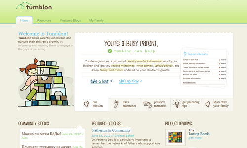
Site: Tumblon
Placing a subscription in your homepage could encourage visitors to come to your page again. It will also be an effective way of inviting new visitors to your website. When a visitor gets to your website’s homepage, they will be able to see immediately what your website offers and if it interests them, they will even sign-up to be part of your mailing list or create an account in your site. Having subscriptions and memberships in the homepage is a good way to get new visitors.
9. Show your products or services.
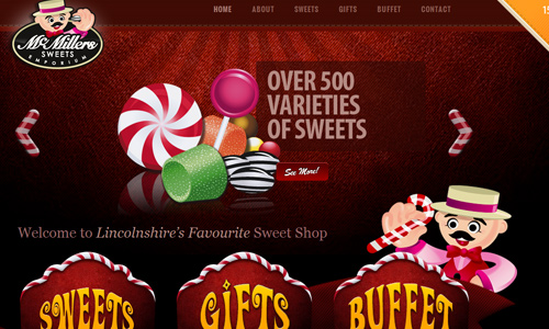
Site: Mcmillers Sweets Emporium
If the website aims to sell some products or to offer some services, show that in your homepage. Clearly let the users know what you offer. This way, you can easily promote them and your clients can immediately identify the kind of website you have and what you have there. Some sites have different homepage views for new visitors and repeat visitors which can also be effective.
10. Use meaningful graphics.
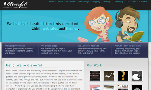
Site: Cleverful
When you choose graphics and images, make sure that it has something to do with the website. If you will just place anything on your homepage, then you will fail to deliver a message to the users. See to it that the graphics you use is meaningful and relevant to the entire website. It can be part of the site’s branding like a character or a mascot. Or it can also be something else that is associated to the website.
It’s Your Turn Now
The homepage is indeed the part where every user will first take a glimpse of a certain website. If the homepage fails to impress the user, the user might leave the site and never return again. The homepage plays a vital role to decrease your bounce rates. So, if you try to apply the things we have mentioned above, it could help you attain an effective homepage. But for sure, there are still other things that you would like to add to what we have listed above. We would be very much happy to know what additional tips you could add.


These tips would be so handy for a catchy homepage design, thanks..