In today’s post, we are showcasing another beautiful business card design that can surely have a long lasting effect to any business. These are the typographic business cards which creatively use typography or text as the only design element. Typography is becoming a popular design trend for t-shirts but let’s see how fascinating this design element can be if applied to business cards.
Take a look at this Collection of Simple Yet Cool Typographic Business Card Designs. Hope this will inspire you to redesign or make your own business card. Enjoy!
- You may want to take a look at the following related articles:
- A Showcase of Inspiring Business Card Illustration Designs
- 50 Examples of Green Business Cards Design
- 60+ Most Beautiful and Creative Business Cards Design
- Creative Examples of Round Die Cut Business Cards
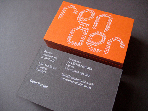
Render
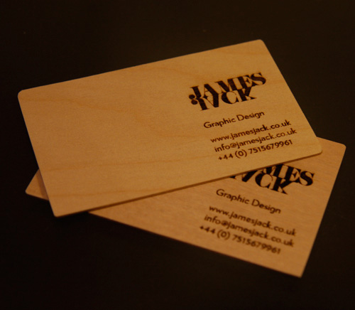
James Jack
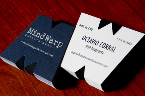
MindWarp Entertainment
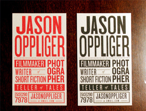
Mr. Jason Oppliger
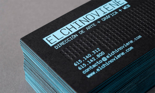
Elchinoviene
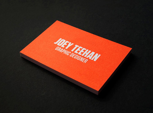
Joey Teehan
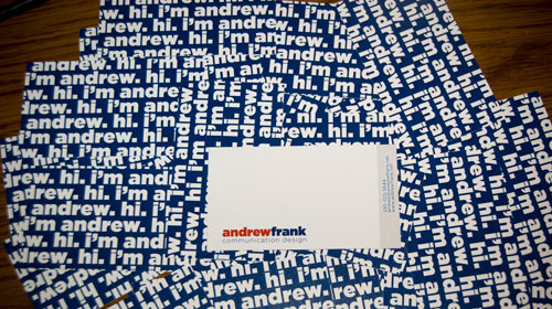
Andrew Frank
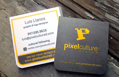
2×2 Square Business Cards
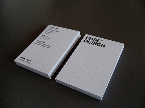
New Fuse Business Card
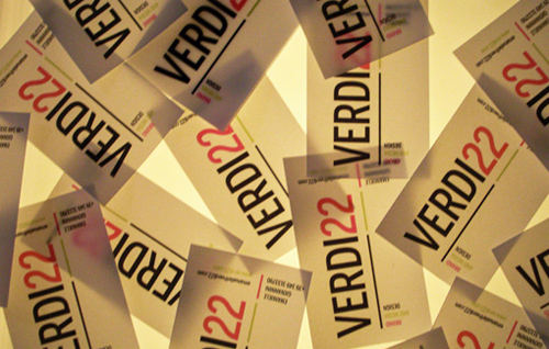
Verdi22 Business Cards
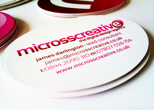
Micross Creative Identity
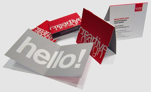
Creartive Design Card
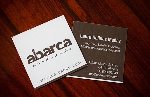
Eco-Friendly Business Card
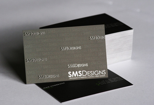
SMS Designs Card
Deep Letterpress Cards
Modern Business Card
Identity Design Card
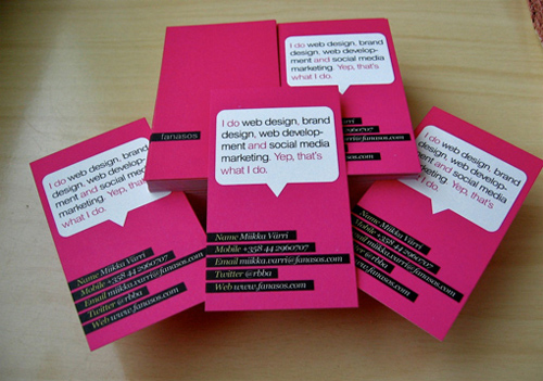
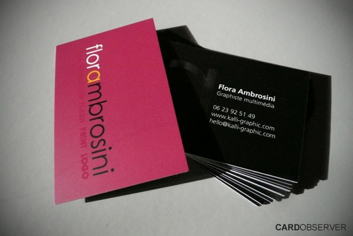
Pink Business Card
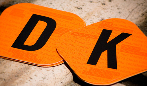
Rounded Corner Business Card
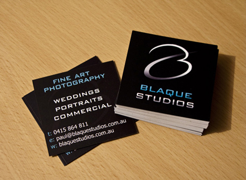
Square Business Card
Custom Business Card
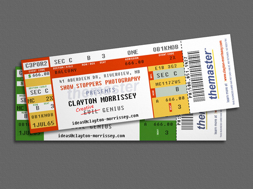
Chlayton Morrissey
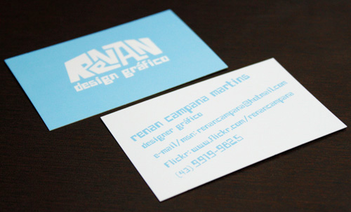
Renan Design Gráfico
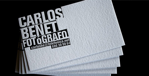
Black & White Letterpress
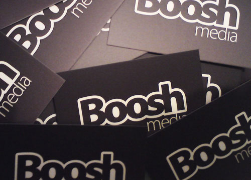
BooshMedia Business Card
Cool Business Card
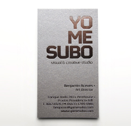
Cool Business Card YoMeSubo
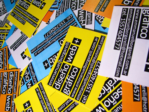
Emmanuel Borgarelli
Julian Hrankov
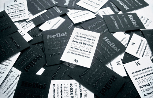
by: Julian Hrankov
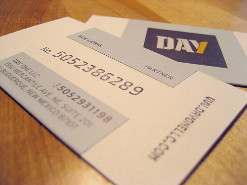
Day One
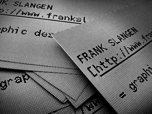
Frank Slangen
Virle Reid
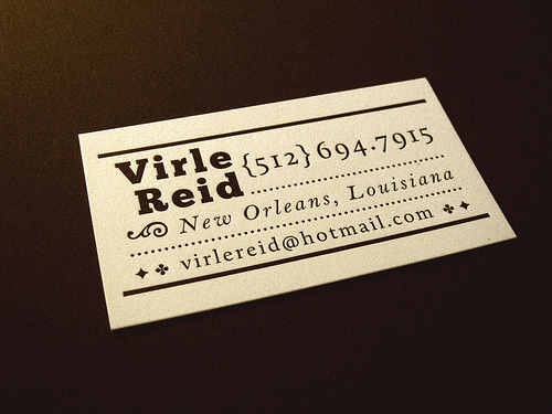
by: Ryan Colgin of Clip Creative
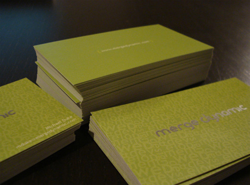
Merge Dynamic Card
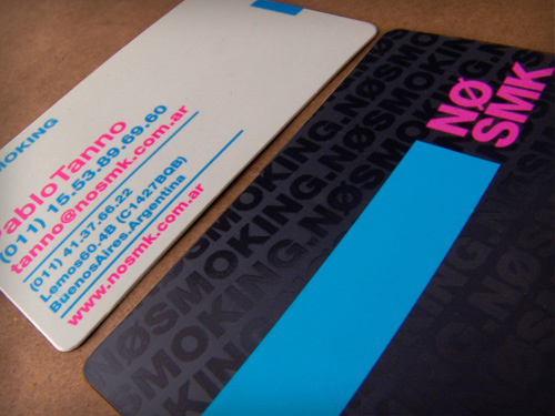
No Smoking
Green Sky Media
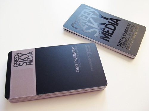
by: Hear Agency



I want to be part of the movement…
Great article! We love the under-appreciated art of business card design. People don’t put enough thought and energy into their cards. It is how a lot of people will remember you.
Very nice collection, I think more and more people will start using Typographic Business Cards
Renan Design Gráfico logo is more of a mountain logo for some reason. I think they should have come up with something else. The font is quite difficult to read, anyhow.
And my favourite card on this post is Virle Reid’s. Great minimalist + vintage feel. But that’s me being bias. Vintage is COOL! Sorry!!
Impressive typographic business card designs, thanks for share..
Some great designs here! Just goes to show that businesses don’t have to stick to a conventional size and layout. The acid pink on black in the second to last is eye-catching.
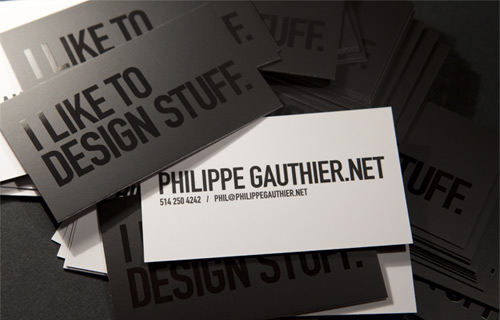
I really would like to know what is the font used on Phillip Gautier’s, his card is really beautiful and impacting.
live and learn … extremely inspiring … if there is an ever changing world is the world of graphic arts … congratulations to the creator!!