One of the hottest topics in design is Flat UI. Many design blogs and websites have talked about this and there had been various reactions from the audience worldwide. We can also see that many websites had adopted flat design in their course in achieving a responsive website. Flat design can be seen in every digital device because it had a huge impact to world of technology. But it has an even bigger impact to designers. It poses a challenge to designers on how they can work minimally when they have so many ideas in mind.
So today, let us join the web’s conversation about flat design. Let us talk about what flat design is, its principles, its similarities to skeuomorphism, and others. We will try to give you an in depth thought about flat design. In the end, let us all ponder if this is merely a trend or if this is something that is meant to last.
What is Flat Design
One look at it would give us one word- minimalism. Yes, flat design is more on designing with minimalism in mind but it doesn’t totally equate to minimalism. It has stripped off the three dimensional effects. Remember how icons looked like years ago? Most icons would appear like candies with striking colors and embossed effects. But in flat design, you will see icons free from bevels and other ornamentations. Flat design doesn’t use any decorative elements like gradient, shadows and textures. It is clean, crisp, two-dimensional, has open spaces and uses bright colors.
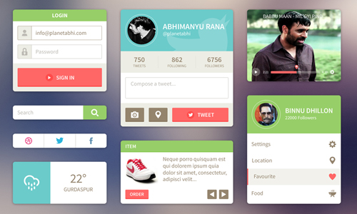
Image: Abhimanyu Rana
Flat design is focused more on communication rather than the appeal of the elements in it. It simplifies usability since it will draw the audience’s mind towards how a site or on how an application works rather than dwelling on how well-designed the elements are. It introduces visual clarity to communicate. It gives more emphasis to function rather than style.
The name is clearly derived to the way it looks- just flat.
Principles of Flat Design
It is actually easy to tell if the design is flat or not but let us look into five things that make a design look totally flat. These five principles of flat design can also be your guide in order to come up with a design that is not just “almost flat” but is really flat.
1. No ornaments and complex effects.

Image: Ben Bate
Any tool that adds an effect to a design is no longer used. No gradient, bevels, drop shadows, gradients and even textures. Icons and buttons no longer look beveled or bulged. It is just plain and flat. No extras.
2. Bright colors.
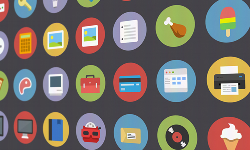
Image: Norm
One thing that makes flat design beautiful is its colors. Instead of sticking to the usual colors like blue for business websites, flat design encourages the use of bright and colorful palettes. It uses colors like lilac purple, green sea, carrot orange, midnight blue and other colors like the ones in Flat UI Colors site. Color is important in flat design for it can help the users recognize them and would also help them identify what actions they could take.
3. Simple yet beautiful typography.
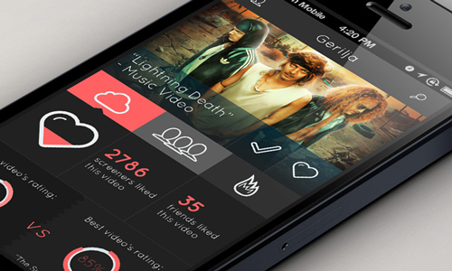
Image: Marcel Henkhaus
Of course, typography has to be simple too because if you will use special typefaces, it will look odd on a simple design. A sans serif type family looks best for flat design. But you can also combine it with a serif type or another novelty font. With a simple background, type would be given more emphasis which is one reason why you need to pick a good font.
4. Use of geometric shapes.
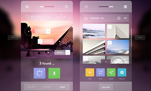
Image: Cosmin Capitanu
Flat design makes use of simple squares or circles for its buttons and icons. Squares could have sharp or rounded edges. You can also try using triangles and other custom shapes as long as it is consistent all throughout the design.
5. Minimalist and simple.
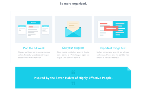
Image: Frantisek Kusovsky
We can never skip this part because flat design would always look minimal. You can observe that since the ornamentations were stripped down, it looked simple. But it isn’t really totally minimal because some flat designs still have so much design elements in them only that they are stripped off from details and effects.
Flat Design Usability
The emergence of smart phones is like a call for flat design. With smaller screens, more details on the aesthetics of a website or application will seemingly crowd it. Ornaments are like excess elements that can actually still make things work even if it is no longer there. Excessive decorations could cause distraction to the users and might even decrease usability. This is the problem that flat design responded to. It obliterated the ornaments and opted to focus on function.
Flat design becomes compelling and functional since it draws the users eye to the information instead of the distracting decorations. It is designed to show users the realism of on-screen experience and not to create a parody of physical things and experiences. With that, user experience is enhanced. As other design elements were stripped down, it allowed websites to load faster and to create cleaner codes for a more legible and adaptable design. This is great for responsive websites enabling easier usage and neater view.
A large number of the human population these days are exposed and aware of how computers and smartphones are used. It is no longer the time when people needed bulging buttons just to let them know that it is clickable. The “introduction” era has ended which means that it is time to “move forward”. Flat design is moving forward.
Is Flat Design, Skeuomorphism?
Heard of skeuomorphism? This word is kind of hard to spell and pronounce but yes, you might have seen it around the web. If not, let us ask Wikipedia what this word really is. As defined by Wikipedia, “skeuomorph / is a derivative object that retains ornamental design cues to a structure that was necessary in the original. It is compounded from the Greek: skeuos, (container or tool), and morphê,(shape). The term has been applied to material objects since 1890 and is now also used to describe computer interfaces.”
There had been many arguments about skeuomorphism and flat design. We have seen articles that referred to flat design as skeuomorphic. But is that really true? Let us try to examine both designs closely so that we will have better understanding on this. Take a look at the example below. These icons are from Apple’s iOS6 and iOS7. Notice their difference and similarities. Those from the iOS6 are beveled and had more details on it while the flat design for iOS7 had a simpler design minus the effects and bevels. The skeu design for iOS6 were based on physical things which was still adapted in iOS7. The only difference is the aesthetics or appearance but the representation is still the same. People will still be able to recognize what function the icons represent.
![]()
Skeuomorphism make use of textures, gradients and shadows to make an object look real. It copies the design of physical objects to make them real on screen. This is the cosmetic texturing era where you can see a real book with flipping pages, an application with leather borders or how a calendar icon looks like with binding paper calendar. With this, function is like converted to ornamentation. This is done in order to create a sense of familiarity to the users like how they use real objects. This was the time when people were not too familiar with how icons functions and how apps work.
In one way, flat design can be a skeuomorphic as it imitates the design of some items like a camera icon to represent its function as a camera. This way, it is related to the physical usage of a camera. But this has to be the case in order to easily relay its function to the users. In this aspect, flat design can be skeuomorphic. But if we look at how flat design is done, it is actually far from that of skeuomorphism because it is much simpler. So, flat design could be but is not skeuomorphic. It has reunited minimalism and skeuomorphism.
Why a Current Trend
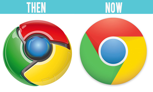
Many would think that Flat UI is merely a stage or a phase in design. But some would think that it is actually an evolution- not just in design but in usage. Take a look at the Google Chrome logo below. Notice their difference in aesthetics while retaining its look and its brand. It is still the same logo we used to see minus the shadow, bevel and other details. The 3D motif was used from beginning of Google Chrome until March 2011 while the 2D motif was use from March 2011 to present. The logo shows us that even the web’s big boss adapted the use of flat design. You can also see that despite shedding it from the effects, it can still be recognized as Google Chrome’s logo. Aside from retaining the colors, style and shape, one reason why it is still an effective brand is because people are already familiar with it. Same is true with the implementation of flat design to websites and applications. The digital users already know how to use it and are entirely familiar with it which makes the design effective even if there are no longer bulging buttons to signify that they are clickable. It even looks lighter, understandable and cleaner which can aid in easier usage.
The question of how this trend started confuses some. But it can also be trailed back to printing and Swiss Style design. In printing, designers have to lessen gradients, bevels and shadows because it would appear different on print. That is why, designers need to be a bit minimalist when it comes to print. This time, even on screen, designers can also be minimalist. The rise of flat design on screen is due to the complex and huge amount of information that needs to be displayed. This calls the need for simpler design and simpler interface. With flat design, a website can be constructed much easily and it can also be good for responsive designs. It also help focus on delivering a clean and clear content to the digital users especially to those who have weak internet connections which means it would take much longer for websites to load. Flat design even became more famous when Microsoft launched Windows 8.
So, we could say that the popularity of flat design could be greatly connected to the digital evolution because we are living in the “now”. But that does mean that we all need to use flat in everything we do?
When to Use Flat Design
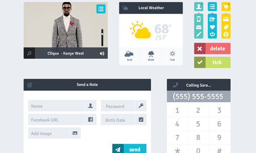
Image: Andy Law
It doesn’t mean that you have to use flat all the time. It depends on what you are working on. Flat design could look good in websites but there is always an exception. If you are working on a website for kids, it would be better to add some ornaments on it to make it look more colorful and attractive for children. Kids might not be able to understand a website with everything in “flat”. But if you are designing a portfolio, flat design can be good. This shows that you have to consider the kind of project you are working on and not just the trend.
Instead of sticking with the trend, know what will be good for your target audience and determine how your design can be effective for a long period of time. Prioritize substance, function and usability when working so that you will never go wrong. Use your mind to determine if a certain trend or style is suitable to a project. You can even work on something different from the latest trend and still look good. But this will also depend on what your clients want.
Giants Embraced it, Clients Want it
Let us face it. Even if a designer wants to work on a different style, it is still the desires of a client that will be followed. Most of the time, the client wants to have a project that adapts to a current trend. Clients look up at the “giants” and wanted theirs to be like what the giants have.
Giants who? Microsoft’s Windows 8 and Apple’s iOS7 are examples. They use flat design for simple, easier usage and more beautiful presentation. Microsoft is a big player in flat design when it used a minimalistic approach in Zune (which was not successful in the market) with big typography and neater design. From there, it then developed flatter designs up to the recent Windows Metro UI.
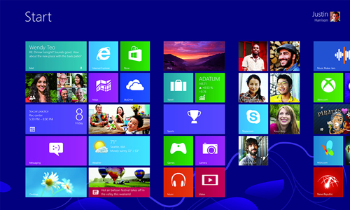
Image: Microsoft Windows 8
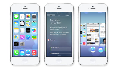
Image: Apple iOS7
What’s next?
Well, after flat design, there would surely be more trends that will come. Most likely, it would be an evolution to flat. Maybe some would add some 3d-ness into it while others would add some shadows or maybe textures. Or a new trend might arise. We will never know. Let us watch and wait on what is going to happen in the world of design on the next months and years to come. But what is really important is that whatever the trend is, you should be able to design with usability and the audience in mind. And also, it has to be timeless- trend or no trend.
So, what do you think of flat design? Is it here to stay or is it merely a fleeting trend?


actually flat design is the main topic of these times, awesome article, thanks to all the naldz group than make useful and atttractive contents, from colombia sebastian 😀
iOS 7 is not flat.It’s a terrible graphic disaster.
Flat design is really a fantastic design but between the APPLEiSO6 and APPLEiSO7,I choose the iSO6 it’s more attractive and precise rather than the iSO7 that look simply designed.
I agree with you Kareen,the flat designs is more colorful.
Thanks for sharing this new information.
massa!
We have Qeeneth. 🙂 Thanks for reading 🙂
Nice trend. Excelent.