The use of business cards is valuable in order to promote a certain business. It is also a mark of professionalism for it is an integral part of a business. It would always look formal if you can hand a decent business card to a client. It would be much easier for them to keep your contact information especially if your business card looks unique and worth keeping. Sometimes, it is really a challenge on how to make a business card effective. But one can choose from various business card designs and integrate the right contents into it.
One type of business card design that looks interesting is the use of typography design. These are called typographic business cards. The use of typography design for business cards had been proven effective for it can easily get the attention of the viewer right into the relevant information in the business card. To help you design a typographic business card, here are some design tips for you.
1. Make sure it is readable.
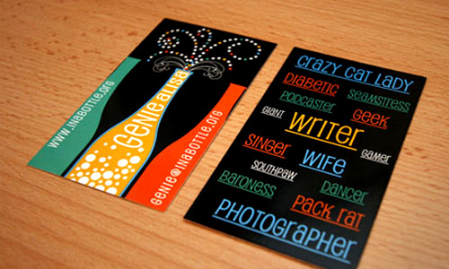
Image: Coolest Business Card
It is always important that you use fonts that are readable. You have to take note of this especially when you start working on the artistic side. Considering this will make you look into the right colors, layout and font styles to use. If your business card looks beautiful but not readable, it would be useless.
2. Match it the company and owner’s personality.
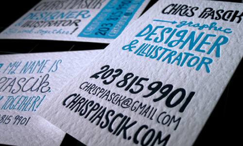
Image: Chris Piascik
If you are making a design for a client, see to it that the entire design suits the personality of the client. It would be easy to do that if you have gathered all the information you need from the client regarding the company and the owner. This way, you will be able to give the right design which can reflect the right personality and could match with the right industry the company belongs.
3. Do not overdo.
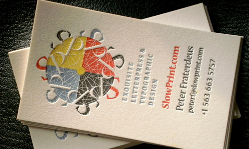
Image: Slow Print
In every design project, it is vital not to overdo everything for it might ruin the entire design. There are also certain limitations that you need to consider. See to it that the design of your typography will be clear to those seeing it and would deliver the right message. It has to be readable and legible.
4. Let typography speak for itself.
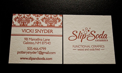
Image: Slip and Soda
Instead of using images and graphics, it is your typography that makes up the design of your business card. Hence, see to it that the type you use will really stand alone and tell the information you want merely by one look at it. It should be able to tell the viewers what type of company it represents. If it is a graphic design company, then work on your typography that way. You might want to go more formal depending on the type of company.
5. Use type hierarchy.
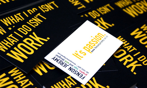
Image: Jeremy Fenson
In designing a typographic business card, it would be necessary for you to create hierarchy in order to give emphasis to the more important parts of it. You can use smaller font size for other texts that are of less importance. You can notice that there are different sizes of texts being used. That is how hierarchy is applied.
6. Use unique but readable fonts.
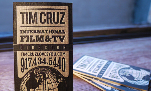
Image: Print & Grain
You can make a business card that can get the attention of the receiver by using a unique font style. But be sure that even if it is unique, it is still readable. See to it also that the font fits the company and their industry so that it will not deliver the wrong impression.
7. Have a power font.
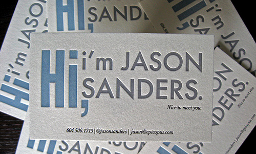
Image: Jason Sanders
There are some parts of your business card that needs to be emphasized. Use power fonts for large text elements. These are fonts that need to attract the attention of those viewing the card. This way, you will surely be able to draw the eyes of the viewers towards the business card’s important part.
8. Use creative layouts.
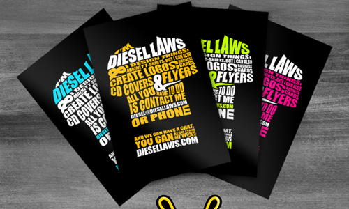
Image: Diesel Laws
You can make your business card look more appealing if you use creative type layouts. This can be done by forming it into shapes like circle or triangle. You can also arrange the letters in an artistic manner like diagonally or vertically. Look for a good layout that could add appeal to the business card while retaining readability and clarity.
9. Use good color combinations.
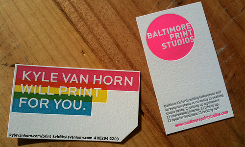
Image: Kvanhorn
Color is vital for it can greatly affect the business card’s impact to the readers. Your choice of colors should match the kind of business and industry. It should also emphasize important elements of the business card.
10. Combine typefaces.
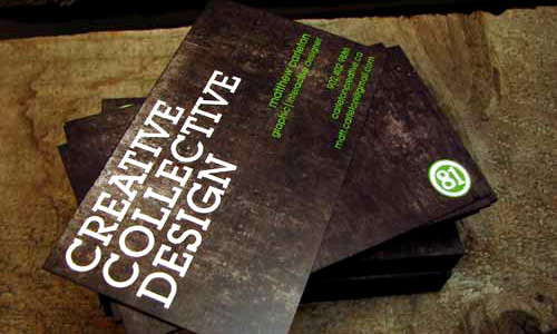
Image: Matthew Carleton
When we say typeface, it refers to either serif or sans serif. Usually, sans-serif is used for larger texts while serif is used for the contact information. But sans-serif can also work well for the contact information. Taking note of the serif/sans-serif rule can help you attain a good typographic business card by doing away from the usual fonts like Helvetica, Arial and Times New Roman.
It’s Your Turn Now
No doubt, the use of typography design is a good manner for getting the attention of the clients. They will surely look into the business card and immediately grasps the information that is in it. If you haven’t tried designing a business card with typography design, you might want to try it now. For those who have done typographic business cards, you might also share some relevant design tips to us.


well done..