
One may observe that every website is unique not just with its site name and brand but also with its entire look. Every website is distinct with the use of colors, graphics, text and even the layout. There are different ways on how to do the layout of a website. But like other art works and design, it can also make use of grids. Some websites can obviously show the use of grids in its layouting. It looks balanced and easier for the eyes of the users.
But still, some people might wonder why there is a need to use these vertical and horizontal guide lines for website layout. Actually, not only website layouting uses grids. Even newspaper layouting and other print materials make use of this to make sure that everything is aligned and looks proportional. So, today, we will give you the top reasons why a grid is used for website layout. Read on and find out what these reasons are:
1. It gives you a pre-conception of your layout.
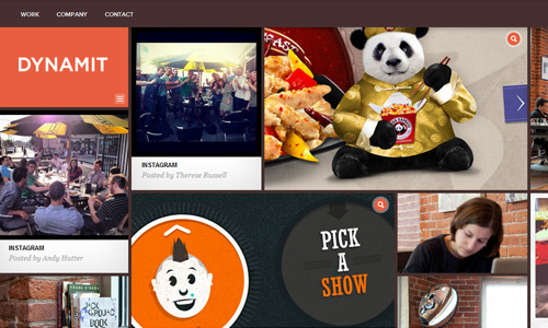
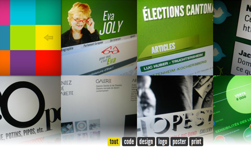
Site: Dynamit
Every designer always has a good design in mind. When he speaks with a client regarding a website layout, he has already formed an advance design in his mind. That is true to most designers. So, when you use a grid, you can seemingly see the website placed on it. This can help you to do some improvements on the design even before you have actually started working on it.
2. It allows you to balance the layout.
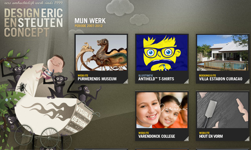
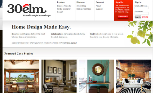
Site: Eric Steuten
Same as a newspaper or magazine layout, the website layout also needs to be well balanced. Doing that would make it easier for the users to read the contents. It is also easy for the eyes to look into the site’s contents. A balanced layout can increase user’s confidence to the site.
3. It creates a good structure.
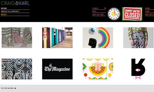
Site: Craig and Karl
A website that has a good structure can also look good for the users. With the use of grids, a good website structure can be achieved. Attaining a good structure gives the entire website a better look, a good usability, good readability and more user friendly. The good structure of the site affects the entire impact of the site.
4. It helps improve site impression.
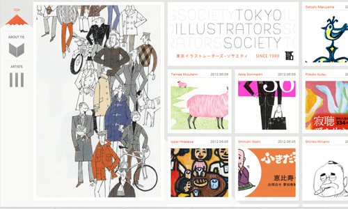
Site: Tokyo Illustrators Society
Having a balanced layout can give your website a good impression. It builds confidence and trust from the users. A reader would consider a well-designed site as professional and trustworthy. Using a grid would help a designer achieve a website with good impression.
5. It helps the designer realize the design.
Site: Elliot Lepers
With the aid of a gird, a designer will be able to create a design that appears seemingly perfect as how he wants it to look like. It would be a lot easier for the designer to look into how he would arrange the elements of a site while considering the users at the same time. A good design will be realized with the use of a grid, giving it a more appealing look.
6. It serves as a guide to position elements of the site.
A website has different elements which include the graphics, texts, videos and others. All of them should be placed properly. If not, the site will look cluttered and disorganized. A grid will be very helpful for a designer to know where these elements can be placed creating a good design. It can also help the designer align all the contents of the site.
7. It makes site look more appealing.

Site: Richbrown
Of course, any web designer and all website users would prefer a website that looks appealing. No one wants to look at a website that has a bad layout and uses unpleasing graphics, images, colors and overall design. Everyone would always love to look at anything appealing. Using grids can help one attain an appealing look that would be more attractive for the users.
8. It helps maintain typographic integrity.
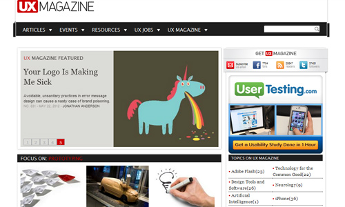
Site: UX Mag
Typography is a vital element of a website. It is important to tell and show the readers valuable parts of the website using type. By using grids, you will be able to use the right sizes of your type. Your entire website will look balanced with the proper sizes of the text for your heading, banners, context and others. You can let your grid serve as a guide to your type.
9. It shows uniformity and consistency.

Site: 42 Angels
Since grids are spaced uniformly and distributed uniformly, it will surely make the website appear like that, too. It would certainly be good to look at a website that has uniform lines and proper distribution of elements. It is much easier to look at and it is also a good catalyst for better reading and understanding. This can even help increase traffic for your site.
10. It allows designer to observe the use of white space.
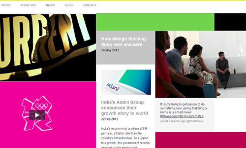
Site: Wolff Olins
White space or negative space is something that a designer should always bear in mind. It has to be applied in a website design in order to give a breathing space for all the design elements. It would be difficult to read a site without white space. Just imagine reading a site wherein all the elements are close to each other. For sure, you will not be able to decipher the contents and you will leave the site. So, use enough white space to make the layout much easier for the eyes of the readers.
It’s Your Turn Now
The points above could make one realize the value of using grids. Although some prefer not to use one thinking that they are being limited as to their design. But that is not true. One can still go crazy with the design and layout but still attaining a well-balanced look through the use of grids. There are different ways to create grids. The manner of making it depends on the kind of the layout you want. Are there other things you want to add above? Feel free to do so.


You kidding?? Why did you just repeat most thing you said on the previous topic?
This whole article could be compressed into few lines.