Every website exists not just to earn but also to communicate certain information to its target audience. Every website owner sees to it that he could give quality design and posts to the readers for these are important things to ensure that the readers will stay. Everyone will surely agree that a website is there for communication. It is a tremendous manner of communicating for it can reach people from all walks of life and it can convey info to people from around the world.
Effective communication is very important for a website for without it, your entire website is futile. In designing a website, one should greatly consider some things in order to ensure effective communication. Websites have different ways of doing that but we will share to you the things that need to be given attention in order to communicate the right thing to the audience. Today, we will give you design tips to create websites for effective communication.
1. Have proper website design approach.
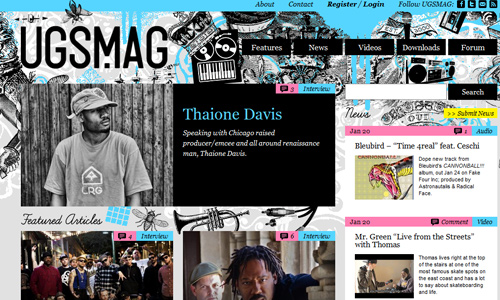
Image: Ugsmag
There are various design approaches that you can apply to your website. But you have to be sure that it will be appropriate to the industry. Make sure that your target audience will be able to connect well to your design. If the website is intended for kids, you can make it have a childish look by using many colors, illustrations, scribbles and others. Let your website design communicate to the type of website you have. You can observe that e-commerce sites are a lot different from graphic design sites.
2. Use readable content texts.
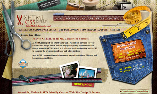
The contents of a website are always important for it is the soul of the entire site. No matter how beautiful and attractive your design is if your site doesn’t have good contents, it would still be useless. Hence, you have to make sure that the text in your contents is readable and clear. You should avoid using fancy font styles for it because your readers will not have an interest in reading it for it is heavy to the eyes. Also, aside from your content’s appearance, you also have to choose a good writing style and approach that will hook your readers to your website.
3. Choose the apt font.
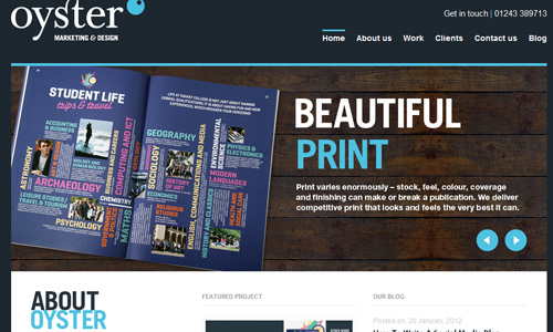
Image: Oyster Design
Your website uses a particular font for different areas and parts of it. Make sure that whatever you choose is readable. It has to suit to the type of site you have in order to relay the right message to the users. Font styles greatly contribute to how your audience will interpret your site.
4. Use fitting website layout.
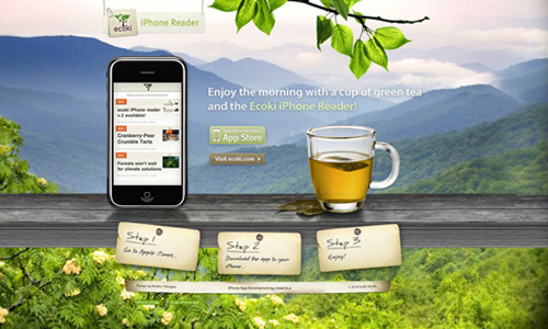
Image: Ecoki
The layout can also tell the audience a message. Use it to communicate to them what your site is. Some sites use a magazine layout especially for those that showcase designs. Others have single-page layouts which only have one page but contain every information you need. Choose a layout that would be apt for the site. You would not use a single page layout for a games website wherein you will showcase various games. That would not be right. So, be sure to use the right one.
5. Use the right images.
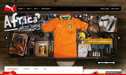
Image: Puma
Images can give your website an excellent look. It surely adds appeal to your site especially if your images are great. Your images are very important. Whether these are stock photos or images you have created, be sure that you will use the right one which can tell what you intend to show. Images can communicate faster and can even retain in the minds of the readers longer. So, choose the right image to avoid wrong interpretations.
6. Use the right colors.
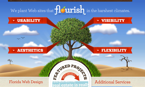
Image: Florida Flourish
Every color sends a different message to the audience. You have to use a color that best represents the website. Do not just choose color thinking about aesthetics. Always consider color psychology. Every website uses a different color depending on the industry of the site and depending on the message it wants the audience to know.
7. Have catchy titles.
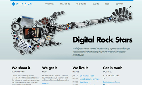
Image: Blue Pixel
Your contents would also have titles. Of course, you need this so that your readers can see what your contents are. Choose a good font for your title. It has to be simple but make sure that it can be easily read by the audience. You also have to see to it that your titles are right and appropriate for the article.
8. Create attractive headers.
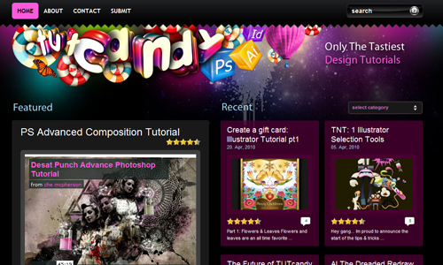
Image: Tut Candy
Headers are also important for effective communication for it is the part where they will immediately examine in order to know what the site is about. Most of the time, it is where you will place the navigation buttons which are valuable for the reader to browse and read what is in your website. Make a header that will also be unique, giving your site a personal and distinct look that will be easily associated to you. Also, the message of your header should directly tell the audience what the website it about.
9. Use unique icons.
![]()
Image: Box
You can see different types of icons in the web. These are websites that customizes icons in order for it to suit the web design. Every icon represents something that makes it easier for the readers to understand what that is. Like the icon for RSS and others. These icons are already familiar to the audience.
10. Integrate a video.

Image: Nystudyvacations
With fast internet connections, there are websites that make use of videos to relay a message. Communication is made much easier due to this. They insert a video where in one can watch it and would get something valuable about a certain topic. Using videos are good ways of communication for it can retain in the minds of the audience. This is also best for people who are not really into reading.
It’s Your Turn Now
There are indeed a lot of things to consider in order to have a website that can lead to effective communication. Since it is always important to communicate rightly to the audience, a designer should be able to bear in mind the things we have above. Do you think we missed something here? Feel free to add it in the comment section below.


Catchy titles can really capture the readers’ attention same as I am really attracted with this article when I browse the net since it gives me an idea to know the tips for an effective communication. Great job!
Yeah! Icons are also helpful! This is an interesting topic on your articles Kareen. I will follow all your upcoming articles! Break a leg! 🙂
Cool guidelines to be followed!
This is really effective! I am happy to read your article especially on tips.
Videos are also one way of inviting people to follow your website. Because some readers are tired and lazy of reading so they tend to check if there is a video available for them to have an easy access to the site.
Another set of helpful insights to keep in mind. Thank you.
I’m always looking forward every single article on tips you post guys. Thanks a lot!
All i can really say is “Bravo!”
I’ll really find time for number 8. 🙂
The 9th is hard for me as a beginner… but i’ll try.. fingers crossed. lol