
With the rampant usage of the internet these days, most people get information using it for it is the easiest way to acquire one. Information can be obtained not just by online sites that provide answers to it but also through what we call infographics. Infographics are also used in print but it can be seen in cyberspace most of the time. Infographics are visual representations of information, data or knowledge. It is an important tool in teaching, in business, in giving inspiration and in presenting information. It is one of the most powerful ways to communicate with complex data.
With the powerful communication reach of the internet combined with the powerful data presentation of infographics, everyone could bite and chew information easily. But the effectiveness of an infographics greatly relies on how it is designed. Hence, to aid designers, we have here a list of items that one should not commit. Look into the 10 don’ts in designing infographics especially the ones that are posted and shared in the web.
1. Don’t use too much text.
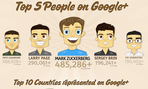
Image: Taylor
The reason why infographics existed is that it would make use of visual design to make a clear point. So, one has to make use of graphics and lesser text or there should be a balance of both elements. Infographics are good for people who read less and depend on visual information. If you still placed too much text and just added a few images, it would still not get the infographic’s aim.
2. Don’t make confusing data presentation.
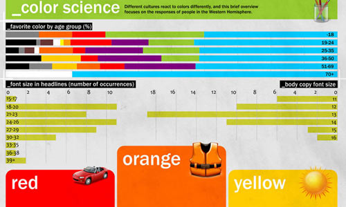
Image: Creatives Park
This would be a big mistake because it is a detour from an infographic’s aim. Do not lose your focus on the elements that needs to be presented in it. Also, make sure that your manner of presentation is clear and understandable. This is usually done by using graphs, illustrations and others. See to it that once the reader looks at it, they can get what you intends to tell them.
3. Don’t overuse color.
Image: Jenn Gerlach
Color overuse would make your infographics distracting instead of being effective in giving information. The readers will not be able to read well and comprehend well the contents of the infographics. Using many colors is okay as long as you are using the right combination and that you are also taking note of color contrasts. Make your infographics healthy for reading and understanding.
4. Don’t place too much numbers.
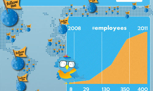
Image: Alex
Yes, your infographics make use of numbers to present certain items. But don’t use too many numbers to the extent that your output will look like a math exam sheet. Remember that you have to use graphics to present these figures. Do not just lay all those numbers on the layout making one confused what all those numbers are. Simplify it but as you do that, make sure that you will still be able to present it accurately. Simplifying your usage of numbers doesn’t mean that you should delete other entries. You only have to make it easier to understand.
5. Don’t leave figures unidentified.
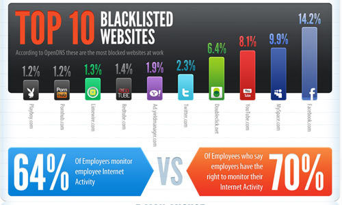
Image: Gavin
One really cannot do away with using numbers in an infographic. Some facts are presented statistically but not all people can understand that. Well, even experts might get confused if you just place figures there without proper identifications. It will be useless if you just place numbers. Hence, make sure that you place proper labels on each one. This would mean a lot for your infographic to be effective and informative.
6. Don’t make it boring.
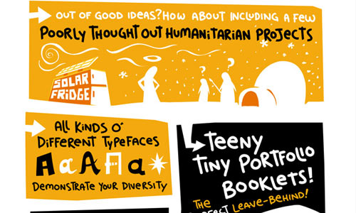
Image: Lunch Breath
Most infographics are entertaining, useful and informative. It aims to give information in a manner that it can easily be understood by the viewers. If your infographic is boring, then it would fail to catch the attention of the readers. You have to create a good storyline and presentation so that it can effectively tell the people what it intends to tell. If it is still boring, then the purpose of your infographics fails.
7. Don’t misuse typography.

Image: Wall Stats
Typography plays a vital role in designing infographics. It can actually enhance the look of it, thus, making it easier to relay information. But the misuse and misplacement of typography will ruin the entire design. You have to know what type face to use that would best suits your presentation and would not deliver a different interpretation. Be sure also that you will be able to place it on the right areas, so as not to distract the readers. Observe good color combinations and right font sizes, too.
8. Don’t present wrong information.
This is a great no no. No one will like to see an infographic bearing wrong data. So, make sure that you have double checked all information especially if you are using statistics. You will mislead and misinform the readers if you place wrong info. It is a must for all infographics to be precise, reliable and correct.
9. Don’t focus on design.

Image: Alex
It doesn’t mean that just because an infographic is beautiful, it is already good. The focus of infographic is not just on design. It is the information being relayed. A beautiful design is useless if it contains wrong or useless information. So, before you do your infographic, see to it that you have all the necessary data correctly. See to it also that you will be able to present it in a clear manner. But it doesn’t mean that you will disregard the design. Of course, it matters, too. The reason why it is called inforgraphic is it can effectively combine both information and graphic design. Come up with a good design while taking hold of the information to be conveyed.
10. Don’t use a circus layout.
Image: Overstock
What we are really trying to say here is that your layout should be good and should be able to guide the readers all throughout the infographics. Do not just place elements wherever you can think of. Consider how the viewer’s will look at it. Be sure that they will be able to understand it on the manner of presentation. Do not layout it like a maze. You are presenting information here and you do not want your readers to get confused just because you were not able to place items well.
It’s Your Turn Now
Well, the don’ts of infographics designing is clearly stated above. You should also include links of your sources so that the readers can clarify your data. Bear in mind that the information is important as well as the design of your infographics. You can take a look on our Tips on How to Design Effective Infographics. This can help you to achieve one that would help you reach the purpose of your design. Have you tried designing one? What were the mistakes that you think a designer should look into when designing an infographic?


