In this generation of the internet, everything goes online already especially that most people are online every day. Even business went online through ecommerce sites which even helped improve their business since online shops could reach more people worldwide. There are many advantages for an online store. Aside from reaching more people, it is also making things a lot easier for the clients to get the items they want without even going anywhere. Since online shops are a very big hit these days, it is important to have a good website design for that.
There are so many things that one has to consider in designing an ecommerce website. In order to get an effective layout, one can put his self on the shoes of the users. Doing this will let him see what things are needed to be added, emphasized or given more clarity. So, while you are acting as the client, you will be able to get the right design. Also, try to look into the points we have below so you can be guided in designing an ecommerce website.
1. Let the design match with the products or service.

Every e-commerce site has different products or service to promote. Hence, you have to make sure that the design of your site complements with the kind of product or service they have. There are different approaches that one can use but whatever that is, the designer should make sure that it will be coherent with everything in the site from text to images to color palette. Like if the website sells toys for babies, the look should be playful and a bit childish.
2. Use friendly navigation.
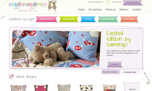
Site: Wiggle Waggle and Co
See to it that your navigation is easy. Do not make it complicated because if you do, you are giving your buyers a hard time to shop. Navigation is needed in order for them to get to certain pages and parts of the site easily. Make sure also that you use text that are clear, direct and readable. Place your navigation on top or on the side bar so that it would be easy to see.
3. Emphasize the products.
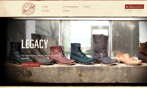
Site: Peter Nappi
Since the aim of an ecommerce site is to promote products, then it would just be right to highlight it. Aside from having good content, it is also important to include good images of the product and then put it in the spotlight. Make sure that it would get the attention of the users. The users are actually viewing your site to see your product. So, show it in the best possible way you could.
4. Use high quality images.
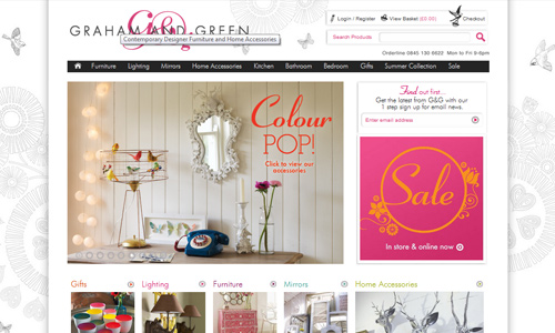
Site: Graham and Green
Of course, this would be very necessary since you would put the product on the spotlight. The better images you use, the more clients will be attracted to the site. The image should clearly show the kind of product so that the users can see what you are offering. You can even place different angles of it or different usage of it. This would make it look more attractive and your users could also understand what you are selling. Like if the site sells faucets and sinks, then you can showcase different kitchen designs using these products. But you should also include single pictures of the items. This way, you are one step closer to your goal.
5. Use strong branding.
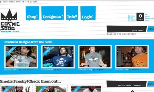
Site: Cosmic Soda
Every website makes use of branding in order to establish a unique identity online. But it would even be more necessary for an ecommerce site. Do that by placing your logo, company name and even a single liner text that would attract them to the site. You can also use colors and font styles as part of it. Actually, the entire look of the site is part of your online branding.
6. Clearly show the price.
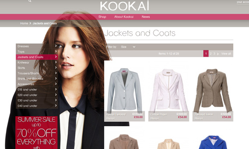
Site: Kookai
One reason why the user is looking at your site is because he would like to see how much your price is. Do not mislead them by showing the price only after they have placed the item on their cart. That would be irritating on their part. Some would even leave the site at once if the price is not clear. Place the price boldly and clearly. If you have discounts, show that, too.
7. Use an accessible layout.
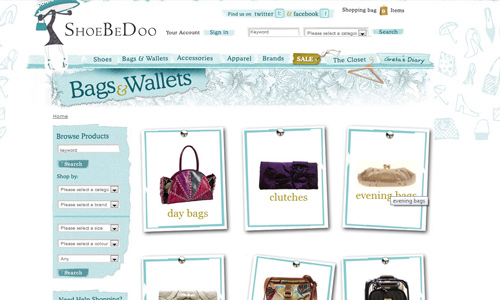
Site: ShoeBeDoo
There are different layouts that one can use. But it would be recommended for you to use a layout for easy accessibility and usability. When you speak of that kind of layout, it means that the user will be able to see every important element of your site easily. Do not give them a hard time looking for certain links like the FAQ or the shopping cart. This is one of the most important things that one needs to look into when designing an e-commerce site.
8. Place all necessary contents.
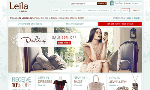
Site: Leila London
Part of that are the images, the text, an about page, a shopping cart, an FAQ, a contact page, a showcase of the products or even a sample of how the product is used. You can also place a link on where one can find your store. If you have a blog, it can also be placed as part of the navigation. See to it that you have everything that a user might need and would look for.
9. Use good context.
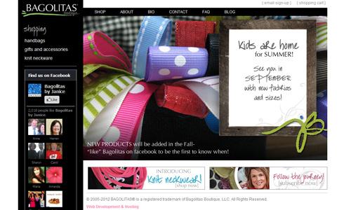
Site: Bagolitas
Aside from high quality images, it would be important for you to use text that are inviting and informative at the same time. You would need this to tell the users what the product is, what it is for and what benefits it can give them. Good text is another way of promoting a product which is also very important. But do not make it very long. You have to be direct on your words.
10. Make your homepage look attractive.

Site: Urban Originals
Like a store, one would be encouraged to visit it when it look beautiful in the storefront. Do that in your website, too. Have a good design for the homepage (and the entire site as well) that would get the attention of the users. Go back to the basic guidelines in designing a site and see to it that you are designing one that would be effective. Use good color combinations, right font styles and sizes and many other points that one has to remember when designing a site.
11. Show the users that you can be trusted.
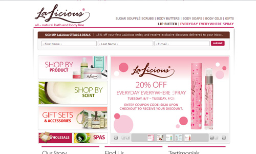
Site: Lalicious
The customers do not personally know you. Hence, in order to succeed in your site, you have to show them that you can be trusted. Place personal information like contact information. You can even place images of you and other people of high ranks from the company so that the users will see that there are really real people behind it. You can also place some certifications and other companies that you are associated with. Likewise, make it easy for them to reach you whenever they have questions.
12. Be able to process all payment methods.
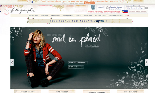
Site: Free People
Having different payment methods would be good for you are giving the clients different choices on how they could pay. But make sure that you are not making it hard for them to pay. Make it simple and accessible. Also, see to it that you are able to process all of the payment methods well. Aside from making it convenient for them to look at the items on your online shop, see to it that you are also giving them a convenient way to pay.
It’s Your Turn Now
These tips might be enough to let you know the needed points one has to consider in designing an e-commerce website. But one best way to get the points above is to look at different ecommerce sites that had been successful. Look at the samples that we have above or you might want to see other ecommerce sites that would be helpful for you. Also, if you want to add some points, you can do that by placing it in the comment section below.


the realism & absorbing sites .
Wonderful post, It is really nice to see your blog.