In designing, the primary thing that one needs to learn is sketching and drawing. Some even still do sketching before they work in the computer to make sure that their ideas will be incorporated well in the design. But there are others who really work on pencil drawings and place it in their designs. This is not only true for printed materials and other graphic design outputs but it is also used in web designing.
It is indeed astonishing how these hand drawn elements could augment a design and create a great impact to the readers. In this post, we will talk about how pencil drawings can enhance web designs. Also, you will get to see a showcase of websites using pencil drawings in their designs.
1. Gives a touch of informality to a serious site.
Some sites look way too serious for some. To give a touch of informality and lightness, why not use pencil drawings instead of the shiny and sharp design elements? You will still get the impact you would like to have and could even have a better one. The use of pencil drawings can still retain the site’s professionalism depending on the type of drawings you use. Some people would prefer web designs like this. Of course, you have to maintain the good contents of your site while having a good design.
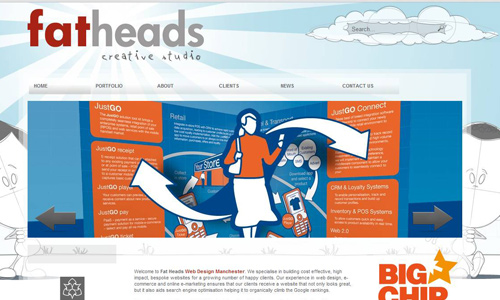
Image: fatheads
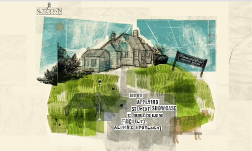
Image: Kutztown
2. Appropriate for children’s website.
If you target children or parents, you may use pencil drawings for your website. Children’s website would best use pencil drawings to showcase what it have. It draws the attention of the target audience and you can easily convey the message of the website with one glance at it. The website of Teresa Walsh below clearly shows that she is an author of children’s books through the caricatures for books shown in the header. Matched with a good layout, it is truly effective.
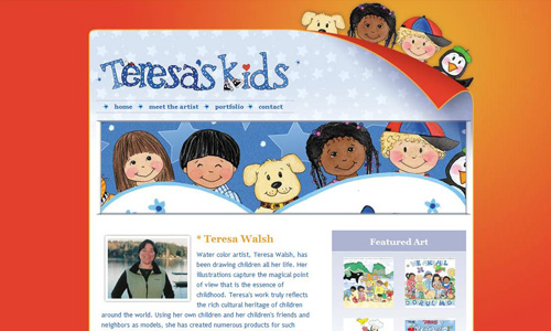
Image: teresawalsh

Image: neighborhoodhomeworkhouse
3. Gives a frivolous impact.
You can create a bit frivolous impact to the readers while still reflecting a good image by using the right drawings in your website. Some people want their readers to look at their site this way but still seriously consider the contents.
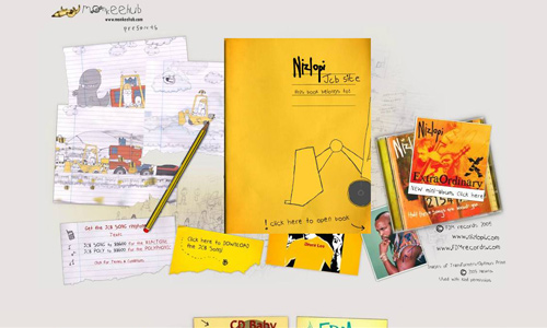
Image: jcbsong
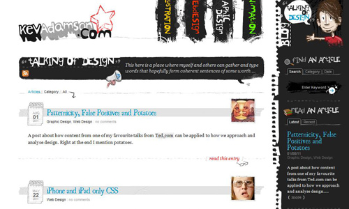
Image: kevadamson
4. Makes the site look playful yet still informative.
Websites give a variety of information to us depending on the topic it tackles. You can actually create a playful website design and relay information through it. These drawings could not only attract readers and users but it also gives them the idea as to what your website is all about. They might even find your site more interesting if you use drawings.
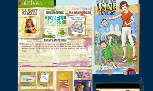
Image: mariska

Image: mikimottes
5. May look good even in a gray color scheme.
When you use minimal colors like a gray color scheme with a little combination of a bright color, you can include some drawings as an accent. The advantage of drawings is it looks good no matter how you render it. It may be colored or in black and white but it will still retain its good appeal. Some take for granted mere sketches of caricatures but if you make use of them well, it actually looks excellent.
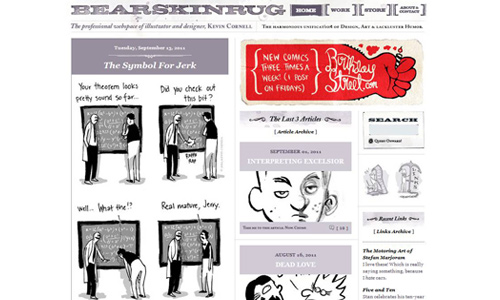
Image: bearskinrug
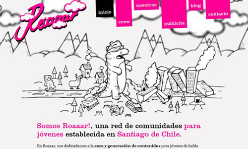
Image: Roaaar
6.Creates a light-hearted footer.
Footers are important for a web layout. It creates that feel of the contents not dropping down. Some merely use a single line while others prefer the use of images and other designs. You can actually use pencil drawings. As you could notice in the examples below, it still looks first-rate and formal despite the pencil drawings in the footings. It doesn’t ruin the design rather, it enhances the web design. If you check to website of Esteban Munoz, you’ll be pleased on how he played well with the drawings for they move as you move your cursor!
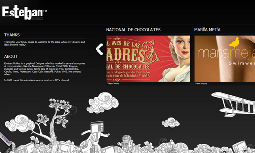
Image: Estabanmunoz
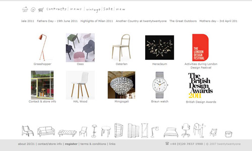
Image: twentytwentyone
7. Makes a bit perky header.
Headers are even more important for it is where we usually get the name of the site and what the site is all about. It is like a book cover that could introduce the entire contents in just one glance. Try using pencil drawings and make it look a bit perky. You’ll certainly have a unique output if you do that.
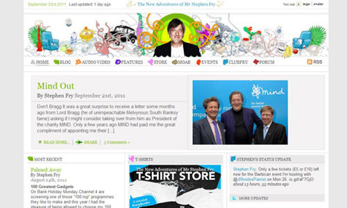
Image: stephenfry
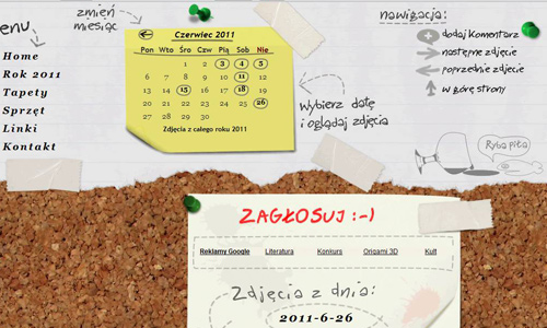
Image: marcol
8. Minimal usage still gives a good visual appeal.
You do not have to use pencil drawings in the entire design. Some opt to use it on some parts of the website and still manage to make it look great. Minimal usage gives a different touch to the entire design and to a website as well. Some use it for icons while others just do a little sketching on some areas.
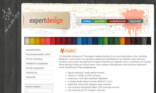
Image: expertdesign
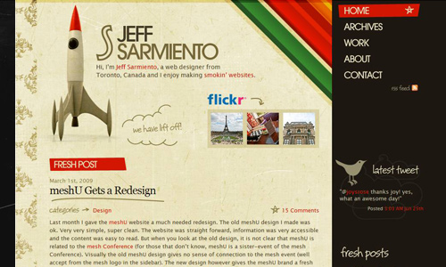
Image: jeffsarmiento
9. Creates a unique design.
Surely, using pencil drawings will make your website unique and first-class in terms of designing. Not all people would opt to use them thinking that it might make their website look childish but with the right drawings, right positions, right layout, and right colors, the design will surely stand out.
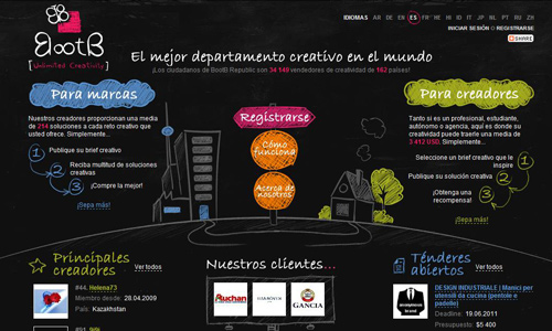
Image: bootb
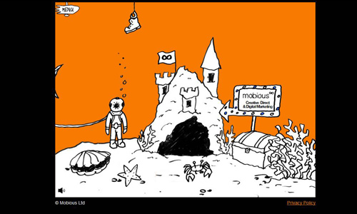
Image: emobious
10. Makes your design look more artistic.
No doubt, the use of pencil drawings will make your design look more artistic. It gives a personal touch to the design making it truly original.
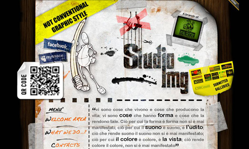
Image: studioimg
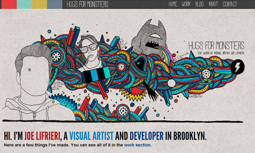
Image: hugsformonsters
There is no limit in designing. What we can see above is a concrete proof that one can really go out of the box and create his own design in his own unique way. The use of pencil drawing is one way that could help you make a truly unique and pleasing website. Why don’t you try using your own pencil drawings for your web design?


Enjoyable post. I especially liked # 9 and wish I had the inner sight to make things like that
Much like the last one so tricky but good variety of colors ..