Everyday, we always encounter various colors – from the clothes we wear, the things around us, the food we eat, the things we use- everything. If our world doesn’t have this variation of colors, then everything will be so dull and boring. We cannot refute the fact that colors are part of our everyday lives.
Designers and artists of course make use of colors in their projects and are taking into account a lot of things before choosing which hue to use. Colors are said to activate the right brain for emotions. Emotions of a person can be seen depending on what color he/she uses. A project can easily reveal what it is trying to say merely by the choice of colors. Hence, it is very important to get acquainted with colors really well. Here are some things that designers need to know about colors.
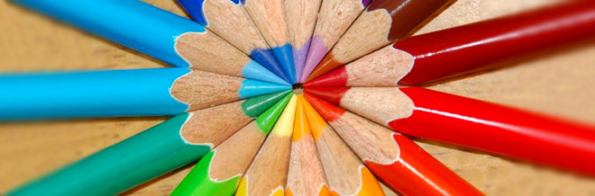
1.The color wheel.
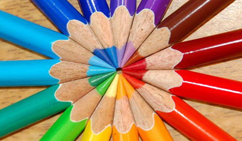
Image: sonorousviola
When you deal with colors, of course, you have to know the color wheel first. The color wheel serves as a reference for the different colors, the right color mixtures, the proper color harmony and many others. The color wheel shows the three primary colors red blue and yellow. When you combine these primaries, you’ll get the secondary colors orange, purple and green. Then if you combine the secondary colors to its neighboring primary color, you’ll get a tertiary color. There are six tertiary colors: yellow-orange, yellow-green, blue-green, blue-purple, red-purple and red-orange.
2.Color schemes.
In working with colors, there are various color schemes that an artist or designer may use.
- Achromatic uses black, white and gray.
- Monochromatic uses a single color with various values and intensities. Black and white can be used here to add various tints and shades.
- Analogous uses colors that are adjacent to the color wheel. Any three neighboring colors in the color wheel are called analogous. The colors vary slightly from each other and are harmonious.
- Complementary uses colors located opposite each other on the color wheel like red and green, yellow and purple, orange and blue. Opposites really attract.
- Triadic uses three colors from the color wheel which are equally spaced from each other. The primary colors when used together are considered triadic. Orange, green and violet are triadic colors.
Image: a dream divided
Image: Ashmantle
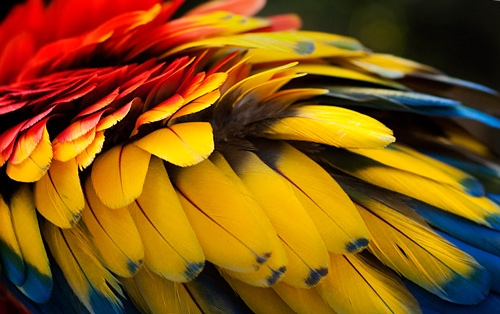
Image: dsoden
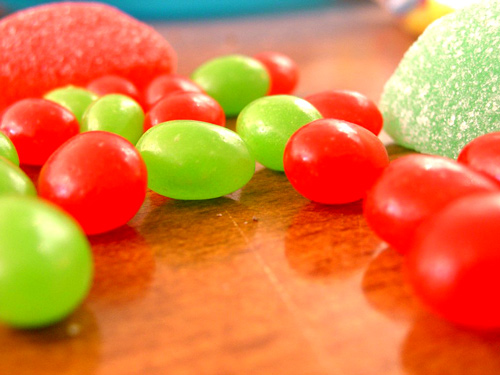
Image: MrLMU
Image:xRinjii93x
3.Experiment
Image:Skyhorse1
Don’t be afraid to experiment with colors. Try using various combinations and you might love the result of your designs. Just make sure that it looks pleasing to the eyes and it conveys the message you want to imply.
4.Color Interaction.
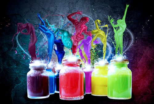
Image: JurgenDoe
Consider how colors behave when they get together. There is a great tendency that it will look different when combined with another color. Colors may change in appearance depending on its surrounding.
5.Readability in combining colors.
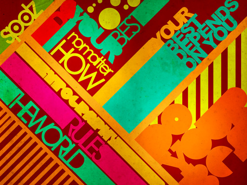
Image: SpiderIV
When you combine colors with type, make sure that the text is still readable. Choose colors that could emphasize and enhance type. Look into the values and saturation of colors. When you use colors whose value is near each other, the text becomes less visible and readable.Try experimenting which color can be best used for your type characters and for your backgrounds.
6.Basic color theories on harmony.
Image: bizoue
In making your designs, you would always want it to look pleasing. So we have to consider color harmony. In doing that, we merely have to know three theories according to A Guide to Top Color Combinations in Web Design: Examples of Color Schemes and Color Combinations Within Designs .
- Two Colors Opposite of Each other on the Color Wheel are harmonious.
- Any three Colors Equally Spaced Around the Color Wheel Forming a Triangle are harmonious.
- Any Four Colors Forming a Rectangle, Each Opposite of Each other on the Color
7.Color temperature.
Image: ScorpionEntity
The color wheel also shows color temperature. Color temperature could either be warm or cool. Colors on the red side of the wheel are warm while those on the green side are cool. But color temperature is relative. Red can be warmer or cooler sometimes. The use of color temperature also helps us determine the position of an object. Warm colors are said to make objects appear nearer while cool colors makes an object look farther.
8.Color psychology or color meaning.
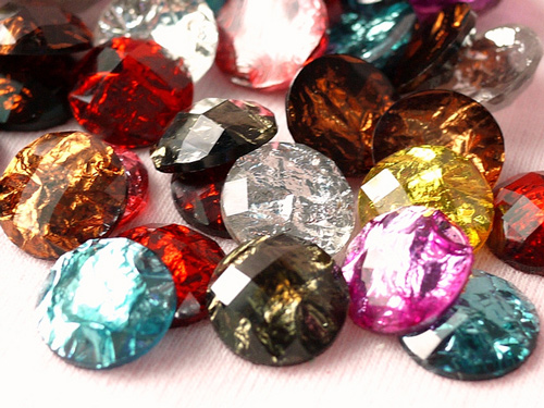
Image:Cranberry+Lover
Every color that we use have its own meaning and would manifest the effect on such designs to those looking at it. It is also important for you to know what the different colors mean. Below are a few adjectives that tells us what each color symbolizes as defined in Color Symbolism,Color and Personality, Gemstone Color & Meaning . You may check the site for you to have a more in depth understanding of color meanings.
- Red symbolizes: action, confidence, courage, vitality
- Blue symbolizes: youth, spirituality, truth, peace
- Yellow symbolizes: wisdom, joy, happiness, intellectual energy
- Pink symbolizes: love, beauty
- Brown symbolizes: earth, order, convention
- Orange symbolizes: vitality with endurance
- Gold symbolizes: Wealth, prosperity, wisdom
- Green symbolizes: life, nature, fertility, well being
- Purple symbolizes: Royalty, magic, mystery
- Indigo symbolizes: intuition, meditation, deep contemplation
- White symbolizes: Purity, Cleanliness
- Black symbolizes: Death, earth, stability
- Gray symbolizes: Sorrow, security, maturity
9.Choosing colors for negative spaces.
Image: Zombie-keeper
For negative spaces, we have to use colors that could enhance graphics, text and other elements. Make sure that it doesn’t take over your design. Most of the time, lighter and cooler colors are used for negative spaces but it still depends on the artists. What’s important is the proper use of color combination knowing that colors look different depending on the surroundings.
10.Color concepts and terminology.
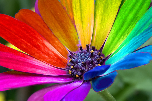
Image: blueman12
In using colors,it is also imperative for artists and designers to know the different terms used to avoid confusion.Here are color terminologies from Color Theory For Designers, Part 2: Understanding Concepts And Terminology By Cameron Chapman. We have shortened the meanings of the terms but you can find more comprehensive meanings on Chapman’s article.
Also, you may want to read Elements of Design: Value and Color where some Color terms are also defined.
- Hue
is color (blue, green, red, etc.). - Chroma
is the purity of a color (a high chroma has no added black, white or gray). - Saturation
refers to how strong or weak a color is (high saturation being strong). - Value
refers to how light or dark a color is (light having a high value). - Tones
are created by adding gray to a color, making it duller than the original. - Shades
are created by adding black to a color, making it darker than the original. - Tints
are created by adding white to a color, making it lighter than the original.
11.Color primers.
Image:sugarfreedreams
Color primers are important things for a graphic designer to know. With this knowledge, you’ll find the right color primer to use in your designs. Here are the color primers as defined by Digital Concepts for Business, Inc.
- CMYK color
is related to print work and describes how the colors Cyan, Magenta, Yellow, and Black are combined. It is a subtractive process unlike how we view color on a computer monitor. So when a designer works on your project and works with a 4 color process they are working with colors that can be represented by % of their individual CMYK components. - The RGB color space
is capable of producing many more colors than the process (CMYK) color space. The most important thing to get out of this is that colors that are in the CMYK spectrum may not be accurately displayed on a monitor, meaning you may see a difference in the colors between your monitor and what is printed. Before you get a job printed you should always view a realist proof from your printer. - Pantone PMS Colors or Spot colors
are solid colors that you can specify – mostly used on logos or added to 4 color jobs to bring out a vibrant or color that cannot be produced with a CMYK process. Most logos are designed using 2 colors, the problem is that if you go to print the logo in a 4 color process the color will shift and may not match. If you are printing you brochures or catalogs in 4 colors and you want your logo to match your 2 color business cards you might be in for a surprise.
We just had a small trip in the world of colors and we surely learned a lot. So, if you were so occupied making lots of projects and have forgotten the basics of colors, this may help you refresh your mind about it. We hope that this article could help you in choosing the right color for your designs and whatever art works you are working on. Have a colorful day ahead!
- Other Resources:
- Art 104: Design and Composition
- Color Symbolism,Color and Personality, Gemstone Color & Meaning
- Color Theory for the Color-Blind by Mario Parise
- A GUIDE TO TOP COLOR COMBINATIONS IN WEB DESIGN
- Customer Knowledge Base: Color Primer


I think the link at item #6 (A Guide to Top Color Combinations in Web Design: Examples of Color Schemes and Color Combinations Within Designs) isn’t pointing to the right page.
Hi shorty,we apologize for the mistake. Thank you for informing us about it. We have corrected the link already. Good day!
What a way to describe this topic, really helpful article, thanks buddy..
Very informative and all points discussed are helpful. I also design print graphics so for me it is very helping. Thanks for a good post.
A great wrap-up of color use, thanks for this article, Kareen
Very useful tips. Colors has always been my weakness in designing, good I found this article. Thanks Kareen
Great overview on colors.. going to design a website, this will be very useful..
Great article 🙂 thanks you 🙂