With today’s HTML and CSS furthering the web designers’ ability to create mesmerizing animations and parallax effects, new web designs have emerged that offer fascinating experience to their visitors.
Though this kind of designs can be attractive and tempting, displaying the right amount of animation, characters, and movements can be challenging to balance and therefore, tricky to pull off. If you’re a planning to design or own a website like this, it could be wise to check out some examples that will give you some precious ideas on how you will create it.
Below, take a look at some of the examples of these Storytelling Websites that we have gathered for you and your convenience. As you scroll down, take some inspiration and share at the comment box the websites and elements that compel you. Come, take a peek, and enjoy!
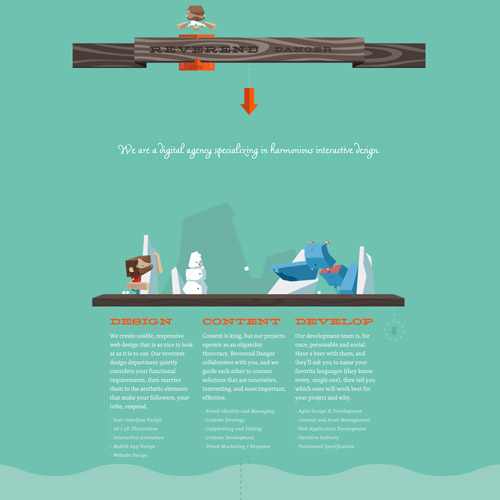
Reverend Danger
Reverend Danger is a digital agency that specializes in interactive design. In their website, they integrate fun characters in semi-flat designs and make them more interesting with the use of CSS animation. The navigation is user-friendly and entertaining that you’ll be scrolling down until the end of the page.
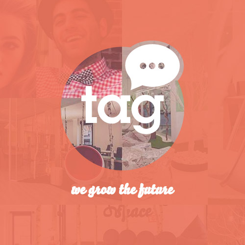
Talent Garden
Talent Garden is a platform that provides a community for talented artists and innovators. In the homepage of their website, you’ll see a creative and informative presentation of what this company is about by scrolling down using your mouse wheel. It will tell you their campuses, events, the corporations they are involved with, and the people behind this company.
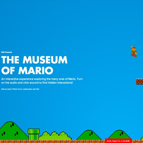
Museum of Mario
Created by the people of HTML5 Pub, Museum of Mario, which is hosted at IGN, gives you a timeline of how Super Mario franchise evolved across the different eras. In the timeline, many effects are incorporated through HTML5, CSS, and parallax that boost the user-experience in each era. The website can be navigated in different ways: the panel on the left side, mouse scroll, and using arrows on your keyboard.
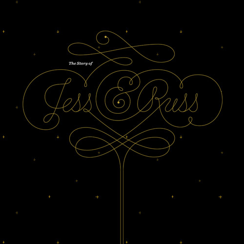
Jess and Russ
This next feature is a wedding invitation, but not a simple one. This site first tells the story of both the bride and the groom through a timeline – right side for the bride and left side for the groom. The storyline is also filled with parallax images and calligraphic fonts that make the whole storyline more entertaining. At the end, an invitation pops out from an envelope requesting for an RSVP.
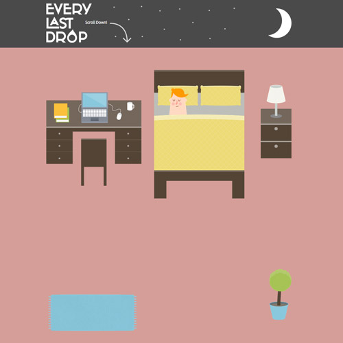
Every Last Drop
Every Last Drop is an entertaining and informative website that aims to lessen water wastage by raising awareness about everyday water consumption. This website incorporates flat design with some minimal animation throughout the story, which is navigated through scrolling or clicking the arrow icon on the lower right corner of the page. At the end of the page, a video is available for readers to watch to get some tips on how to conserve water in our everyday activities.
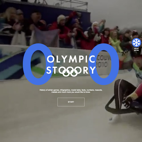
Olympic Story
Olympic Story is a website designed to tell stories and fun facts about the Olympic winter games through the history. You can navigate through the facts and timeline using the arrows on your keyboard.
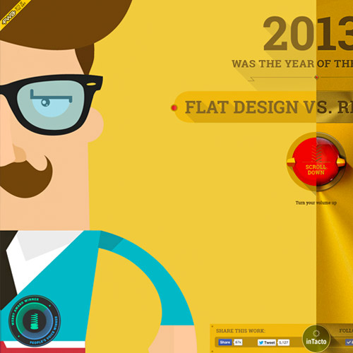
Flat vs Realism
This next website tells the story of how realism and flat-design ‘fought’ for dominance in the realm of digital design. The web design tackles on different effects such as parallax scrolling, CSS animation, and time warp effects throughout the storyline. Overall, the design is creative enough to entice excitement and fun to its readers. The end part shows the people behind inTacto who created this site.
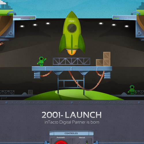
inTacto 10 Years
Here is another website design that were made by inTacto. The design uses parallax scrolling which effectively illustrates a rocket ship taking off to space. It conveys the journey the company had in a decade of digital frontier by presenting a timeline that shows different stages of the company with its achievements, partnerships and expansions.
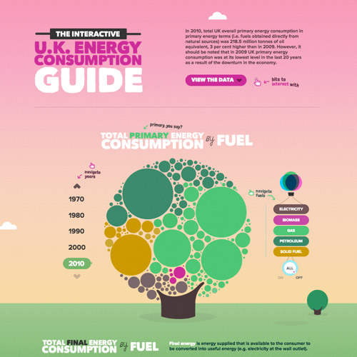
The UK Energy Consumption Guide
EvoEnergy, a solar power specialist company, has created this web design that presents an interactive guide on UK’s energy consumption. This illustrates the energy resources that have been utilized through the past decades. It uses charts, graphs, and other infographics that are made more eye-catching with its lively colors.
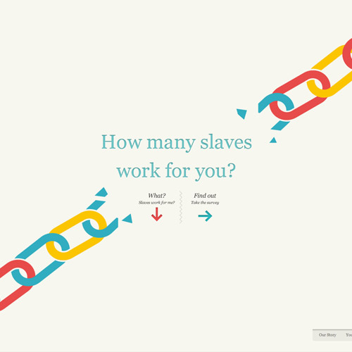
Slavery Footprint
Slavery Footprint is an organization that condemns modern slavery. The web design utilizes flat design that explains how slavery happens up to date. Parallax scrolling makes the role of putting some spice onto the presentation. As you scroll down, the paragraphs are creatively put into place by hands and other various tools.
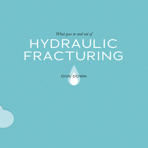
Dangers of Fracking
This next website is about hydraulic fracturing or fracking. The storyline basically tells how this process works and how it can be harmful to the environment and health. The web page incorporates a flat design with noise texture.
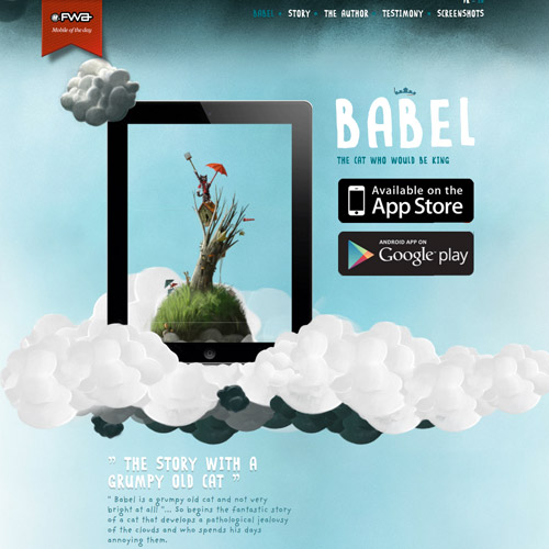
Babel the King
Babel: The Cat Who Would be King, is an interactive app for kids. The web design is a colorful environment that is also specifically designed for kids. It incorporates some illustrations of clouds and sceneries with some images and characters moving through parallax effect for a more enjoyable experience.
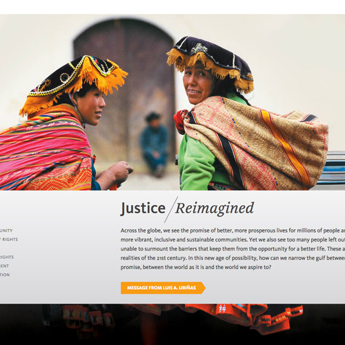
2011 Annual Report
The Ford Foundation website creates their 2011 annual report with this web design that incorporates big background images with text layouts that move accordingly in parallax scrolling.
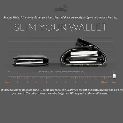
Slimming Your Wallet
Slim Your Wallet is a webpage that focuses on Bellroy’s wallet products. It talks about the wallets’ utilities and shows illustrations of their functionalities and designs.
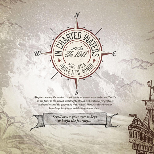
In Charted Waters
In Charted Waters is about how the map evolved as our knowledge grew through voyages and explorations. With the timeline design, discoveries are explained in different time periods, which give an insight on how the world map grew along the centuries and got completed to the present. You can navigate this page by mouse scrolling or using arrows on keyboard.
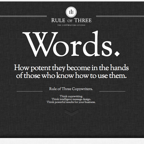
Rule of Three
Rule of Three is a copywriting studio. Their website tackles on how words and content dominates both offline and online platforms. This simple design only comprises of black and white, fabric background texture, some slightly animated images, and great typography. Yet, it still gives a clean and elegant feel that makes them more professional and reliable.
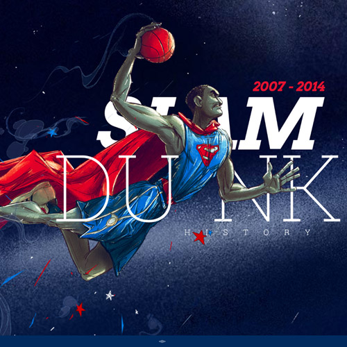
Slam Dunk History
Next is a site that shows the history of slam dunks from 2007 to 2014. Each players are nicely illustrated and gloriously animated to their dunking state through parallax scrolling.
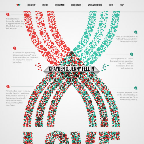
Jenny and Grayden
Here is another wedding invitation website. First, the page contains a story of the couple first met with the sort-of-timeline that indicates important points of their romantic relationship. It also includes some of their lovely photos together.
After that, it is all about the wedding. It includes the groomsmen, bridesmaids, as well as the when and where of the wedding ceremony, and how to get there.
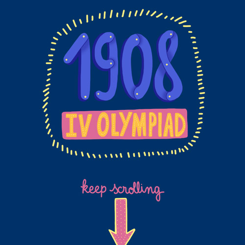
Well Done Team GB
This next example is for the team of Great Britain who participated on the Olympiad. It also uses parallax scrolling to animate the digitally illustrated sceneries and characters of different game events.
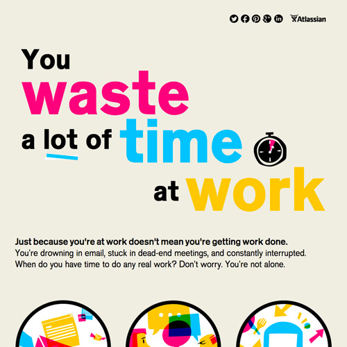
You Waste a Lot of Time at Work
Here we have a website that tells us about how much time and the cost we waste during our working hours and the reasons why this happens. It is designed with various illustrations that are composed of bright, transparent colors that sometimes overlap to each other.
Defend the Internet
Defend the Internet is about its own title. It condemns the 2 bills (SOPA and PIPA) that will basically limit internet access to the public. It tries to explain its point through image illustrations and specific textual contents.

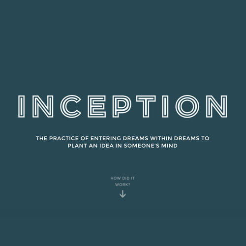
Inception Explained
Have you watched the movie ‘Inception’ a couple of times and still find the plot blur and hard to understand? Then this website will explain it in step-by-step explanation. The guide is made more enjoyable with the parallax effects and illustrations.
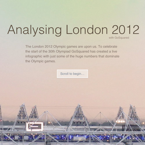
Analysing London 2012
Here is a site about London’s 2012 Olympic games. It entails different game statistics, and the huge stadium where the event was held.
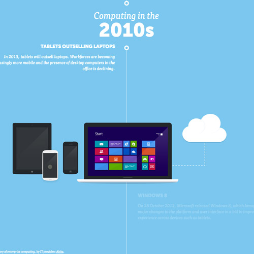
Computing History
Another website that tributes a history, this time for computers. It shows different eras of computers in a timeline from 2010 to the 1950’s. Each era has its own information and some fun facts.
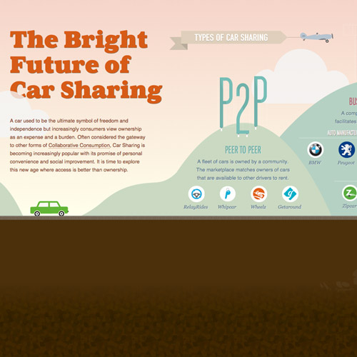
The Future of Car Sharing
This last feature on the list is all about car sharing. The site is designed with flat design scenery and a green car. To navigate through the horizontal page, you need to use the right and left arrows of your keyboards.
The site illustrates the advantages of choosing car sharing instead of buying a personal car.
Note: All visual content above is copyright to its respectful owner. Please read the Terms Of Use of these resources before using to prevent unwanted occurrences. NaldzGraphics does not claim credit nor responsibility for any images/videos featured on this site unless otherwise noted.
Have something in mind related to web design, freelancing, and other awesome stuff? Let us know and maybe we’ll feature it on our next post. All your comments and opinions are appreciated. Let us hear em up in the comment box. Thank you and see you again mate!

