Textures, having been identified as versatile when it comes to its usage in Web Design has captured many artists and have been widely used. With its variety, the visual interest it adds to your design becomes achievable enough. These have been used commonly yet with the artistic ways of creating something new out of many, leads to a masterpiece. May they be just accents to your design or for its every aspect. We have already posted quite a number of textures you may choose or you could’ve have chosen from in the past so we just thought of sharing some tips with you today.
In this modern way of Web Design, there should be knowledge and there should be balance. You’d know what fits where… So here are Tips you may make use in choosing the perfect textures for your Web Designs…
1. Less becomes more.
In effective web design, it doesn’t have to be very detailed. Let it convey the message you are trying to point out. Less textured details that fits your site, more users.
2. Let features match with audience.
You have to be sure of who your audience is so to be able to decide which texture/s would be best for the whole site. From the wide array of textures, it would be confusing when you are not yet sure who the viewers will be.
3. Make it simply overwhelming.
When deciding to make it look simple, take into consideration how to give a variation. The eye may rest in one color but with a few details, it makes the site look simple yet interesting.
4. Do not overdo.
Colors and its artistic appearance matters but effectively combining both is superb. It depends upon the particular texture that goes perfectly with your planned structure. Textured yet less background colors.
5. Cohesiveness to the site is a plus.
Incorporating the texture to its headers and footers would make the site look more cohesive. Everything goes perfectly smooth.
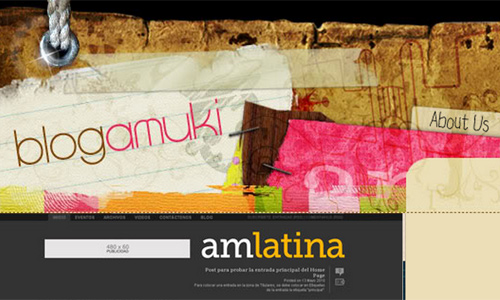
6. Multiple textures should go subtly with all the others.
When using a variety of textures, bear in mind that not all of them may go together. You may maintain a scheme of monochromatic color to enhance the effect instead.
7. Wisely choose the one that adds visual interest.
Echoing the textured background into the other pages becomes effective. It gives the eyes rest and swiflty goes about the other features of the site.
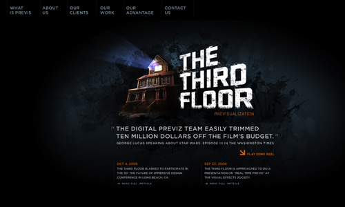
8. When content is minimal, heavy use of textures may work.
Be cautious when deciding to use textures heavily. It overwhelms the content when not wisely thought of but it works perfectly as long as the site’s content is minimal.
9. It doesn’t have to fill the whole design.
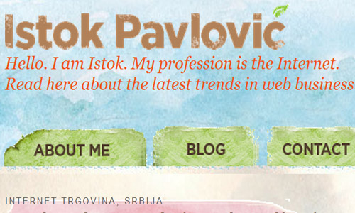
It doesn’t really have to fill everything in the site. Textures may just be used in headers and sidebars. This adds impact too even wheen the rest of the background is just white.
10. Try combining subtle patterns with subtle textures.
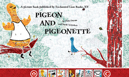
Would you want your desing to look elegant and make its appeal stand out? You may combine subtle textures with subtle patterns where it creates a unique and refined after effect.
11. Consider the difference it will make for the site.
When the Web Design is required to look simple, it may look so boring so as the designer, make sure that it won’t be classified as site that’s very minimalist. You don’t just choose it with a click but with passion as well.
12. Make sure the appeal is convincing.
Deciding on the final output with all its final touches may it be designed minimally but with highlighted textures or may they have been heavily texturized, make sure that it takes your viewers to how you have made them expect with your style. It should rock with all the other pages when it already rocked the homepage.
Overall, whatever texture perfectly fits your web design, the end result must be fulfilling. Its initial reaction fascinating and ends convincing. Whoever the audience may be, it is always important to please them with the first glance and satisfy them till the last. The secret here is how swiftly and wisely you get to finally think of the “Image” of your site so you would be able to determine which perfect textures to use and who would be your site visitors…










Thanks for another great tips, this is exactly what i need ..
i found your article very relevant and helpful, thanks
Invaluable article well organized .. keep it up guys!
Currently making my new project and this give me lot of pointers to remember.
Nice resources! have a great time reading this article it really inspired me to start freelancing.
Great job!
Thanks for the tips, very helpful
hi, great examples. textures truely give some detail and thats makes the work interesting
I like to use different textures combined with patterns and brushes in my designs so this article is perfect for me 🙂 thanks