When you were a kid, you were taught different shapes and various examples of each shape. You really know how circle was associated with the sun, a balloon, a smiley and others. Now that you have grown up, you make use of circles in different manners as you saw various usage of it. As a graphic designer and web designer, your use of circles even levelled up. You now use it to make great designs not just for your own use but for your clients.
Well, circles are just one of the many shapes that can be applied to a web design. As you look at the showcase of sites that uses circles, you will certainly be amazed on how well it is done. If you haven’t tried using it in your design, we will give you some web design ideas and tips in using circles. Take a look and encircle those that you find useful.
1. Use multi-layered circles.
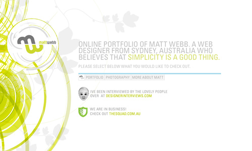
Image:Matt Webb
Artistically combine different circles in various layers and you will get a stunning output. Along with this, you can use different colors to make it look more dynamic or you can opt to use only a single color for a monochromatic touch. There are various ways of using layers for your circle, if you use this technique, you can use as many layers as you want or lesser layers if you want it to look simpler. Place it as a background or in your headers or in other parts of the site.
2. Use semi-transparent circles.

Image:Pngised
Many web designs use semi-transparent circles in their design. They either use colorful circles or some color choices only. Most of the time, it is used as a background. But there are also instances that it is used to highlight relevant parts of the website. This is an effective manner of drawing attention from the visitors.
3. Use large circles.
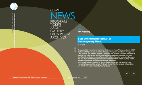
Image:Warszawska-Jesien
Extra large circles can also make your website look unique and appealing. It can be placed as a background of your site. It may use a color that could be an accent to your primary color or it can also bear your primary color. Some make use of large circles to illustrate something or to deliver a particular message. Circles are also effective for information and communication.
4. Use circles for navigation buttons.
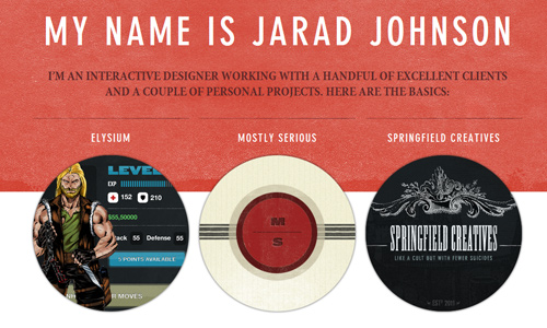
Image:Jarad Johnson
Your navigation buttons will look unique if you have it done in circles. Although, circles occupy more space, it can still be effective for navigation because it is clear and can easily be seen. You surely won’t have a hard time leading your visitors in your website.
5. Use circles for headers.
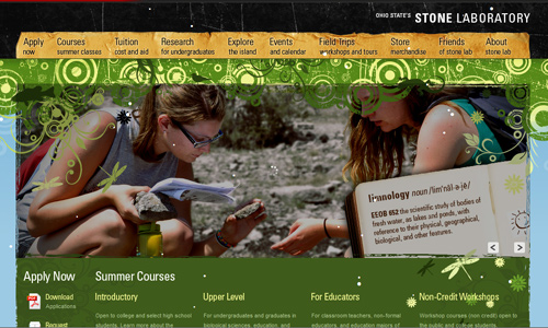
Image:Stone Laboratory
Headers can look inviting if you use decorative circles in it. Simple circles can also do the job well. Depending on the website you have, you can make your circle suitable to its concept and design style. There are different ways to manipulate a circle that can titivate your header.
6. Use multi-colored circles.
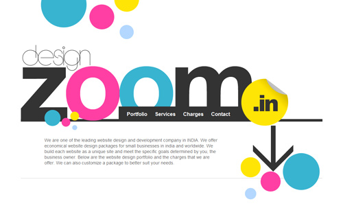
A rainbow looks attractive. Same is true with using various colors for your circles. It can also look attractive. When used as a background, it draws the reader’s eyes towards the contents of the page. The page even looks more interesting if you use multi-colored circles.
7. Use circles subtly.
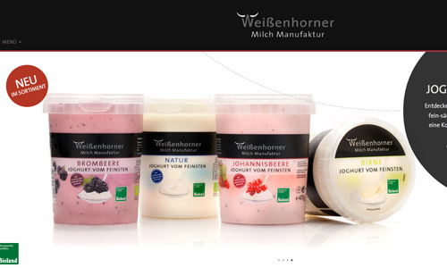
Image:Weissenhorner
Circles can also look good when subtly applied to your site. Some even choose to use it on one area of the site only. Some use it for their logo or for their site name. But no matter how simply it is used, it can still attract the attention of those looking at the site because of the shape it used.
8. Use many circles on the background.
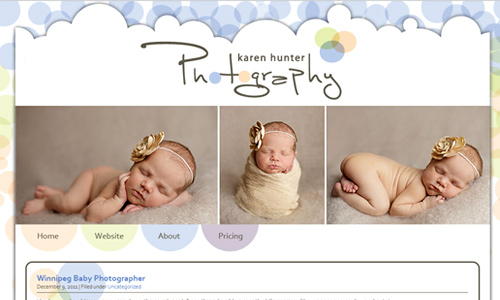
Image:Karen Hunter Blog
Use so many circles for the background of your website. It can look more appealing if you make it semi-transparent. You can also use various colors if it suits with the concept of the site. In whatever manner, you website will surely look great upon using many circles at the background. It can even emphasize the important contents of the website.
9. Use circles for galleries.
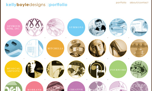
Image:Kelly Boyle Designs
For a photographer’s website, instead of a grid style using mere squares or rectangles, you can use circles. Circles are great when used for galleries and categories of a site. It doesn’t need to be a photographer’s site all the time. It can be anyone’s site that can make use of this style.
10. Use creative circles.
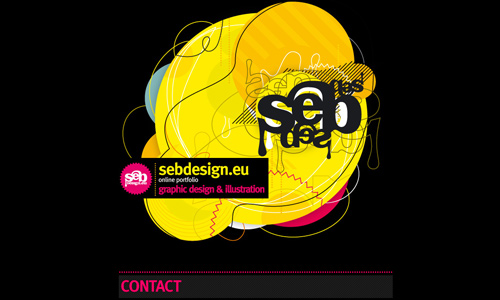
Image:Seb Design
Circles can be fancy and decorative. There are so many ways in adding a unique twist to your circle. Be creative in manipulating it so that it can add beauty to the site. You may add swirls, layers, textures, half-tones and others in order to make the circle beautiful. Some do away with the mere smooth-lined circle and choose to use the ones with an artistic touch.
11. Use retro circles.
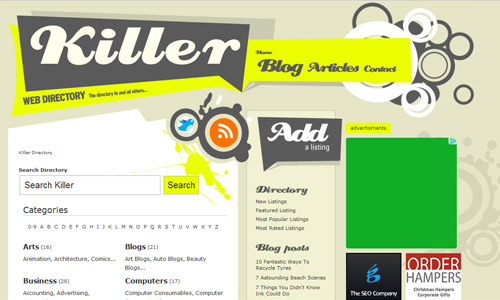
Image:Killer Directory
Retro circles are great to give your site a vintage and retro look. You can even play with colors when you use it. Add other elements to your retro circles to make it look more attractive. Use it for the background of the site or as an additional decorative element for some parts of your website.
12. Use circles and textures together.

Image:STO Solutions
Textures alone look good. When you combine it with creative circles, it looks even much better. This is mostly effective when used as background. But you can also experiment different placements of the circles together with a particular texture that goes along with it.
13. Use circles for labels.
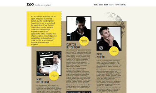
Image:Zoo Advertising
Circles can also be used effectively for labels. It can easily be seen and would best inform the visitors what you would like them to know. As a label, different colors could be applied to it but it will be more effective when a solid color is used.
14. Use circles for call to action.

Image:Benitos Hat
Every website uses a call to action. Using a circle for your call to action can make it eye-catching. Use a color that is also attractive and would tend to encourage the readers to do some action in your site.
15. Use circle as a pattern and with patterns.
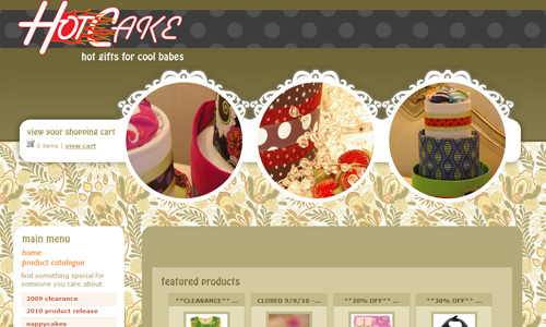
Image:Hot Cake
Combine circles with some patterns, too. It looks pretty when joined together. Just make sure to use the right kind of pattern for your design. You can even use circle as a pattern in your web design. It also looks great when used as a pattern.
It’s Your Turn Now
Circles are indeed vital in adding a different touch to a particular design. But it actually depends on how your creative mind will work. If you will be able to come up with a great design and then add some circular touch to it, then it will certainly be appealing. Have you used circles for your site? Would you like to share your work with us?


Thank you!
Thank you, nice to see some inspirational work with circles. A great help for future projects.
Great article just missed bokeh effect !
You are GREAT!!! Thank you for help me so many times!!!
helpful post thanks a lot
Circles! thank you for the post bro
Good job with circles.
Yes, i’ve asked a friend to use circles for my labels in a brochure 🙂
Use circles to illustrate direction and flow in your web design (Good combination with balance, if you can pull it off correctly)