Illustrations come in different styles and most of them would reflect the kind of personality the illustrator have. Each drawings and designs that we see would always have a distinct touch to it. This is because of the varied hand strokes of every individual and the different style of each one which will help us to easily associate an art to the artists. Giving personality to an artwork does not merely make the work unique but it also becomes an integral part of his branding which is actually even more powerful than logos and other aspects of a brand.
There are so many illustrators around the globe and we can surely easily pinpoint which work is done by this and that artist. Today, we will be featuring a freelance award winning illustrative designer who has a great deal of details, typography and colors in his works. He is Steve Simpson whose work ranges from packaging design, illustration, art for children’s books, posters, murals and others.
Steve is from Manchester, England and is currently based in Ireland. He has won numerous international awards for packaging design and illustration which includes the Gold, Silver and Bronze awards he got at the ICAD.ie awards 2013 just recently. When you get to his page, you will see a long list of awards which manifests that he really excelled as an illustrative designer. Now let us take a look at some of his works below.
Carlow Festival
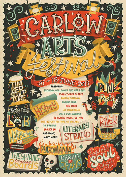
A festival programme cover and poster that was designed for the annual arts festival in the Irish town of Carlow.
Picante SpongeBob
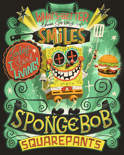
Steve was invited to contribute an artwork for the “Nautical Nonsense”, a tribute show by Nickelodeon for SpongeBob SquarePants.
American Gothic High
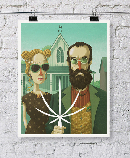
The 420 Times magazine wanted Steve to create an illustration for a cover and fold-out poster based on a classical painting by Grant Wood called American Gothic. The 19th century mid-west purists was to be transformed as 21st century hemp farmers.
Cows are Really Meaty
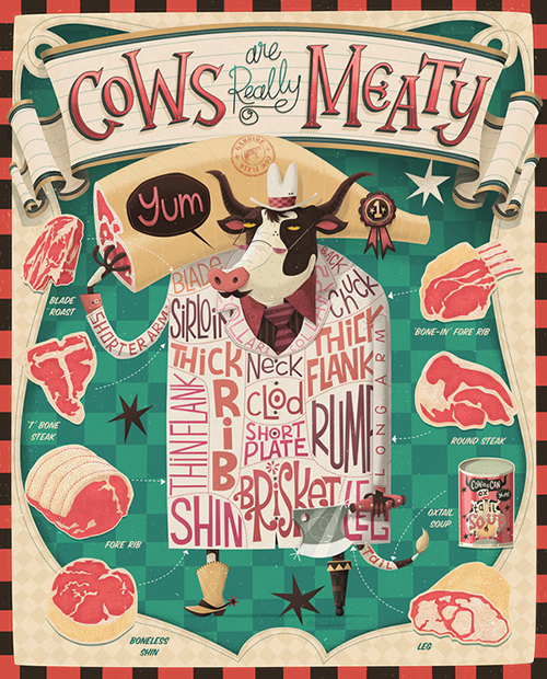
An artwork that is part of an exhibition of Contemporary Illustrators that dwells on the subject of “Extinction”.
Becoming a Successful Illustrator
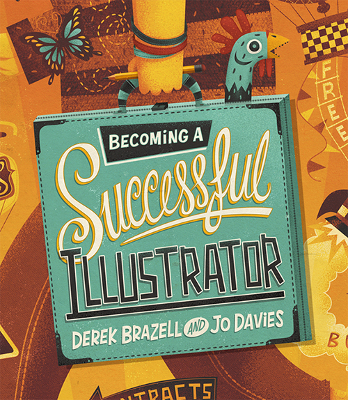
This one is done for a book jacket. Everything you see here except for the logo were hand-drawn.
Wired Magazine – Rap Genius
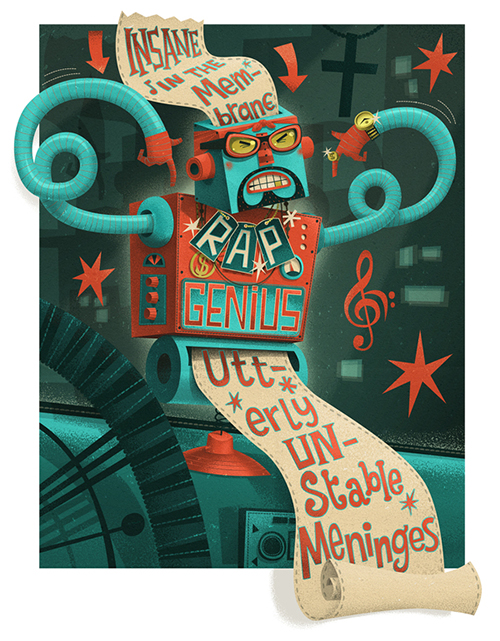
Done for an editorial illustration of Wired Magazine about the online guide to the meaning of rap lyrics, Rap Genius.
Ob-La-Di Ob-La-Da
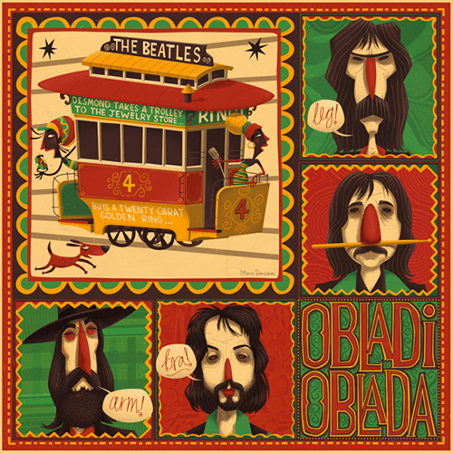
Steve was part of the Illustrated Beatles show. He was given the song Ob-La-Di Ob-La-Da to illustrate. By tracing back to the history of the song, he was able to create this piece.
Let Your Dreams Fly
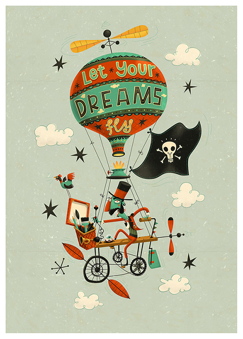
This design was inspired by vintage flying machine designs. You can also see this design as a t-shirt print.
Evil Genius – The Extraordinaires
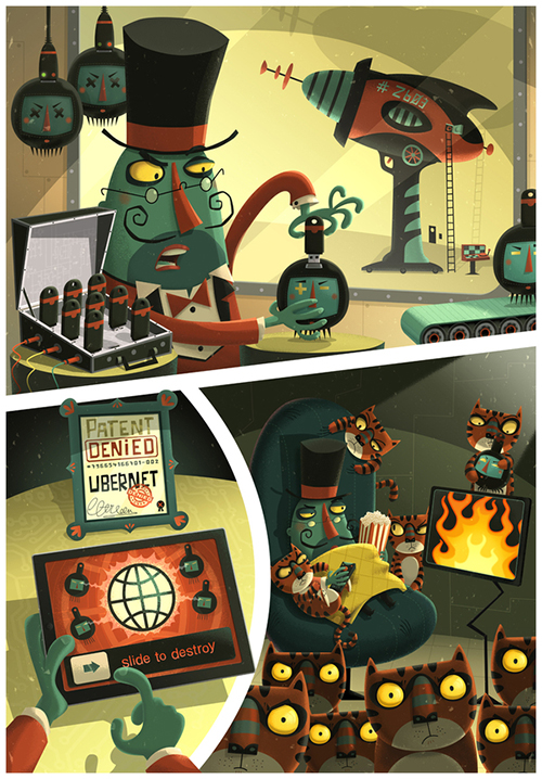
Illustrations created for a creative thinking game for problem solvers aged 8 to 108!
Smorgasboard – Game
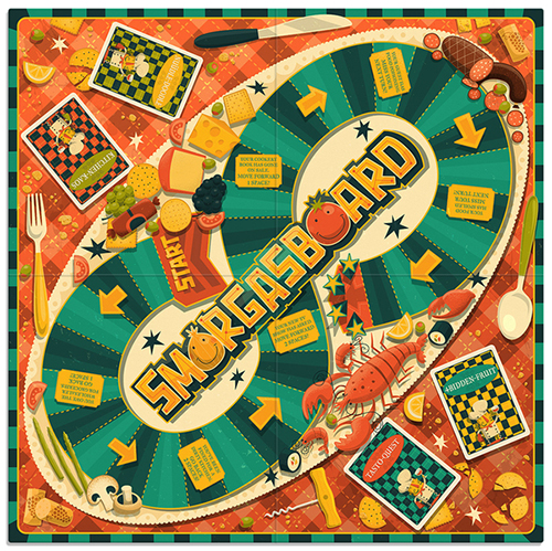
Steve is really versatile for he can even design for a board game like the Smorgasboard. This is a board game wherein players pretend to be aspiring chefs.
Menu Cover – Fade Street Social
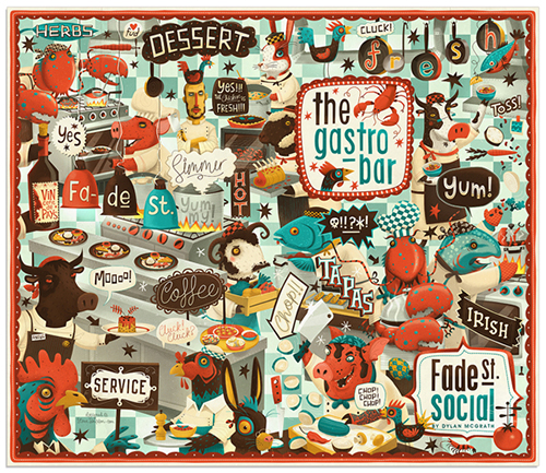
You would surely love to open a menu with this cover showing Irish food and characters with some touches of sense of humor.
7up Winter Wonderland
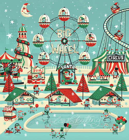
A design and illustration for 7up which received several recognitions. Colors used are associated with the holiday celebration.
Señora Lavery
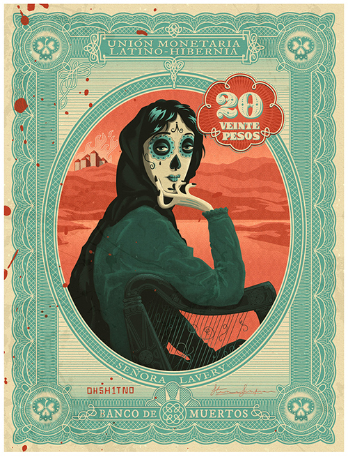
This illustration was inspired by some text Steve got from The Freeman’s Journal in May 29, 1922. It is an exhibition piece for PUNT NUA.
It’s All GEEK to Me
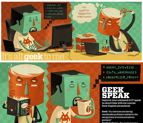
An editorial illustration showing us that a geek has a totally different language that some people cannot understand.
Skillnet Poster
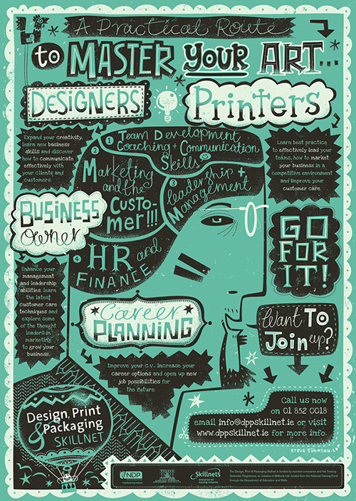
With hand-drawn type, this poster was skillfully done in two colors. This is for a direct mail poster of Skillnet Ireland.
Tuzo – Mexican Kitchen Illustrations
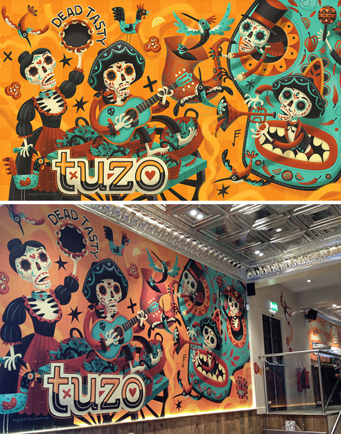
What you can see here is a wall mural to cover the main wall of this burrito bar. Aside from this mural, Steve also did their signage and pre-order menu.
Anatomical study
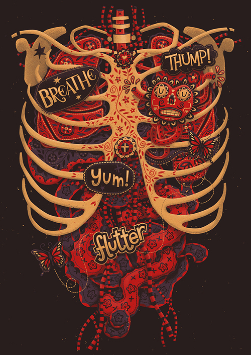
An anatomical design based on the Mexican “Day of the Dead” holiday.
Find the Artist
Steven makes use of vintage color schemes for his works. He considers his style as a result of mixed influences. You can observe that each artwork is jam-packed with details. If you get a chance to check his website, you will see some work in progress images where in you can find how Steven really started from sketching his works with pencil and paper before going digital. He would also make sure that his works will clearly depict the client’s brief while integrating his own style in it. So, which illustrative designs do you like most?


