With the thousands of websites, only a few can really be considered successful. Others might even wonder what makes them reach their goals. The secret could be good communication technique. Designing a website is not just about how it will look and what impact it can give to the audience. What is more important is how it can effectively communicate to its target audience. Without the right communication technique, you will fail to tell the users what you want them to know.
For this post, we will give you communication techniques for an effective website. These points can help you ensure that your website will be grasped by the users. At least, when you create a site that has good communication techniques, it will make all your hard work worthwhile. So, here they are:
1. Prioritize what to communicate.
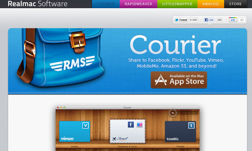
Determine what you really want to communicate. This way, you can prioritize the contents that you really want to give attention to and really want your readers to know. Like if you are selling some products, your priority would be to show the clients your products so that they can purchase it. So, show these products on your page with their specifications and prices. This will make it easier for the readers to shop.
2. Prioritize contents over design.
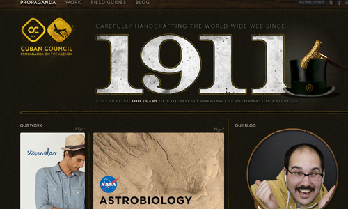
Image: Cuban Council
When designing your website, bear in mind that your contents are more important than your design. You will not be able to communicate effectively if you will allow your design to eat up the contents. It will only make your site beautiful yet empty. No one would be willing to visit a site like that because they are after the information and not the aesthetics. Although, design is also important but you have to give more value to contents and usability.
3. Prioritize your target audience.
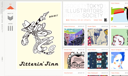
Image: Tokyo Illustrators Society
You might think that those who will navigate the site are not just your target group of people but there would also be others. Yes, that is true but you really have to make sure that your contents and your site design will be relevant to your target audience. If not, you might lose all the readers. Design your site in a manner that other people can also relate to it but you have to think of those who are within your target first.
4. Simplify.
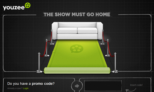
It would be easier to communicate something if there are no extras and distractions. Also, if you are planning to communicate so many things, be sure that you will be able to lay them well. Simplify them into categories so that your readers will find it easy to digest all the information. Reducing information will assure you that the readers will get what you want them to know.
5. Have a clear message to keep reader’s attention.
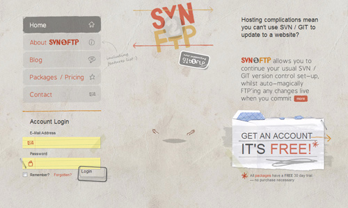
Image: SVN 2 FTP
Do not give your readers a headache. Communicate with clarity by having a clear purpose and by prioritizing what to communicate. This way, you can keep your readers and you can even engage them in reading your posts. A clear message applies to both your image and text. Make sure that they are not misleading.
6. Only use those with impact.
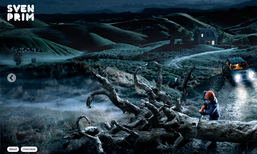
Image: Sven Prim
When you are in a catch 22 situation, wondering which image or text would be best to use, check which one has better impact. Do away with anything that serves a duplicate purpose as the other one. This way, you can avoid clutter in your design by having stuff that are no longer necessary.
7. Make sure that readers notice it.
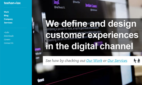
Image: Teehan Lax
No matter how important your message is, it would still be useless if you do not look for ways for it to be noticed. You can do this by using large colored texts. You can also use an audio, a video, pop-ups, slideshows and others. This way, your readers will surely get the message and won’t overlook it.
8. Make it short and complete.
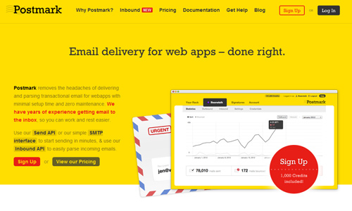
Image: Postmark
Online readers won’t be spending a lot of time reading your posts. So, to make sure that they will read it and they will immediately get the message, make it brief but complete. Be sure to give the message directly and do not be running around the bush. But when you write more in-depth articles, that would be a different story. Hence, it would be okay to make it longer.
9. Have a professional look.
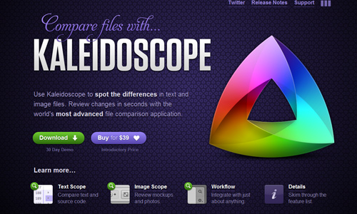
Image: Kaleidoscope App
This is a must in order to gain trust from the readers. A professional looking website is more convincing and would even be more encouraging for the visitors to read what is in the site. It can also persuade them to respond to your site’s call to action.
10. Have a unique personality.
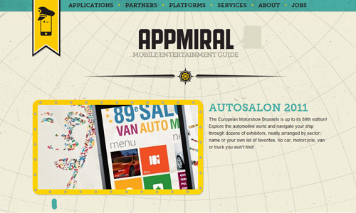
Image: Appmiral
Give your website its own personality by making it unique. Have a good branding in your website so that people can easily recognize you and connect you with that brand. Remember that a website is a representation of you and your company. What they see there is you. How you communicate online is how you are personally.
11. Website typography.
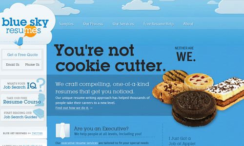
Image: Blue Sky Resumes
Your type would greatly affect on how a particular message can be effectively communicated. Choose a font style that is attractive but do not use a font that is too fancy making it impossible for one to read it. You can also use bold text and large text. This can give a different impact to your text making it noticeable.
12. Avoid having too much content in a page.
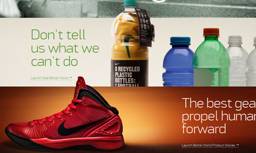
Having much quality information is good but if you place all of them in a page, then you will confuse your readers. You will not be able to make communication effective. You can actually show many contents but make sure to do it in a manner that it will be presented one by one. Websites that have lesser contents can actually easier achieve their goals in getting their clients.
It’s Your Turn Now
When you created your website, what were your communication techniques? Was it effective in making your site effective and successful? Tell us your communication techniques so that other people can also apply it in their own websites.


I have to strongly agree with “Prioritize contents over design.” It’s actually hard to compete with well-conceptualized sites. But the competition has to begin at what’s in the site…
I actually have a blogsite. I made it to a point to follow your 7th tip… so far, it’s been doing well..
Great insights! I’ll have to review this and my site too..
I’d have to make it to number 4… thanks for these great ideas!
I had to make sure that the colors i chose for the design was good enough to catch the attention of the readers. was that good enough?