Having an online portfolio can certainly help one to promote his own skills and business. Photographers can greatly benefit from having an online portfolio for this can help them showcase their works to a vast number of clients from around the globe. Some can even sell their photos to those interested people.
People would always want to capture important events of their lives. That is why many would like to have their pictures taken for it is the best way to keep memories of momentous events. There are also some who just want to see beautiful images of people, landscape and others. Photography is a form of art that captures the beauty of things. For photographers, it is very important to have a good online portfolio in order to show the people their expertise in storing memories and art through the click of their cameras. Today, we will give you tips on how to design an effective online portfolio for photographers.
1. Start with a great impact.

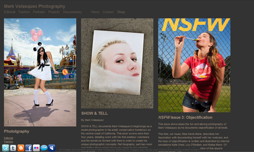
Image: Mark Velasquez
First impressions last. Hence, it is important that you will impress your readers the first time they get into your online photography portfolio. You can do that effectively by using your best photos in the first pages of your portfolio. If you will have a slideshow of images, choose those that are your best work. Be sure also that it doesn’t change too fast. Have a good tempo of 4-5 seconds.
2. Easy navigation.

Image: Gavin Gough
No matter how stunning your portfolio will look like, it will still be useless if you will not have an easy navigation for the users. Place the navigation bars in areas that are clear to the visitors so that they will find it easy to browse your images. Of course, your navigation bar should be located above the fold so that the users would not need to scroll down in order to find it.
3. Use different galleries.

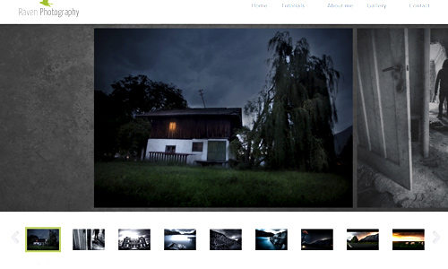
Image: Raven Photography
This way, it would be easier for the visitors to view your portfolio. You can group your images according to themes like fashion, landscapes, weddings, portraits and others. If your portfolio is well categorized, it would be easier to browse them and to view your work depending on what the visitor wants to see.
4. Use lesser text.

Since your aim is to showcase your work, use lesser text. Let your works tell the visitors who you are as a photographer. But you can have a page where you can tell the visitors who you really are through a ‘Bio’ or an ‘About’ page. Aside from that, you can also have a page where you can place testimonials from clients.
5. Keep it short and concise.

Image: Paolo Boccardi
Of course, you have so many photos to upload in your portfolio. But you really do not need to include all of them. For every gallery, you can have 15-20 pictures. Choose your best works only. If the visitor wants to see more of your works, he will ask for it. But the number of photos in your portfolio could already be enough to tell them how efficient you are as a photographer.
6. Keep it fresh.

Image: Jill Greenberg
Always update your portfolio. Showcase new and fresh works. You might also want to update some elements in the portfolio. This is good because visitors will know that you are still active in the field. They will also be glad to see some new outputs from you.
7. Use apt colors.

Image: Dimitris Theocharis
It is important that your website background could give emphasis to your photos. Let it complement with your images. Do not allow your website color to distract your showcase of pictures. Do not use too flashy colors. You should also be consistent with your chosen color. For black and white photography, you can use a monochromatic color scheme.
8. Showcase picture with high quality.

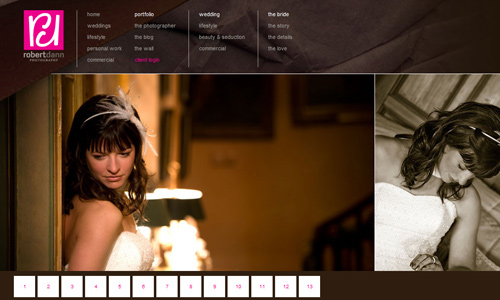
Image: Robert Dann Photography
As mentioned, you should only showcase works that are the best. Make sure that everything in your portfolio can give a good impact to the visitors. It should be of high quality. You would not want to give an impression to your prospect clients that you are not really a great photographer. Of course, everything should be of the best quality to let them know you could be the best photographer for them.
9. Place second bests in the middle.

Image: Andrew Hobbs
There could also be some images which you consider as good and of high quality but not really the best. You can still include this but insert it in the middle of our gallery. This way, even if the impact decreases in the middle, it can still go back up on the next images. They can start and end with images that will surely impress them.
10. End with a great impact.

Image: Albert Ooviedo
In a photography portfolio, you have to start and end strong. With your last photo, make sure that you will let your visitors know that you are an excellent photographer. Your last image could be retained in the memory of the visitors. So, make it a goal to leave a mark the minds of your visitors. This way, your portfolio will be certainly effective.
It’s Your Turn Now
A photographer’s website is always stunning and attractive. One look at it and one will surely be encouraged to browse on the photos contained in the portfolio. Of course, photographers always see to it that the quality of their images will not be sacrificed in their online portfolios. So, if you are planning to have one, make sure that you will take note of the guide that we have given above. It could also serve as a guide for web designers who are creating websites for photographers. But if you think that we skipped something, feel free to add it in our comment section below.


lovely portfolios with photography presentations which i really like.
Another impressive post!
. As always, very nice post you have
Applause for this blog
Thanks for sharing this Kareen
Impressive!
It’s hard to achieve such an awesome portfolio, good enough you posted this for our guide! 🙂
Number 10 seems so hard to reach but i’ll try. thank you kareen
I’m sure you can do that! End with a bang to leave a mark on the visitor’s mind. Thanks for reading Thomas.
Awesome!
Lovely…
We are happy to know that you benefited from the design tips we have for you. Thanks for dropping by!
All are very good tips, but I think #5 sticks out the most for me. One of the hardest thing for a photographer is keeping it concise and high quality. Visitors would always rather look at several really stunning photos rather than many average photos.