Websites have their own calls to action which are manifested by a button which urges you to perform an action and brings you to a different page after clicking. It could ask you to purchase an item, to subscribe to a newsletter, to give information, to download something and many others. No doubt, having a call to action is an important part of any website for it provides focus from the users and it directs the users, too. It is also a tool to measure your effectiveness and success as a website.
Hence, it would really be necessary to make your calls to action effective. If not, you will fail to achieve your purpose. For designers, here are some tips for you in making an effective call to action. Try to take note of these points for it will not only help you create effective calls to action but it will also help you have a more successful site.
1. Determine why you need a call to action.

Image:Get Concentrating
The first thing that you need to do is to determine why you would need a call to action. You need to know what you want your clients to do and what they would get if they do that. Identify what you need and what you can offer.
2. Determine where the process goes.
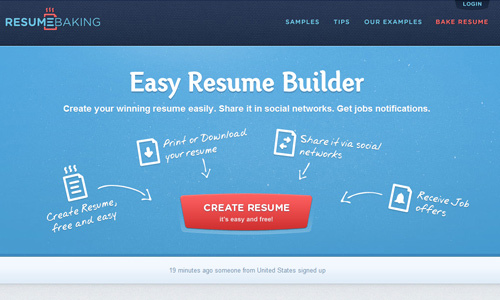
Image:Resume Baking
When you have a call to action, make sure that you know the process. Be sure that you have thought well on how everything will happen. Think where the visitors will be led when they click on the call to action. Your process should be good so that your visitors will cooperate well.
3. Tell users what to expect.
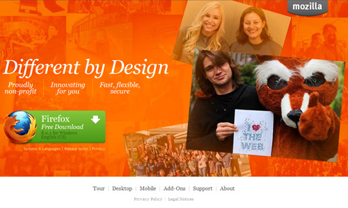
Image:Mozilla
In your call to action or in your page, state what the visitors will expect when they click on your call to action. This is important so that they will know what this is for. People always want to know the results of an action first before doing it.
4. Show them that it is easy.
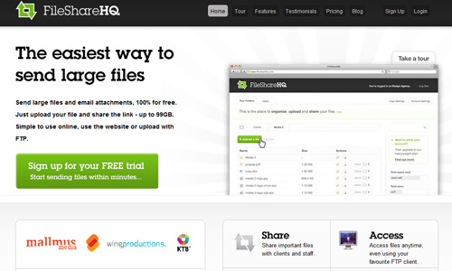
Tell your visitors that it won’t be difficult for them to avail of a service through your call to action. Let them know that it would be easy for them to get an offer. People always want to do things the easy way.
5. Make it sound urgent.
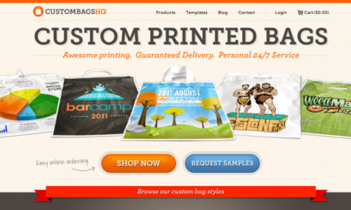
Image:Custom Bags HQ
Have a sense of urgency. Doing so will make it look that they really need to do something right now. Make it sound that if they won’t do something today, they won’t get a chance to do it tomorrow.
6. Use active language.
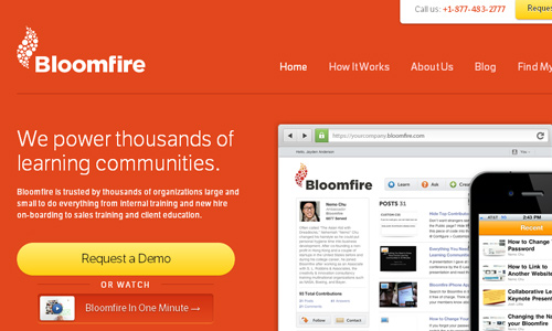
Image:Bloom Fire
By using language, you are in the “now” position. It means that the users should take an action that very moment they are seeing your site. Using the present tense gives them the feeling that something should be done at once.
7. Show them that it is safe.
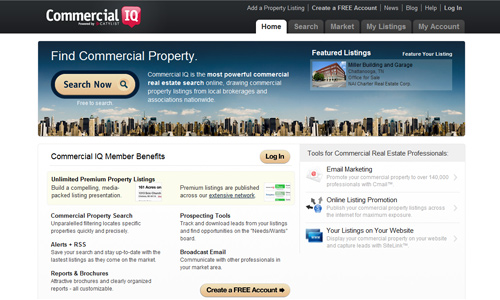
Some people are afraid to click on anything in the internet because they think that they’ll be asked to pay or their private information will be shared to others. So, make it a point to show them that doing some action won’t harm them.
8. Use the right size.
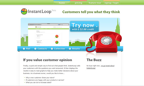
Image:Instant Loop
Of course, size would matter for bigger calls to action will attract the attention of the visitors at once. But you have to see to it that you will be using the right size. The size of your call to action depends on its importance. The larger it is, the more significant it is for the site. There could still be other calls to action in your site but are less important.
9. Consider proper positioning.

The position of your call to action is critical to draw the eyes of the visitors towards it. You can place it in a distinguished area to make it stand out in the layout. You may also place it on the top of the page that will make the users notice it at once and even remember it when they leave the site. Or try placing it in the middle to attract attention and encourage an action.
10. Sweeten the deal.

Image:Get Dashboard
Offer some extra stuff to your visitors. It can encourage them to take some action if they find out that they could get free things. People love anything that is free. So, offer some incentives to entice the users to respond to your call to action.
11. Have less distinct actions.
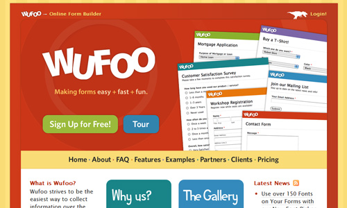
Image:Wufoo
Some sites use one or more calls to action but do not use too many of them that you will create confusion to your users. This will also overwhelm them which will result into negative response. The more calls to action you have, the lesser is the chances for visitors to do something in your site. Reduce the amount of mental effort by focusing to one or two calls to action.
12. Place it on all pages of the site.
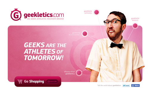
Image:Geekletics
Since your call to action aims to lead the visitors towards another page, you have to make sure that they will not end up in a dead end. Place it on inner pages of the site with smaller sizes and different text. Think of a way that their stay in your site will be worthwhile.
13. Use white space to distinguish call to action.
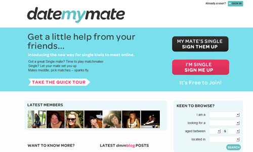
Using white space near your area for the call to action will ensure you that it will be read and noticed by the users. If you place it in a cluttered area, it will not be noticed and would be useless.
14. Use contrasting colors.
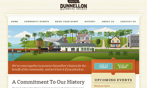
Image:Dunnellon Depot
To be sure that it will be given attention, use a highly contrasting color for your call to action button. It needs to have a high contrast relative to the surrounding element and background in order to draw attention.
15. Use alternative colors.
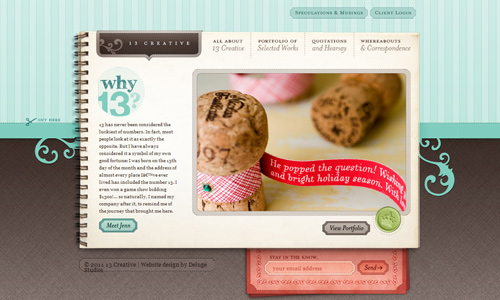
Image:13creative
If your webpage uses light color of blue, make your call to action darker like red or orange. This way, it can be noticed by the users. Do not use colors that can blend with the entire design. Let it stand out.
It’s Your Turn Now
An effective call to action greatly contributes to the success of your website. It is always necessary that your calls to action can get the attention of the users and the visitors for that is the primary step to urge them into cooperating and doing something for the site. Of course, you will greatly benefit if you have an effective call to action but be certain that it can also give benefits to your visitors. Can you share to us how you made your calls to action? What where the things you considered in creating it?


Perfect post! ;-D
I definitely and absolutely agree!
It’s funny how others would love to complicate their sites when there’s an easier way around…
I’ve come across the site Wufoo in the past… good you made them an example. Will be sharing this with friends. 🙂
Number 9 is a hit! It gives a headache really when tabs or options seem to be all over!
How nice !
AMAZING !!
Perfect post !