Whenever you try to get a job, you will always prepare a resume. Of course, everyone wants to get the job they want. Making the right resume is one key to get your desired post. A graphic design resume is a bit more challenging for you have to show your prowess in lay-outing and designing through your resume. Along with it, you also have to make sure you have written the right contents.
In this article, we will share to you some things that you need to consider in writing a graphic design resume.
1. The Paper Quality.
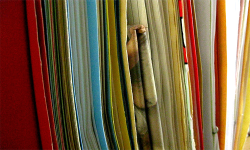
Image: EvelynGiggles
Sometimes, you would overlook the type of paper you are using for your resume. Of course, you would focus more on the design and contents of your resume but do not forget the type of paper you will use. Some employers are actually particular with your paper choices. Grab a good paper and it will give you more points to get the job.
2. The Layout.
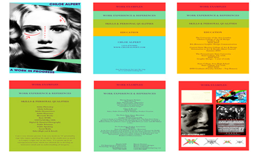
Image: thatunknownartist
Since you are a graphic designer, make use of your lay-outing skills but do not make it look too crowded, complicated and over designed. Give it a graphic designer’s touch but do not over do it. Use plenty of white space so that it wouldn’t strain your prospect employer’s eye.
3. The Typography.
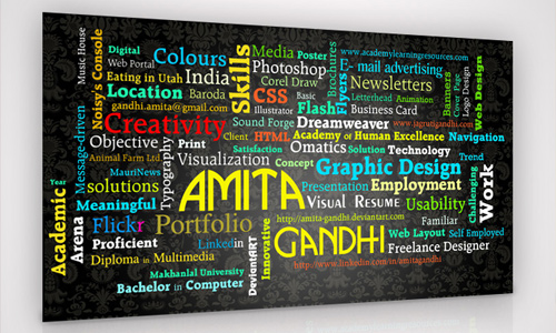
Image: Amita-Gandhi
The font and the font size are very important. Choose a good font. Be sure that you have chosen a font that is readable. Do not make it too small. Remember that the contents of your resume are very important for it is the key for you to get the job.
4. The Structure and Presentation.
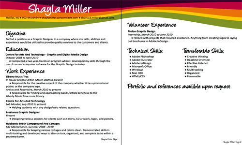
Image: Shayluh
Your resume should look good in one glance. It needs to be concise, clean and informative. It also needs to be easy to read with the right usage of grammar and spelling.
5. The Needed Contents.
a. Your Name and Contact Information.
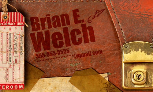
Image: rkaponm
Of course, this is important. This is placed in an area where it can easily be noticed-at the upper topmost part of the paper. It now depends on you on how you will make it look good and noticeable.
b.Your Personal Statement.
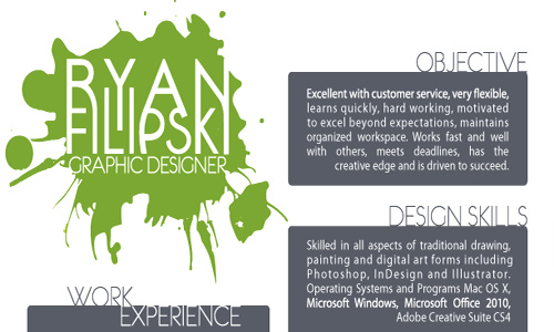
Image: ryan-gfx
A brief statement about your goals and your desired position. There will be a better impact if you will make a statement that is suited for the job. Avoid generic objectives; use a personal statement that will interest the employer.
c. Your Experience.
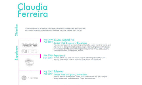
Image: miyucita
This is the part where you place your work experience which includes the job title, employment dates, brief job description and location.
d.Your Education.
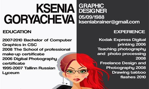
Image: Kseniabrainer
In this section, include your academic background like what degree you finished, the date of graduation, the college you attended, and the location of your college.
e.Your Capabilities.
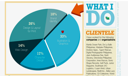
Image: pyrotensive
This doesn’t need to be too long but just state your special skills like good interpersonal skills, experience in managing projects, multitasking and others. This will help your employer to get to know you better.
f. Your Software Skills.
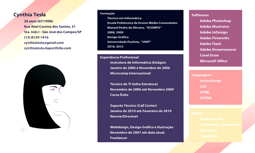
Image: Srtcynthia
Since you are applying for a graphic design job, this section is needed. List the software you use and other design related skills.
g. Your Awards and Recognition Received.
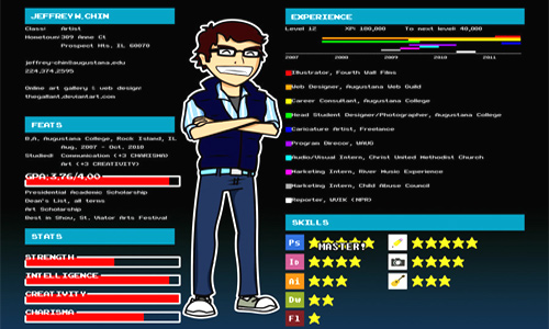
Image: TheGallant
Enumerate your awards and recognitions here. Also include publications or websites where you had been featured.
h. Your Affiliations.
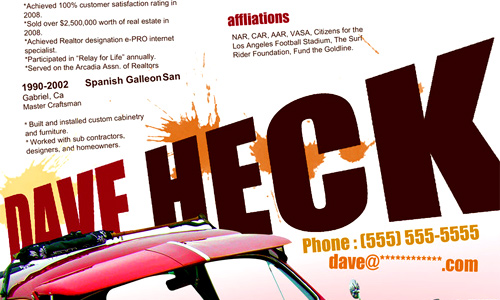
Image: rkaponm
Part of improving yourself as a designer is by joining different design organizations. So, write those organizations in this part.
i. Your References.
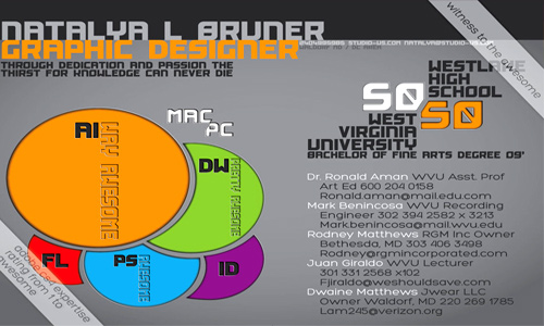
Image: PsychoPink
Some people wouldn’t include this but merely state that “References available upon request.” Just be ready with your references when they ask for it.
6. The Not Needed Contents.
a. Personal Information.

Image: Khaosxcaos
It is not necessary to include information like your age, religion, hobbies, family status and others. Remember that your employer is interested on your professional life and not your personal life. So, there is no need to mention those things.
b. A Generic Objective.
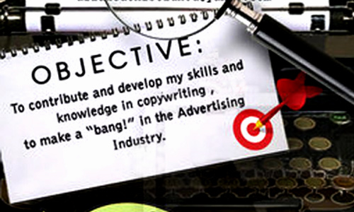
Image: arianedenise
Do not make a generic objective. Make a personal statement instead. The employer will not be impressed to read that what you have written is prepared for wherever company and whatever positions you will apply for.
c. Things Not Related To Design.
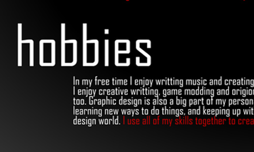
Image: ShawnBaybo
Make sure that what you will include in your resume will only focus on you being a graphic designer. Do not include other things which are not really necessary.
7. The Cover Letter.
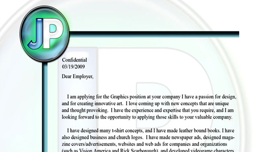
Image: Numbmonkey
Make a cover letter. Although, some employers do not require seeing this, there are still others who prefer to see resumes with cover letters. Make your cover letter look good too and be sure it is specially written for a certain company. Follow the right letter format and contents.
8. Have a Consistent Theme.
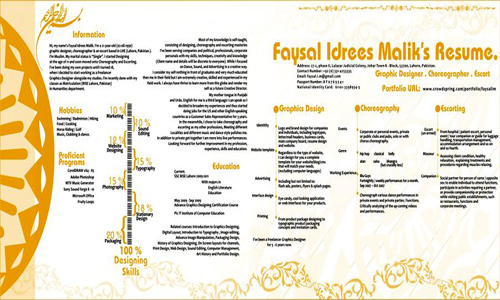
Image: Faysalim
Do not use a variation of concepts in your resume. That will look like a scrap book and not a resume at all! So use a consistent theme or concept from your cover letter to your resume.
9. Limit Number of Pages.
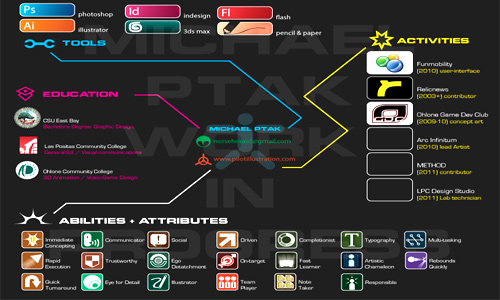
Image: Norsehound
It doesn’t have to be long. A one page resume is more effective for employers don’t have time to scan a bunch of papers when there are so many applicants. But you can use two pages if that is really necessary, especially if you had been in the field for a couple of years already.
10. Organize Entries Chronologically.
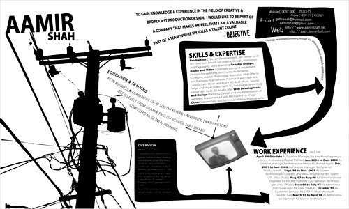
Image: aash
It is recommended to arrange every entry in chronological order from the most recent job or award you receive moving backward. This is the manner employers usually want.
To give you more ideas in making a graphic design resume, here are 30 Artistic and Creative Résumés , 36 Beautiful Resume Ideas That Work and 38 More Beautiful Resume Ideas That Work.These might give you inspiration when you work on your own resumes. And do not forget the important points while you are making one. Remember that this is your ticket to success.


Some great tips and some inspiring examples, great post kareen.
These tips are what I am looking for to share in my website. Thanks for sharing.
Great article, very detailed and useful, thanks..
I never thought that graphic design would make a resume better than an ordinary layout. Thanks for sharing this. 🙂 Kudos!
While some of these are good tips (Good paper is a must! Make sure you get something that’s got a nice, heavy weight that doesn’t bleed. Get your resume printed using a laser printer, NOT an inkjet; the inkjet will make your type fuzzy and it’s the kind of the thing that design firms look for.) Some of them are against industry practice, and some of the examples are… lacking, at best.
Objectives don’t belong on your resume. Objectives in GD resumes belong in your cover letter – which, for any professional level job, you /absolutely/ should include, even if it’s not requested. Call ahead, figure out who you should send your information packet to. The ‘packet’ can be just a cover letter and a resume, or extend so far as to a mini-portfolio piece. You have to sell yourself.
SPELL CHECK. Your cover letter example is riddled with typos, and it’s the sort of thing that would kill you right out the door. It’s also horrifically generic; every graphic designer loves doing conceptual work and being creative. That’s why we’re graphic designers. The example for ‘education’? Also riddled with typos, and is plain bad design with the inconsistant spacing, orphans, capitalization, etc.
What makes you stand out? What sets you apart? Maybe it /is/ your hobbies. Most design firms want to know that you’re a person, and what you like to do in your spare time. If you’re creative and build websites, say that. If you make posters because you love them, even if it’s not your job? Say that, too. Creative writing. Doesn’t matter. There’s a difference between I sculpt concept cars in my garage out of Bondo and I like cats. Be interesting, and it’ll also give you something to talk about in your interview.
Don’t list things you did in High School. Don’t list that you were a waiter, unless you ended up designing signage for the restaurant. Don’t give up your references unless they’re asked for; it’s considered unprofessional, and wastes valuable space because you really do want to stay to one page.
Less is more. Giant background graphics take the focus away from the actual text. You want people to look at the text, not the background. You want them to look at the words, not that you have a texture behind all the text.
In short, make it clean, simple, easy-to-read with a clear visual hierarchy. Don’t ignore hyphens, widows, and orphans. (All bad!) Leave off your birthdate.
Make your resume look like #s 5c, 5e, 5h (watching the orphans), and MAYBE 10. Know what you’re looking for in a job. Sell yourself. Be PROFESSIONAL. Be interesting. Use everything you’ve learned, and you’ll be fine.
Resume cv all that is past-only worth it when u want to be a somebodies “working monkey”- make the logo bigger 🙂 haha -this post is manual how to be exactly same as the one before and one after you-mediocre
If you’re going to include a personal statement, make the heading “Personal Statement”, not “Objective”. “Excellent with customer service” is a description of yourself, not an objective. Your example is misleading.
(Though I would say that that kind of statement belongs in the cover letter anyway. A resume is supposed to be a list of your skills and experiences. Put the paragraph about why you’re awesome in the cover letter where it belongs.)
This is such a creative angle to designing a resume. Obviously, for a graphic designer, its appropriate. But, I wonder how it would hold up in another job environment. Maybe applying as a marketing person? Thoughts?
Great ideas for how to make a graphic design resume. But most places will ask you for a text resume so you better know how to use Word also.
My piece of work:
http://www.behance.net/gallery/Infographic-Resume/3074793
Graphic resume will be impressive when it is used properly 🙂 This tip of yours is very good!
Very good suggestion it is good for working and beneficial for design
the tips are good but some of the resumes you chose as samples are not pleasing to the eye…
Amazingly inspiring! Thanks for sharing.