Using a logo is a must for every business -may it be online or offline. This is one way of giving yourself a brand and setting you apart from the thousands of online businesses on your genre. The relevance of using a logo had been proven for most people could easily recognize if something is from your company by merely looking at your logo. Of course, you need to make a logo that perfectly tells the costumers who you are and hat services you offer.
It is actually a great challenge to every logo designer as to how they will make the design truly effective. Online, there are various websites and design communities who specialize on logo design. Most companies and individuals avail of their service because these people are experienced in the field and could easily understand the client’s preferences. Hence, the transaction becomes easier.
But it has been a question of many if what type of logo design is more effective. The simple ones or the more complicated ones? Everyone has their own opinion to that. There are people who would say that simple logo design are easily remembered while others say that complicated designs actually look more professional and are unique. Well, let us try to weigh things and look into the advantages and disadvantages of a complex and simple logo design.
Simple Logo Designs
Simplicity is beauty- the adage says. That is also the belief of some designers which makes them opt for simpler logo designs. The use of simple colors and shapes makes it easier to perceive by the viewer of such logo. It is easier on the eyes and will be easier to remember. One glance at it would make one easily recognize it. The next time he sees it, he will know it is yours.
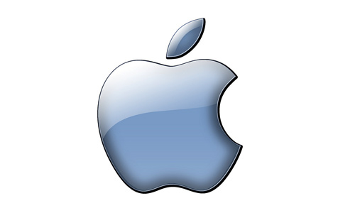
Some say that simple logos are hard to market for one cannot easily determine the meaning of it. But actually, it always depend on how good your marketing strategies are. Take a look at the Apple logo. Isn’t it simple? But one look at it, you will immediately know that a laptop, an iphone or an ipad is made by Apple because it bears that famous logo.
Apple
Let us try to look at other logos. Take for example the Dell, HP, Mistubishi, and Nike. These are some of the companies that we know well. And their simple logos worked well for them. Your design doesn’t really need to be complex in order for it to look professional and trustworthy.
Dell
HP
Mitsubishi

Nike
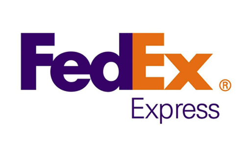
Some simple logos actually have complex meanings. These are done by really great logo designers for they are able to integrate a hidden message no matter how simple the design is. Now take a look at Fedex’s logo. It uses simple typography and two colors only but as you look more at it, you can see a hidden message. In between the letters e and x is an arrow which symbolizes the company’s aim for progress.
Fedex
Another thing, simple designs are easier to reproduce especially when you have it printed on T-shirts, mugs, cups or anything. The details would be clearer and it could save you from printing cost because it uses fewer colors.
Complex Logo Design
The more the colors and the shapes used, the more applauded the design is. This is what other designers think. Some make complex logos to impress their clients. Some just would like to place everything that they think will best represent the company.
But having a fanciful logo could cluster the mind of the audience. The message will no longer be clear and would eventually be lost for it will drown into the variety of colors and styles being used. Also, you need to have a better marketing for this since the message isn’t really clear. There are really logos that have lots of stuff inside it and every little thing has its own meaning. The audience could even ask what those things are for and might be confused due to lots of explanations needed before they could get the message. But actually, the audience wouldn’t be asking you. They’ll just look at it and might even forget it.
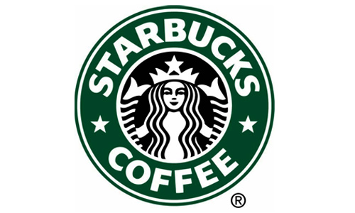
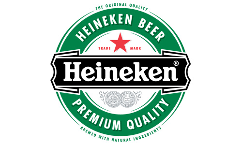
Look at the logo of Starbucks and Heineken. They are using complex logo designs but still remained famous. Many would wonder why a well known coffee house has that kind of logo. The Starbucks logo which features a mermaid with two tails at the center is a symbolism of the irresistible and seductive taste of the coffee. It has an interesting history and had been improved thrice.
Starbucks
Heineken
The use of many colors in making a logo is time consuming for you need to get the right color combinations. Using too many colors will also increase the printing costs if you will place it on other materials like T-shirts.
Making a complex logo is said to be a manner of expressing one’s creativity and to ensure uniqueness of the emblem. But in some instances, it fails to deliver the real purpose of the logo.
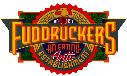
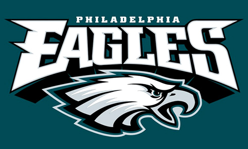
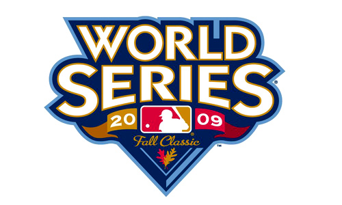
Here are other examples of complex logo design:
Pirate Bay
Fuddruckers
Philadelphia Eagles
World Series
Wrap Up
Well, whatever logo design you make, may it be simple or complex, what really matters is it distinctly identify your company or website and it has a visual impact that makes it easy to recognize and remember. Always take note of the main purpose of a logo. It is to let others know who you are, what you do, what you want to get and what you can offer them.
But whether you design a simple or complex logo, you should always make sure that it is resizable and every detail will be clear if it is used in whatever manner. It should look the same when used in a billboard and in a letter head. Also, it should look effective even without the colors. You need to try it in black and white, too.
The effectiveness of a logo actually depends on how the designer could integrate a message into it and how good the marketing strategy is. It wholly depends on the company and the designer. There should be a good agreement between the two in order to come up with the right logo design. Now that we have laid before you the advantages and disadvantages of a simple and complex logo design, it is now up to you which one you would prefer to use.
We would like to know you point of view on this. Which do you think is more effective -a simple logo design or a complex logo design?


Cool design all are unique..
Great article so creative could use some of these for my new project 😛
Thanks for sharing this awesome work!
It’s a great article, I like to design like this too.
Simple designs especially, knowing the costs of printing multi colours I think a one colour design can be just as effective.
Tony
My own opinion is that I think simple logos generally have a longer life span. More complicated ones, because they have more detail and embellishment, can be subject to changes of fashion and can date more quickly.
To me the logo should not be much simpler, and not too complicated. Primarily due to the fact that it has been truly unique in the minds of consumers. An example for me just the logo, which is not unique – the Honda logo on the cars. There was a company Hyundai with its logo and now the two are almost the same logo. Honda – H straight Hyundai – H canted. Many inexperienced users think Hyundai is actually a Honda. But this is completely another brand.
Now about the complex logos. Just in case there Heineken. So, for many (I will not give a reference to the research, lost it once), Heineken is the same as Carlsberg. In both there are green and red, both European brands… I had just hanging around to ensure that the logo should be simple, with small chips to a clear identification of its
Thanks for the article
ill’ go for the simple Logo. To me they are more effective, and the message seem more clear.
-I just made my new Portfolio Logo, its visible at behnance; http://bit.ly/qvJnLJ
Please let me have your opinion or appreciation!
interesting article! 🙂
any logos either simple or complex as long as it is unique and easily remembered, then serves their purpose.
btw, i like simple and minimal logos… thanks for sharing! 😛
Cool design
In my opinion truly great logo design should have layers whether the image is simple or complex. an ideal logo should be easy to describe but also be visually complex.
for example apple logo shown here is a good example of that. described simply as: its an apple with a bite out of it. but closer inspection shows that it has a lot of complex detail; highlight, gradient, multiple colors, and a drop shadow this adds to the visual complexity of a simple to describe logo.