Real estate industry is a competitive environment. In order to stay ahead, realtors need to know where the customers are and it’s a no-brainer that a lot of them are doing their searches online. With that said, a real estate website should be designed well to attract and accommodate the potential customers and cater to their needs as well.
A good website effectively shows off the listings and the agents selling the properties. It is also a great option to display positive testimonials from previous clients.
To get more ideas for your design, we have compiled great examples of real estate websites below. Whether you’re a real estate agent or a web designer, these websites can help you get insights and concepts on how your website would look like. Enjoy your browse.
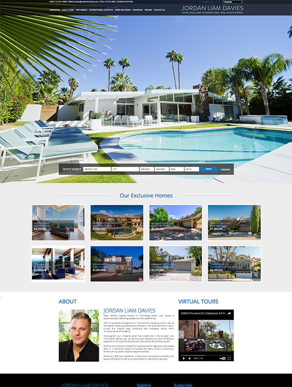
Jordan Liam Davies
Jordan Liam Davie’s website has a sleek and clean design with a full-screen slideshow of various properties followed by a gallery of listings. It also has a an ‘About’ section as well as an embedded video of a tour.
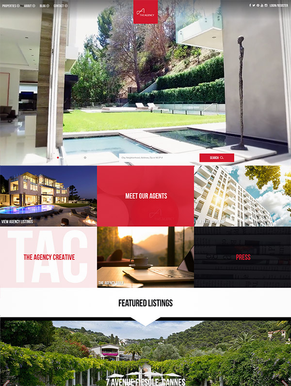
The Agency
Here is a real estate website with a modern web design and layout. It has a video background for its header and galleries for its featured listings and agents.
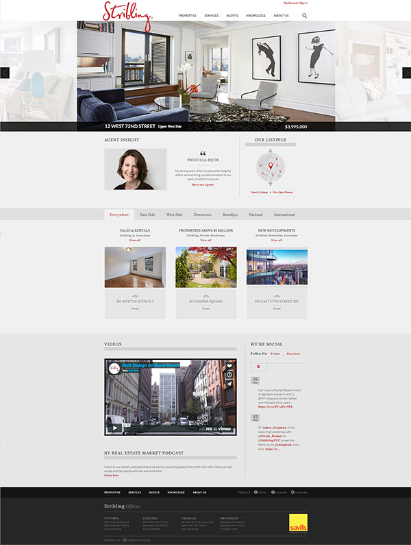
Stribling
This agency is based in New York City and its homepage has a clean design that is easy to the eyes. The website offers some industry insights in an educational video and shows live Twitter stream at the bottom of the page.
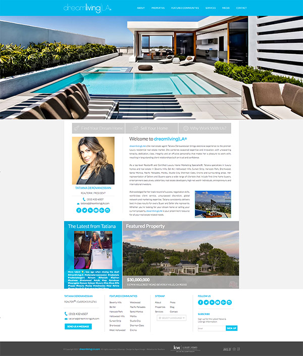
Dream Living LA
This site’s cerulean color scheme subtly exhibits the tranquility of the beaches in Los Angeles where this firm is based.
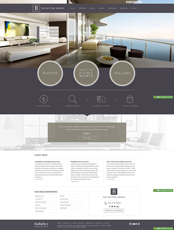
The Bitton Group
The Bitton Group’s grey and beige color scheme brings an elegant and luxurious ambiance to the site with matching white sections to balance it out.
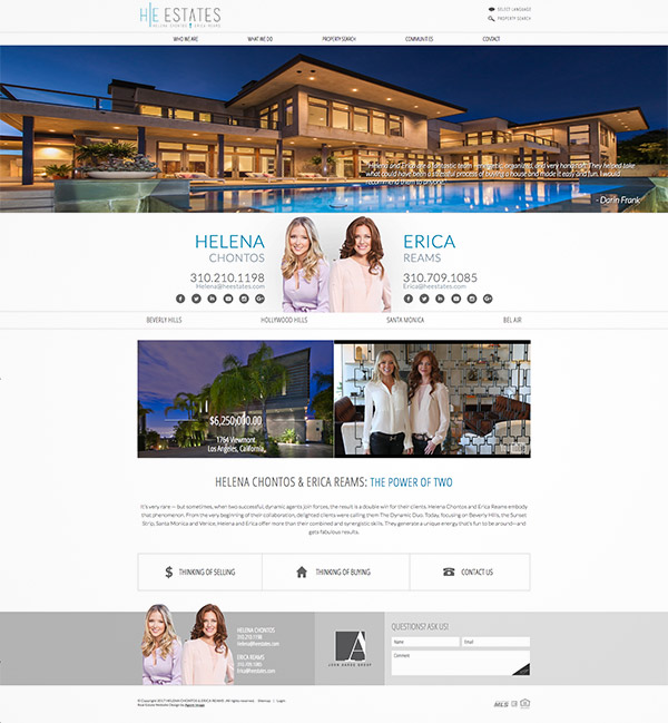
H|E Estates
H|E Estates has a clean and professional design that is inviting yet not overwhelming. It has a full-width slideshow that showcases beautiful interiors and exteriors of various estates with testimonials from previous clients.
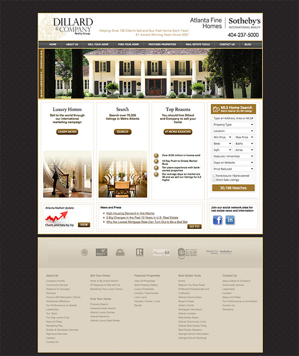
Dillard & Company
Dillard & Company has a vintage style website with a boxed layout and an elegant background pattern. It showcases a rustic ambiance with straightforward and user-friendly content.
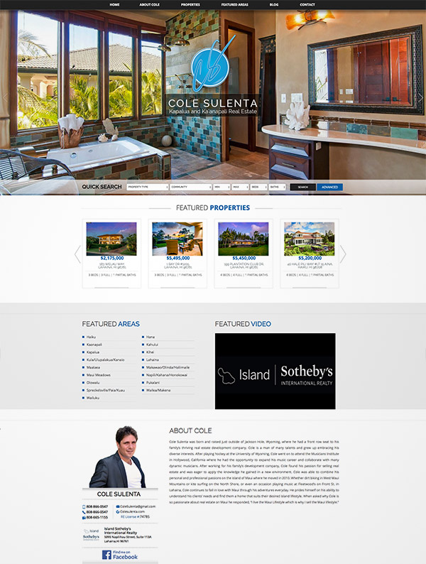
Cole Sulenta
The site wisely highlights the lush beauty of the island as well as of the luxurious, tropical-flavored details of its finest homes.
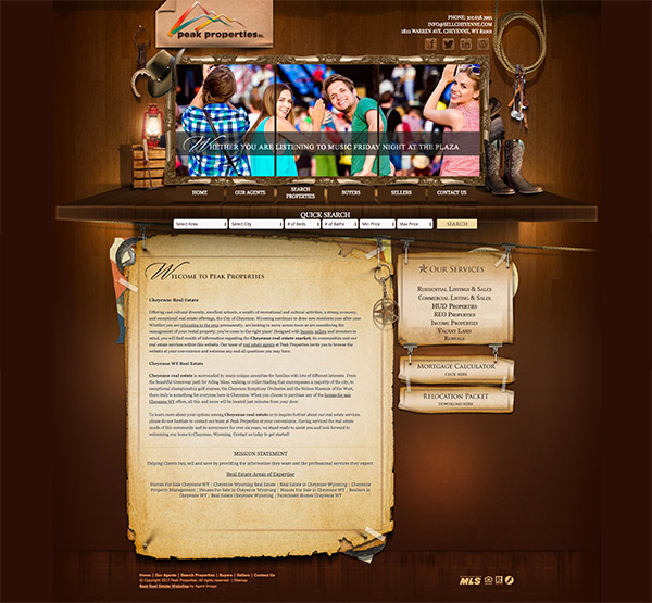
Peak Properties LLC
Peak Properties has a rustic website design with wooden plank pattern as its background, slideshow with a vintage-style frame, and an “about” section designed with an old paper texture. It also offers a quick search feature with various options.
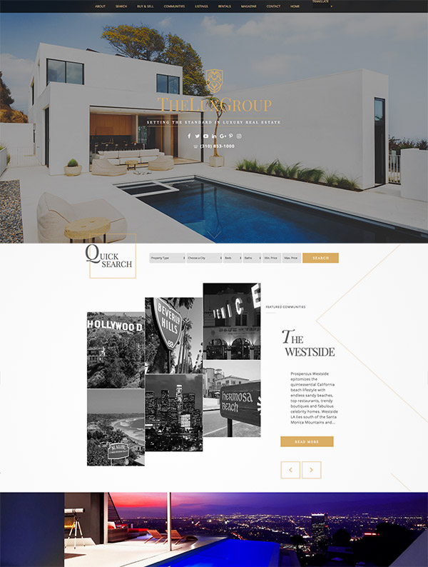
The Lux Group
The Lux Group’s site has a sleek and professional design that brings out an elegant and luxurious ambiance. It also utilizes parallax scrolling and quick search option.
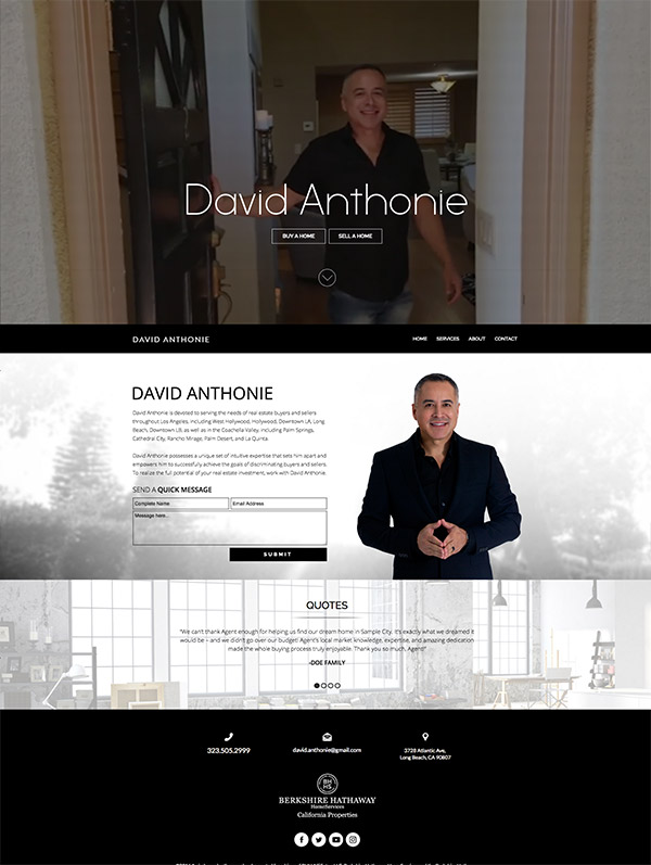
David Anthonie
David Anthonie’s website shows on-the-action scenes by showing a video background on the home page. It showcases the types of homes in Los Angeles that are available in his listings.
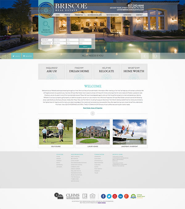
Briscoe Real Estate
The website showcases hi-res images matched with elegant color scheme and modern font, complementing each other perfectly.
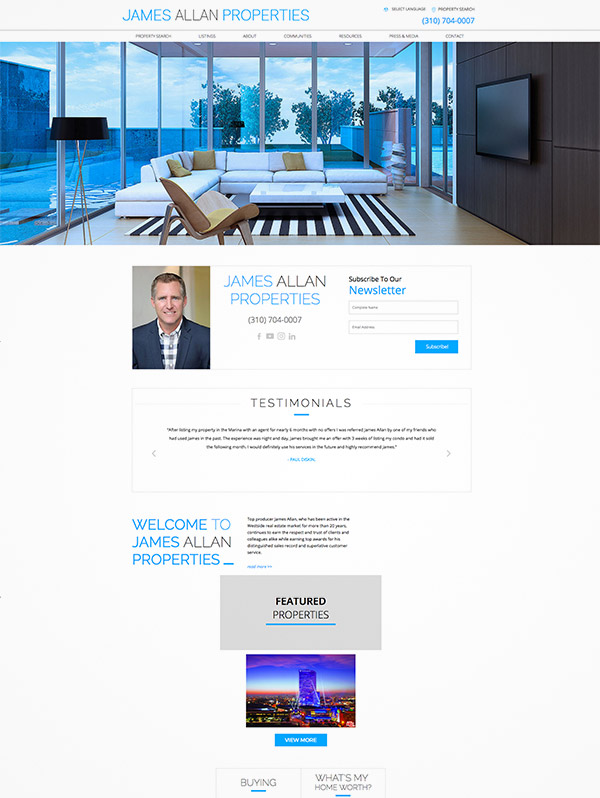
James Allan Properties
This website has an unusual web design with its subscription section right below the header. It is followed by testimonials and featured properties.
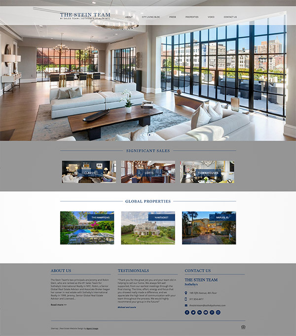
The Stein Team
The Stein Team showcases a user-friendly web design with its straightforward layout. It also utilizes a full-screen slideshow header that displays beautiful interiors of different properties.
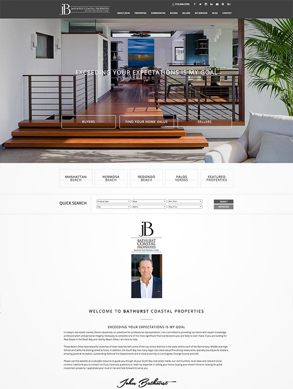
Bathurst Coastal Properties
Bathurst Coastal Properties has a gorgeous website that has a full-screen slider that showcases glimpses of beautiful properties. It also uses strips with alternating backgrounds – white and background images.
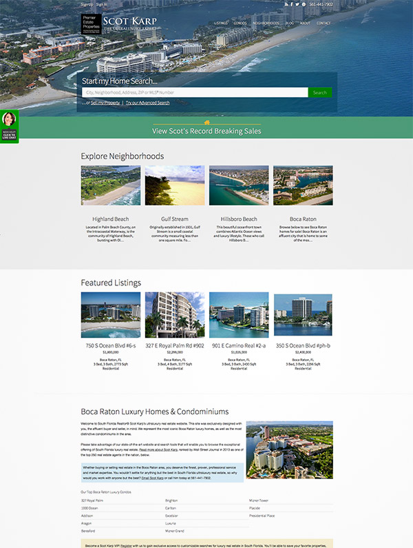
Scot Karp
Scot Karp has a full-width header design that showcases a stunning aerial view of coastal properties. Moreover, the search bar is also overlaid on the header. It is followed by galleries of featured listings and neighborhoods.
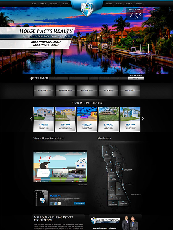
House Facts Realty
House Facts Realty has a dark-themed website with a slider for header and featured listings.
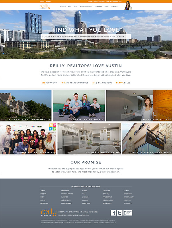
Reilly
Reilly has a modern and clean layout design for its website. It has a video background for its header, which gives a lively vibe to its market.
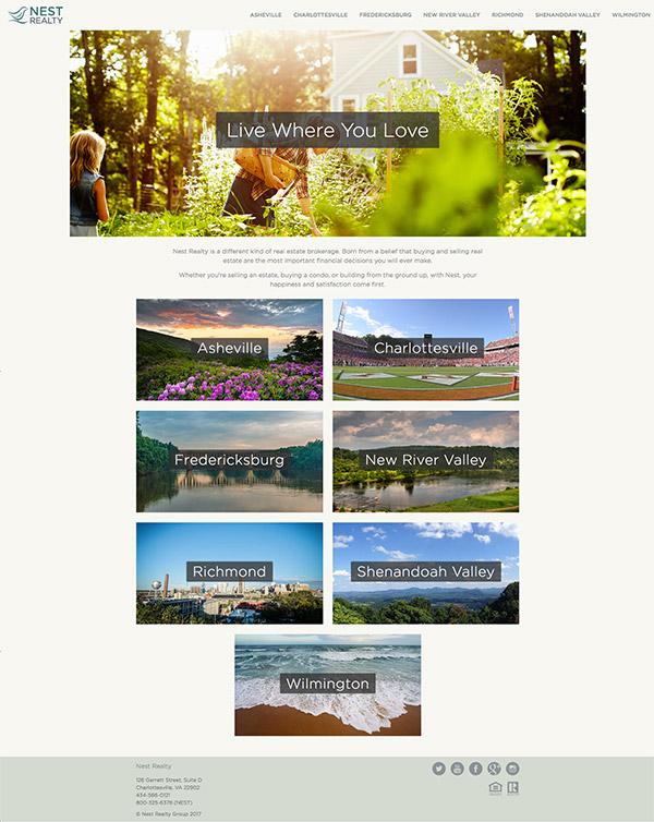
Nest Realty
Nest Realty website is a great example for agencies and firms that are based in multiple places. It shows the various locations of their offices and they are designed with simplicity for a user-friendly experience.
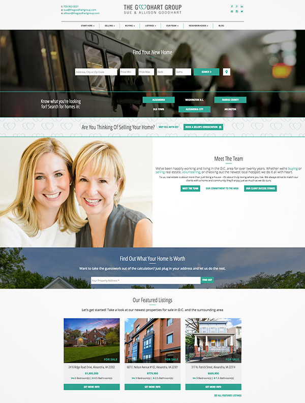
The Goodhart Group
This website has a lively ambiance with its video background in the header and creative layout designs. It effectively showcases the featured listings as well as the agents in the agency.
Note: All visual content above is copyright to its respectful owner. Please read the Terms Of Use of these resources before using to prevent unwanted occurrences. NaldzGraphics does not claim credit nor responsibility for any images/videos featured on this site unless otherwise noted.
Have something in mind related to web design, freelancing, and other awesome stuff? Let us know and maybe we’ll feature it on our next post. All your comments and opinions are appreciated. Let us hear em up in the comment box. Thank you and see you again mate!


