Brochures are one of the most effective promotional materials you can use. With it being cost-friendly and efficient in disseminating information, it is really one of the best go-to when you want to promote your products and services.
One example of a business that can gain advantage by using brochures is spa services. You can use it in many ways such as a menu for the services being offered with their respective prices, seminar schedules, or maybe a coupon ticket brochure if you offer coupons.
If you’re thinking of creating one for yourself, then we can help you get a great design.
Here we have gathered some of the best spa brochure designs that you can observe on to gain some ideas and inspirations for your own project. These samples deliver a relaxing and enticing vibe that can surely allure customers.
Let us know what elements got your attention on the comments!
Spa Menu
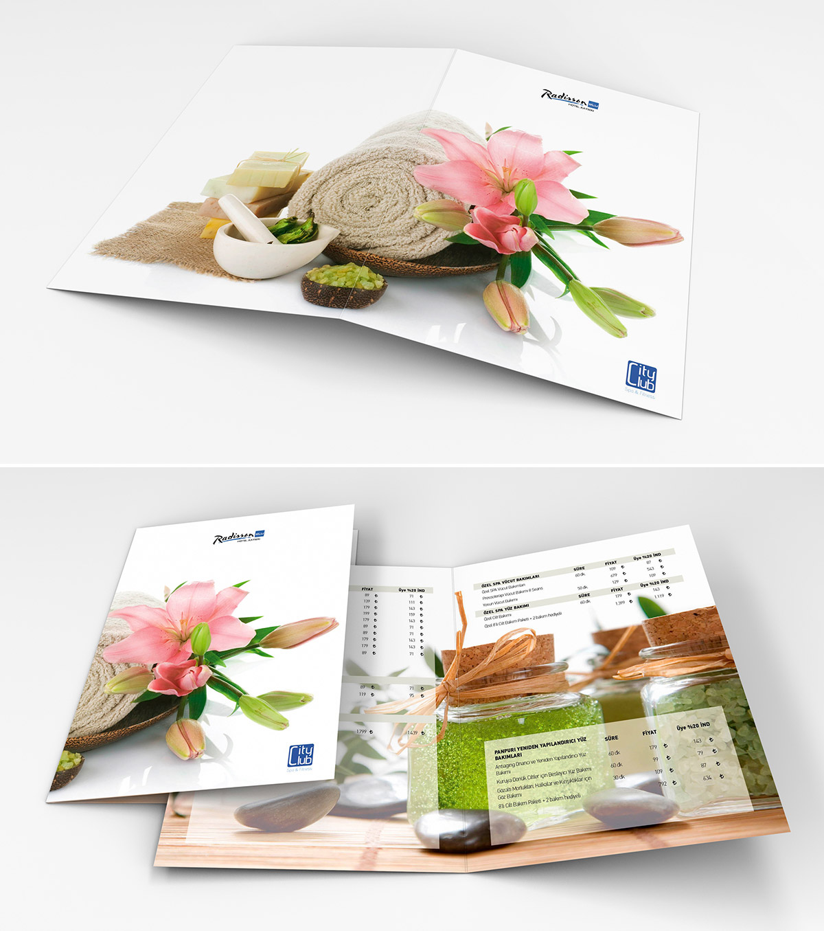
This brochure’s design capitalizes on the background images. These images alone can entice its viewer to have a break and take a relaxing experience in spa.
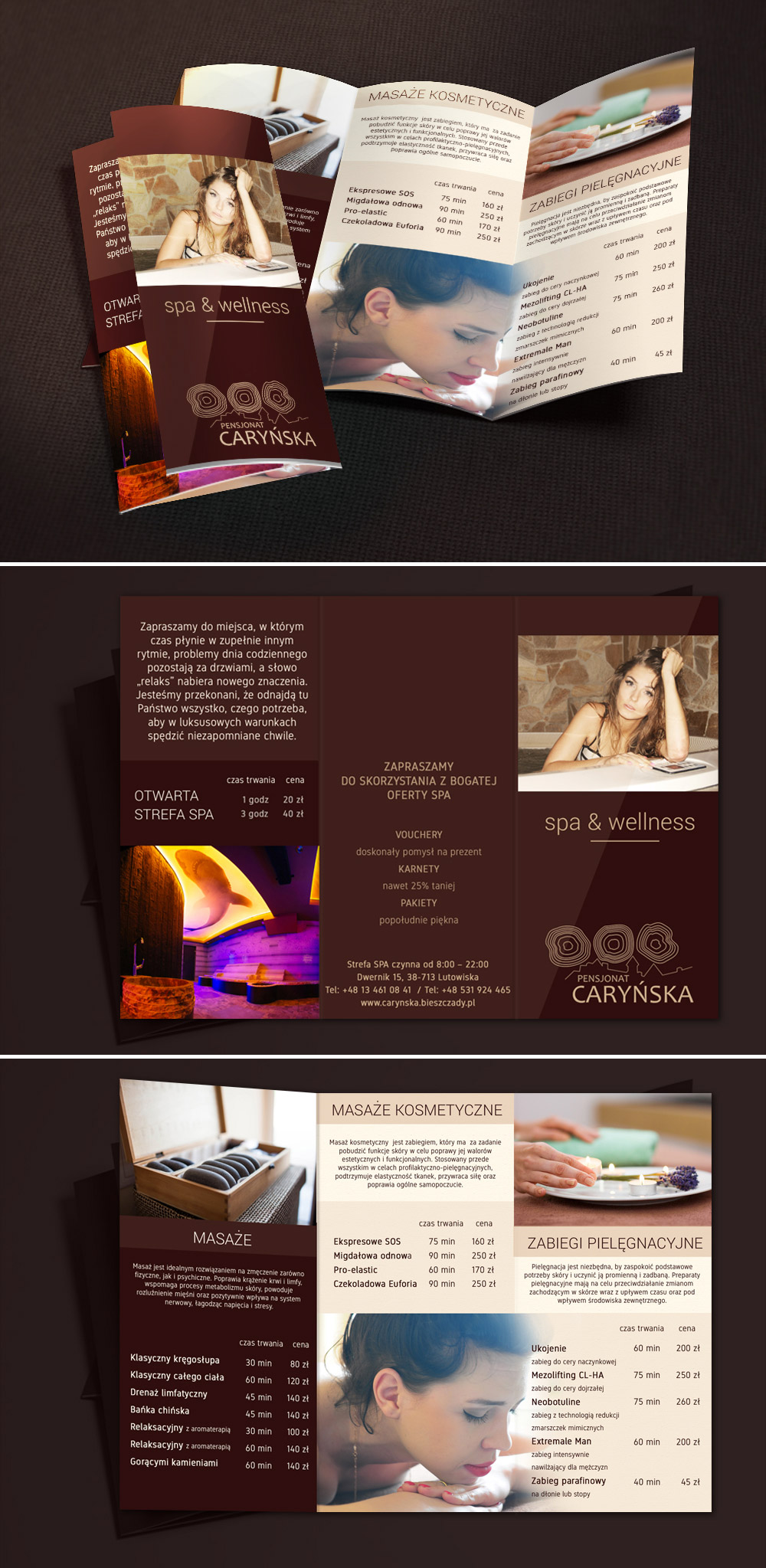
Trifold Brochure Spa
Next in the line is this trifold brochure design that utilizes a brown motif. Its layout comprises the services that are offered – along with their respective prices, contact details, and more.
Spacio
Spacio brochure design has this beautiful material that can be used for many beauty-themed businesses.

Gloria Palace
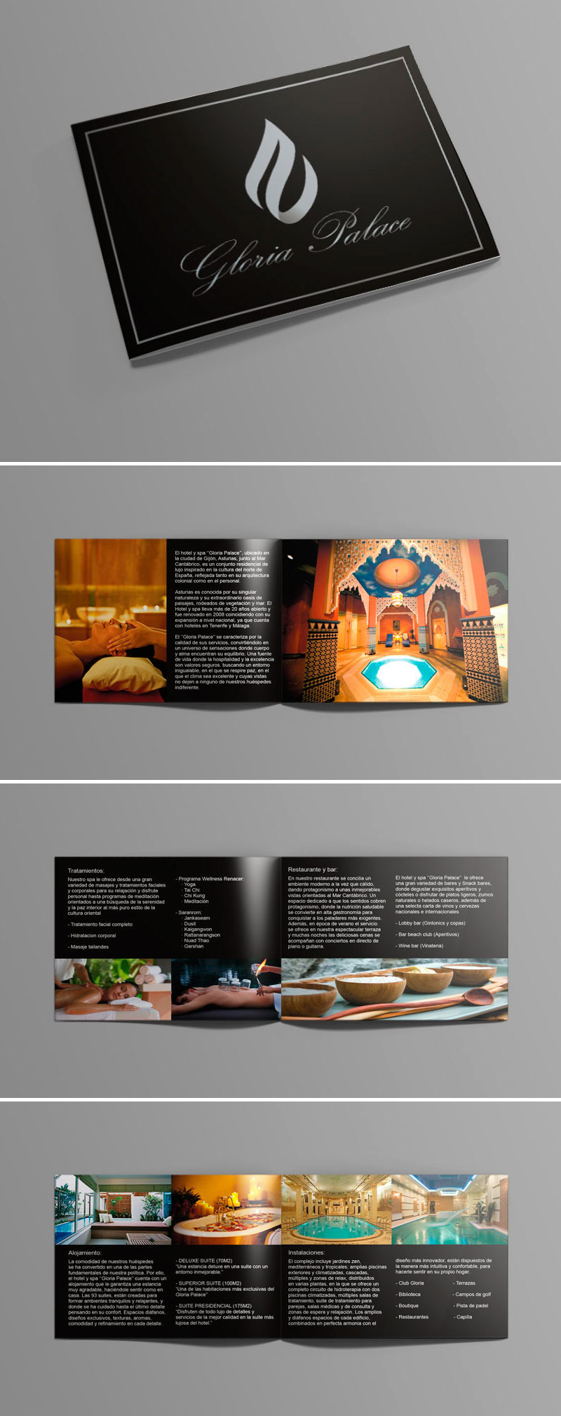
This heme aims to exhibit quality service through this elegant design.
Red Lane Spa
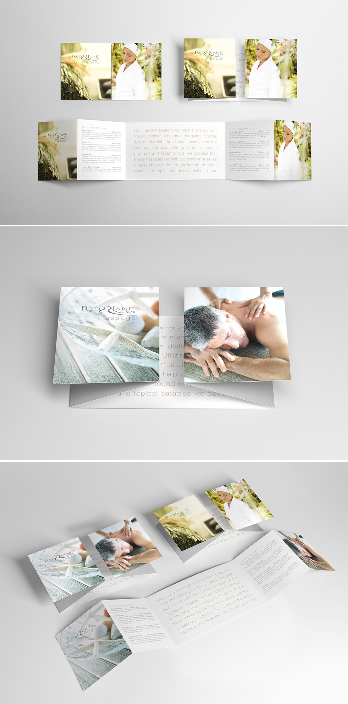
Here is a uniquely folded brochure that majestically opens to show you its content.
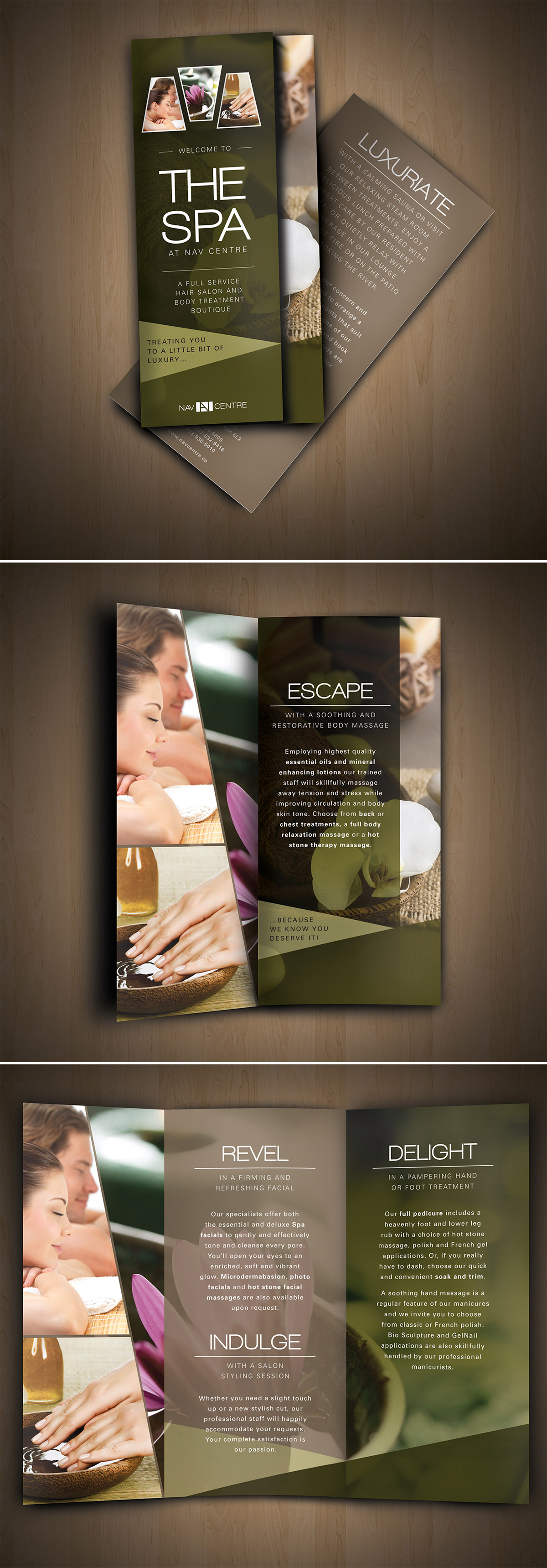
Nav Spa Brochure
This next one is also a portrait trifold brochure design utilizes more on background images as well as text descriptions to allure the customers.
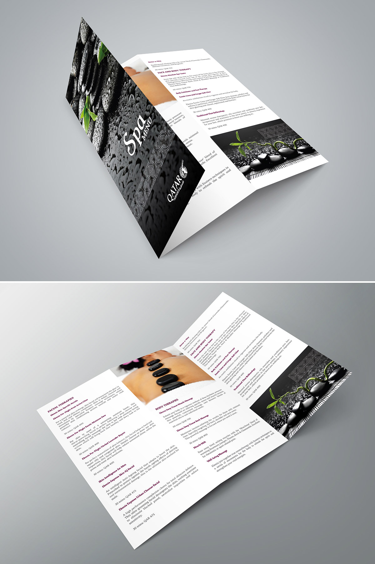
Qatar Airways Premium Terminal Spa
Here we have a full greyscale background for the front part, and a minimalistic approach on the content part. The clean white background makes the texts and images pop out.
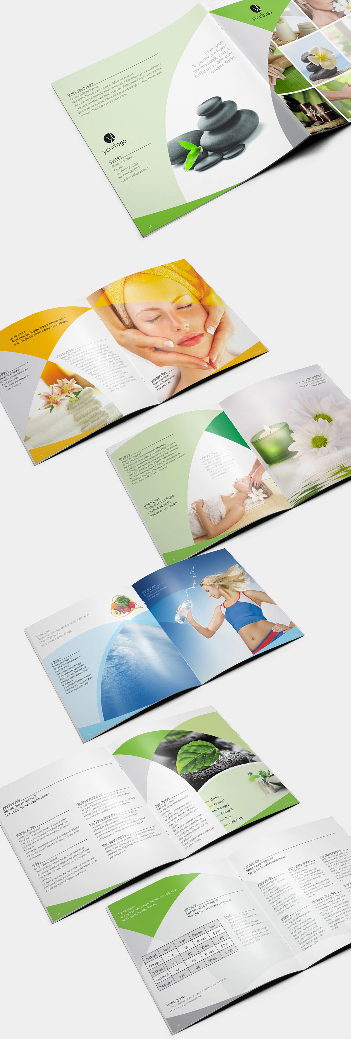
Spa Brochure
This template displays various designs, each with its own color palette and layout.
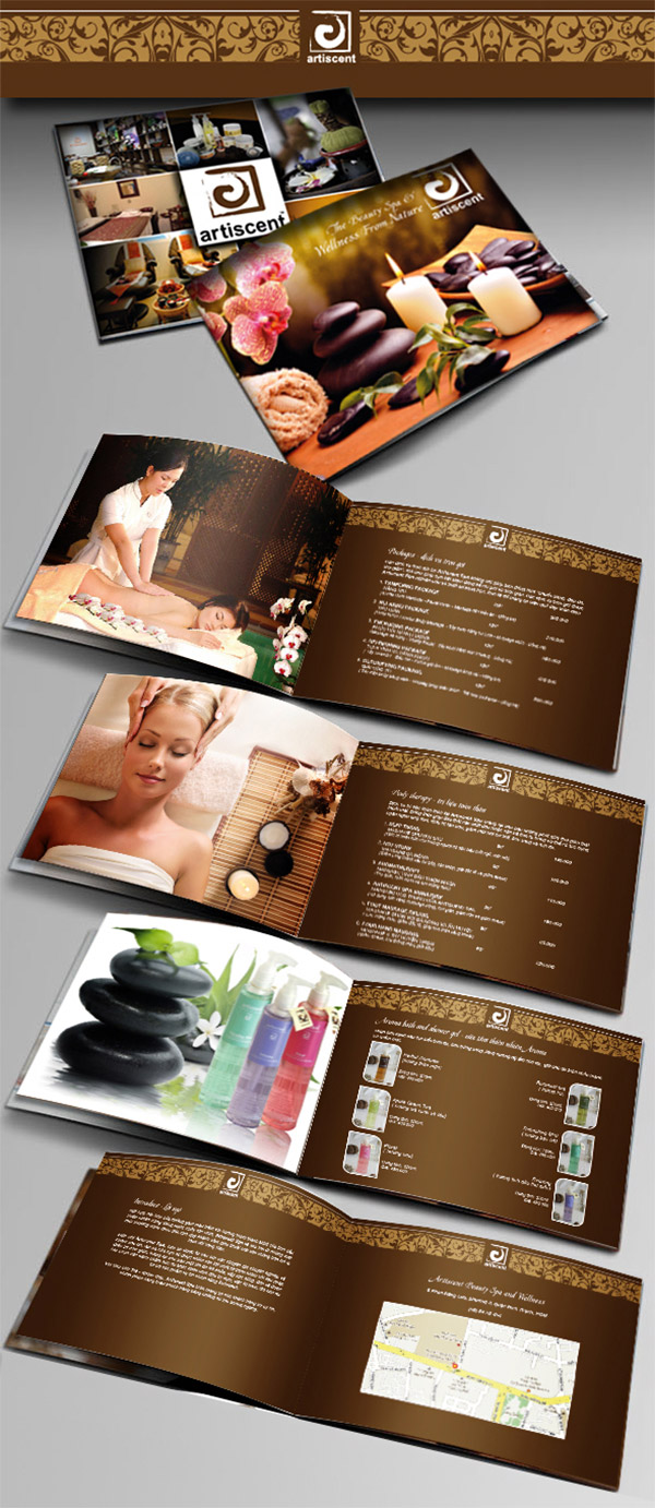
Atiscent
Atiscent has a booklet format that uses enticing background images on left-side pages and some menus and descriptions on the right side.
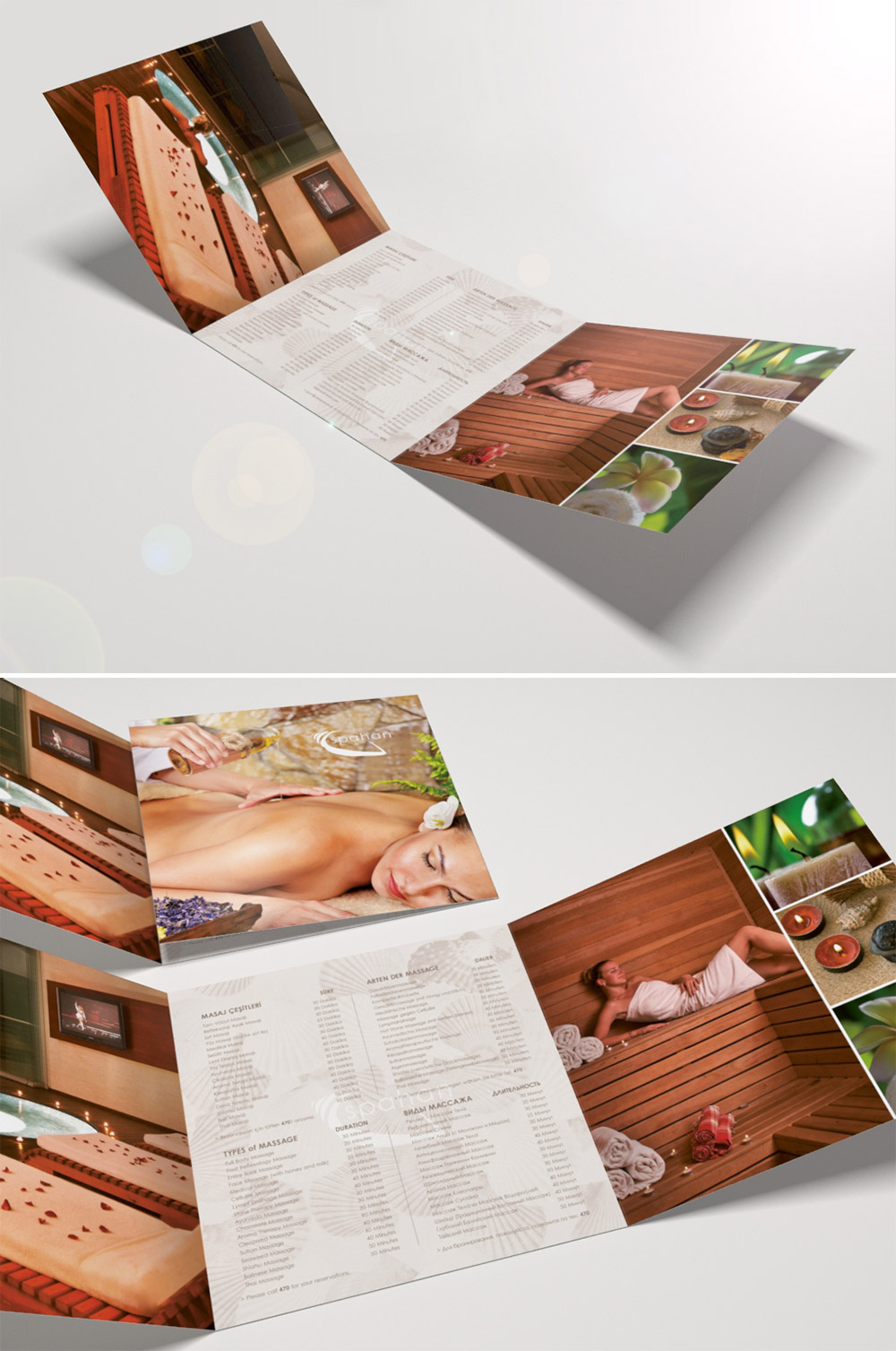
Spahan
Spahan has a landscape trifold brochure that was designed with a neat total layout. The designer placed all the images on the side flaps and the list of services being offered on the center.
Note: All visual content above is copyright to its respectful owner. Please read the Terms Of Use of these resources before using to prevent unwanted occurrences. NaldzGraphics does not claim credit nor responsibility for any images/videos featured on this site unless otherwise noted.
Have something in mind related to web design, freelancing, and other awesome stuff? Let us know and maybe we’ll feature it on our next post. All your comments and opinions are appreciated. Let us hear em up in the comment box. Thank you and see you again mate!

