If you’re a designer or freelancer who is available for a new job, then I can’t stress out more how having a great portfolio can help boost your chances of landing on numerous opportunities. We must make sure that it is fresh, attention grabbing, and contains all the necessary information, of course.
You may be wondering what a nice portfolio looks like. No worries, we got you covered in this post.
Here we have gathered some of the best portfolio designs that you can refer to in making your own design. Check them all out and maybe get some inspiration and ideas that you can apply in making your portfolio more interesting and fun for your potential clients. Scroll down and enjoy the browse with ease.
Lounge Lizard
Lounge Lizard’s website design incorporates a full background image in a vintage ambiance. It covers some of their best works, strategies, clients, etc. At the bottom of the page, there is a “request a proposal” link for interested clients as well as sign-up form for free newsletters.

Steven Bonner
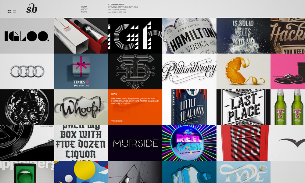
This next feature is Steven Bonner’s online portfolio designed with a grid layout where some of his works are effectively showcased. Visitors can also choose to view the works in a list style where they can also see the title and a brief definition beside each of them.
Small Studio
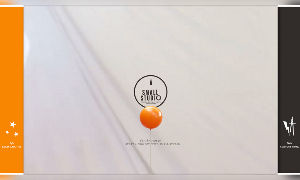
Small Studio is a creative agency from Melbourne with an online portfolio creativity does not disappoint. It is filled with creative elements (interactive design, questionnaires, videos, etc.) that make browsing experience more interesting.
Super Awesome
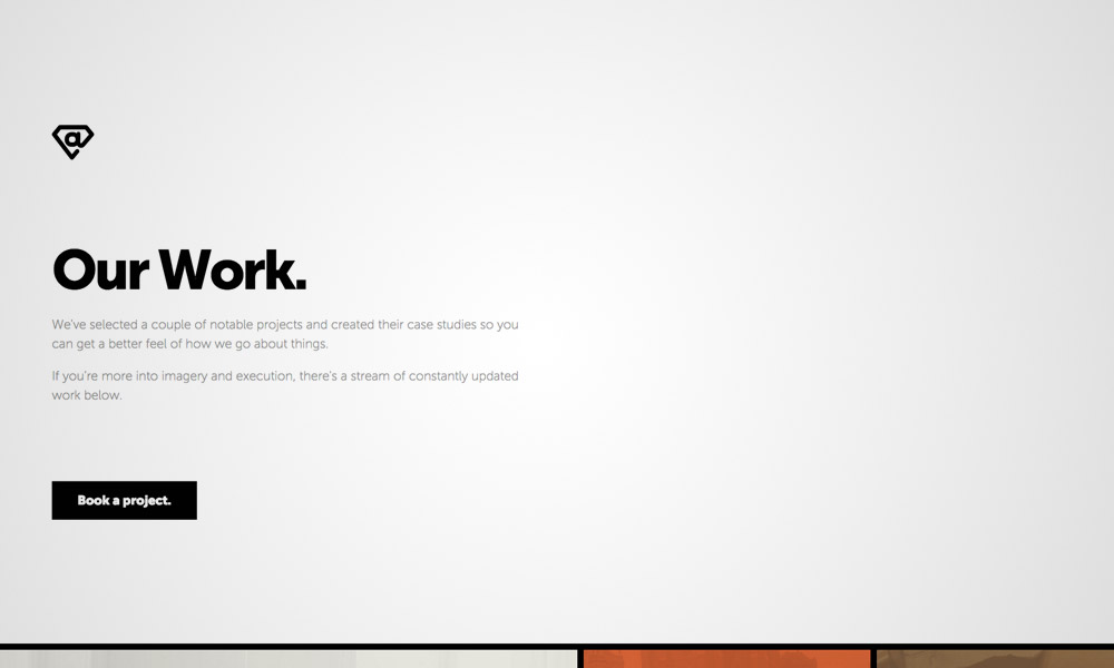
Super Awesome’s portfolio has a landing page that starts with words in minimal design with a call-to-action button for contact form. The site also incorporates a grid layout with some square filled with cool colors.
David Hellmann
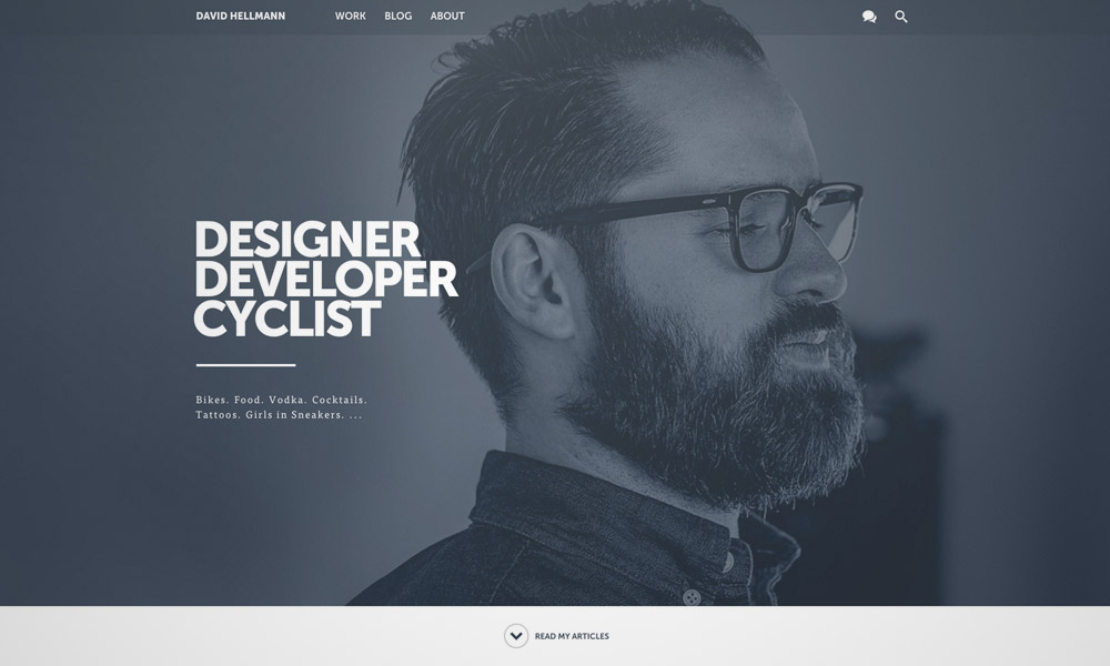
This next portfolio also uses a big image background in a greyscale design. Below this is the space that showcases some of his articles and works and finally, the footer where social media icons are placed.
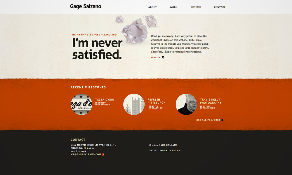
Gage Salzano
Here is a simple yet still effective online portfolio designed with layers of paper made more artistic with the added texture. The site contains the designer’s works, resume, and contact information.
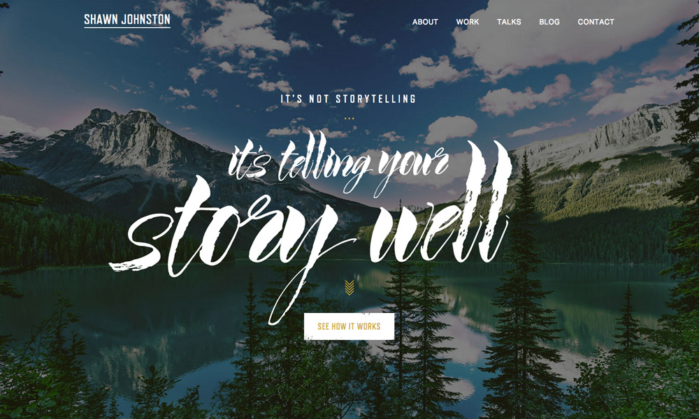
Shawn Johnston
This one also has big background picture, which is interestingly matched with script font. The site offers some information about the Shawn, his works, clients, case studies, as well as a link to his blog and contact info.
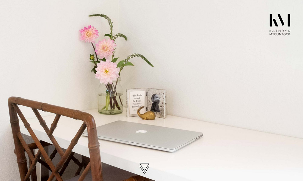
Kathryn McClintock
Kathryn is a developer that specializes in responsive designs. Her online portfolio beautifully portrays a minimal design with a feminine touch. Aside from the background image, the design relies on the font styles that are used in the site.
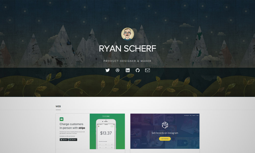
Ryan Scherf
Here is a great example of a one-page portfolio design. It has a large header that is designed with a background illustration and is overlapped with social media icons. The body has minimal design and is where featured works are showcased; while the bottom part is a contact form.
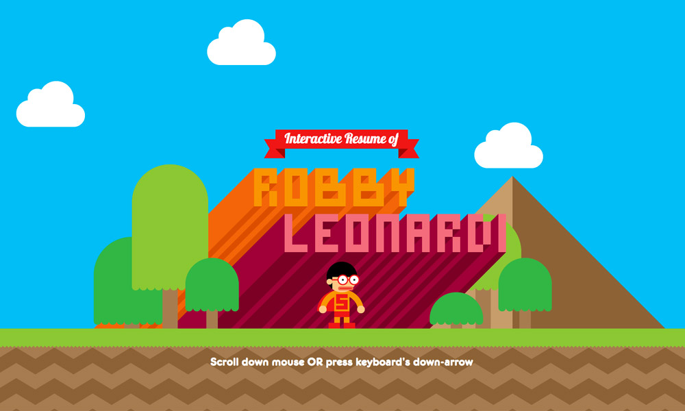
Robby Leonardi
Here is a fun portfolio! It is an interactive site that will take you to an adventure ala video game style. This resume alone is enough to show the skill of this designer. Go ahead and scroll away.
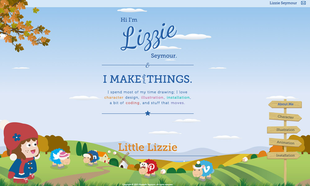
Seymour
With this next feature, Lizzie Seymour uses a character illustration in her own online portfolio. All of the content and elements are illustrated including the background and the social media icons.
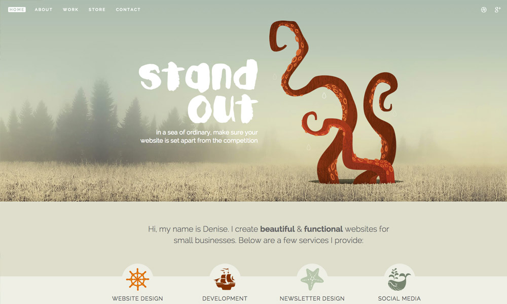
Denise Chandler
This portfolio is in a semi-flat design that favors the modern users today. It has a large header that is filled with a slightly blurred background image, and holds the navigation buttons and social media icons.
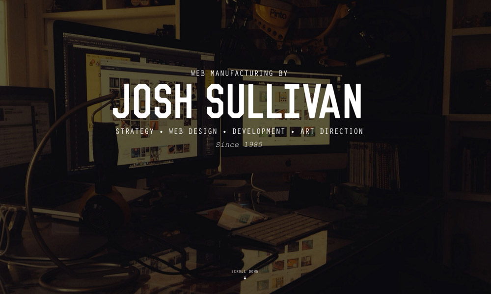
Josh Sullivan
Here is another good example of a one-page portfolio for freelancers. It has the trendy design that uses large typography and a full background image. It also contains some of his popular clients, his works, a brief introduction about himself, and his contact information.
Adham Dannaway
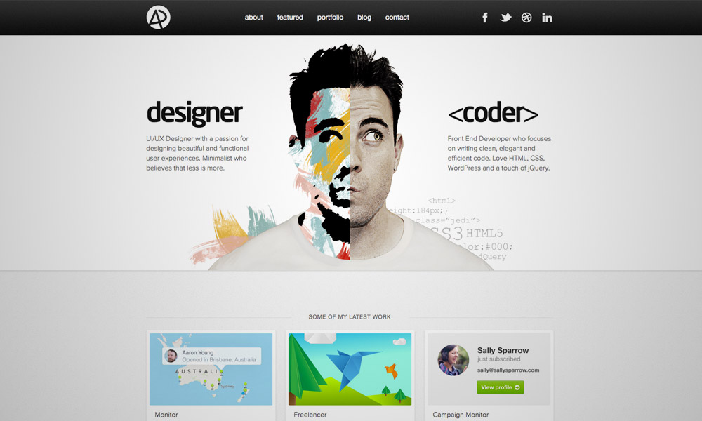
Adham Dannaway also has a creative online portfolio up his sleeve. He is able to effectively showcase his specialties b mixing his image and an illustration.
Adhemas Batista
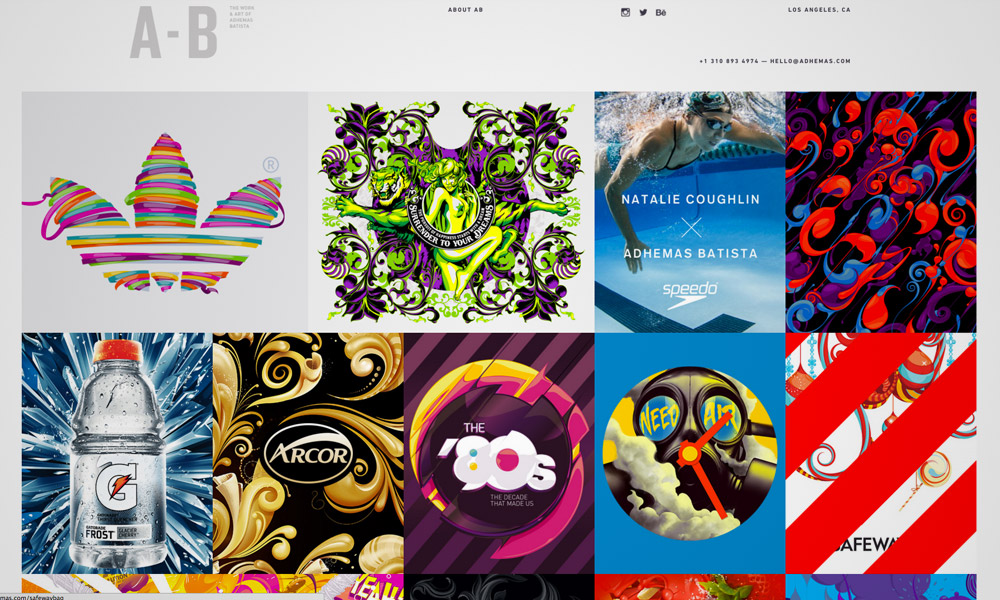
This portfolio has a grid style that also displays some of Batista’s lusciously colorful works and clients he has worked with as well. You’ll also notice an animated hover effect that adds more creativity to the showcase.
Note: All visual content above is copyright to its respectful owner. Please read the Terms Of Use of these resources before using to prevent unwanted occurrences. NaldzGraphics does not claim credit nor responsibility for any images/videos featured on this site unless otherwise noted.
Have something in mind related to web design, freelancing, and other awesome stuff? Let us know and maybe we’ll feature it on our next post. All your comments and opinions are appreciated. Let us hear em up in the comment box. Thank you and see you again mate!


