
First developed in Germany, Gestalt is a theory that tackles on how our cognitive behaviors are affected by various visual perceptions.
It illustrates how our minds react to what we see with our eyes – how we relate and separate elements to make sense of an image.
Gestalt, in dictionary, means “a whole that is perceived as more than the sum of its parts.”
In designing, this simply means that when you add certain elements in a specific manner, you can come up with a great design. There are five design principles that comprises Gestalt theory:
- 1. Similarity
- 2. Continuation
- 3. Closure
- 4. Proximity
- 5. Figure/Ground
These principles have been applied in designs for a while now and resulted to positive outcomes. With that, let’s get to know them more!
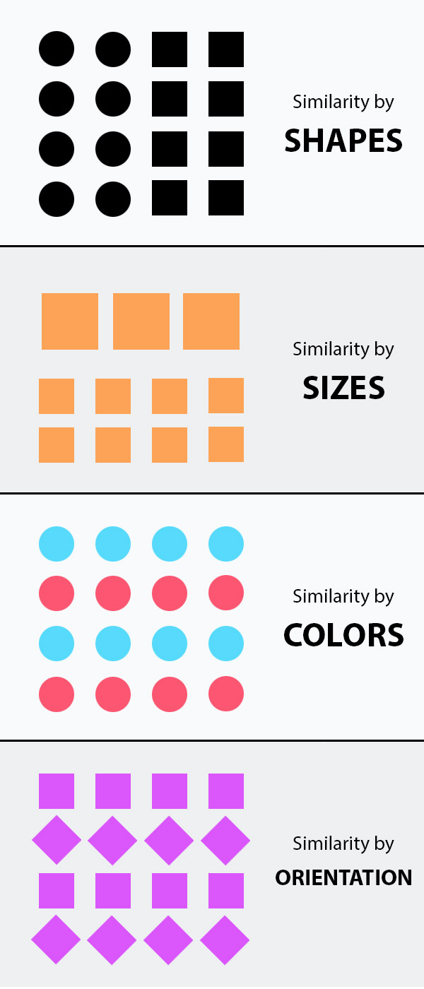
1. Similarity
Simply put, elements that look alike, or at least have a common visual attribute, tend to be perceived as a group.
In a psychological sense, our mind is inclined to organize items with their relationship to adjacent objects. It is also true with the opposite, elements that are dissimilar tend to resist grouping.
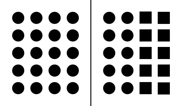
On the left part of the image above, the 20 similar elements seem to look like a single group. On the right side, the round and square elements look like they belong to two different groups.
Similarity can be achieved through color, sizes, shapes, and orientations.
Similarity In Practice
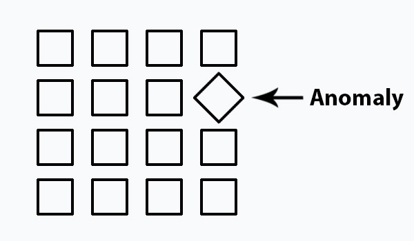
You can use the principle of similarity to obtain connection of elements and unity in your design.
On the other hand, you can also use it to give more emphasis to important parts by making it dissimilar. This is called ‘anomaly’.
Examples of Similarity Principle
7up
In this example of a 7up ad, the colors of the soda can are similar to the leaves and fruits. It easily blends with the branch, which makes it easier for us to associate it with the tree and convey its message of being 100% natural.

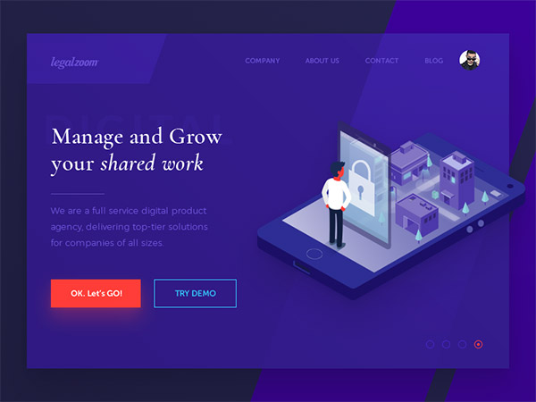
Workflow
This design is another great example of how the principle of similarity can unify a design, in this case, with the use of color while at the same time creating an anomaly on the call-to-action button to emphasize it.
2. Continuation
Continuation principle tells us that when we start to follow a line, actual or imaginary, either we tend to continue to follow its path until we see something significant, or we figure out that there’s nothing significant at all.
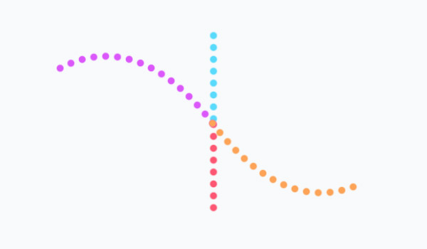
In the image below, you may see two lines, a vertical line and a curve line intersecting at the middle.
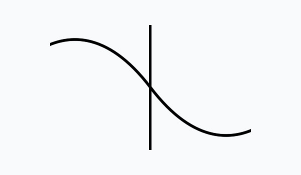
But it actually contains 4 lines meeting up in the center.
Continuation In Practice
This principle can be applied to your design to guide the eyes of the viewers to a specific element.
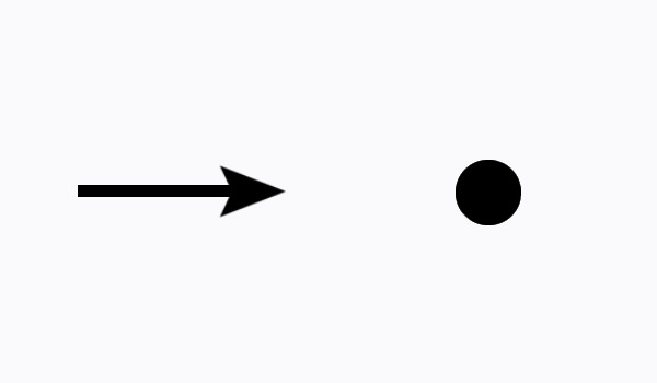
A good example is an arrow and a circle. In this instance, the arrow seems to create a perceived line that guides the eyes to the ‘significant’ element.
Examples of Continuation Principle
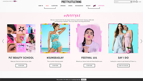
PrettyLittleThing
Here you’ll see the images are arranged horizontally. This gives the viewer a perspective of a horizontal line and hints them of a horizontal slideshow.
Lighthouse
This logo design has a yellow line that points our attention rightward of the design to emphasize the company name.

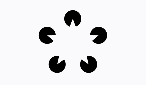
3. Closure
Closure depicts the tendency of our eyes to ‘complete’ a rather incomplete shape by filling up the missing information.
Our minds are inclined to fill in the blank spaces when we are given some context from the objects around it. With that said, you have to give enough hints or information so the viewers can fill in the rest.
Below you may see a star in the center even though there are only 5 circles with wedges available.
Examples of Closure Principle
FedEx
The FedEx logo has been around for a while now, but it was only recently when we noticed a clever design – the arrow between the ‘E’ and ‘x’. Sneaky.

USA Network
Another great example is the logo of USA Network. The design of the letters U and A makes us see the letter S.

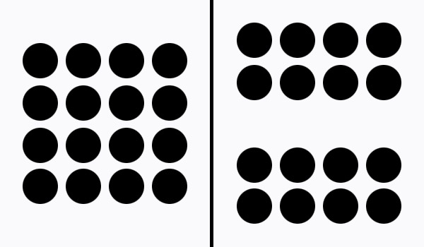
4. Proximity
Basically, proximity principle tells us that elements close together are perceived to be more related than those that are further apart.
In contrast with similarity principle, elements don’t need to be alike. As long as they are near each other, they will still be grouped together.
On the left image below, you can see a group of circles. But, when a distance is added in between, you may perceive two groups of circles as seen on the right side.
Proximity In Practice
The principle of proximity can be a big help especially in web design. It can minimize unnecessary clutter in websites and improve user experience. It can also help in grouping related elements so the navigation can be easier for the readers.
Examples of Proximity Principle
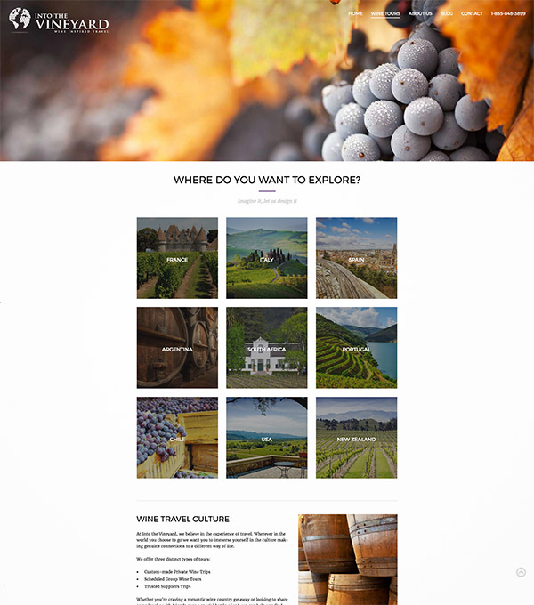
Into The Vineyard
In this example, the square images are placed close together while maintaining a space from other elements. This makes it more pleasant to the eyes and easy to navigate.
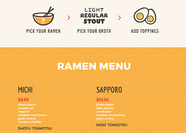
Michi Ramen
Here you’ll see in the menu section, the ingredients are placed closely to the name of the dish so they are easily perceived as related to each other.
5. Figure/Ground
This principle tackles on how we perceive space. It describes how we are able to differentiate the objects (figure) from their surrounding background (ground).
The figure is the one that immediately grabs the attention of the viewer while the ground gets less of the attention but helps in giving a context to the whole picture.
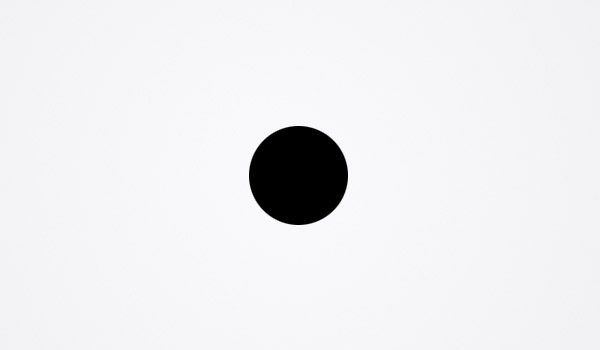
Here, the figure is the black circle while the ground is the grey background.
Figure/Ground principle also explains how our brain interprets an image in the simplest way possible.
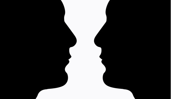
For example, even though this image below shows a candlestick, people may instead see two faces close to each other since it is simpler to see than the intricate shape of the candlestick.
Figure/Ground In Practice
This is important because it’s the first thing people try to determine when looking at a picture. It is well embedded to our evolutionary core. In a way, it helps us to quickly make sense of what we’re are seeing.
In the context of web design, this principle helps the users distinguish the content (figure) from the structure (ground) of the website.
Examples of Figure/Ground Principle
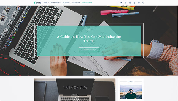
Natura
This theme has a vibrant background that can easily grab attention. However, the green box (figure) is more prominent because of how it contrasts with the background and the border that surrounds it.
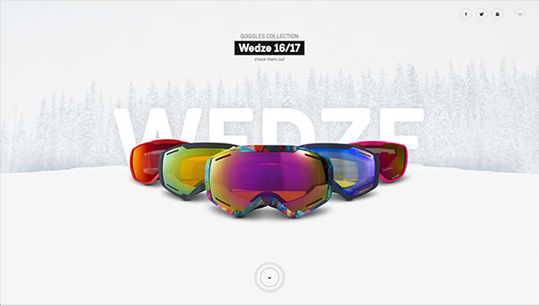
Wed’ze
Here you’ll also notice immediately the colorful goggles in this image below.
You’re up!
Now that you have a glimpse on what Gestalt theory is, you can start familiarizing yourself with its principles by noticing them in various designs online and even in your day-to-day environment. Pay more attention on how these Gestalt principles play their role on them. Doing so can greatly improve your insights in designing and you can harness and implement them for your next projects.


