
White space has hugely been underrated in web design for the past few years.
Although many have previously neglected this in designing a website, white space is actually a fundamental element that is crucial for an effective design.
Now, its importance is now observable in most, if not all, websites today. Gone are the days of cluttered web pages that are a pain to the eyes.
Let us dive deeper into this powerful tool and learn what it is and why it has an influence in the world of web design.
What is White Space?
Also known as a negative space, white space basically refers to the empty space or area between elements including the design and the content.
Don’t be confused with its name. Though it’s called white space, it doesn’t necessarily mean that it should be white. It may come in various colors and even background images with a universal color theme.
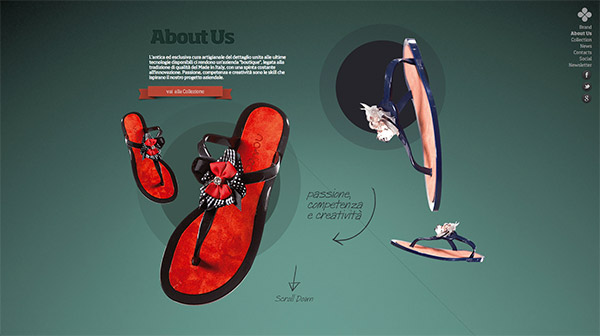
Here are some examples of excellent use white space in web design.
Metta Skincare
Here you have a hero image that uses an off-white background with a hint of a painted texture.

No Leath
No Leath utilizes a clean background with a green gradient color. As mentioned above, it doesn’t necessarily need to be white…
Ditto
…It can even come in black…

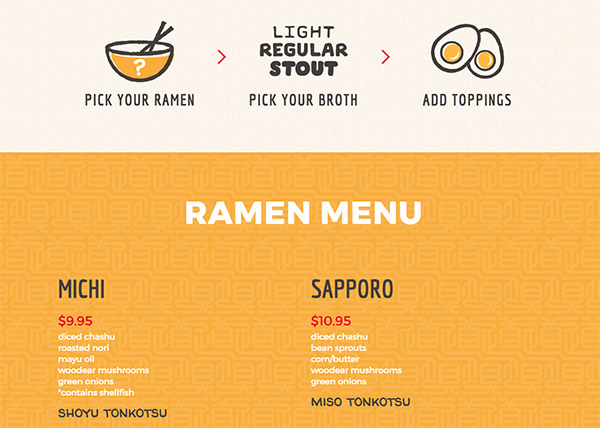
Michi Ramen
…Or in various patterns as well.
Macro vs. Micro White Space
White space can be further categorized into 2 parts – micro and macro white space. Each has its own characteristics and function in the design.
Macro White Space
Macro white space refers to the large spaces between core layout elements of the layout and its surroundings.
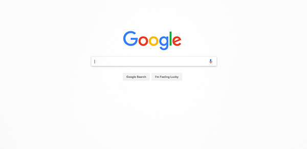
One of the best examples of a website utilizing a macro space is Google. It’s mostly made of macro white space, which helps you focus your eyes and attention unto its main function – search box.
Since it comes in big spaces, it’s more noticeable than micro white space.
It is applied in creating the overall look of the layout and it will dictate how the website will look in “big picture”.
Micro White Space
Micro white space pertains to the little spaces found between the smaller elements of the design layout. You can find it between letters, paragraphs, image grids, buttons, etc.
Though it’s often too small to be noticed, it’s vital in creating a web design.
It can influence your content’s readability as well as the clarity of your layout when observed in finer detail.
Moreover, it can help your readers to identify the connectivity (or separation) of various elements. A difference in micro space can signal your visitors that a certain button is connected to the nearest content.
Both of these types are used simultaneously in web design to come up with a user-friendly web design.
Benefits of White Space In Web Design
If used well, white space can provide significant benefits in your web design. Here are some advantages below:
1. Improves content readability
If you’ve been using the internet in the 90’s, then you’ve probably seen websites that looked like this:
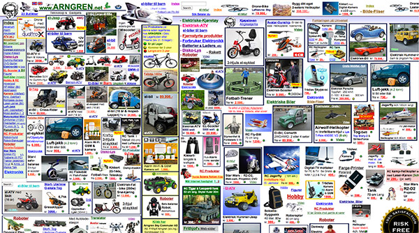
It’s like you’re being forced to see everything at once.
With this regard, white space is a great solution in reducing the clutter in your website and allowing your readers to focus in one element at a time.
White spaces in paragraphs and other elements actually help readers understand the flow of the content and therefore make it easier for them to comprehend the content.
Overall, it makes your composition or overall layout easier to follow for visitors.
2. Adds Aesthetic Value
In today’s trends, elegance and minimalism reigns supreme. It is also in this category that white spaces are most significant. Check out these examples below and see how much white space affects these websites.
Below is a couple of websites that displays elegance with the help of white space:
Christopher Hall Design
The New Yorker
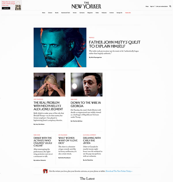
This goes without saying, the aesthetics and ambiance of the website play a big role in how the visitor will feel about the site.
It can dictate the user to trust it or not, to stay longer or go out immediately.
3. Emphasizes Key Elements and Content
Studies have shown that the attention span of people today has been declining dramatically. For websites, this means that visitors may go out immediately if they don’t find what they’re looking for.
White space can provide visual cues to visitors that can guide them to focus more on the right elements. This is a better scenario instead of letting the visitor find its way through a cluttered page.
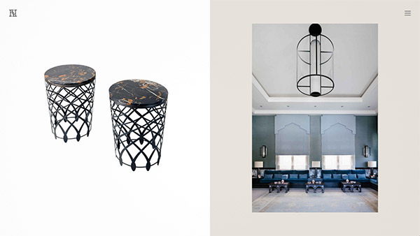
Into The Vineyard
Here is a great example of a website that uses white space to prioritize its main elements.

In the header, you’ll notice that the part of the image where the logo is located is blurred. This is because in photography, white space is the surrounding of the image that is not the main focus.
It makes the logo more noticeable to the readers, which is good news for the website’s branding.
The site’s grid design for its gallery also has enough macro and micro white space that it takes no effort in spotting it.
4. Highlights Call To Actions (CTAs)
Web designers and marketing strategists know how important CTA buttons are in converting leads.
One way of making them more attractive and enticing to the visitors is adding a right amount of white space around it.
Here are some great examples:
Snowbird
Snowbird’s blue call-to-action button on the right is very distinguishable due to its surrounding empty space.

Over
Though Over’s Download CTA button is far from the usual line of sight, it is still visibly clear thanks to white space.

Things
Here the call-to-action button is also surrounded with a white space that makes it very appealing to the eyes.

5. Helps Separate Unrelated Elements
Another benefit of white space in web design is its uncanny ability to separate elements while at the same maintaining (even improving) its overall visual design.
This visual separation helps readers connect related elements such as texts and images of the same article, and differentiate them from other elements such as captions, social media icons, and other elements from another article.
Thus, they will have a better understanding on the flow of your page and browse accordingly without the hassle.
Check these examples below to get a glimpse on how white space is used right in separating elements:
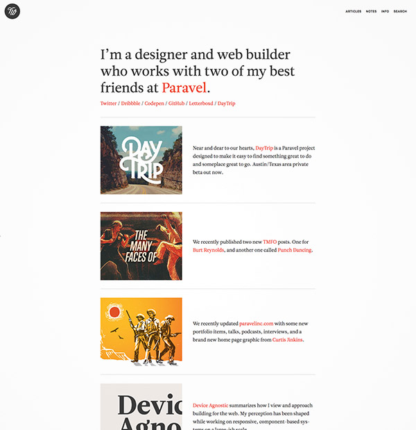
Trent Walton
Trent Walton has a clean and minimal web design that only displays a few elements. The articles’ captions are well placed to their respective image preview, which effectively shows their connection to each other.
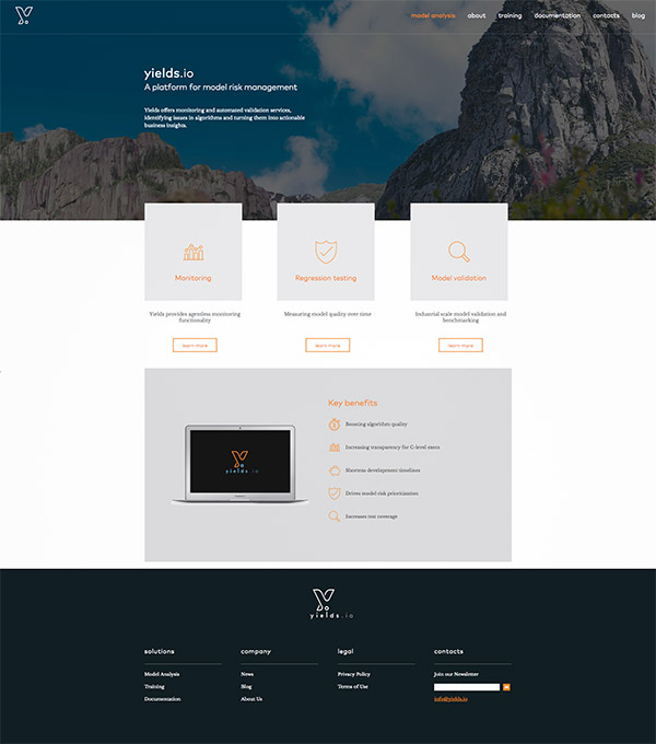
Yields.io
White space separates the boxes, captions, and call-to-action buttons in a clean and elegant manner.
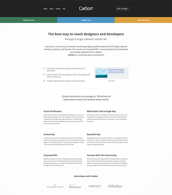
Carbon Ads
This landing page shows a beautifully designed layout that utilizes white space to make each element and section easy to discern from one another.
You’re Up!
Now that you have an idea about white space in web design, it’s your turn to apply it to your design projects. Keep on browsing examples to broaden your imagination and practice until you’re familiar with them.
Over time, your gut will be well trained in telling you the right amount of white space needed for your web design.
White space is a silent yet powerful tool that is available to all designers. It has the influence to how users will experience in a website.


