The flat design discussions in the web had resulted in various reactions and views. There had been so many articles that presented their own views and understanding about flat design. But despite those, there are still diverse perspectives about the matter especially that there are already recent changes to flat design. Like other trends, designers had already experimented with flat design and had added some effects to make it look less flatter or just almost flat.
Well, this could be the reason why other readers had a different understanding of our article, An Extensive Look at Flat Design. People’s mindset was already dwelling on the current evolution of flat design where shadows and other effects were already added. So, as a follow-up, we are going to show you how flat design has evolved.
We did a little digging in the internet to find out what designers had tried doing and experimenting with by borrowing the principles of flat design. There were already different styles that we have seen and we are going to show you what we found out. Let us take a look at flat design evolutions.
Long Shadow
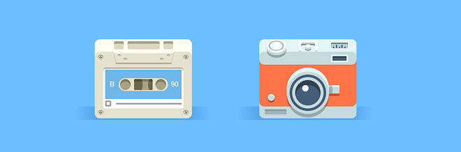
Of course, you have all seen this evolved style of flat design. Long shadow is a term used in lighting and photography where photographers use long shadows to add drama to their photos. It was adopted in this design where it used a long shadow.
Long shadow uses an extended shadow at approximately 45 degree angle while others use 120 degrees. Its size is usually 2.5 times of the object. This kind of aesthetics gives a logo or an icon a sense of depth while remaining flat. The shadow used is also flat. It doesn’t have any gradient, shading or fading.
But the downside of using it is when you line many icons with long shadows, your attention will be driven to the shadows and not to the icons. This is because the shadows seemingly give a block effect. It will have more impact and will standout than the icons. It is like you will be seeing a bunch of shadows instead of seeing a bunch of icons. But still, it depends on how you look at it.
We have gathered some works that made use of long shadow in their design.
Clock
![]()
Image: Dmitri Litvinov
Ipad Mini
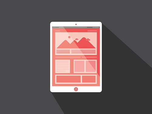
Image: Zachary VanDeHey
Social Media Flat Icons
![]()
Image: Graphic Burger
Theme
![]()
Image: Bosco
iOS
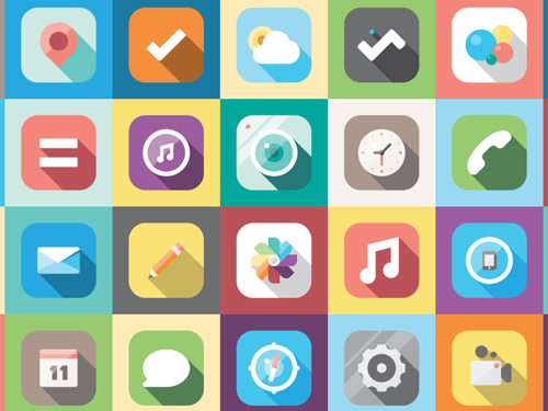
Image: Jacob Cummings
Flat Design with Gradients
This is also common. Even iOS7 used this for their icons. This is done in order to add a subtle effect to the design. Like long shadow, this is for mere aesthetic and to add some impression into it. Let us check on some examples below.
Icons
![]()
Image: Jee
Camera
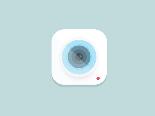
Image: Rovane Durso
Not the new Clear iOS 7 icon
![]()
Image: Realmac Software
iOS 7 Concept
Image: Alex Martinov
Flat Design Icons Set Vol3
Image: Pixede
Drop Shadows in Flat
Aside from gradients, designers had also added drop shadows to flat. This is different from long shadow because the shadow is a mere cast of an object. It gives an image a repeated effect to the design and could also make it appear like floating from the background.
Flat Icons Brownie Theme
![]()
Image: Sunbzy
Android Icons Set
Image: Raul Taciu
Shield Flat iOS App Icon
![]()
Image: Zachary VanDeHey
Squares
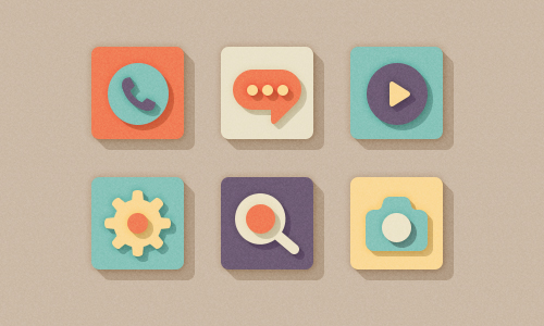
Image: Oleg Turbaba
Theme
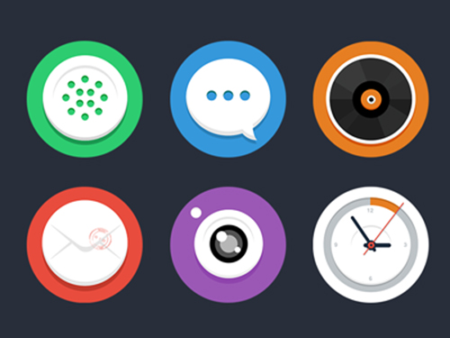
Image: Bosco
Flat Icon
Image: Bosco
3D Flat Design
Well, you might say that flat design is just 2D. Yah. Flat design is 2D but there are already designers who work on flat design on 3D. There are some works that used 3D while still retaining the principles of flat design. The designs below will give you more light on this.
Super Simple Icons
![]()
Image: Nick Kumbari
ICT7 Mockup
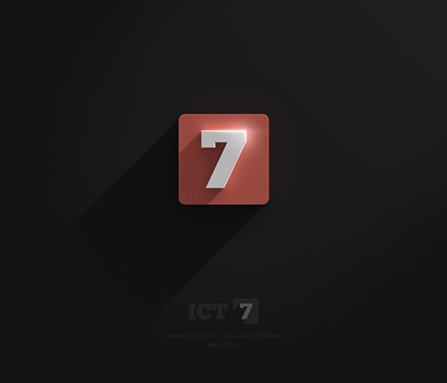
Image: Dirk Jan Haarsma
“R” Hotel
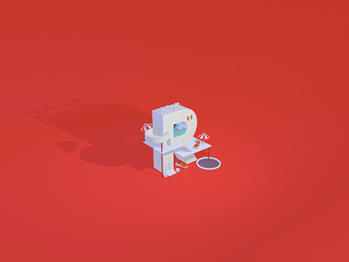
Image: Lewis James
Squares Isometric
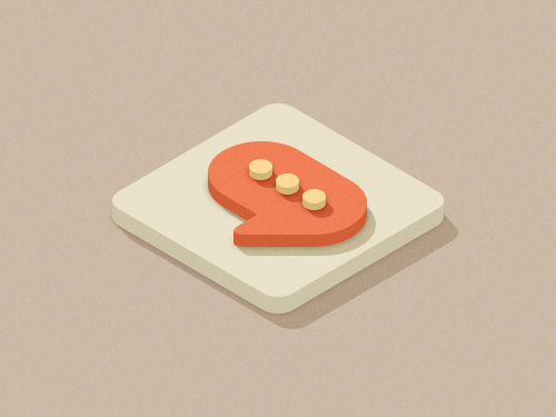
Image: Oleg Turbaba
Facebook Icon
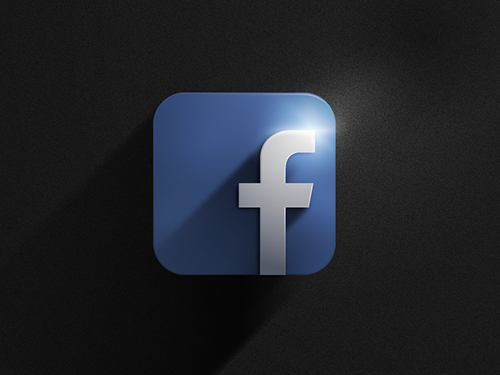
Image: Tomohiro Suzuki
Bevels in Flat Design
You might say that if there is a bevel, it won’t no longer be flat. But if we look at the flat designs below with subtle bevels, we can still associate them to flat design. Adding subtle bevels is another way to create a bit of 3Dness to icons and logos. Check out the examples below:
Icons
Image: Rovane Durso
Blue Web Identity Icons
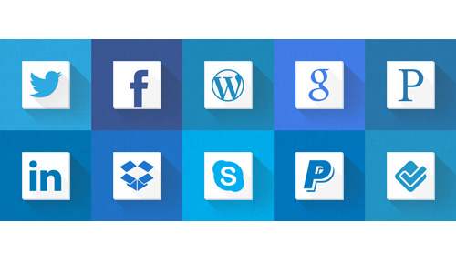
Image: Shaun Byrne
Long Shadow Flat Icons

Image: Xklibur Clab
What Now?
We cannot blame designers for experimenting with flat design. This is the result of their creativity and to their attempt in adding some “life” to flat design which is regarded by some as dry and plain. With subtle (or not so subtle) additions of effects, evolutions of flat design were born. The above designs broke some principles of flat design with the added ornamentations but it sure lifted its aesthetics. What is common on all the above designs is that they managed to retain the flat look while adding effects on it.
Trends come and go. We are not certain which of the above evolutions would be adopted by many and which would last longer. But like these flat design evolutions, even the existence of their inspiration, flat UI is also something we all wonder about. Well, let us observe on what will happen on these styles and design aesthetics.
What can you say about the emergence of flat design evolutions? Have you observed other styles that we failed to mention here? Do you think this trend will last?


Great designs, thanks for share.