Typography is always used in whatever design one will work at. There could be similar things that one should take into consideration but there are also some different things that one should look at especially in web designing. When some visits your site, they will surely be curious about what your website or blog is. Hence, they will read what is there. You have to prepare your website to make it readable and pleasing for the readers so that they will stay longer in your page and be a regular reader.
Aside from choosing colors and images, typography is one of the priorities of a web designer. The art of arranging type has a great impact on the entire appearance of the website. That is why we will share to you some important things to keep in mind when designing a website using typography.
1. Read the text.
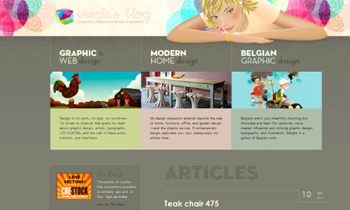
Image: veerle.duoh
Some designers think that it is enough to copy and paste the text given to them by the client. But it is not. You have to read the text so that you will know if it is readable or not. Also, try to look if the text appears good and pleasing to the eyes. You might have used double spaces in some areas or you might have skipped to paste some parts of the text. So, it is important to read it before you finalize it.
2. Apply a clear hierarchy.
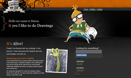
Image: sr28
A web site needs to have a well developed hierarchy so that the readers will know where to start and how to proceed. This expresses an organizational system for content where in some parts are being emphasized and some are diminished. There should be cue for each level of hierarchy. It could be spatial- indentions, line spacing, alignment. It could also be graphic- size, color, style, typeface. There are different ways to do that. Your type should lead the readers by the hand as to how they will go through the site.
3. Consider macro and micro typography.
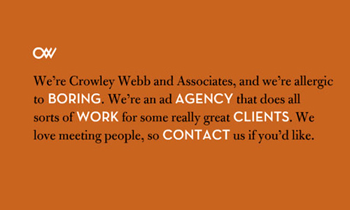
Image: crowleywebb
When we say macro typography, it refers to the overall structure of your type considering how it appears and its aesthetics when you look at the text as a block. Meanwhile, micro typography is more into the details of spacing and the text in detail if it is readable. You need to check both in order to make sure that your text is legible. After looking into micro typography, look into macro typography and make your site look more appealing.
4. Pay attention to type colors.
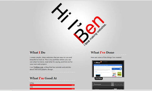
Image: benlind
Choose the right colors for your website. After choosing which font style to use, you need to choose a color that can be readable. If the background is red, then do not use orange for your text. Black or white is most effective for text colors. But you can also use drop shadows, bevels and glows to highlight your text. Be sure that everything is readable, or else your readers won’t visit your sight again because it gives them headaches.
5. Your CSS.
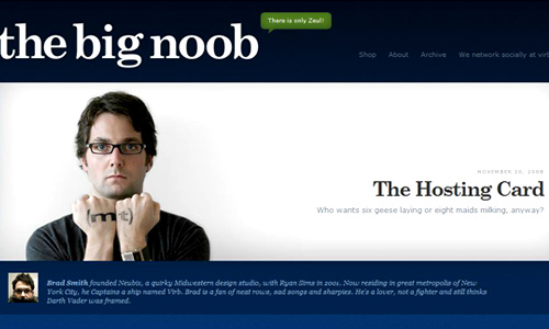
Image: thebignoob
CSS can help you to have an easy consistency of your typography and the entire website. Keeping a consistent typography is a simple matter in CSS. This will help you to easily highlight some parts of the website or do simple things to make your website look better. If you have solid CSS, you can move flawlessly in your website.
6. Use the right font size.
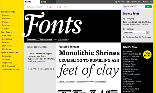
Image: fontshop
Do not use super large or super small fonts. That would be an eye sore and no one would like to read that. Most designers use 10 point font or smaller for their layouts. This is because most people are comfortable reading with the said font size. You can make your text larger if it is necessary but do not make it too large. You need to know what size suits a headline and a body.
7. Spacing.

Image: vignettebrandcommunications
If you look into the spacing of letters and words, you will surely make your design readable and relevant. Adjust the spaces when necessary. You can do some experiment for the spacing. Be sure also not to place so many spaces between paragraphs for it will mislead the readers. Use only one space after a sentence and not two.
8. Line-height.
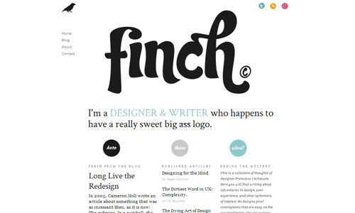
Image: getfinch
Another important thing to consider is the line height. This refers to the lines of text that are placed on top of one another. Make sure that each line can be read and is not overlapping or too near the other line. Give enough spaces between each text lines. Hence, you need to use the proper line height.
9. Alignment of text.
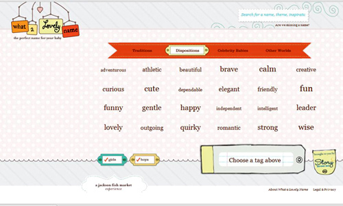
Image: whatalovelyname
Use the right text alignment. You should see to it that the readers can read it well and will not feel uncomfortable with your manner of arranging them. You could justify your text if you want or use left or right flushed alignment. Some people use centered text. But sometimes, centered text is hard to read. Since most people read from left to right, then flush your letters to the left.
10. Identifying links.
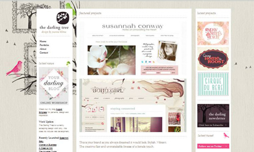
Image: thedarlingtree
For sure, there are links in your website. You need to make it clear to the readers if what you are presenting is a link or not. Usually, links have different colors and are underlined. Do not do this for the rest of the text so that it is easier to identify a link. This will help the readers avoid confusion.
11. Use safe fonts.
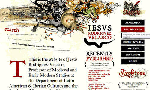
Image: jrvelasco
When using typography in the internet or in your web site you have to make sure that the font is safe. When we say safe, it means that the text can be read and will show up no matter what internet browser you are using. It would be pointless to use a beautiful text if it is not in the system of the reader. You have to be sure that the text can be read online by anyone. That is why most designers opt to use safer fonts.
Sometimes, when you are totally engrossed with the designing, you will sometimes overlook typography and even the text used in the website. Spend some time checking the text to make sure there are no mistakes. For sure you’ll have time to work on the typography for the website’s name which could have a totally great impact to the website. When used well, typography looks great even without the images and striking colors.


Thanks for the idea you’d shared here!
now i know 😛 keep posting article like this. cheers.
Loved to read this article, really make sense good job Kareen
Thumbs up for for you guys..
Kareen,
Liked the article but not mentioning @font-face and other replacement techniques in an article about typography on the web, especially in #11 I believe is a major mistake. In fact, some would argue that properly using CSS techniques such as @font-face will relegate “web-safe” fonts to a legacy consideration. Just a thought on an otherwise interesting article, although maybe a few CSS examples thrown in to illustrate your points might be nice.
Trevor
hei thanks for sharing..
i’m the process of learning of typography..this will help me a lot..
i want to create a superb design using typography 🙂
Hi Kareen
it’s the best info.. i had now a days.
Thanks for sharing great typography.
Keep it Up!
Very interesting article Kareen! ^_^