There are so many ways to design a website which is the reason why every website is unique from each other. Some uses creative elements like ribbons, banners, circles and others. Some uses distinct layouts like grids, minimal layouts, magazine layouts and others. Some has colorful web designs, monochromatic designs or black and white designs. Some uses different website backgrounds to enhance the appeal of their websites. Website backgrounds also come in various types like textures, patterns and even big pictures.
Big pictures when used as a background for your website can bring your site into a higher level of beauty. With the right choice of image, it can surely make your site distinct and impressive. For today’s post, we will give you the reasons why you could use big pictures as website backgrounds.
1. Add more visual aesthetics.
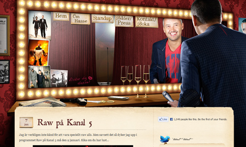
Image: Bronten
When it comes to websites, the appearance really matters for most people would consider the look first before anything else. It is the site’s design that first comes to the eyes of the visitors that is why it is very important. Using big pictures in websites can add more appeal to the site. May it be colored or not, it can still make the still attain a higher level of aesthetics. Just be sure also that the image you use is of high quality and suits to the website.
2. Gives the message in an instant.
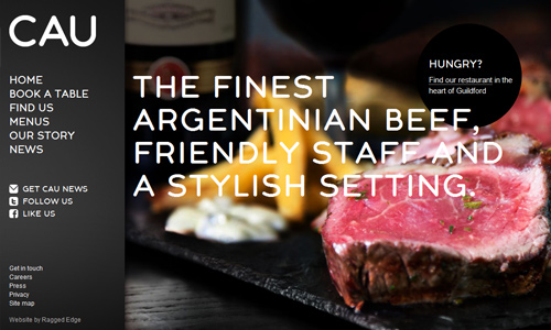
Image: Cau Restaurants
It would be a great advantage to you for you can immediately deliver the message you want. Since big pictures can be seen at once, it would be the first thing that they can see. Because of this, you will find it easy to give a message to them even if they haven’t read the text yet. The image you use should perfectly show the readers the information you want to convey. So, be smart in choosing the picture.
3. Tells what the site is about.

Image: Cenwood Kitchens
Aside from giving an instant message, big pictures can also tell the visitors what the website is about. If it talks about animals, a huge picture of an animal can be seen. There would be a different picture if the site is about design, gardens and others. Your picture should be able to tell the audience the kind of blog or website you have. Choose an image that can flawlessly represent the website’s theme and topic.
4. Visual representation of the contents.
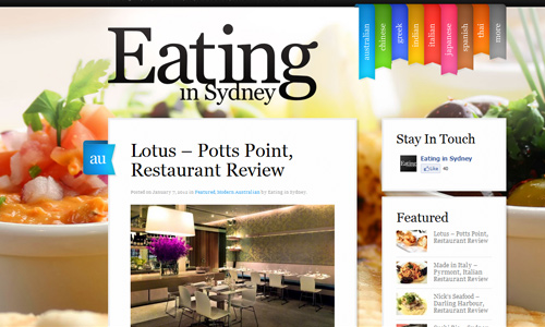
Image: Eating in Sydney
Pictures can also tell what the contents of the site are. Since a picture can send so many messages, it can tell stories that can be seen in your site’s contents. Looking at the image background could give the audience an idea as to what the contents are. They can even decide if they want to continue reading or not. But if you successfully picked the right image that can be intriguing and interesting, then you can persuade your visitors to read your site.
5. Emphasizes important texts.
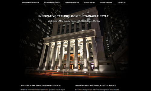
Image: Bently Reserve
Using large pictures as backgrounds can also be advantageous for it can highlight important texts in your site. Of course, in a large background, you can easily see the little things fronting it. This would make it easier for the readers to see words that you want them to read and understand even just for a few seconds. In placing text above a big image, choose a color that would be readable. You can also use strokes or text linings that will make the text visible. Others use transparent backgrounds behind the text.
6. Attracts the readers.

Image: Creative People
When your design is unique, you can no doubt get the attention of the readers. Upon seeing a large image, they would wonder what it is for. So, instead of jumping to other sites at once, they would try to know why such image is used and would read the contents of the site. You are lucky because if they like what they are reading, there is a great chance for them to get back to your site.
7. Makes site look more interesting.
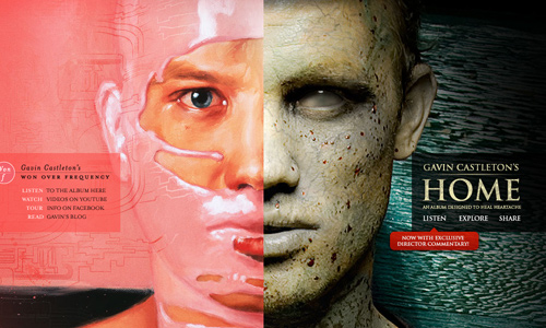
Image: Gavin Castleton
Anyone would like to have an interesting site for it makes the readers curious and would encourage them to read the site. In the same manner, readers would only be attracted to a site when it looks interesting. With that, you will be able to guide your readers into important parts of your site. They will be curious and interested enough to know more about the big picture they are seeing.
8. Allows readers to examine entire site.
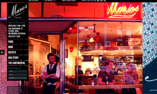
Image: Marios Cafe
Since the background is spread in the entire screen, it allows the reader’s eyes to examine the entire site. It lets them see important parts of the site including navigation buttons that will bring them to more informative pages. It directs the eyes not just to one aspect of the design but to the entire website.
9. Gives room for unique navigation.
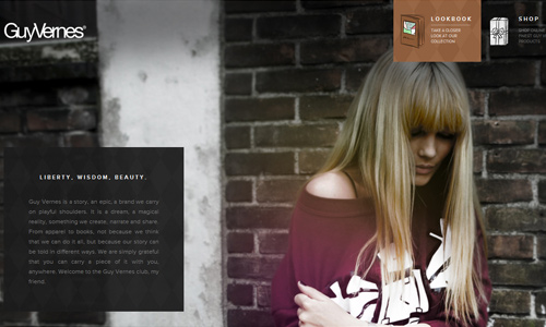
Image: Guy Vernes
The creative use of big pictures as background can allow you to create unique navigation. You can do away with the usual navigation in various creative manners you want.
10. Allows you to showcase your products.
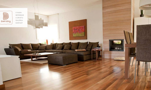
A smart way or promoting products is by using a big picture of it as background. This way, prospect clients can easily see what you are offering and how good it really is. They can have a better view of your product because of the big image.
It’s Your Turn Now
You might not notice the advantages of using big pictures as website backgrounds but it actually gives simple yet big impact to your web design. Have you seen some websites using this kind of design that caught your interest? Would you like to share that site to us? Or have you tried designing one with a large image as background? Feel free to share that to us, too.


[quote]When it comes to websites, the appearance really matters for most people would consider the look first before anything else.[/quote]
This statement is so far from the truth. As a web designer for over 16 years, the one thing I’ve learned is the fancy design doesn’t mean much at all; it’s the ease of use, the ease of purchasing a product or locating information.
I used to be the creative designer all wrapped up in colors and eye candy, but I am now more successful keeping the eyeball fireworks to the very bare minimum. Web design is about information way for than it is about art.
Great Informational Article.. Thanks for Share this 🙂
Large photos are becoming increasingly popular in web design, particularly acting as a background of a website. They can help quickly establish mood, color palette, and easily reflect the meaning and the purpose of a website. However, such photos tend to attract attention and it’s important to have a really great photo in order to use it as a background, but you should remember that very often photos require some tricky photomanipulations. Besides, it’s relatively harder to resize photos based on a user’s browser size, some advanced CSS or, in some cases, Flash, is required to make everything look good
Thanks for the information. I just know about this. I am not that conscious of the website graphics.
It is nice to know the different crucial role of big pictures in designing the website. You really gave me an idea the factors that I need to consider in creating my business website. 🙂
I just got the idea why most of the websites are having large font in their homepage. Now I realize how important it is to be part of the website for it emphasized the website’s goal or mission as well..
LOL I thought big image or letters are only for the billboards I don’t have any thoughts that it can be used to websites, too. Thanks!
Big pictures and big letters are really helpful in giving out the most important part of your homepage yet it gives color and meaning to your website. Thanks for providing an additional input. Break a leg!
More power to you! I am pretty sure that you may exhibit more of your high quality articles and amazing collections of images. 🙂
I agree on that Stephanie. We have the same perceptions on her collections. I feel that you have an artistic heart and researching as well appreciating these work.
Thanks for sharing this! This is cool dude! Please post more! I will share this to my colleagues.
There’s something huge to travel through with the eyes. Big pictures are cool for web backgrounds
Liked and tweeted! thanks for sharing this post
It’s part of saying that when the eyes explore the huge picture, they better understand what these things are all about.
Bigger picture leads to a bigger understanding right at once. 😀
Yeah. I’m on for the 9th! My bro tried this on his personal site. It’s working perfectly so far.
Good round up of sited facts! keep it up
Yes, it really attracts readers. Good job on this post!
The 5th reason is true. as long as the perfect fonts and colors have been used.
This post has been added to my favorites! thanks for the share and more!