Chocolates As we see various types of websites for online portfolios, business and others, there are also websites that are created in order to inform the people what they have to offer like websites for educational institutions. That includes schools from primary levels to graduate schools. There are academies, universities and other institutions where anyone can learn and be trained into a better person equipped with apt knowledge and wisdom in a certain field. Schools are vital part of our society since it is where all of us are being moulded into who we are today and what we will be tomorrow.
Websites for educational institutions also come in various styles and designs. Some may look very creative and artistic but all of them remained professional and inviting for those who are willing to be part of their school. So, today, we will showcase various website designs from educational institutions worldwide. Notice how each one looked both professional and artistic.
Undergrad Biola USA
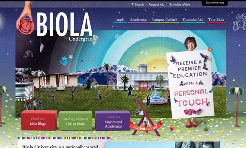
A colorful homepage is used for the site to make it look inviting.
Source
Munich International School
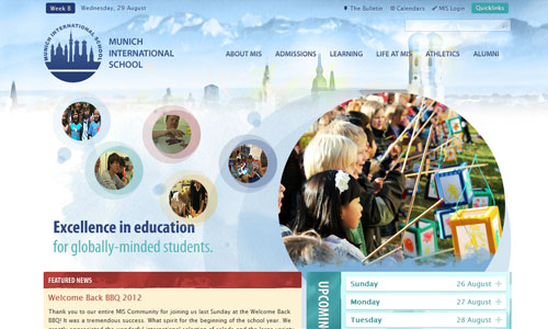
Looking cool with its white and light blue colors and it also looked appealing with its use of circles for the sites elements.
Source
Full Sail University

A school for individuals who are inclined to entertainment, film and other related fields.
Source
Virginia Commonwealth University

Patterns are used as the background of this site of good color combinations.
Source
St. Whites Primary School
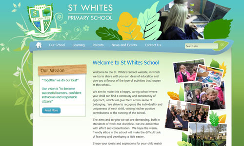
Green and blue shades are seen in this site with leaf design accents.
Source
Maryland Institute College of Arts
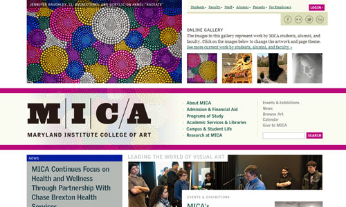
A minimal design is used here with a good layout observing balance and style.
Source
Ash Hill Primary School
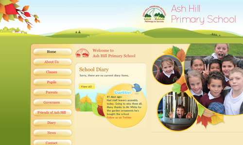
With a childish touch, this site obviously shows that it is for little kid’s learning.
Source
Coker College

Might look plain for you but when you get a glimpse of the site, you’ll get to appreciate its simplicity
Source
Ohio State University
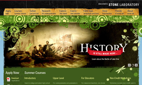
A university that is proud of their rich history and made use of grunge textures to give it a classic look paired wih green retro circles and swirls.
Source
Lipscomb University
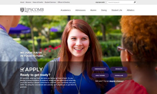
Another university website that has a professional feel.
Source
St. Augustine Academy
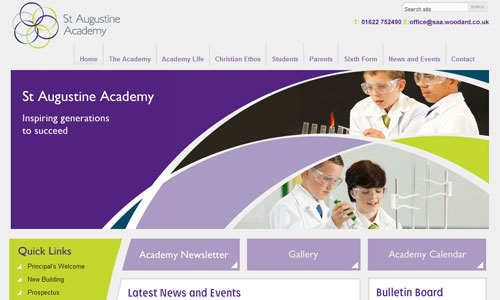
Instead of straight lines, the designer made use of curves and arcs for the layout which looked distinct.
Source
University of Notre Dame
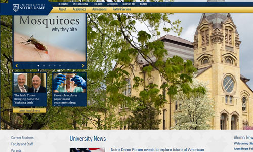
This one gave emphasis to some parts of the school by creating a big slideshow of it.
Source
Washtenaw Community College

Cartoons are seen on its footer adding a different twist to the site’s look.
Source
Unity City Academy
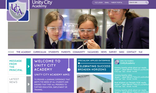
A balanced layout is used for this site with a good mixture of colors.
Source
University of South Dakota

A slideshow of photos is seen on the header to give its viewers a glimpse of what they can offer.
Source
Johns Hopkins University
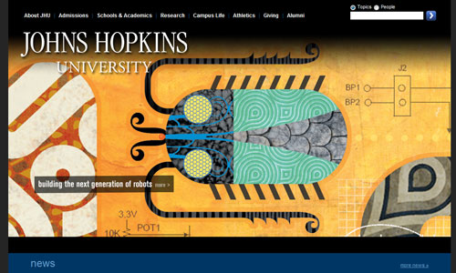
Attractively designed site with apy information regarding their school.
Source
University of North Dakota

Grid-based layout is used here to observe balance combined with good design.
Source
Kent College

Yellow emerged in this design with typography that played a good role for the entire look.
Source
Passaic County Community College
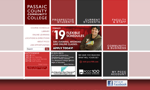
Creative manner of using grid layout with good choice of red and gray shades.
Source
University of Nothingham UK Campus

This one seems is simple with white background and merely used pictures to give life to it.
Source
National University of Singapore

Well categorized contents below the big slideshow of photos are seen in the site’s homepage.
Source
Uxbridge College

Seems like pixels inspired design with good usage of colors and green as the primary color.
Source
Rutgers-The State University of New Jersey

Red and white is used in this website which is the official color of the university.
Source
Tufts University
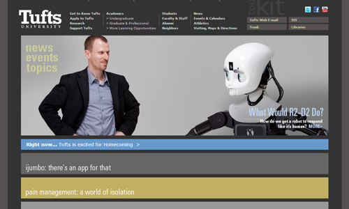
A large image with horizontal rectangles are used to make this site look modern and appealing.
Source
University of Texas Health- Office of Communications

Professional looking website with the use of warm shades making it look even more formal.
Source
Kutztown University
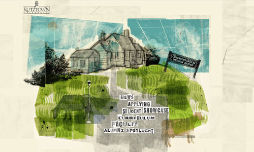
Totally unique as you can see a cartoon on the homepage.
Source
Showcase of Undergraduate Research Excellence

The brush of yellow color makes this one different although the rest of the layout is just simple.
Source
Nebraska Wesleyan University
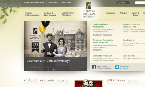
Another site with a simple design and a good balanced layout.
Source
Hampshire College

It is the large photos that make this site look appealing as it used a simple design.
Source
University of Pennsylvania
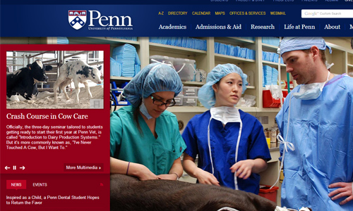
One would certainly be curious on what every photo would like to tell in this site’s homepage.
Source
For sure you have noticed how each one is uniquely designed and how they have successfully showcased what their school can offer. They also managed to appear professional and reliable. If you think you have seen other impressive websites for a school, you can also share that to us. Feel free also to browse other website design inspirations from Naldz Graphics.


Brilliant works!