In designing a website, it involves considering parts that will be displayed to the readers and users. It is also important to have a user experience design to make sure that it can be used by the readers easily. Part of a website is the website archive. Archive refers to past posts and articles in a certain site. This makes it easier for readers to look into your previous posts even if it was posted days, weeks, months, or even years ago. Your readers will benefit a lot from reading your previous posts and you will also benefit from it because they are still reading your article no matter how old it is.
But most the time, the website archive is not really getting too much attention even in the design stage. Try being creative with your archive and successfully attract the attention of the users. This is one of the best manner of promoting archive posts. Also, make sure that it is user-friendly and functional so that you will be able to achieve your goals in giving your users an easy manner of finding topics of their interest. So, today, we will give you helpful tips in designing a functional website archive. Take a look at it:
1. Be creative.
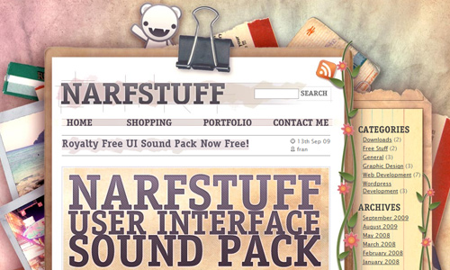
Image: Narfstuff
Do not hesitate to be creative for your archive area whether it is an entire page or just a little portion. You can add graphics if you want to and put anything that would make it look a lot better. Also, see to it that the design of your archive will make it appear one with the entire site.
2. Break it up.

Image: Naldz Graphics
You do not have to place your archive in a single list. You may have recent posts, most popular posts and others. This way, it will look more interesting for the readers and they will also be able to find it easier. This is also a good manner of organizing your archive for people can immediately see what you have at the present and what articles had driven the interest of many readers.
3. Place it in conspicuous areas.
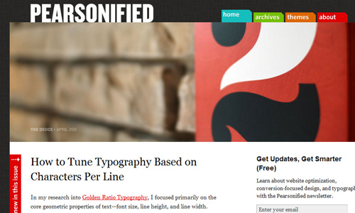
Image: Pearsonified
It would be useless if you have an archive but will not be found by the readers. Be sure that your readers will be able to find it. You can do that by placing a link on conspicuous areas like the header, sidebar or footer. Also, see to it that your archive link will appear that it is really part of the entire site.
4. Clearly define it.
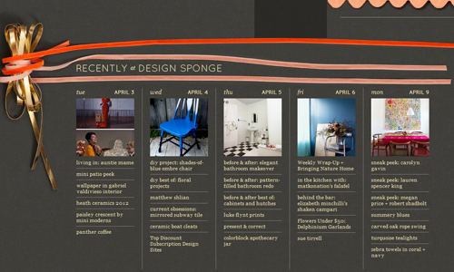
Image: Design Sponge
If you are not using a separate page for your archive, you have to make sure that the users can clearly see that you have an archive in a certain area. If you place it in the sidebar or footer, you can use a different color for it or use a border, a box and other elements in order to clearly define the area. See to it also that it looks distinct from the surrounding contents.
5. Show view options.
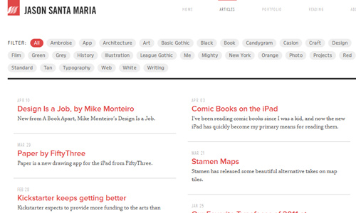
Image: regadenzia
Offer different view options for the readers. You can display only the titles and dates of the articles but you can also let them see an excerpt of the articles. This way, they can find it really comfortable to browse your archive and they will be able to find the topic of their interest much easier.
6. Use an entire page.
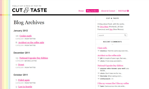
Image: Cut and Taste
If you have enough space, do not hesitate to make use of it. You can use an entire page for your archive. That would make it easy for your users to locate the archive page. You will also be able to place enough items in it. You can even add some great designs if you want to.
7. Create categories.
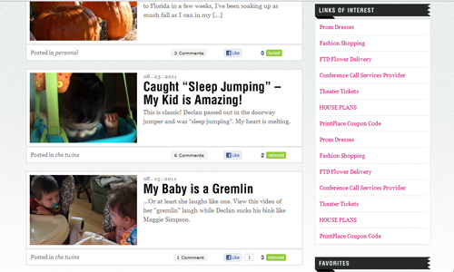
It would be very convenient for the readers if your archive is well- categorized. This way, they will be able to find what they are looking for much easier. Categories should state clear headings so that they can surely find the right thing that fits their interest. Be sure that you will not mess-up with the distribution of articles so that you will not confuse the readers. You can also use tag-based archive especially if your website it already big.
8. Make it date-based.
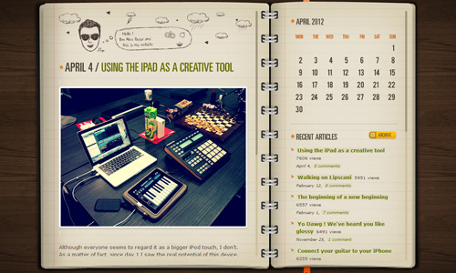
Image: Alex Buga
Date-based archiving is also effective especially for personal blogs. You can place it in the sidebar, on a separate page or you can have it in your footer. Look for a good design for your date-based archive so that it can also look attractive and not boring for the readers.
9. Combine categories.
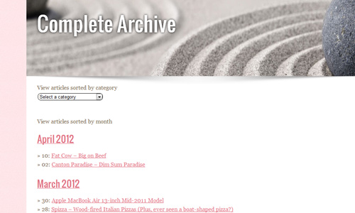
Image: Sparklette
You may also combine tag-based, date-based and topic-based categories. This way, you are offering a lot of choices for the readers. Doing this can help them find what they are looking for and they will also be able to filter well the articles they want with the different manner of archiving you have.
10. Avoid showing all the contents.
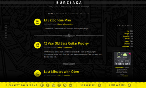
Image: Ismael Burciaga
It would take up a lot of space if you place all the contents. Just place the title or a small excerpt of the article. You can make use of two to three sentences for the excerpt. This way, your archive will look more organized and clean. It will also be a lot easier to navigate and search the archive.
11. Be unique.
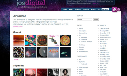
You can also be unique with your archive list. Some websites make use of images in order to show what they have posted in the past. It is also a smart manner of displaying archives for one will surely be attracted to it and will also be interested and curios on what a certain image can show.
It’s Your Turn Now
A website archive can certainly be helpful for your readers to efficiently find the information they need. It would also be an effective manner of drawing the readers into your website. Would you like to share to us your website archive designs? Or do you want to add some tips to what we have above? It is now your turn to speak up. Feel free to leave a comment below.


Creativity is the most important key for the designer. Most designs are simple but they are unique and creative to catch the people attractions.
Very goog post, useful for all that have a website!
Roberto Maldonado C.
ojoandroid.com