Logos are indeed important for a company’s identity and branding. It is one of the major things that the market usually looks into in order to remember and easily recognize their company. But logos do not just function like that. It seems like the heart of a company’s identity. There are always great stories behind these logos and how they went up with the success of a company.
Logos also speak of a company’s rich history. It can tell how the company climbed mountains to reach the peak of success. Every logo has a story to tell. Let us see the stories of ten famous companies whose logo have undergone different changes. Take a peep at their logo’s evolution through time.
1. Apple
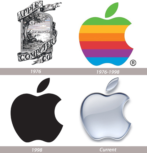
With the genius minds of Steve Jobs, Steve Wozniak and Ronald Wayne, Apple begun in 1976 to sell their hand built computer Apple I that was rejected by HP. On the same year, Jobs and Wayne designed the first Apple logo showing Isaac Newton with an apple dangling on a tree above his head. The inscription “Newton … A Mind Forever Voyaging Through Strange Seas of Thought … Alone” was written around it since Apple is a tribute to Newton who discovered gravity through an apple. They then hired Rob Janoff to create a simpler logo for them. The result of Janoff’s work is the Rainbow Apple used until 1998. It is said that the logo is rainbow colored to manifest their first success through Apple II, a computer with colored graphics. The bite of the apple helps one identify that it is an apple and not a cherry tomato. The bite also honors Mathematician Alan Turing, the father of computers who committed suicide by eating an apple with cyanide. The bite is also in line with their slogan “Byte into an Apple”. But in 1998, when iMac was launched, the Rainbow Apple was changed to a monochromatic logo since the rainbow colored logo would look silly on an iMac.
Today, the gradient chrome silver design is even more flexible and can be placed in all their products as what Jobs wanted to happen. Although, one of Apple’s pillars has passed away, the company and the logo still remained famous and recognized all over the world.
2. Canon
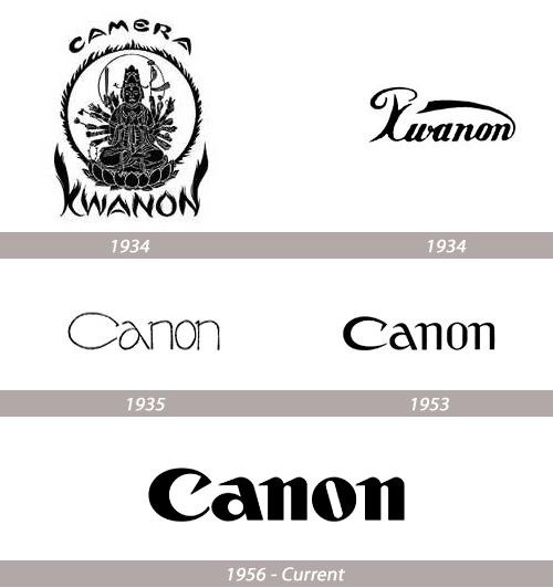
Aiming to make a name worldwide, Canon had its first logo in 1934 as designed by a specialized advertising designer. The first camera they launched was named Kwanon named after the Buddist Goddess of Mercy. That is why the logo shows the Goddess Kwanon with 1000 arms and flames.
As the company strived for a much simpler logo, it used a typeface not seen in Europe or North America with a unique “C” on its top end curved inward, ending in a sharp point. In 1935, the logo was improved and trademarked and as they made the logo look more balanced, another version was made in 1953. And it was in 1955 when the perfected Canon logo was created which we could still see on our favourite cameras today.
3. Pepsi
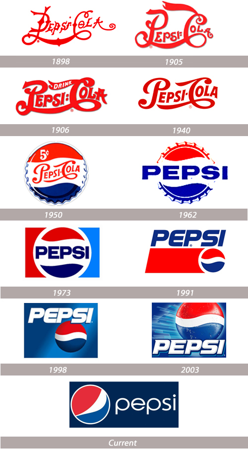
Every soft drinks lover would know Pepsi Cola which was founded by Caleb Bradham in the 1890s. It was first named as Brad’s drink and was changed to Pepsi Cola as shown in its first logo in 1898. It was in 1903 when the name was trademarked. Their logo was them improved in 1905 and 1906. The logo had a major breakthrough in 1940. In support of the USA during World War II, they used a crown in line with the new bottle design of the product, designed with red and blue swirls showing patriotism.
In 1950 and 1962, the crown was retained but as it got more popular, Pepsi Globe was used in 1973 instead of the crown. The typeface was changed in order to fit in the globe. The Pepsi globe was placed inside a box, too. In 1991, another revision was done as the typeface was moved out of the globe. In 1998, the white background in 1991 was changed to blue with a 3D globe. It was in 2003 when the globe was given more emphasis with a smaller text. But the recent logo of Pepsi has totally done away with the script and retained the Pepsi Globe.
4. IBM
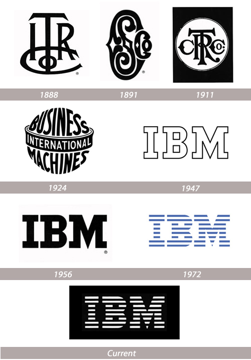
Before, IBM was called International Time Recording Company (ITR) which was patented by Willard Bundy in 1888 where they had their first logo. It was the revised in 1891 but was then again revised in 1911 when ITR merged with Computing-Tabulating-Recording Company.
In 1924, it was named International Business Machines Corporation which can be seen in the logo. It was in 1947 when they used IBM as their logo using the Beton Bold typeface. When Thomas J. Watson, Sr. died in 1956, Tom Watson, Jr. took over as CEO and changed the logo. In 1972, Paul Rand designed the logo with stripes. Since it is already well known, only little changes were done to the logo. Stripes were retained and placed inside a black rectangle.
5. Starbucks
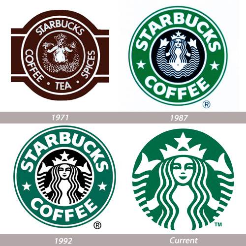
Known for its delicious coffee, Starbucks also had a rich history for their logo which looks quite intriguing for those who doesn’t know the reasons why a coffee company would use a crowned mermaid in its logo. The first logo was based on a classic 15th century Norse woodcut of a mystical siren. This inspired the logo where the crowned siren was seen with revealed breast and long hair. It was then improved in 1987 with a green colored logo and the breasts were covered by its hair. In 1992, it was further improved wherein the navel of the siren was also obscured.
This year, as they celebrated 40 years in the business, they used a different logo retaining only the mermaid. The present design focuses in the warm and inviting face of the mermaid which is a symbolism that tends to attract people to take a cup of their delicious coffee.
6. Microsoft
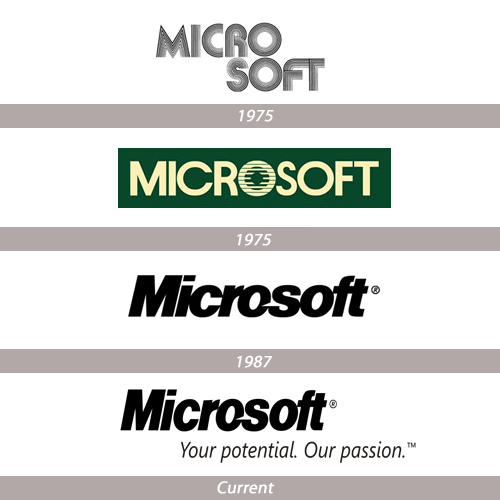
The journey of Microsoft begun in 1975 when Bill Gates and Paul Allen coded BASIC, the first computer language. It was first named as Micro-Soft as seen in the logo and changed it in the same year by dropping the hyphen. The logo has a unique letter O which they call as “Blibbet”. They even have a Blibbet Burger in the Microsoft cafeteria that time.
In 1987, a new logo was designed by Scott Baker despite the campaigns to “Save the Blibbet”. The new logo was known as “the Pacman logo” as resembled by the cut in the letter O. A tagline was integrated in the logo in 1994 that says “Where do you want to go today?” Many disliked it which urged the company to try other taglines like People Ready, Start Something, Making it Easier and others. It was in 2008, it used a tagline “Your potential. Our passion” while retaining the logo. This is the logo that we have known today. And up to this day, Microsoft is just getting bigger and bigger.
7. Coca-cola
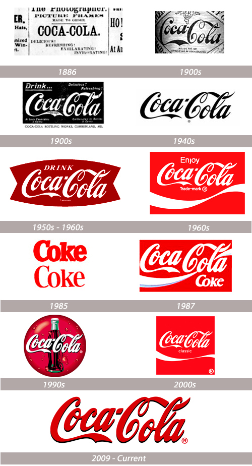
When Coco-cola first served the people in 1886, it used a slab serif and chunky sans serif. It was in 1187 when Frank Robinson, Coca-Cola’s bookkeeper drew the first script logo of the company. For years, the logo undergo different versions until the 1900s and 1940s when a clear interpretation came out. In 1950s and early 1960s, the script logo was placed inside a shape and was named as fishtail logo. In 1960s, the wave was first used. A New Coke was then introduced in 1985 wherein it created a new logo.
The script logo was again used in 1987 in combination with the previous logo. In 1990s, the script was used with a bottle of coke. The wave logo was then used again in the year 200s. In 2009 up to the present, the red script logo is used. Amazingly, the logo that we are using today is similar to the logo it used so many years ago. But no matter how many logo changes they will have, they will remain as one of the biggest and best soft drinks company in the world.
8. Mercedes Benz
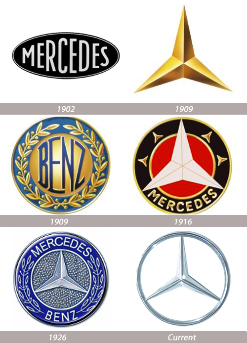
The Mercedes-Benz was formed by the merger of two car companies – DMG (Daimler-Motored-Gesellschaft, founded by Gottlieb Daimler) and Benz & Cie, founded by Karl Benz. These companies merged in 1926 and called it Diamler-Benz.
The logo in 1902 was a mere text saying Mercedes. In 1909, a three pointed star which originated from a postcard by Diamler represents making vehicles in land, water and sky. In 1926, the original logo of the two companies was combined. This results into a three pointed star with laurel wreath from Benz. In 1934, the current logo was chosen during the first Grand Prix at the Nürburgring when one of their cars exceeded the eligible weight of 750 kilograms. So, the officials polished the white paint back to its silver color which is the reason why the car was named “silver arrow”. Since then, the three point star and a ring was colored silver.
9. BMW
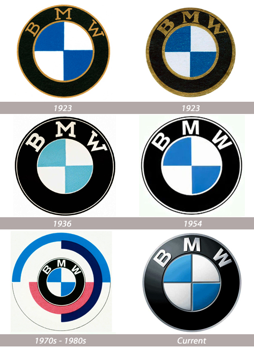
The once aircraft company ended up as one of the well known car manufacturing company. BMW or Bayerishce Motoren Werke AG (Bavarian Motor Works) also used to supply planes during the World War I. After the war, they made railway brakes, motorized bicycles, motorcycles and then cars. The colors white and blue symbol in BMW came from its roots as an airplane company since the pilot’s view through the propeller were alternating segments of blue and white.
As the years passed, it was styled into solid quarters to declare their identity of cars and motorcycles. In 1970, BMW continued its improvement for the logo. Up to this day, the inspiration of the logo is still the airplane’s propeller.
10. Ford
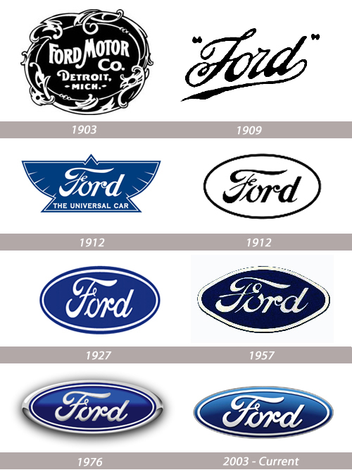
Henry Ford founded Ford and Malcomson, Ltd. In 1902. It was then named as Ford Motor Co. when investors agreed to put money in the company. The said name is seen in the first logo of the company. Borrowed from Childe Harold Wills’ business card, a new logo was created in 1909. A complete makeover was done in 1912 with the text “The Universal Car”.
It was even improved to a much simpler logo in the same year. When the car named Model A was launched in 1927, a blue oval was introduced with the Ford script. They also experimented on the logo with a diamond in 1957. The logo then had its last major improvement in 1976 and used the ellipse again. In 2003, the current logo they are using was launched which was known as Centennial Blue Oval.
Aside from the great designs and the impressive revisions these logos have undergone, it is the stories that perhaps made you smile. It could have amazed you how these companies leaped to victory and how their logo changed in every step. There are still many logos with great logo evolution stories, too. You may also want read about them in here soon.


Canon still rocks!
Well, designers so love Apple! Nice evolution! 🙂
Great article, great to see all the early logos
Typo on the dates for Coke. Too many 1990’s. Interesting post thanks!
Great article, and great archiv for old logos 😉 thankyouu
I wonder what makes Apple’s logo appealing even when it’s not as colorful anymore… Nice