Presentation takes a big part in getting approval from your client. If your client has already liked your design, a little extra effort in presenting the design will help the client make his/her decision. The key here is to help the client to see your design applied on the chosen medias, as if they were already printed out. For an example, a picture of a business card held by our hand looks more appealing than a picture of the flat business card by itself. In this tutorial, we’ll show you how to present your logo design in 5 different ways.
Here’s the example logo was used for this tutorial:

1.Holding Business Card
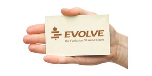
Take a picture of your hand holding a card with your logo design on it. You can always use the same picture for other logos in the future.

Place your logo into the card in Photoshop.
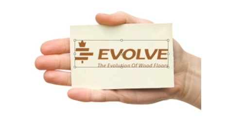
Ctrl+T to distort and skew the logo to fit the perspective of the card and scale the logo into the right size.
2.Contrast Background
Clients need to see that the logo would work on dark background as good as on white background. For dark background, make a 100% black background in Photoshop and copy the logo into another layer.

Use 95% black for the highlight color in radial gradient, set the somewhere near the logo icon as the center.

Use 15% black for the shadow gradient in the logo.

Make a new layer on top of the logo layer. With the elliptical tool, make an ellipse on the logo, where you want the shadow to be. Use the gradient of 50% black from top.
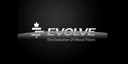
Press Ctrl and click on the logo layer thumbnail to select the logo. Ctrl+Shift+I to select reverse. Click on the shadow layer and press Del or backspace button to delete the area outside of the logo.

Last Step is to make shadow under the logo by right-clicking the logo, choose Blending Options on the menu, Drop Shadow, adjust the distance of the shadow to 2 or 3 px, depends on your size of the file and your preference.
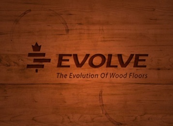
3.Wood Texture Background
Choose a wood texture background you like, smooth texture works better for logo bevel and emboss.

Copy the logo to another layer and fill it with brown color picked from the background.
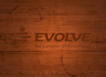
Multiply the logo layer on top of the wood texture layer. The color will look darker like below. Right-click on the logo layer and choose Blending Options, Inner Shadow. You might wonder why I don’t use Bevel and Emboss option there, you can always try it and compare the results. Personally I prefer a manual Bevel and Embossing because the light and shadow would look more real.
Duplicate the logo layer into two different layers. Black on top of white logo layer, move the black logo slightly right and down.

Hold Ctrl and click on the black logo to select its outline. Then click on the white logo layer and delete the selected area, leaving only the white edges. Now choose the layer effect overlay, adjust the position until the lighting looks right.

4.On the Office Building (Sign)
Get a picture of the company building which logo you’re designing. Open it in photoshop, copy the logo into a new layer.
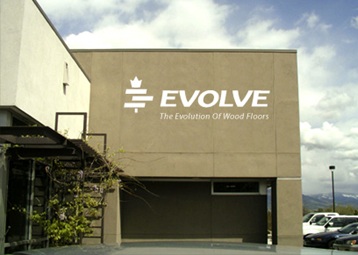
Photo credit: iStockPhoto.
Apply 30% black of gradient to the logo. Add Drop Shadow. And here it goes.

Photo credit : iStockPhoto.
5.Product Background
Choose a picture of the product and set as a background. Apply subtle Outer Glow on the logo to make it stand out from the background.

Photo credit : iStockPhoto
Conclusion
Presenting your logo designs to clients on signage, a business card or even a piece of wood will: 1) show how well it works in ‘the real world’ and 2) make the logo more appealing to your client. Remember, presentation is critical when pitching on freelance logo jobs and logo design contests – it will help you win more work!


Excellent work .. thanks
Very presentable … simply awesome! thanks for this tutorial ..
Good tips for identity projects!
Great tips, thanks for sharing!
Excellent article and great work
Great presentation to make someone impressed..
Great design. I like the different visual implementations of the logo. Great post.
Great ideas. I never thought of presenting logos in this manner.
lol nice – I like the office building trick 😉
Really great. Thanks a lot for sharing..
What a great Idea, I will definitely try that one out next time, some times clients don’t appreciate the logo until they can see it practically applied. Awesome idea Elisha Leo. What tips would you give someone wanting to improve their logo design skills?
Superb. Thank you for sharing this.
Demos
Wow! Good post. Business card presentation I use everytime. It’s work!
nice tips. tnx for sharing.. 😀
Awesome stuff, thanks.
Great tips! Would definitely try these out.
The extra effort probably can go a long way
Good idea on helping clients to visualize how the logo looks in the real world. Will definately try that out next time. Thanks for sharing.
Wooow, that’s alot of info right there…
Thanks alot…
wonderful and informative article and useful examples
This was totally not what I was expecting when I followed a tweet here. I was expecting to read about the pitch and a process to presenting concepts (verbally, not visually)
While this may get a client buy-in, in my opinion, it puts focus on the wrong things..Maybe I’m way off base.
My main goal is to get the client to look at the concepts as a solution to their needs and not with emotion. For my first review I present concepts ONLY in high contrast BW and I show them in 2 sizes — one that’s large on the page/screen and one that is minuscule. BW because people most always have some type of emotional response to color. The variation is size because logos get reproduced in so many formats and almost any size.
very impresssive…….. thanx “)
What a great presentation tips ! wow ! thanks Elisha Leo !
Very nice and helpful – thanks putting this out there.
Great ideas, however I would keep the background distraction to a minimum since it is the logo that you want to focus on.
this will be a really good idea to show logo to my client.. thanks for nice tips…
Good post, useful, relevant and fresh. Subscribed.
very informative !
great tips 🙂