Usually, most sites share the same set-up… In terms of scrolling down, that is.. Most often, they are browsed through vertically. We came across a couple of sites that presents a different type of browsing experience for their readers. Amazingly, the result is more creative and unique. As a reader, you may find it more entertaining than the usual browsing. Take a look at this collection that we have came up for you…
40+ Examples of Horizontal Scrolling Websites is compiled below for you to check out. Witness the unique settings the owner has came up with. If you are planning to create your own site, then you may get useful ideas with this awesome collection. Feel free to visit these sites…Who knows, you may pick a tip or two.
Publicidade Viva
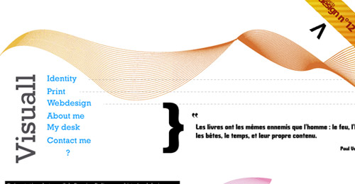
Visuall
A Waste-less Journey
Ctrl+N
The Horizontal Way
Carrot Creative
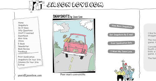
Jason Love
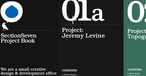
Section Seven
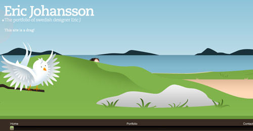
Eric Johansson
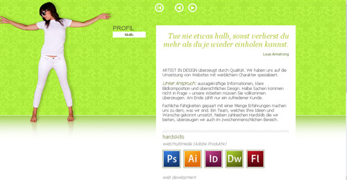
Art in Design
Ladio
Front End
Tinkainteractive

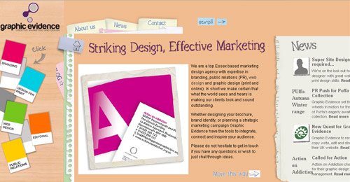
Graphic Evidence
Charlie Gentle
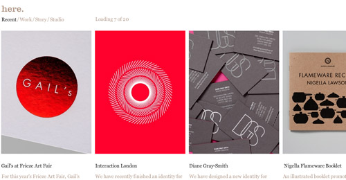
Here Design
Suie Paparude
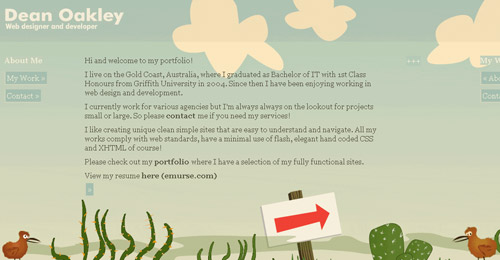
Richard Arran
Eolo Perfido

Bia Costa

The Perfect Jodi
We Shoot Bottles
Les Hautes Mynes
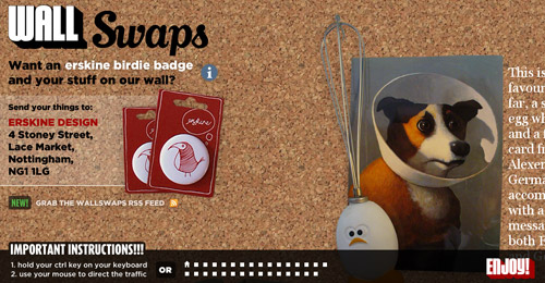
Wall Swaps
Gavin Castle
Gelisiguzel
C.L. Holloway

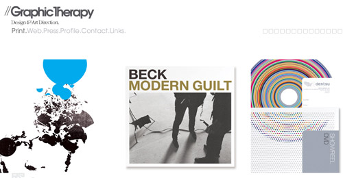
Graphic Therapy





























The thing is, making one of these websites is difficult. In css there is no height=100% (only width=100%).
Great Article! Check it out!
@Neddy
Making these sites are very challenging. The thing that I have ran into when creating them is to have only one thing show up on the “active” window. Also, it’s interesting to try to get these to work across multiple resolutions. I would like to see a few tutorials on how to get around these hurdles. Also, my concern with horizontal sites, is that the “standard” user will get intimidated by them, I created one and had some “not-so tech savvy” people use it and they didn’t really know what to do and when the JQUERY slid the page they were in a bit of shock. I do think that these sites are very, very cool and definitely bring a whole new area of the web world to web designers.
You should add The Lens blog from The New York Times to the list http://lens.blogs.nytimes.com/
Another great post!
Those are really beautiful! Personally I’ve always been iffy about horizontal layouts since they make assumptions of the visitor’s browser resolution most of the time. Too high and they get a scroll bar, too low, and the layout looks silly :/
Regardless of the quality of design, i find the horizontal scrolling harder to use. It makes me dizzy, and the scrolling down gesture just feels more natural.
ericj is amazing
Here is the same portfolio with horizontal scrolling (they show a lot of the same work but are implemented on different web sites.
I Like those designs
I remember trying this when I first got into design. I like the sites that kinda just zip you along without having to scroll too much..
Nice article.
Nice with the new idea. 🙂
amazing stuff !
Great list.
Like those designs, realy look difierent comparing to other sites
This new idea is really cool and different.. Really inspiring for the web designers.. Thanks for the share.. 🙂
Cool..Thanks for share. May I know the tutorial how to make it.
How ’bout IndoFolio.com
Hi ! These are great! Good job
Thank guys for showing my site Publicidade Viva, its a pity that my client did not pay this years hosting, co’s he has gone bankrupt.
Regards and keep the nice posts
TZ
Yaay, I like them !
Horizontal Scrolling Websites: très beau choix, cordialement
after the splash page the horizontal layout is very cool.
here is mine.
melanimodel.com.
made for a beautiful girl
Great list!
superb collection……
very interesting post…loved the work
Any tutorial helping me to create horizontal scrolling one page website ?
Thanks