There are various ways to make a website look captivating and stunning. There are also different design trends in creating them. Since websites are used by many people for their businesses and by others to get information, it is important that the design is appealing. It wouldn’t be nice to be staring for long towards a website that is poorly designed. One thing, once you own a website, you will certainly see to it that it has a professional design and it could achieve your purpose in creating it.
Today, we will give you web design ideas and trends used this year in creating most websites. For sure, most of these could be seen in existing websites and web designers out there are also thinking of using them in their future designs. Come and take a look.
1. Use HTML5 and CSS3.
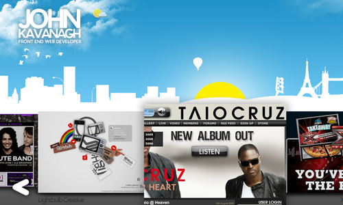
Web designers gain more advantages with HTML5 and CSS3 for easier navigation and it helps them load the site faster. It also makes websites easier to build and link it with social media tools. Of course, to make it more effective, one has to learn to properly use HTML5 and CSS3. Aside from the design, it is very important that your website will really work.
2. Creative usage of typography.
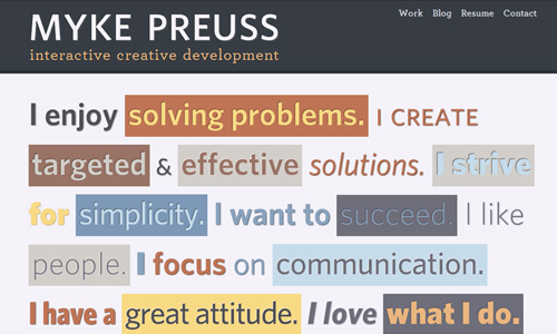
Typography in web design has been widely used. But designs these days do not just use standard fonts but they use customized fonts. It makes the website more readable and attractive. The manner of using type in a creative way is indeed effective for the users can immediately get the message of the site especially if the font used is unique and the color choices are great.
3. Use of 3D effect.

Websites use 3D effects that give emphasis to dimension and depth. It gives captivating outputs and realistic designs. Flash, HTML5 and JavaScript are even used to combine with 3D effects to make it look great.
4. Use of large background image.
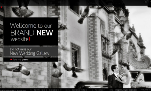
The use of big images is also a trend. These images are captivating and add appeal to the website. Although, it has been used before, it is still used these days with a more modern touch. Websites using this kind of design are also eye-catching especially if you have a great image choice. And you do not place just any kind of image. It should have something to do with the site.
5. Links to social media.
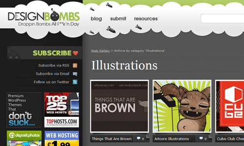
Social media is widely used these days and is even considered as one way of promoting a website. Place social media links in the sidebar, footer or anywhere that can immediately be seen by the readers. This way, other people can share your posts and could also increase the traffic of your website.
6. Single page layout design.
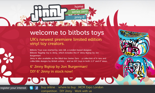
Designers can avoid putting unnecessary pages to a website through a single page layout which is more effective because the visitors can focus on the contents. This is applicable if you really do not have much to tell about you. This also became a trend due to the usage of touchscreens and smartphone apps that allows the use of varying screen sizes.
7. Use of attractive custom illustrations.
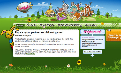
Web design looks stunning when illustrations are used. This makes it unique due to that personal and creative touch. It is also successful in getting the attention of the target audience. Just make sure that the concept of the illustrations fit to the website you are designing. Another advantage to this is that it can be easily remembered by the customers.
8. Use introductions.
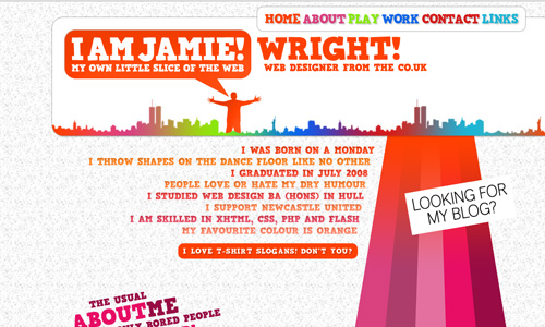
Another way to present a website is by using introductions. This way, the readers can immediately know who you are and what you can do for them. This is usually used for portfolios and blogs owned by an individual who offer some services like designing and others. Using this kind of design will allow the reader to know you even just for a few seconds. Make sure your statements are not so long. It should be brief and straight to the point.
9. Websites for mobile.
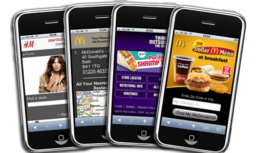
With the release of smart phones, websites also adjusted to it so that people who use their phones to access websites can easily view them. Web designers have created sites that have smaller versions for mobile. This increases the number of users for the website. More traffic gives more revenue.
10. Websites with grid layouts.
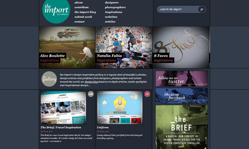
This type of design has been used for long but it is still used up to this date for it is easier to use. This also allows placing more contents in the website. The site also looks organized and you do not have to think on where the next info will come out for they are merely in one line. This is usually used for simple layouts.
These web design ideas and trends have been effective and successful for many different sites. Since there are many manners of designing a website, there might be some trends that we failed to include. Have we missed something? We look forward for your additions in the comment section below.


Thanks for sharing this great ideas.
Like the examples, useful post.
Agree with the good topic, thanks guys!
Bookmarked! Nice list, thanks 🙂
Hay,
that’s a great articel. I like it. I think the points 1, 2 & 5 are very important for this year. Because CSS3 & HTML are the future and typography is very is at this time very important for the image of websites. And 5 will be more important in future, because everyone get smartphones 😉
Luka
Totally agree, I saw a lot of these come to play in 2011 but looks like we’ll be hitting hard that HTML5 and CSS3 in 2012. Thanks for the post!
really agree, with the increasing of internet bandwidth we can use more images to make the design more eye catching, one more my opinion about this year web trend is the use of CSS3 to replacing image in some web design part, like button, navigation, box gradient, text-shadow. etc.
Increase in Internet bandwidth is not an increase of bandwidth to the server where your site is hosted.
CSS3 gradients are a great addition to designers that have site build quality in mind, to ignore page load times and Google’s push on server and site configuration is foolish. Even if you are one hundred percent design orientated, your designs have to be scalable and optimisable for the web.