With the trend of using the internet to convey information to millions of people worldwide, it also becomes a challenge on how you can effectively communicate to the people with your contents. Making one’s content eye-catching and easy to understand is not an easy task. You need to dig deeper into a topic and look for ways to present it in a manner that you could outshine your competitors. It is not just you who have thought of writing or presenting a particular topic. There are thousands of people who are also posting the same. The challenge is for you to make it unique and more attractive. This is where infographics come in. Infographics are visual representations of information, data or knowledge. It is an important tool in teaching, in business, in giving inspiration and in presenting information. It is one of the most powerful ways to communicate with complex data.
But some people haven’t really realized how beneficial infographics are thinking that they can work on good data presentation with mere graphs and charts. Some are even confused if graphs, charts and infographics are just the same. Of course, they are different. Infographics may contain graphs to present some figures. Now, let us take a look on the ten reasons we have listed here that makes infographics important.
1. It makes info more appealing.
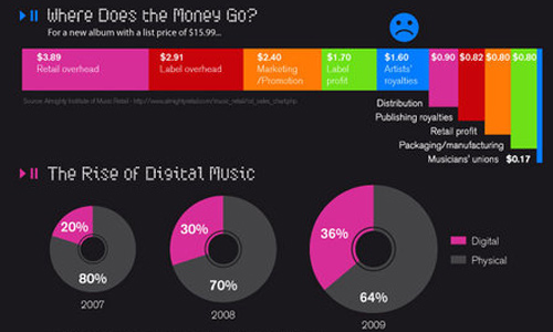
Image: curseofthemoon
It is not an ordinary bar chart or flow chart but is more of a union of creative designs and vital information. With infographics, information is presented with more appeal which makes it more effective than mere words and text. The creative use of colors, lines, and shapes makes it unique. Every infographic is different from another infographic because each one is made with a different design. You can easily distinguish one from the others.
2. It shows valuable ideas.

Image: cwaddell
Infographics are not mere works of art but there is more to that. The information it tries to deliver to the people are more vital than the colors that you see in it. You could be impressed by how it is being presented but you will actually be more impressed by the kind of information you will get from it. For surel, after reading it and understanding it, you will be thankful that infographics was conceptualized.
3. It is attention-grabbing.
Image: adheeslev
With its appealing designs, your attention will really be caught by these. Also, you would be curious as to what are those lines, charts and graphs for. There could even be images in it that will immediately make you turn your head towards it. Once you see it in your computer screens or printed on paper, you will surely take a look at it and without knowing it, you have learned something very important for just a little time.
4. It is easier to understand.
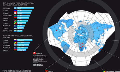
Image: jaypachi
Since information is simplified, you will find it easier to understand infographics. If you are glad that data is well presented in graphs and charts, you will surely be happier to see them in a well-designed image. Everything you would ask for is already in one image. You won’t have to break your brains trying to understand long pages of data and numbers because you can easily get the idea with a single glance at an infographic.
5. It lessens boredom.
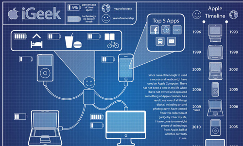
Image: new-moon-night
Complex information will certainly bore you. Who would spend a lot of time reading pages of info? Who would spend a lot of time understanding complicated facts and figures? Well, some would still do that but most people won’t. It seems like a waste of time when you can actually get info in a simpler manner through infographics. Do away with those boring presentations for they can be given life now.
6. It awakens one’s interest.
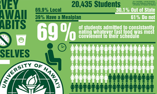
Image: gabrielyanagihara
Even those who are oblivious of important facts will have that interest to look at infographics. Its design will fascinate everyone even those who do not have interest in that information. No doubt, it is indeed an effective manner of presenting facts.
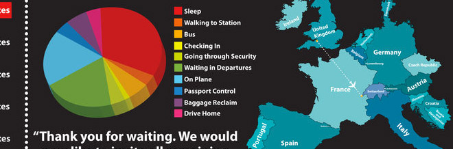
7. It is accessible.
Image: shutterstock
Since the internet is available for everyone, you can easily see infographics. If you look for it using search engines, you will still get it using searches for web and images. Whatever you use, you will get what you want. It can also be printed on paper and still successfully convey information. Anyone can see it and have a grasps of it.
8. It is more persuasive.
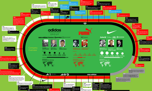
Image: thwallochi
Due to its unique way of presenting information and its clear manner of arrangement, it can easily persuade the readers. It is more convincing and influencing. The readers would less likely doubt the data they are seeing. Of course, no one would waste effort in designing such a great infographic to merely lie about information.
9. It is memorable.

Image: the charles
The use of bright colors, graphs and shapes makes it easy for infographics to be remembered by the people. Remember that images are easier to commit in one’s memory. That is why television advertisements are effective because of the use of visual presentation. Infographics give a similar effect.
10. It can easily relay info.
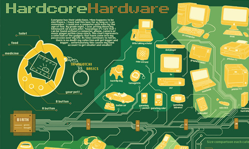
Image: r-idz
The clear data representation can relay information well. There would be lesser misinterpretations in using infographics because of the good presentation of facts and figures. These things are oftentimes misleading but infographics can get you straight to the point.
Infographics are indeed important. That is why designers see to it that they create infographics really well without causing misinterpretations. They also make sure that their choice of colors and shapes are appropriate for a particular fact. Well, it really takes to be creative and smart in order to come up with an effective infographic.


This has really confused me in the past. Thanks for this post Marvi!
A great blog, i’ll spread the word.
Hi Marvi
I would like to comment on the use of Adidas vs Nike vs Puma timeline – it is credited to thwallochi. However that is a graphic that I created while working for MeetTheBoss.tv. The original post has been removed from that site now, however I can share original sketches and development for that graphic.
Thank you.
Thanks for this informative post
There are so many ways to become competitive. Thank you for the post
Very very informative. Thanks for sharing 🙂
We hope to see more of this in the future blogs. Thanks
You guys here are a genius!
great ideas. thank you guys
I can attest to the number 9. 🙂