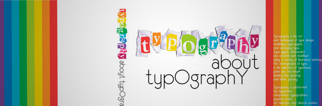
In designing, you will surely use typography for it is an important element of design. Whatever you are working on, may it be for graphic design or web design, type plays a vital role. It is used in order to say something and to convey information to the target audience. Since it is a design element, typography font also has their own elements that make each one unique and appealing. Typography font design elements are added beauty to your works as they serve as communication tools to the audience. Due to the variation of typography font, some designers find it hard to choose the right font and typeface for their design.
After you have studied and known the basic things about typography, you may come up with the dilemma of choosing your font. Some can achieve good use of type merely by looking at what other designers are using. But isn’t it better to know how you can choose the ones that are appropriate for your design? Today, we will give you tips on how to choose the right typography font for your designs. May this be a great help to you.
1. Know your design concept.
Image: 32-d3519n
It is important to know this first before anything else. If you are designing a wedding invitation, then you will use fonts for weddings that are usually stylish and uses curves. If you are designing a business card for a cartoonist, then you can use a font that suits a cartoonist’s style. Do not just immediately use a font just because it looks good for you. Try to look into the concept of the design. If it is masculine, then use masculine font, so on and so forth.
2. Know your goal.
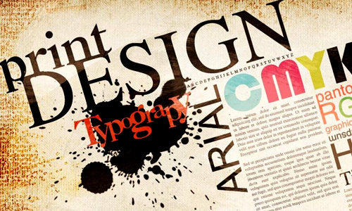
Image: kniemeyer80
You would need to know what your client wants the audience to see when they see the design. Most of the time, it is the client that tells you how they want their audience to react. You can look for a font style or a typeface that can give you this impact to the audience. With this in mind, you will surely be able to get the right font you need.
3. The visual aesthetics.
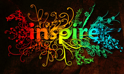
Image: firetongue8
Of course, you would consider this in choosing a font. You will not use a font style that doesn’t look good in your design. As you look into the beauty of a font, try making sure also that it is apt for your goal. Also, see to it that the different font styles you will use will work well together.
4. Consider the mood of the type.
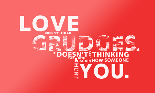
Image: american18076
Every type has different moods. There are those that look creepy while some look romantic. You can also evoke different emotions to those reading it. Some can even make their readers panic while others can make them feel calm. There are varying emotional responses from every font. So, you have to see to it that you have used the right one.
5. Create your typography hierarchy.
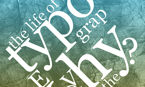
Image: emindeath
Typographic hierarchy refers to the different levels of importance your design choices use to the information you’re trying to relay. You may have different font for your heading, sub-heading, body, call-outs and others. Choose the fonts and typefaces that work well together. Be sure that the audience will be able to identify which one is the body, heading, and others. You can achieve this by using varying sizes and contrasting typefaces.
6. The space available for type.
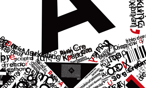
Image: batucy
You also need to consider the space you will need to fill in your text because every kind of type occupies a different amount of space. You can achieve the right one by comparing which one takes up more spaces in the design. It now depends on you if you want it to use more spaces or fewer spaces.
7. The legibility of the type.
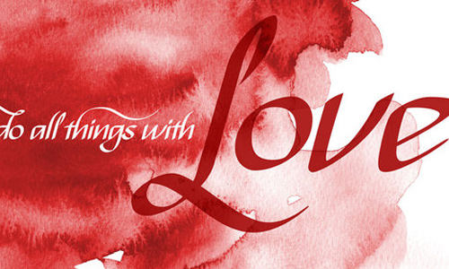
Image: Jackson Alves
See to it that the typeface you have chosen is legible. If not, then it is not the one you need. Legibility and readability is different because legible refers to font’s design element. You can attain a legible type by using ample spaces in between and by choosing simpler font styles for long reads. Decorative fonts can be used for shorter texts but when you are having more words, use the simpler ones so that it can be legible.
8. Choose your type category.
Image: vanderh7
There are different font type categories that you can choose from. It could be Sans Serif, Decorative, Modern, Slab Serif, Script and many others. Determine which category suit to your design. Make sure that these can deliver the message you intend to convey to the audience.
9. The readability of the type.
It would be useless to use a typography font that is beautiful but not readable. When we talk about readability, it refers to the combination of the impact of all the elements in your font. You can say that it is successful when one is not finding it hard to read the words and can easily understand it in first glance. You can achieve readability by using the right colors, having apt tracking, leading, spacing and alignment.
10. Use limited typography fonts.
Image: mohd90k
Do not make it look like a circus of fonts. Limit the font styles you will use. This way, your design will look simple but readable, legible and easy to the eyes. You can actually use those font styles that you usually use for your projects. This way, you know that it will really work for you had been using it for a lot of times.
11. Experiment creatively.
Image: tbubicans
Nothing is wrong if you use different typography fonts together and experiment which ones will be the right one. You can pick those that appeals to you and could give the right design intent of the project. It would be fun experimenting and you will also be able to discover new fonts that you will love.
12. Look at other’s work.

Image: ankayama
Try looking for inspiration and ideas from the finished work of other designers. You can look at what font styles and typefaces they are using. It can serve as reference for you. You will be able to determine if it looked good that way or not.
It’s Your Turn Now
There are different ways on how you could choose the right typography font for your design. When you have chosen, make sure that they look good together and would convey the message and intent that you want. Can you tell us how you choose your fonts for your designs?


