Every artists and designers are aware that colors play a crucial role in the outcome of the design and how its audience will perceive it.
As every single shade of color carries a different feel, representation, and impact to people, it is very important to be wise in choosing the right color that will fit the nature or theme of the design.
In speaking about web designing, there have been different styles and experimentations that have been used by designers in an aim to crate a website that is visually attractive and reader-friendly as well.
Some incorporate different colors in their website in an attempt to entice attention, while some invest in a specific shades of a color for various reasons, either to maintain simplicity and easy viewing or suggest a specific feeling and emotion to its audience.
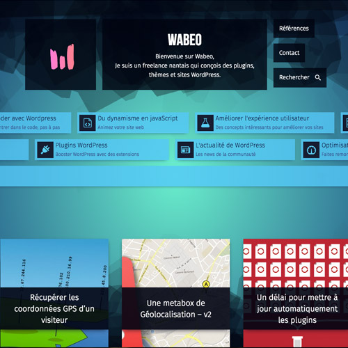
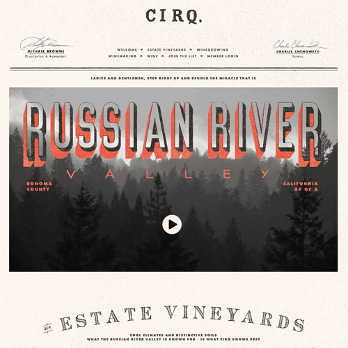
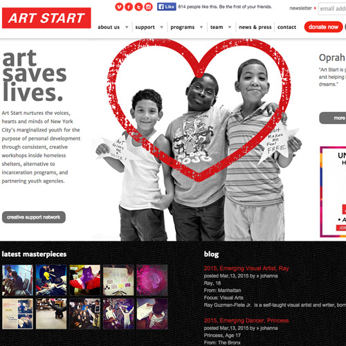
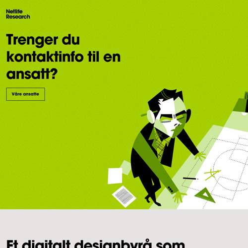
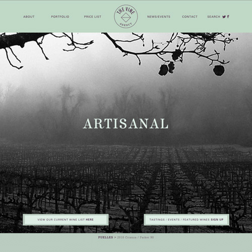
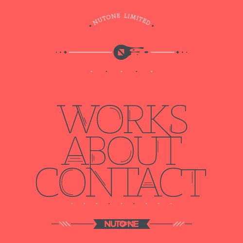
A website with a design one major color or shades of one color is called a monochromatic website.
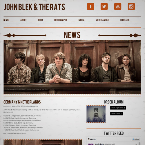
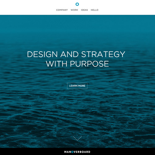
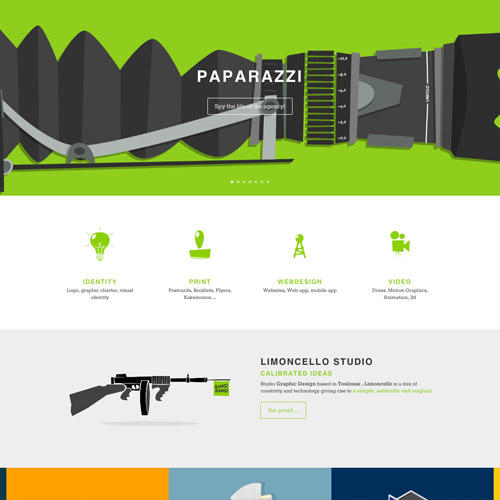
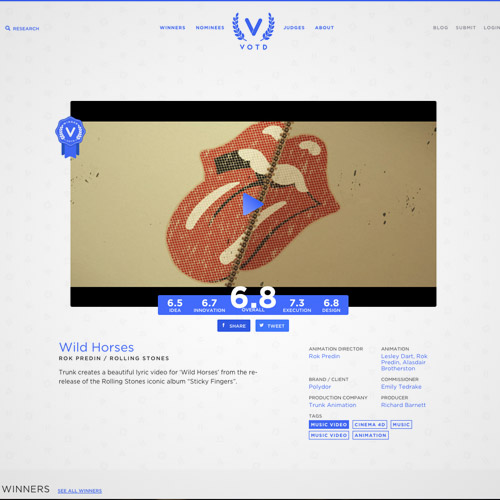
In this post, we have the beautiful examples of Monochromatic Website Designs that you can check out below. Scroll down and maybe get some fresh ideas and inspirations for your own work. Come, take a peek, and enjoy the designs!
Paralotna

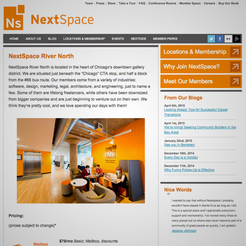
Next Space
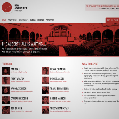
New Adventures in Web Design Conference
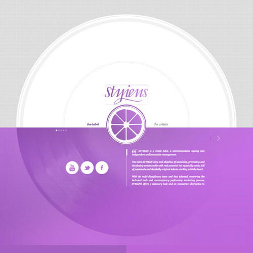
Styiens
