Annual report brochures are one of the helpful informational materials that shareholders and other people who are interested in the company’s development can go to for references. This specific type of brochure consists of contents that not only tell the background of the company, but also present a comprehensive report about the company’s activities, alongside with its growth and performances.
Aside from being an informative medium, these brochures can also serve as materials for promotional purposes. One reason for this is that they are usually given away to people who want to look deeper into the company. Hence, it can reach out to them and help them gain more confidence and understanding about the company. But for this to work, these brochures need to have an attractive and stimulating design in order for it to entice the approval of its readers as well as efficiently deliver to them the message these brochures are meant to convey.
If you are looking for ideas in creating your own brochure designs, or you are a designer who has a client project that involves annual report brochure designs and is looking for some examples, then you are in the right place. This post is all about a showcase of Annual Report Brochure Designs that are compiled together to help you gain more ideas that can engage your Imagination, and give you some inspiration that you need to push through with your design. Scroll down and check them all out below. Come, take a peek, and enjoy your browse!
Annual Report Series 1
Here we have our first example of the collection. It demonstrates a professional and corporate design with an easy-to-understand infographics for the numbers and values of your report. This is fit for any corporate companies that look for a clean and informative annual report.

Annual Report Brochure Indesign Template
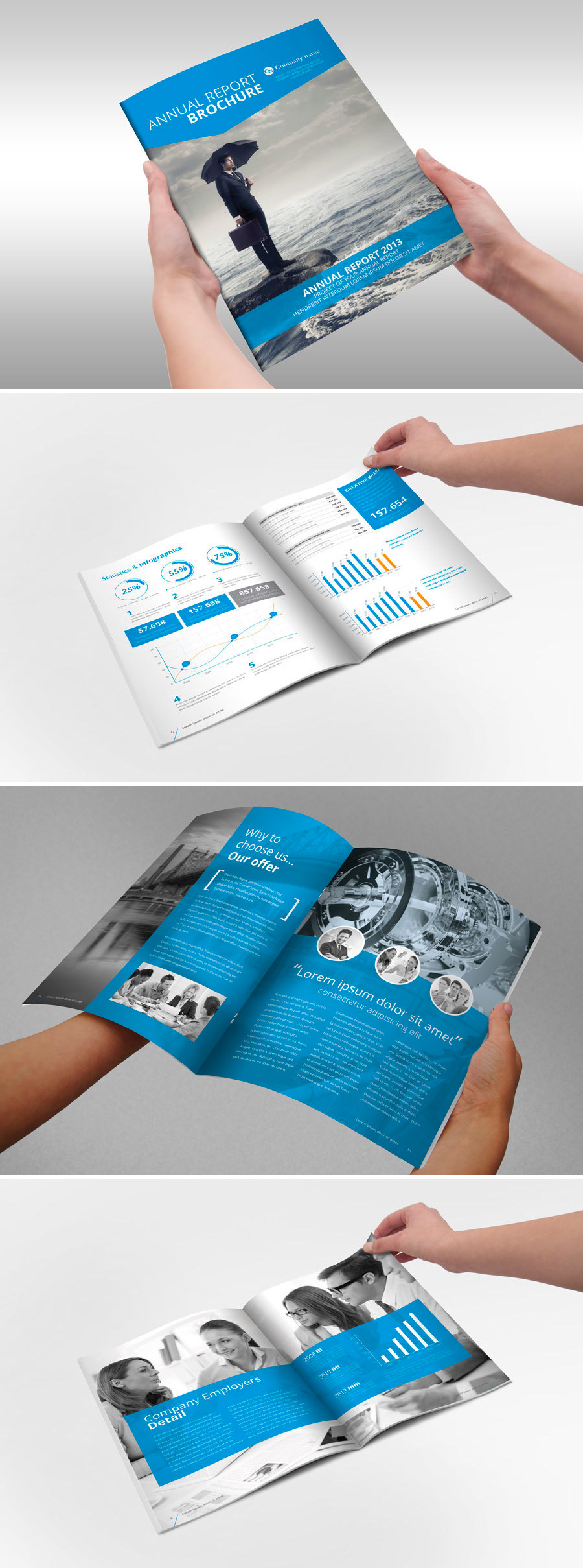
This next brochure has a nice blue-themed design that uses images to portray a proficient look for corporate companies, as well as charts & figures that represent the details of the reports; all in one brochure design.
Simple Annual Report Template
Here we have another nicely done brochure design that incorporates colored pictures and use them in both background and foreground. It also has charts, figures, and timelines that show the performance details of the company.

Indesign Brochure Square Design
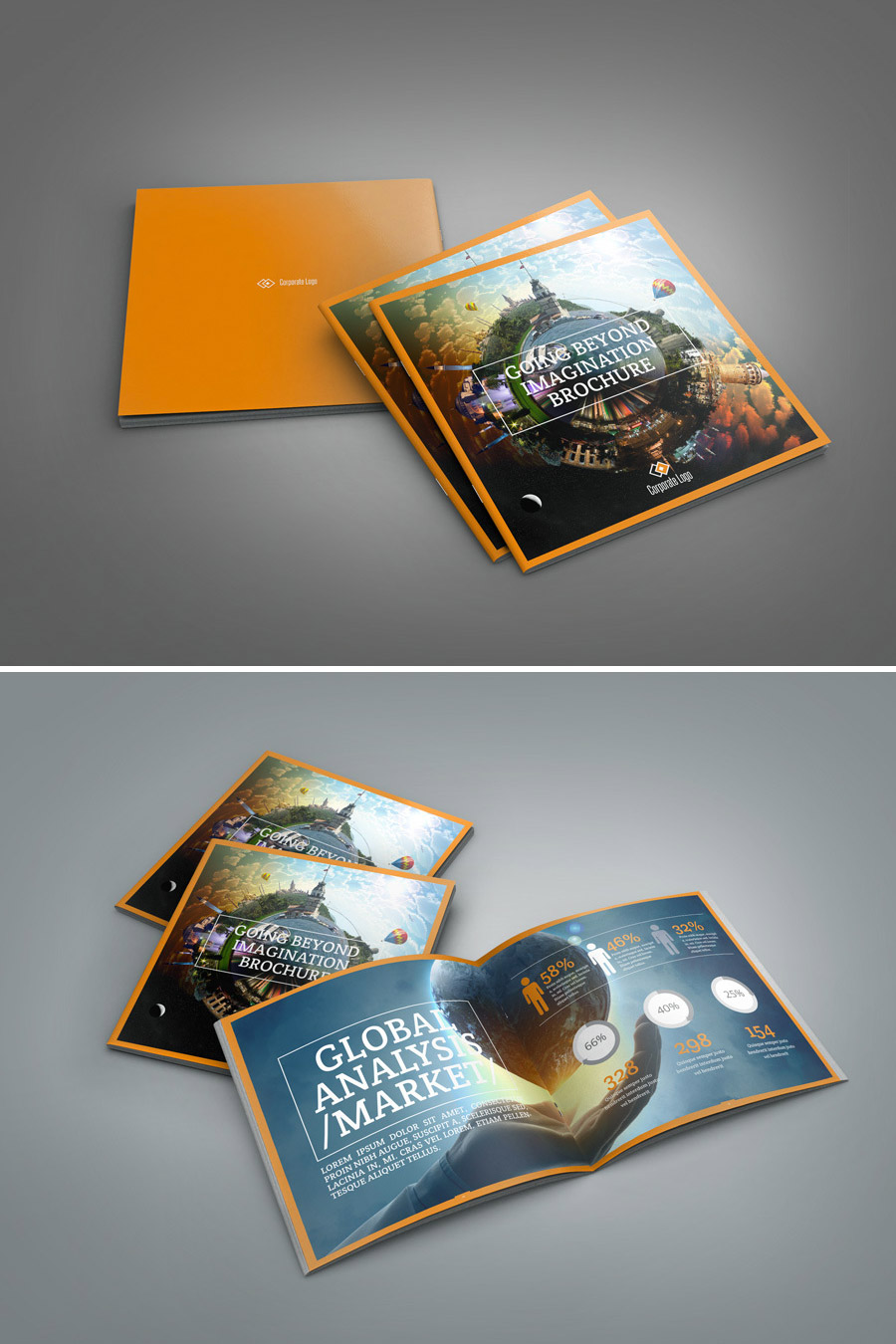
Going Beyond Imagination brochure is a 16-page, square-type brochure that uses an orange-theme design with beautiful image backgrounds to captivate its readers. Of course, it has chart elements and figures that effectively display the statistics of the report of the company performance.
Business brochure Template
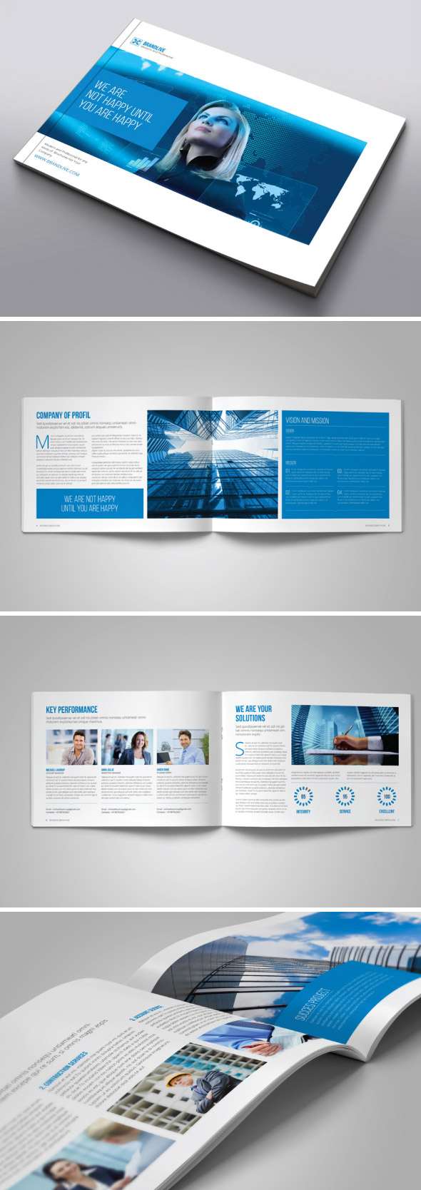
Business brochure template is a landscape-oriented, blue-themed, 12-page brochure template that has a design that goes for a practically clean and innovative look. While its front and back cover display competitive women interacting to technology, the content inside the brochure are comprised of well-placed images and texts that further presents a professional ambiance to the template itself.
Infographic Annual Report
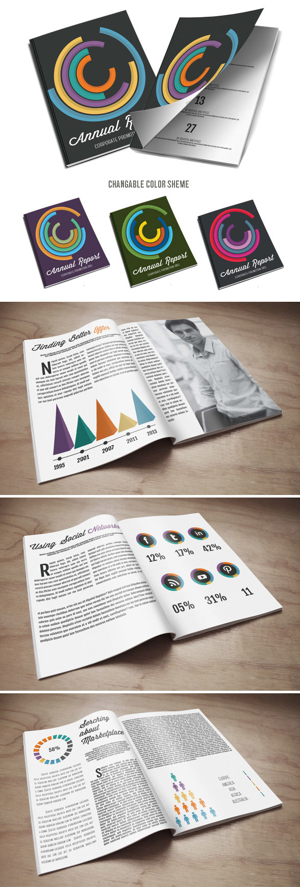
This next brochure example is in a portrait-faced booklet form. It has 36 pages that are designed using a combination of text paragraphs, full-page background images, plain-color backgrounds with text quotes, and infographic elements. The infographic elements here are creatively used for effectively displaying the values of the company’s annual performance.
Transoil Annual report and corporate brochure
Here is another booklet-type brochure in the list. Compared to the earlier booklet brochure, this one incorporates a very clean minimalist design with circular elements that are used in images. For the numbers and values, they are demonstrated well by bar graphs, pie charts, and geographic figures – all under the shades of blue.

BlauStein Annual Report
In this next brochure, less graphs and tables were used. Instead, information of the company is integrated with attractive and engaging background images. Overall, this brochure focus more on the company’s background, including their services, values, branding, and more.

Sharp and Clean Square Indesign Brochure Template
This square brochure template is all about sharpness and professionalism. Though this brochure also talks about the background of the company, unlike the previous example, this brochure is designed with tables, graphs, and geographic figures that display the statistics of the company’s performance.

Business Brochure Square InDesign
This next square brochure is designed with gray layout mixed with colored images. Other pages have full background images having blue color overlay. As with the other annual report brochures, it also includes bar graphs, charts, and geographical figures with detailed numbers and statistics.

Corporate Business Brochure
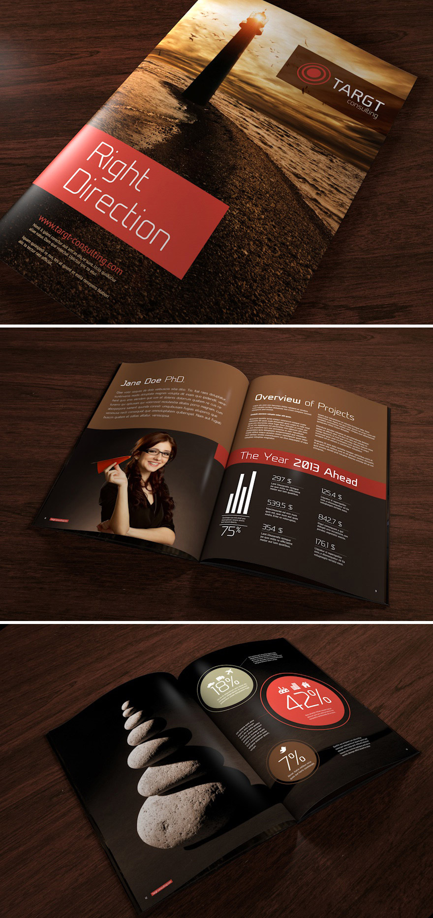
For this brochure, a dark theme is integrated to the design. This 16-page brochure is mostly in brown background & red outlines. It also incorporates colored images, bar graphs and statistics designed in outlined circles.
Annual Report Brochure
This 12-page, booklet-type brochure creatively exhibits information about the company as well as its statistics through various bars, tables, and other figures. The outlines, shapes, and fonts are highlighted with different shades of blue.

Annual Report Design Vol.1
Here is a bright and lively design of a booklet brochure. It includes 36 pages that are filled with colorful background and foreground images, geographic map with statistical features, editorial page, and other graphs and charts that illustrates the company’s annual performance.

Annual Report Template II
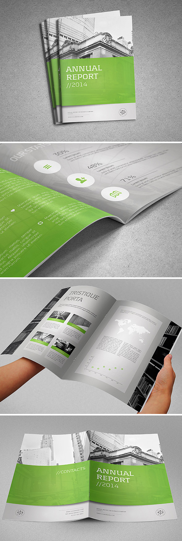
In this next list, the layout is in gray plain backgrounds and grayscale background images. To top it off, the paragraphs and other texts are emphasized on green platform. It also includes geographical figures, tables, and numbers for the performance report.
Quick Annual Report 2014
Here is another brochure template that uses grayscale background images. It is also using bars, charts, tables, and map figures for statistics demonstration. They are highlighted in blue layout along with shapes, texts, and paragraph.

Uralsib Annual Report
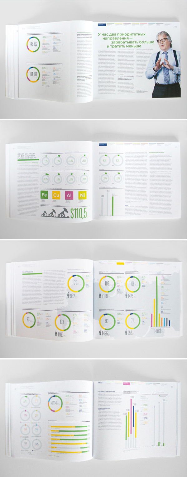
For this next landscape-oriented brochure, you’ll see how lively colors can bring a design into its playful side. Uralsib 2012 annual report utilizes bright colors to graph and chart elements to make them pop-out and look more attractive. It also contains graphic illustrations that make it even grab more attention to the reader.
Ultra Clean Annual Report
Next is a portrait booklet-type brochure with a light and clean design. Most pages of this brochure are formed having light background that further emphasizes images, texts, and figures. Statistics are delivered through bar graphs, map distribution, and percentage numbers.

Annual Report Template
This next annual report template is another great example of how grayscale photography can help to give a professional ambiance in a material. Mixing a grayscale image with a monochrome design boosts each other, making the overall design more stunning and effective. This specific template also comes in 5 variations of colors.

Design Marketing Brochure
A brochure design that is classic and minimal, this is what Design Marketing Brochure is about. Its pages just give out a clean and professional look that helps readers to focus on the content while putting some stimulating pictures to still make it more interesting. This design will definitely be perfect for those who are aiming for a simple yet elegant theme for their annual report brochure.

Annual Report 2015 InDesign Template
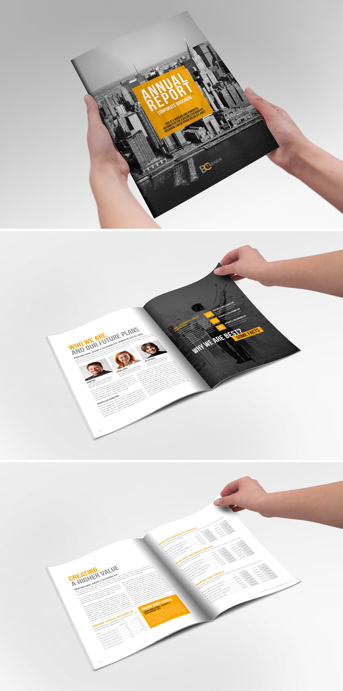
Here we have an Indesign template of an annual report brochure. In this design, most of the pages go for the clean, white background layout where texts, colored images, and tables are presented well. Some pages however, are designed with full-page grayscale background images. To top it all off, all pages have a monochrome touch of orange that are filled in certain texts and boxes to spice up the whole aesthetics of the design.
Annual Report
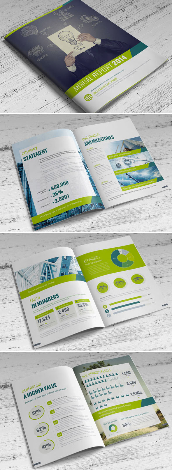
This next brochure template was also made from Indesign, which has gone for a fresh green-themed design. Inside it tells the performances of the company through texts and are backed up by various visual figures such as charts, tables, and numbers – all made more eye-catching with the help of some pictures and the use of different shades of green.
Annual Report Flat Style
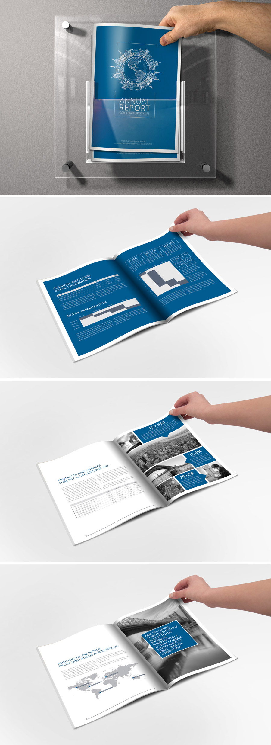
In this list’s last (but definitely not the least) example, the brochure is made with a semi-minimalist design that also applies grayscale background and foreground pictures. Some of these pictures are further explained with texts in adjacent boxes. Its content tackles the background of the company and what it is about, as well as showing its performances through minimalist tables and numbers.
Note: All visual content above is copyright to its respectful owner. Please read the Terms Of Use of these resources before using to prevent unwanted occurrences. NaldzGraphics does not claim credit nor responsibility for any images/videos featured on this site unless otherwise noted.
Have something in mind related to web design, freelancing, and other awesome stuff? Let us know and maybe we’ll feature it on our next post. All your comments and opinions are appreciated. Let us hear em up in the comment box. Thank you and see you again mate!


