Magazines are published in regular schedule with variety of articles in it and are usually financed by advertising, purchase price and subscriptions. It had been good sources of information and entertainment. There are different kinds of magazines. It could be a fashion magazine, art magazine, design magazine, health magazine, product magazine, sports magazine, computer magazine and many more. You can easily distinguish the type of magazine depending on the central image it issues and the entire cover.
When you design a magazine cover, there should be great strength, creativity and composition. The cover could be a portrait cover, typographic cover, illustrated cover with lots of pictures on it, or whatever style you could use. It defines what you are for your potential readers and it is the key to drive readers to pick a copy of your magazine, buy it and read it. So, when you design a cover, there are some simple things that you need to consider to make it stand out. Check it out.
1. Attract the eye.

Magazines are placed in browsers that are six to eight feet high. If your magazine stands out from the rest, there is a big possibility that your magazine will be picked first for it has caught the eye and the interest of the reader. You should use legible cover lines, lots of contrast and a good central image that can easily attract the readers even in a distant. You magazine cover should be like a beauty queen wherein everyone follows her with stares while walking in a mall or in a crowded area.
2. Unveil the story.
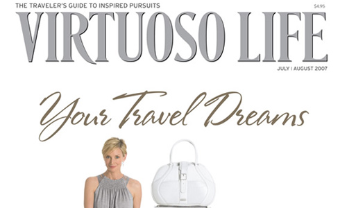
Everyone that looks at your magazine would like to know what is the lead story in the issue. They would like to know what is in the magazine that will make them want to buy it and read it. Emphasize the lead story and other interesting stories of your magazine. This will help rise interest for the readers.
3. Use great colors and fonts.
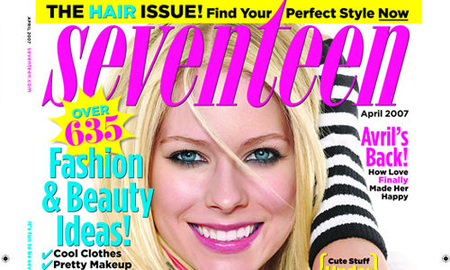
Colors have a huge impact on your cover. Choose a color that will suit the image of the magazine and will make it stand out. Choose the right colors by using swatches and color palettes as reference. Also make sure that the color you used while lay-outing will appear the same when it is printed. Choose the right font. You can use the drop shadow, glow or bevel techniques to highlight text. Use bold fonts and different fonts that will compliment each other. Be sure to use the right combination and always make sure that your masthead will look different from the rest of the text in the cover. Masthead is the portion of the magazine that bears the title.
4. Clear product identification.
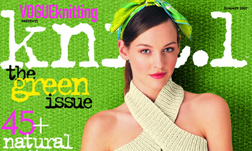
When you make the design, use a central image that will show the product clearly. One glance at it, the readers will know the type of magazine and the product the issue is promoting. Also, make sure that one look at the magazine, your logo can easily be identified. It should be bold and clear. You can do that by placing your logo in an area where there are no obstructions. Or, better yet, design it in a manner that it can easily be seen and recognized.
5. Offer benefits to readers.
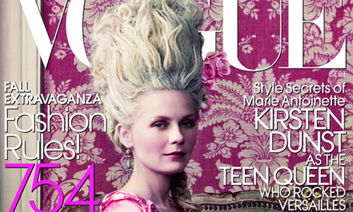
You can do this in your cover lines. Treat it as an ad to attract the readers to get a copy, buy it, read it and then still look forward to the next issue. Offer something that readers want like updates, tips, how-to, knowledge and entertainment. Be sure that the cover can show the best aspect of your magazine that could make them subscribe for it and constantly look for it in magazine stands.
6. Create thrill.

Exciting magazine covers can add to the attraction. When we say exciting, it means that you should place something that will make the readers feel the urge to buy it now or else they will loose something they wanted to have. You can do this by offering some giveaways, some exclusive insights, special guides and tips and many others. Some magazines include posters, stickers or whatever bonus items inside.
7. Specific cover lines.
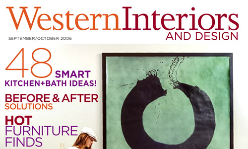
In your cover line, be specific with what the magazine will offer. Instead of saying that you will give sources for “Photoshop brushes”, it would be better is you will state that you will give sources for “100 New Floral Photoshop Brushes” This way, the readers will know what they can find in the magazine and can even increase their excitement to read it.
8. Gives an energetic impact.

You can make your cover energetic by giving text lines that are like saying “now”. Instead of using gerunds or verbs with “-ing” endings, use verbs that will make the readers think they will learn or do something now. Instead of saying “learning InDesign”, you can say “learn Indesign”. This sounds like a promise to them that when you read it, you will surely learn how to do it now.
9. Showcase the product.

Whatever type of magazine you are working at, you need to showcase the product well. If it is a computer magazine, then let the cover feature computers. If it is a gardening magazine, let it feature plants and flowers in the cover. If it is a babies’ magazine, then have a baby as the cover. This way, the readers will immediately know that you are showcasing or featuring a particular product and will eventually know what you magazine is all about.
10. Have your own identity.
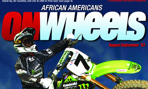
Every magazine has its own identity. You should be able to establish this identity so that people can easily recognize it in the magazine racks. If they are great fans of your magazine, they will just pick up a copy and buy it immediately to complete their collection. If you stick with a clean look and a clear singular image, it can easily be perceived by the readers in one glance.
Designing a magazine is both fun and challenging. It is fun for you will surely enjoy exploring colors and fonts as you work on the design. It is also challenging for you need to achieve the things mentioned above. You need to stir up that creativity in you and apply it in your design. You have to bear in mind that your cover will have a great impact to the readers for it is the part that can first look at upon browsing on which magazine to buy. If you have other tips to share on how to design a great magazine cover for it to stand out, feel free to give us some input.



nice article, so far another inspirational tips. Cheers.
Thanks for the tips Ace. gonna start this project 😛
was expecting Forbes mag. anyway great article, good job.
Thanks for this set of tips, currently making my own mag cover design and after reading this article it give me some ideas.
Thanks for sharing such an great info..
hi there Ebrian, I’m also a medical student from Philippines and i also like web designing but still a beginner. I just want to ask if you have a formal training in web designing because your works are great and i admire you and also your tips are very useful… I always wanted to create great designs but i’m thinking if i can create one because i have no formal training in web designing.. Can you give me some of your advice on how you’ve started until you’ve recuperate on web designing? I know my English sucks but i’m trying to work on it… ^_^ thanks a lot…
Hi, I have a vision of designing a magazine, but I don’t have a
clue how to get started…..do you have any suggestions and if
So I will greatly appreciate it.
I am working as graphic designer in one of fashion magazine and i am “one man show for 150pp magazine” kinda hard to do but it so much fun. Still in struggle to select a main picture for cover. any tips that help will be gratefull. Cheers!