As a designer, you would always use type in your works. Hence, it is important for you to know the basics of typography. Typography is a central component of design and one of the primary ways of communication. This has been passed from generations and has undergone various improvements. To date, there are thousands of typefaces and fonts that can be found in the internet. Its usage has evolved and is one of the important things in design, business and marketing.
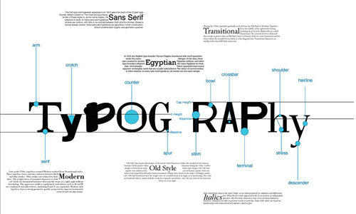
Image: kidcasanova
Typography is the arrangement of type for different uses. It could relay different messages aside the words itself. The mere choice of typefaces and its arrangement can greatly affect an entire design. The first step to use typography effectively is to know the basics. You wouldn’t be able to use it well if you are not fully equipped with the basic knowledge of typography. So, before we post other articles on typography, let us deal with the basics first. Here are some things that you need to know about typography:
1. Type families.
This is important for you wouldn’t be able to recognize fonts and their types if you are not aware of this. Since you are a designer and you use type in your designs, you need to have apt knowledge on this.
Image: RichardTheRough
Every font style has different type families. It could be Condensed Bold, Condensed Black, UltraLight, UltraLight Italic, Light, Light Italic, Regular, Roman, Italic, Extended or Combined Styles.
2. Typeface.
Image: Rachel-Speed
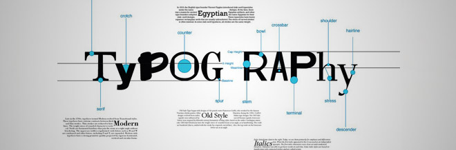
Type face is usually mistaken with font. But they are different. Fonts refers to a specific member of a type family if it is roman, boldface, etc while a typeface refers to the consistent visual appearance or style of a font. You need to select typefaces that suit the theme of your design.Typeface is divided into two main categories, the Serif Font and the Sans Serif Font.
Serif Fonts
Image: JamOff
Serifs are small lines at the ends of character strokes. Serif fonts are font styles with serifs at every character. These are usually used in books for it guides the eyes from letter to letter.
Sans Serif Fonts
Image: daveycoleman
Meanwhile, a San Serif doesn’t use a serif. It is usually used in magazine headlines and in websites for it is easier to read in the computer screen.
3. Kerning, Tracking and Letter Spacing.
Image: GCORE
Since you already know about fonts, its families and the typefaces, you need to be aware of these three things now for it affects how a reader will look into your design. Tracking is adjusting the space between all of the letters simultaneously. Kerning involves reducing the spaces in between two letters while letter spacing is increasing the spaces between two letters. This is could be a little detail but would affect the whole design if you won’t give it proper attention. Spaces are very important to direct a reader’s eye. If your letters are too crowded, it won’t be interesting to read at and it will look heavy to the reader’s eye.
4. Leading.
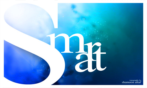
Image: shamoonaltaf
This refers to the amount of space between the lines in a text. This is referred in CSS as line-height. This is measured from a baseline to another baseline. You should be aware of this for it greatly affects how readable your text will be. When leading is decreased, the lines of letters get closer to each other making it appear more compact. Letters tend to collide. If you increase the leading, it can reduce the pace of the text and could let the readers pause due the white spaces. Although, more leading can relax one’s eye, it can mislead the reader’s eye sometimes. Too much leading can cause continuity problems. Hence, you should know if your leading is right or not. Put yourself in the reader’s shoes and you’ll get the right leading.
5. Size.
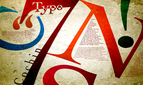
Image: YungRob
The use of different sizes will affect the design and the message of the design. But you’ll find it really important to use different sizes to give emphasis to some parts of the design. For instance, in a newspaper, headlines are always bigger that the text for the news story. On the other hand, banner headlines which are used for the most important news story, are bigger than the other headlines in the paper. Same as in designing, you will find it helpful to use various font sizes.
6. Alignment.
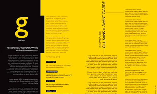
Image: guelfi
This might look less important but it is not. It is one of the most important things to consider when you use type. To know which kind of alignment to use, you have to consider readability first and the design aesthetics. When you use an alignment, be consistent all throughout the design. If you use center alignment for your headline, do that for the rest of the pages. If you use mixed alignment, it will confuse the readers and might not even continue reading for it is now an eye distraction. Now, let us take a look at the different alignments:
Flush Left
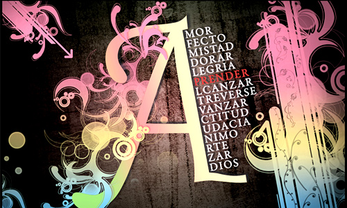
Image: guillhermes
Flush Left (or Ragged Right). Text is aligned to the left and is one of the biggest factors for improved readability. Since, we read from left to right, this is really effective.
Flush Right
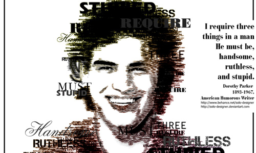
Image: solo-designer
Flush Right (or Ragged Left). Text is aligned to the right and could be used to highlight some parts of the text. It can slow down one’s reading for we are used to read from left to right.
Justified Alignment
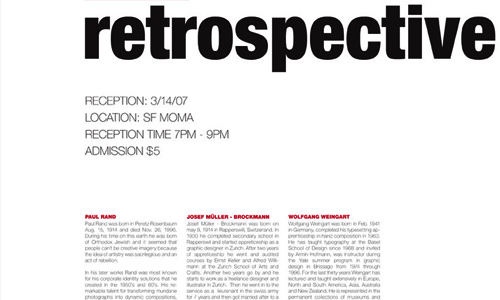
Image: kenji2030
Justified. Text at the start and end are aligned to left and right. This looks clean similar to fitting all the letters inside a box, although, sometimes other people find it hard to read for there isn’t a visual cue on when the text line will stop.
Centered Alignment
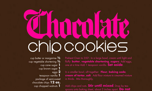
Image: Postpwned
Centered. Text is aligned to the center. Make good use of this for if used properly, it can make your work look elegant. Wedding invitations use centered alignments to express elegance. If you do not use it well, it may create confusion to the readers.
7. Choosing secondary fonts.
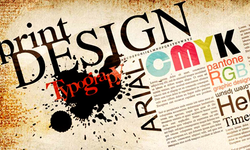
Image: kniemeyer80
Since you wouldn’t be using a single font in your design, make sure to choose a good secondary font that will still jive with your primary font. Make sure to use different fonts to avoid visual confusion but you also have to see to it that there is a good combination. Your design will look funny and odd if you do not choose your secondary font well.
8. Font communication.
Image: jaysquall
Like colors, fonts also relay a different message depending on its typeface. Every font communicates a different attribute to a reader. Some look masculine while others look feminine. There are also some scary looking fonts while some are elegant looking. Choose which one suits your design. Your font choice can speak for itself.
9. Typography art.
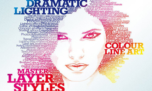
Image: staceygrove
Aside from using typography in books, posters and others, it is even more effective when used in art. You’ll be amazed how some designers played with type and made a totally unique and beautiful design that will make you love typography. There are various ways of using type. You can even alter fonts if you want and add some swirls, textures and others which will make your design livelier.
10. Look for inspiration.
Image: kho13
As always, looking at other’s work could give you more idea and inspiration in using type. Look at posters, brochures, logos, websites and others and figure out how they use type. You can get a lot of ideas from their work. Study existing examples and start with your own.
You can see type anywhere every day. You can see it in the TV, in billboards, in magazines, in cars and in many other places. Type is everywhere and you could never get away from it especially that you are a designer.
Bear in mind that what we mentioned here are merely guides for you to make use of typography. Some people even opt to break the rules but still make a great design. But also remember that before breaking rules, you need to have a good understanding of it first. After understanding, you can now play the rules and come up with your own work. Enjoy using type and you’ll learn to really love it!


Great introductory post for typography! I believe you have covered every aspect thoroughly enough to give anyone a start into understanding how typography works. I especially like the fact that you mentioned “inspiration” as one of your points (albeit the last point, but it doesn’t matter what point it was). I believe that the use of inspiration from other sites is overlooked from time to time by those that are inexperienced.
Two thumbs up!
muy buenos trabajos
Excellent work, the arrangement/step oh how to design a typography is good, thanks for the information. keep it up guys.
Yeah inspiration is a great influence, as mention above looking at others work could give some ideas, absolutely agree with that… 🙂
Yet another informative tips you got here! thanks
Loved typography much 😛 thanks for the tips.
Very cool & informative writeup… THANKS 4 sharing!!!
Great post for typography. I like to use Sens Serif fonts.
Will surely follow these tips… Thank you for sharing…
Thx for this post, very instructive