In creating a website, it is crucial to have not only a great UI design, but a great accessibility as well.
It may be a tedious task especially if we cannot relate to certain conditions that can hinder a good user experience.
One of these conditions is color blindness or color vision deficiency (CVD). If you are not color blind, chances are you don’t think about it very often. People who have this condition, however, have to deal with it all the time. Though it is considered a mild disability, it can affect a lot of daily activities – cooking, eating, transportation, and browsing the internet.
With that said, our website should be accessible to as many people as possible – including those with CVD.
Not sure how to do it? No worries! We’re here to help you.
This article will help you learn deeper about color blindness and the things you can do (and not do) to make your design more color-blind-friendly.
First, we need to understand what color blindness is.
Understanding Color Blindness
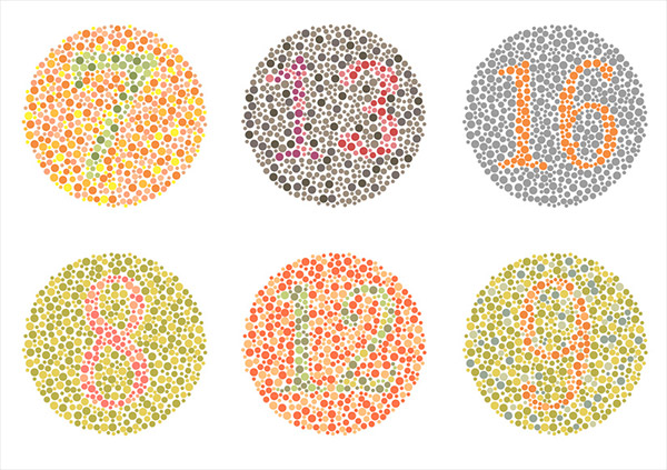
For at least 90% of the time, color blindness isn’t really a form of blindness, but a deficiency in distinguishing red, blue, or green. This disability can cause difficulty in identifying certain colors compared to those who have normal vision.
Contrary to popular belief, color blindness doesn’t show identical symptoms. This means that it is possible for two people with color blindness to see different range of colors at the same image.
Types of Color Blindness
1. Red-Green Color Blindness
This is the most common type of color blindness due to the absence or weakness of red-cone cells (protans) or green-cone cells (deutrans).
It can be divided into these subtypes:
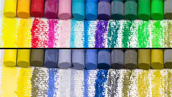
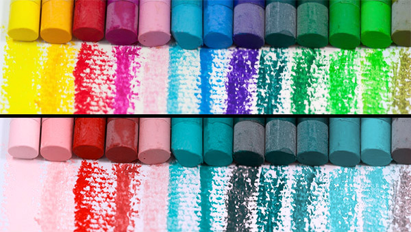
- • Protanopia – absence of red-cone cells. Red looks like dark brown; orange, yellow, and green appear in various shades of yellow; and violet looks like blue.
- • Protanomaly – defective red-cone cells. Colors are less bright and the red, orange, and yellow colors appear to have a bit shade of green.
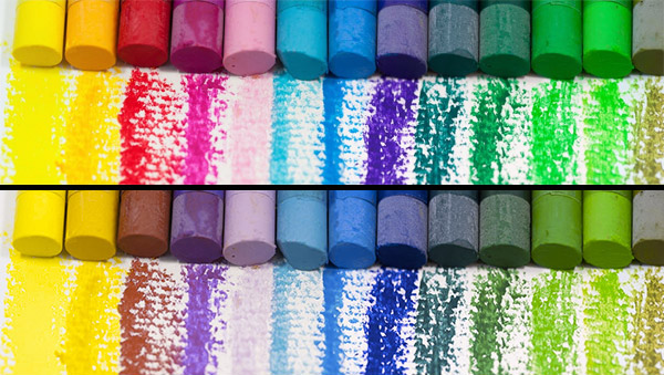
- • Deuteranopia – absence of green-cone cells. Reds and greens appear as brownish-yellows and violets also look like blues.
- • Deuteranomaly – defective green-cone cells. Colors are less bright. Yellow and green colors appear to have a bit shade of red.

2. Blue-Yellow Color Blindness
This is a rarer type that happens when the blue-cone cells (tritans) are either abnormal or nonexistent.
It can be divided into these subtypes:
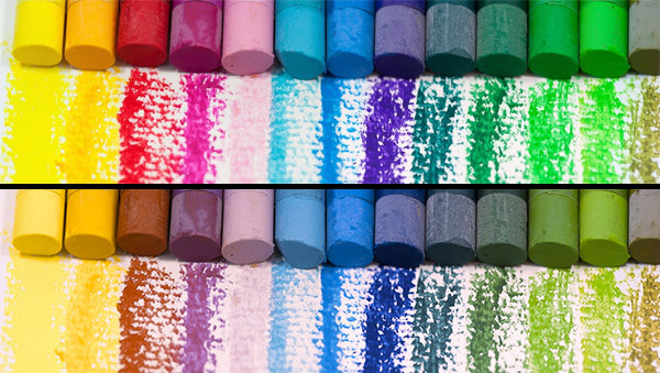
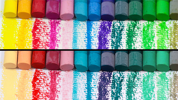
- • Tritanopia – absence of blue-cone cells. Red is not significantly affected; blues become more greenish; yellows and oranges become somewhat pink, and greens become blues.
- • Tritanomaly – defective blue-cone cells. Blue appears to have a bit shade of green and yellow and orange can be a bit paler.
3. Complete Color Blindness “Achromatopsia”
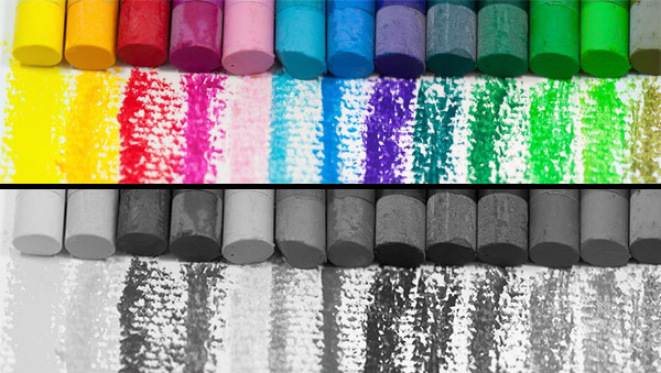
This is the most severe type where it is literally correct to use the term color blindness. This is when a person doesn’t see any colors at all. It occurs when none or only 1 of the 3 cone cells work.
Web Design for Color Blindness
In estimation, about 100 million people are using the internet. These 100 million people sees everything, including your website, differently from others. It may be advantageous for you, conversion-wise, to make their browsing a lot easier when they visit your website.
Here are some ways to better accommodate your CVD (Color Vision Deficiency) users in your website.
1. Don’t rely in colors.

When designing a concept, always keep in mind to not rely so much in colors to convey important information. Otherwise, people with CVD will have a hard time understanding your design and may result to a poor user experience.
For example, when trying to fill up the necessary green fields, it may be obvious to us with normal vision.

But it can be a nightmare for those who have color vision deficiency.

Instead, you can use other elements such as texts (keywords and descriptions), shapes, icons, gestalt principles, etc. to get your information across.

Also, color theory is less likely to work on people with color blindness. Hence, don’t use them for feedback interface. If you’re only using a red color as an indicator for something “wrong” or as a “warning”, you might want to reconsider.
2. Use Color Blindness Simulators.

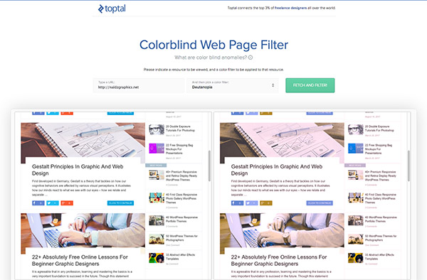
One way to make sure if your design is color-blind-friendly is by seeing it yourself. There are a lot of online tools and software that can help you see in a CVD’s eyes.
If you’re using Photoshop, it has a built-in tool that allows you to do so. You can enable it by going to View > Proof Setup.
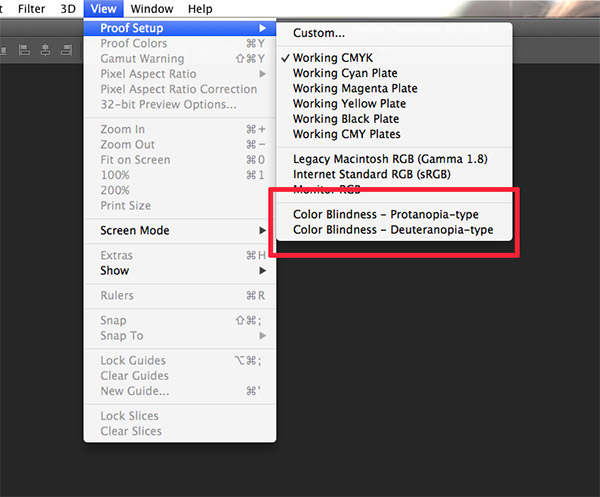
For websites, you can use this web page filter.
3. Hue, Saturation, High Contrast and Brightness.
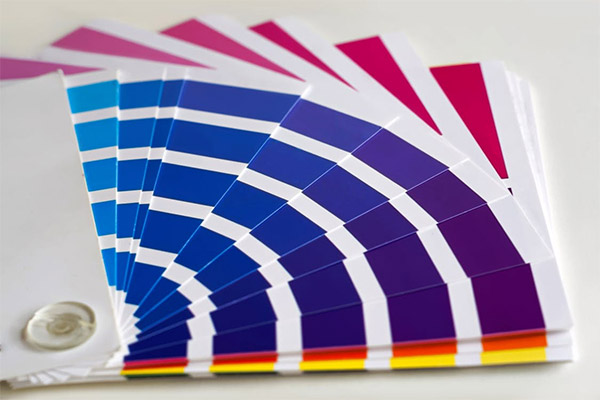
Though lacking in the color department, CVD users are still excellent in perceiving contrast, hue, saturation, and brightness. Use this to your advantage.
For example, you can use a light blue background and partner it with elements that have a darker blue color.

4. Think Minimal.

You can hit two birds in one stone here. Aside from the fact that minimalism is a trend in web design, you can also lessen the confusion and maintain color accessibility.
You can also go for a monochromatic color scheme for your website design. It will compliment well with high contrast since you’re only using one color with different shades.

You may have thought of black and white or greyscale when you read “monochromatic” – It’s definitely fine! But to be clear, you can use any single color you want. Be creative and explore various shades and how you can combine them.
5. Avoid Bad Color Combinations
For users with CVD, there are color combinations that hard to identify, and then there the worst combinations that can give them nightmares. Here are some that you should consider avoiding for your design:
- • Green & Red
- • Green & Brown
- • Green & Blue
- • Green & Grey
- • Green & Black
- • Blue & Purple
- • Blue & Grey
- • Light Green & Yellow
But if you must use some of these, you can lessen their burden by adjusting the colors’ brightness (light vs. dark). You can maybe go for a light red with a darker green. This would at least help them to differentiate the one from another.
You’re Up!
Hope these infos and tips will help you create a better website for everyone. Now you have more knowledge that you can use to reach out to more users and increase your traffic *fingers crossed!*. But more than the personal benefits, it can be a big help for those who have this condition. They will sure be grateful for your efforts.
Thank you for spending your time with us. Did we miss any good tips and ideas? Share what you think in our comments below.


