Websites are designed in so many ways which gives a web designer the option as to what he will use to make a website look appealing to its target audience. Flash websites are used these days. It is a multimedia technology that allows much interactivity even for a small file size. It gives great benefits to the modern world for it can present information attractively and in a picturesque detail. Flash websites can instantly get the attention of the viewers.
Interactive animation through flash websites can easily grasps the attention of the people and could easily relay information. Hence, it is one of the chosen manners of web designing. For flash website-wanna-be-designers, here are some things for you to consider in making one. This might help you create a truly stunning flash website.
1. Loading effects.
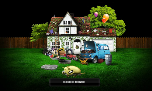
Image: scruffs-game
Make sure that your flash website doesn’t load too long. Also, make creative loading effects so that your page won’t look boring. Some sites place the design elements little by little as the page loads. The elements are appearing while the page is loading. Some add some color effects that varies as the loading progresses. You could use a character that dances while loading. You can use swirls and shapes that moves while loading. In The Scruffs website, you can see Scruffy fall down and then fells into a deep sleep while snoring.
2. Interactivity in the website.
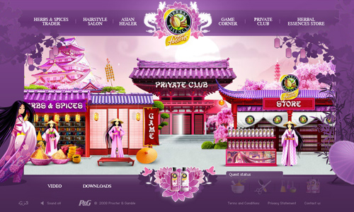
Image: theoleg
Interactivity refers to how the websites could communicate with the person viewing it. It means that the site should be able to relay a message or let the viewer or reader do something in order to gain some information regarding the website. For example, the website for Herbal Essences has a great interactivity wherein you will seem to interact with the characters in it. It even has a game for you to play, learn and enjoy.
3. Use 3D effects.
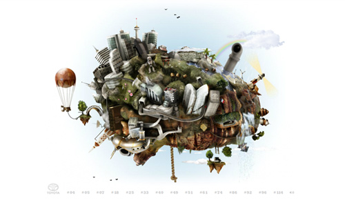
Image: ihuvudetpatoyota
Since there are two types of flash websites, the 2D and the 3D, you can use 3D for some aspects of the design. You don’t really need to make everything 3D but if you could, it is even more impressive. The website above shows a 3D flash website. You will be amazed on how information is get and how some parts of it move as if they are really alive. That includes the two fingers that are actually wobbling like worms.
4. Subtle animations.
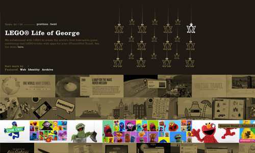
Image: hellomonday
You really don’t have to overdo the animations. Simple ones can still have a great impact to the website. I have seen the website of Hello Monday and I was really impressed on how they made it. They used the mouse hover effect and it really works out well. There is even a unique way of reading their posts with a zoom in and out feature. Really great animation that is so simple yet impressive.
5. Mouse hover effects.
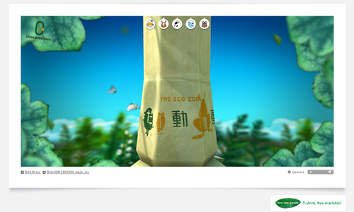
Image: ecodazoo
Part of a flash website is the use of mouse hover effects wherein you have to move your mouse around the website and certain effects will happen. Some sites changes color when the mouse touches the images, some have pop-ups coming out while others have some text appearing. The website above is a 3D flash website that uses 3D all throughout the entire web. Check what you can do by merely moving your mouse around the site.
6. Typography.
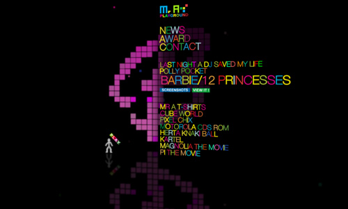
Image: adenek
Typography is one of the important elements in web design. Some uses the 3D text approach while others just play with typography. Some sites doesn’t really use much images or videos but they make use of words to show what is in their website. The website above makes use of typography and colors to make the site look elegant and attractive. The words that you can see blows up once you point your mouse into it. That is the time you get to see some images if you opt to look at it.
7. Background animations.
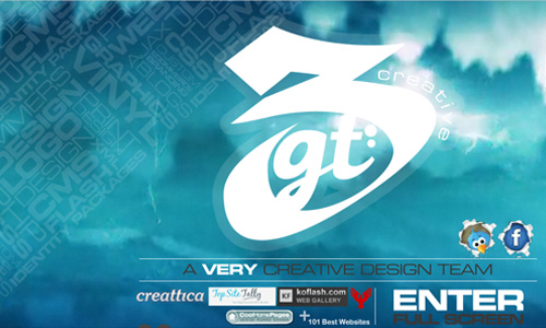
Image: gt3creative
Sometimes, to make the site less heavy, it is only the background that is animated. It is also a good way of using flash. You have to be creative in doing that and do not overdo your backgrounds that it would seem to eat up the important elements of the website. An example is the website above which shows a blue cloudy background. There are actually lightings everywhere and the clouds are really moving.
8. Creative videos.
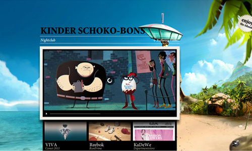
Image: parasol-island
Include videos in your flash website. But it would be better if you make use of videos that also look creative and jives with the theme of the website. Do not just put any kind of video. Use something that will attract the readers and would make them wait for the video to finish. It could also be a motivating factor for them to continue browsing your website.
9. Illustrated designs.
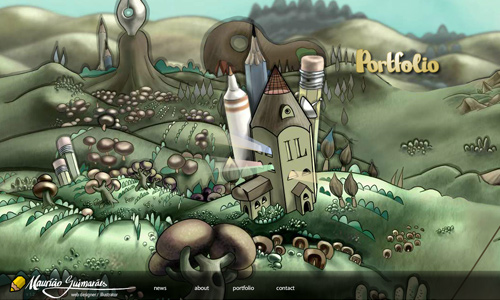
Image: mauriciostudio
No matter how much time one would spend in creating illustrated designs, it will always be worth it. Websites using illustrated designs are stunning and attractive. It really needs the talent of a good illustrator. If you combine illustrated designs with a flash website, the result is really great and you would even be excited and curious to know what the website will give you. Above is a website portfolio using illustrations. Try to navigate the site and you’ll surely be impressed and you’ll even have fun.
10. Sound effects.
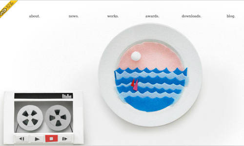
Image: plateinteractive
You can use sounds or music in your flash website. Just don’t make it too noisy that your reader will be distracted. Choose a music that sounds good. Also, have an option for readers to turn off the music if they want to.
If we speak of visual impact, flash websites would not fail to give that to us. It is even more eye-catching and enjoyable to watch. So, if you are making one, you can consider the above things. Or if you have other things to add to what were mentioned, feel free to do so.


Its important that the animations come out smooth. Great round up of flash website essentials.
Just quite in time since I recently asked my designer to update my site. Thank you
It seems like it’s hard to achieve number one but i’ll try. thanks for reminding.
Oooop, you forgot a very important one…
It doesn’t work well on mobile and not at all on iDevices – Is a Flash site good for your customer?