J-pop, ( Japanese pop music), has its roots in the 1960’s. The term “J-pop” was coined in the 1990’s and rose to a peak later that decade.
It served to describe the energy behind the music. Although J-Pop is stuck in the 90’s (and deliciously so), the album cover art isn’t.
It embraces modern culture, manga, anime, the strange and the outrageously hilarious. However, what can we, as designers, gain from this? We can understand how pushing boundaries, combining simplicity with symbolism and having no fear can create amazing designs! So feast your senses on these J-Pop album covers!
In this article, we present 40 J-Pop album covers. For viewing pleasure, they have been divided into “Cartoon”, “Illustrations”, “Manipulated Photography”, “Bold and the Bright”, “EXPLOSIONS!”.
You may want to take a look at the following related articles:
• 30 Futuristic Landscape Digital Illustrations
• A Showcase of Astonishing Spaceship Concepts
• 45 Astonishing Dragon Illustration Artworks
• Typographic Portrait of a Human Face
Cartoon
The Japanese have a very unique and highly recognizable cartooning style. This collection best demonstrates this.
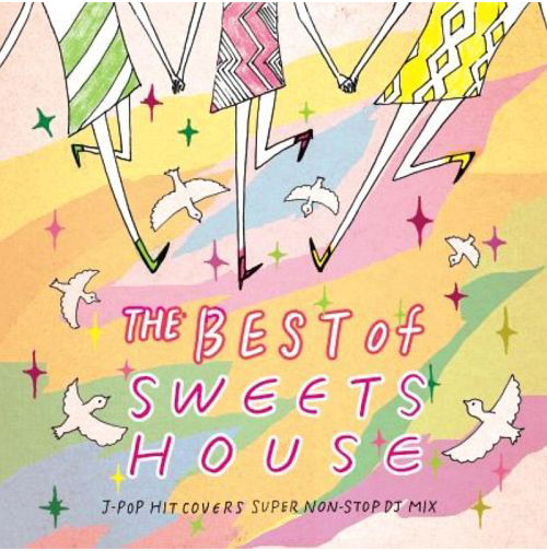
The Best of Sweets House
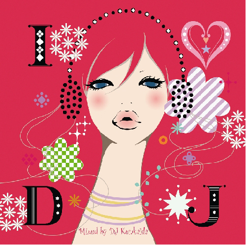
DJ Kenkaida – I love DJ
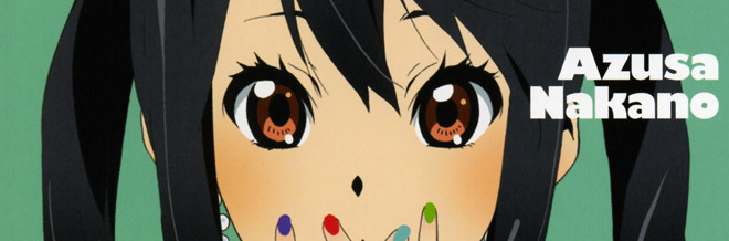
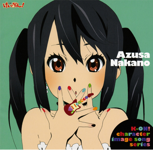
K-On! Azusa Nakano Character Image Song Series
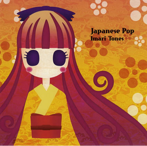
Japanese Pop – Imari Tones
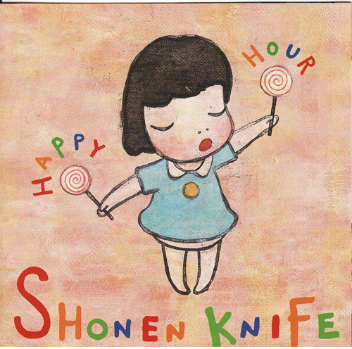
Shonen Knife – Happy Hour
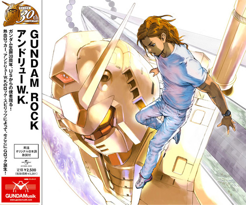
Gundam Rock – Andrew W.K.
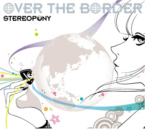
Stereopony – Over the Border
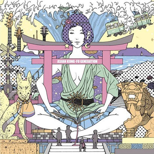
Asian Kung-Fu Generation
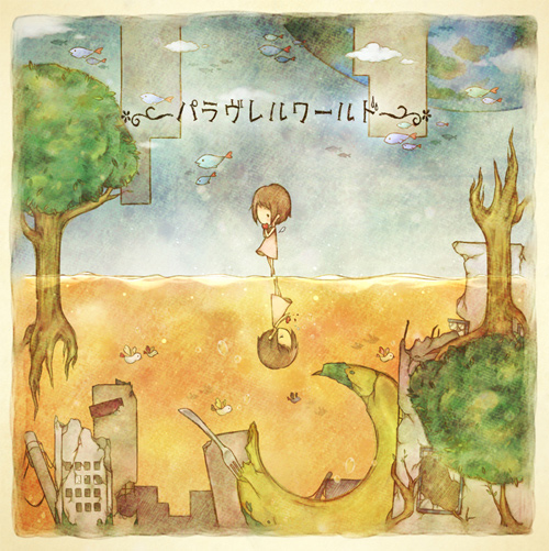
DECO*27- Paravereruwarudo
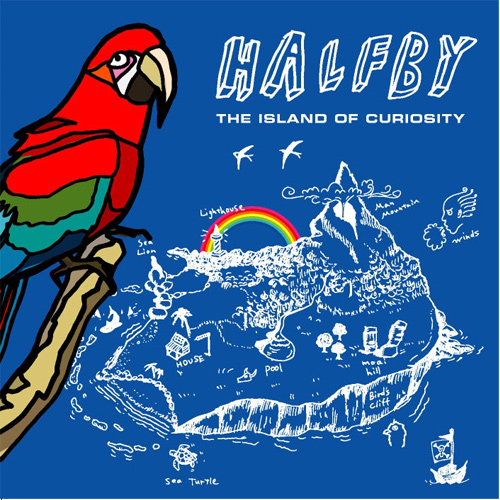
Island of Curiosity – Halfby
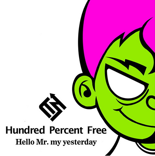
Hello Mr. My Yesterday – Hundred Percent Free
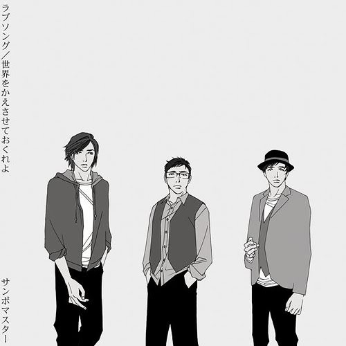
Single Album – Sambo Master LoveSong
Illustrations
Whilst it can be argued cartoons are illustrations this collection contains album designs that are more detailed and have a different level of depth.
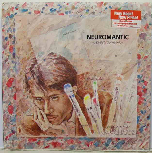
Neuromantic – Yukihiro Takahashi
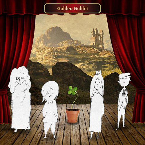
Yotsuba Sagashi no Tabibito – Galileo Galilei
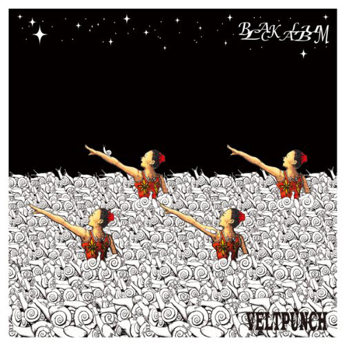
Black Album – VeltPunch
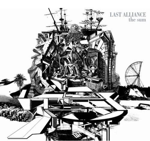
The Sum – The Last Alliance
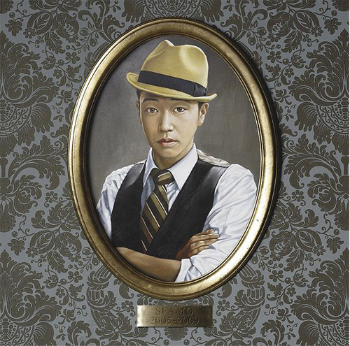
The Best of Seamo
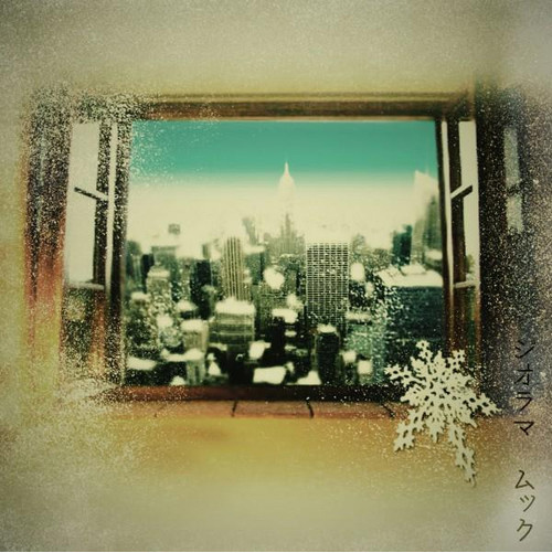
Diorama – MUCC
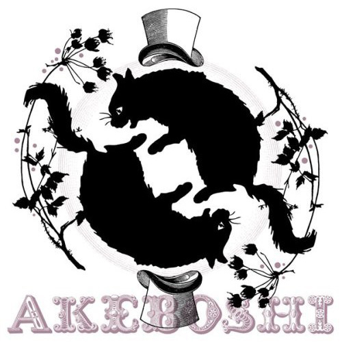
Roundabout – Akeboshi
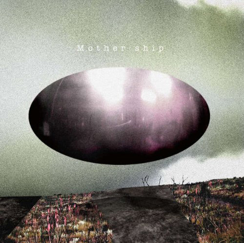
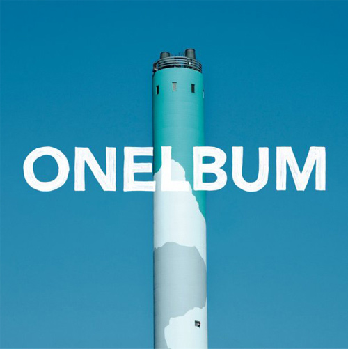
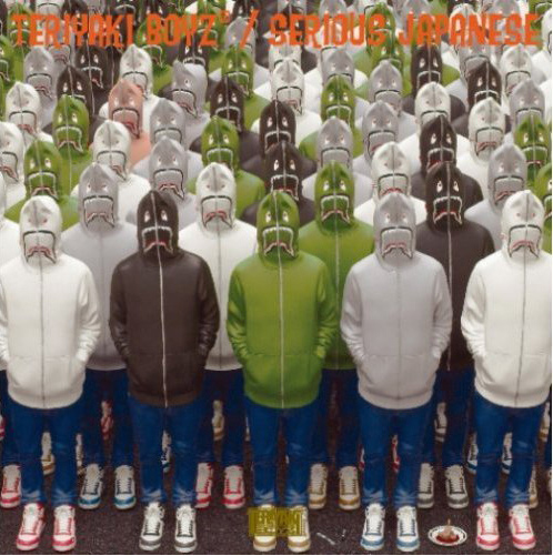
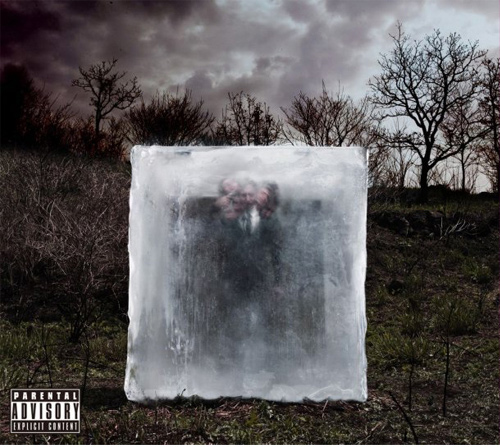
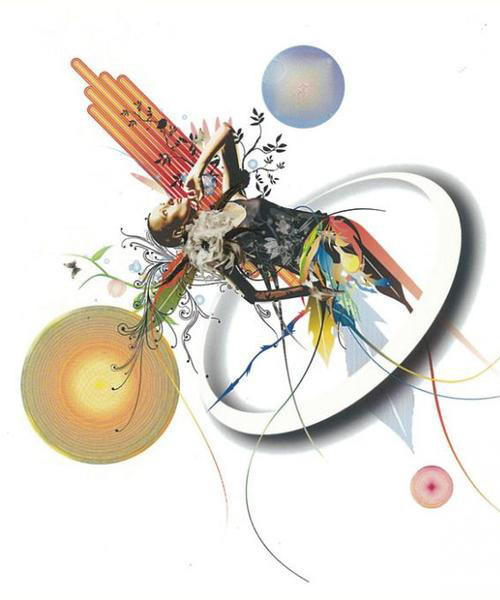
Manipulated Photography
These covers use manipulated photographs. As a result most of the manipulated photographs in this collection have resulted in being a bit on the surreal side.
Mothership – Lego Big Morl
Crawl – Natsu Best
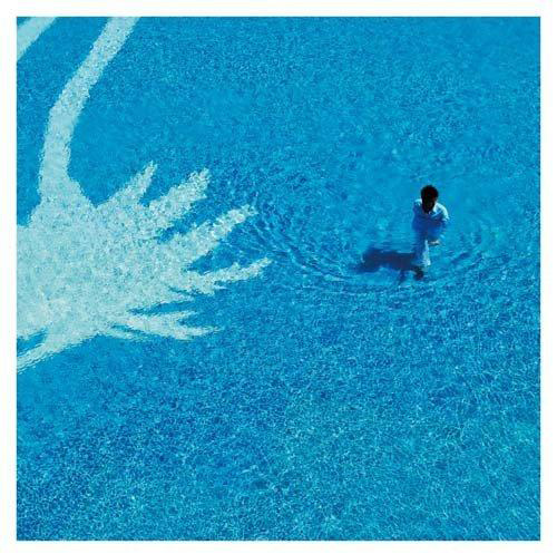
Onelbum – Natsu Best
Serious Japanese – Teriyaki Boyz
Gazette – Dim
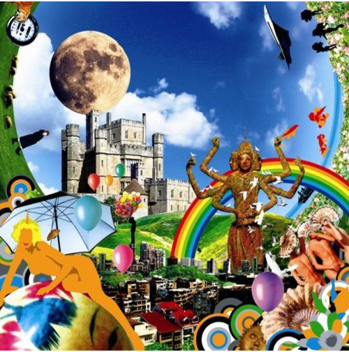
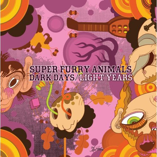
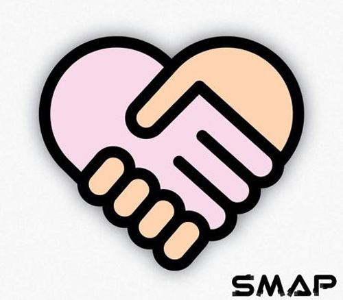
Bold and the Bright
This is the collection’s brightest and boldest album covers! Strong lines, brilliant colours and bold typography are throwing themselves around in these albums. Watch out!
AntennaGo!GO!7188
Dark Days/Light Years – Super Furry Animals
Sotto Kyutto / Super Star – SMAP
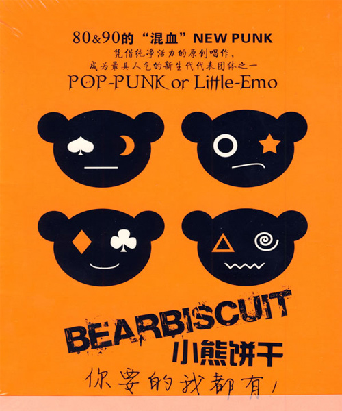
Ni Yao De Wo Dou You – Bearbiscuit
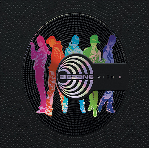
With U – Big Bang
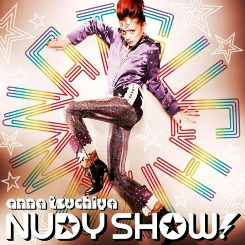
Nudy Show – Anna Tsuchiya”
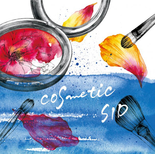
Cosmetic – SID
Extract7- IVE

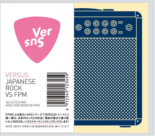
Japanese Rock VS FPM
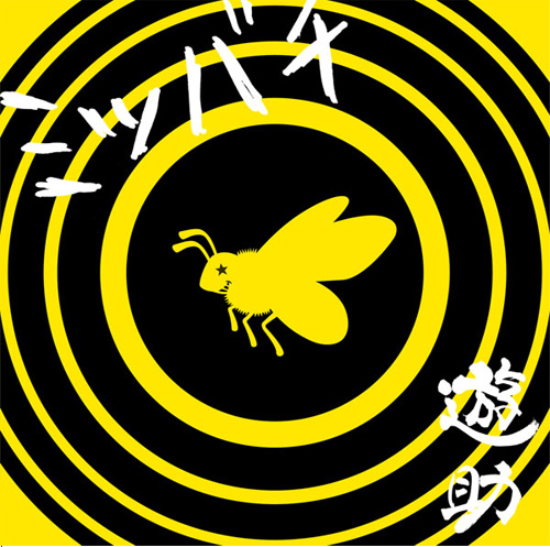
Yusuke – Mitsubachi
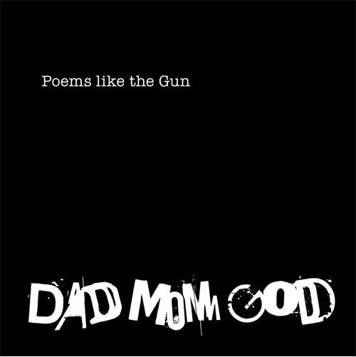
Poems like the Gun – Dad Mom God
Vandalize – Alice Nine
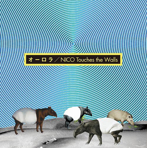
Nico Touches The Walls – Aurora
View Source
EXPLOSIONS!
We”ve left the best to last. EXPLOSIONS!
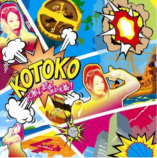
Shichiten Hakki Shijou Shugi! – Kotoko
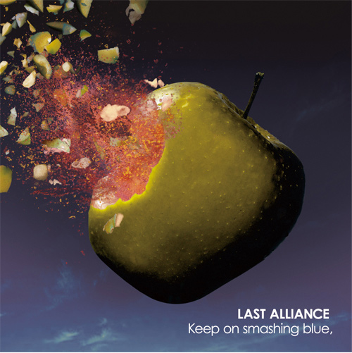
Keep on Smashing the Blue – Last Alliance
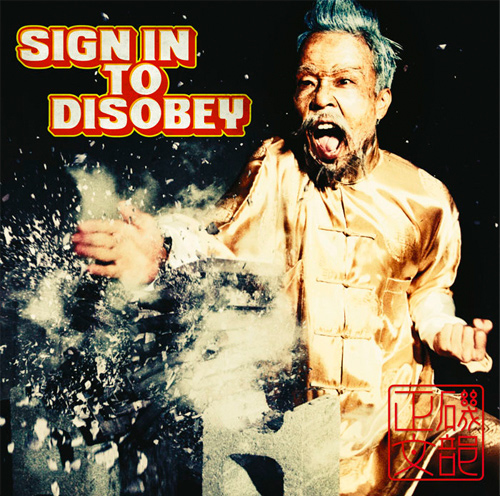
Sign in to Disobey – Isobe Masabumi
Conclusion
As you can see, these album covers are full of energy and give the visual feel of the music.
They also cover a wide range of styles, mediums, angles and emotions. These covers show the strong relationship between visual elements and typography which is an important point to consider when designing. It also demonstrates how to make something look eastern which is helpful if your called upon to design for a client or project from a different cultural heritage to you.
When designing, whether it be websites, logos or illustrations, the designer has one chance to encapsulate their message. Look through these images again and see for yourself how they capture the music they are designed for. Also look at their treatment of type, colours and line work.


So cute..very creative..
I love this style, insightful post, thank you Emma for this wonderful list !!
Lovely list … very inspirational .
Very impressive collection of image.
Cheers for that!
It’s a amazing collection, excellent job.
thank you very much
Japanese Rock VS FPM, is interesting. It is hard to speculate on the design without knowing the context of the music on each album. That being said, a lot of these are less than inspiring.
Super Furry Animals are a Welsh indie band!
All work on the site deserves loud applause. Among them would like to commend the work: “The Best of Seamo”.
What a great collection
I love Deco
It’s nice to read a good blog post. I enjoy lots of the blog posts on your site.