Modern web designing mostly involves a clean, shiny and glossy look. But with the use of different design elements, we can actually alter it and create a unique design. Textures can be of help to enhance the appeal of a website. You can even try using grunge texture for a provoking and crude look.
Grunge textures look dirty with nasty elements. It can give a filthy touch to a design and a little bit of irregularity. Instead of that clean, sharp and shiny look, why don’t you try a grungy appearance or might as well combine both? In this post, we will talk about how grunge textures can make your websites look appealing.
1. Good visual appeal.
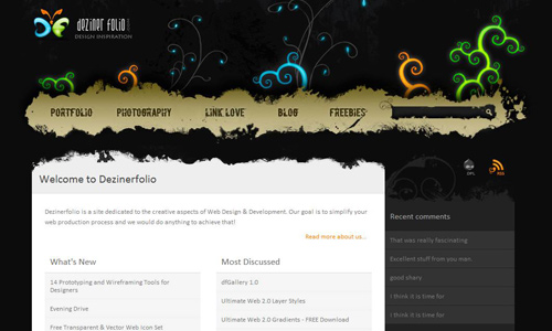
Image: dezinerfolio
Of course, the visual appeal is always valuable for it is the primary aspect that could drive people to your site. Apart from a good layout, easy navigation, great contents and fresh posts, the visual appeal is important. Grunge textures can give appeal to a web design when it is used creatively.
2. Gives a unique look.
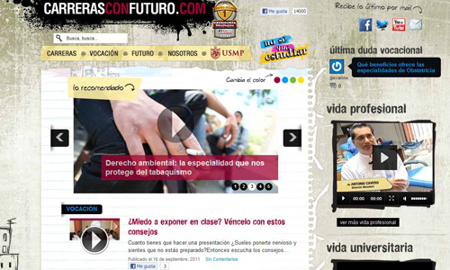
Image: carrerasconfuturo
Since grunge textures can give your output that dirty touch, it will look unique for despite the formality of the design, it can still incline to a little grungy appearance. This makes the design unique for some people opt to make a design clean and sharp with lines and curves perfectly done. You can put a little imperfection to your design and this will surely blew others away.
3. Looks good when combined with other textures.
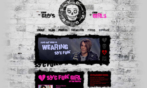
Image: sycfuk
Grunge textures are used by many designers and even by those who call themselves “creative” but not necessarily a designer. It is amazing how creative people experiment with combining textures with another texture. There are varieties of textures one can choose from and your choice of textures to use for combination would greatly affect the look of the entire design. Hence, you also have to consider if both textures work well together. Just don’t pick any type of texture. Grunge textures look good when you use it with more detailed or heavier textures.
4. Gives a good effect even when used with minimal colors.
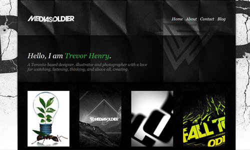
Image: mediasoldier
A rainbow may give you all the colors you want but you can actually work on a design with minimal colors and merely use the gray palette. The result still looks good especially if you put a grungy texture into it. The use of minimal colors will be enhanced by the texture.
5. Despite its grungy appearance, it can make an elegant impact.
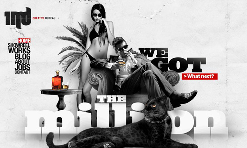
Image: 1mb
Filthy as it may appear but it is still amazing how some designers could create an elegant design using grunge textures. It truly depends on the creativity of the designer on how he could make a magnificent twist to the design.
6. Gives a vintage effect.
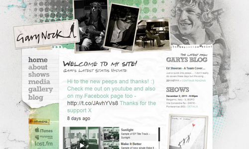
Image: garynock
Using halftone brushes, the design looks retro. Adding a grungy touch makes it even looks more retro and vintage, too. Despite the modern trends in design, retro and vintage designing are still making its way to the web design world.
7. Can add a unique touch to edges.

Image: bristolarchiverecords
You don’t have to make the entire background grungy looking but you can still pursue with a grungy look by applying it to the edges. You have to choose as to which edges you would like to apply it. Also, when you do that, be sure to choose the right colors so that it would look apt with the texture.
8. May use it heavily.

Image: thefarmerandthechef
Do not hesitate to use the texture heavily. It still works well when done rightly. It should also jive well with the website’s theme. Use it heavily but not too heavy that it could not make the content clear anymore.
9. Can give a chic appearance.
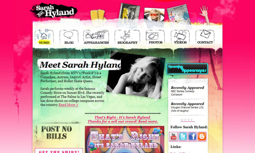
Image: sarahhyland
Yes. Indeed it is a grunge texture but it can still create a chic design. When used with pastel colors and a bit flirty fonts, it will give a totally different impact. Isn’t it amazing how dirty-looking textures can create chic web designs?
10. Subtle use of grunge textures.

Image: lanikaiproperties
You may use only a little grunge texture. It will still be noticed and appreciated by the viewers. No matter how little you use, it still gives a good appeal to your design.
11. Can still make design look professional.

Image: blackwave
Grungy textures can make your design look professional. If you think it is only used in blogs and portfolios, you are wrong. It can also be used in business sites and other professional sites.
12. Dark grunge textures give emphasis to contents.
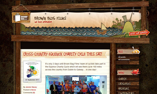
Image: brownblogfilms
In our previous post about dark website backgrounds, we have given you some tips in designing dark websites. You can actually use a dark grunge texture, too. It gives emphasis to the contents of the site and also makes it visually appealing.
13. Use it on some parts of the design.

Image: Racingups
You do not have to use the texture for the entire page. You can actually choose some parts where you can apply it and still end up with your desired grungy look.
14. Combine it with simple patterns.

Image: 1love
Textures and patterns could look good together when you use the right pattern. Grunge textures can be used with both simple and complicated patterns. It will add a different feel to your design.
15. Gives an impressive artistic touch.
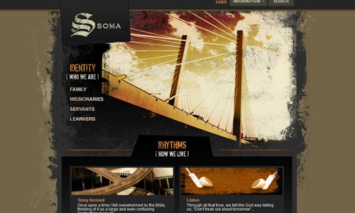
Image: Somacommunities
If you wrap up all the things that a grunge texture can do to your website, you will end up with this- giving it an impressive artistic touch. Creatives out there will surely say yes to this.
Well, considering the examples that we have above, you will certainly agree that a grungy look is not bad at all. You could also try designing your website using grunge textures. For those who have tried using it, you may share to us your work by providing a link below.


Yeah, grunge textures simply rock! It actually blends well with any color and with the subject, whether for professional or simple personal website.
Another great piece, this post is so friendly.. thanks!
Quite look cool really catches the eye of a reader..
Helpful list..also the resources are nice as well.. thank you Kareen
getting some ideas from this article 😛
Adequate info. gonna saved this..
Thanks.