When looking for a job, one would certainly see to it that he has the perfect graphic design resume. That way he is increasing his chances to get the job he wants. In a resume, one can tell what his skills, abilities and qualifications are. It is like putting yourself in a sheet of paper through words and visual representations. Of course, your aim is to impress your prospect employers so that you can get the job. Hence, you have to make sure that your graphic design resume will not be disregarded or thrown in the trash bin or in the recycle bin.
You can avoid that by taking note of these graphic design resume mistakes that some commit. If you do away with these, you will have greater chance of getting your dream job. Do not just waste the opportunity due to one mistake. Aside from the best practices to remember, there also mistakes to take note of. So, here are the things that you have to be careful of not doing for your graphic design resume.
1. Using flamboyant designs.

Image: shutterstock
One mistake the most graphic designers commit is by making overly decorated resumes. They are doing this to show their good design skills. But that shouldn’t be done that way. Instead, the skills should be written well in the context of the resume. It is okay to design you resume in a creative manner as long as it do not steal the attention from the contents and it does not drown all the necessary details. Some designers smartly use the design as manner of showing resume contents. It actually depends on how you will do it.
2. Using fancy fonts.

Image: keepwaiting
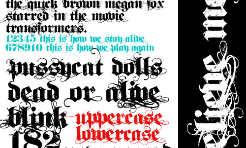
A graphic design resume needs to have readable contents. So, make sure to choose font styles that are clear. Avoid using fancy fonts for most of the time it is not readable. Do not give your prospect employer a hard time reading your resume or else, he will not read it at all. Also, aside from choosing the right font style, use a font size that is not too small. Make use of the right colors, too.
3. Using heavy colors.

Image: shutterstock
Some designers might be overwhelmed in designing their resumes and might use heavy colors in it. Do not use too striking colors because instead of attracting the employer to read it, you might push them away. They might think that your resume is a pain in the eyes for it is too heavy. Use colors that are easy and light to the eyes. This way, they will not find it hard to read the contents and they will also be able to appreciate your well-designed resume even if it doesn’t bear many colors.
4. Using too many images.

Image: shutterstock
Using heavy colors is already a no no. How much more of using many images! Avoid using too many images in your resume for it will not be easy for the reader to get into the contents. There are graphic design resumes that make use of images to tell the employers important things about him. That would be okay. It actually depends on how you do it. If you will just use images to decorate your resume, that would not be good. It will only be a distraction.
5. Failure to tell skills.

Image: shutterstock
When one is so into the design of the resume, he may overlook how to effectively tell the more important parts of the resume. That includes the skills and abilities. It should be shown accurately because this is what your prospect employer is looking for. Make sure that you will be able to tell what your skills are.
6. Failure to show previous work functions.

Image: shutterstock
In a resume, you would include your previous job experiences. Stating the job is not enough. You also have to tell what were your functions, achievements and duties while you were at the job. Doing that will tell your prospect employer what you are capable of doing.
7. Wrong spellings and grammar.

Image: shutterstock
Some graphic designers do not give much attention to grammar and spellings. They think that the design is all that matters. But of course, you are wrong, the contents are more important than anything else. So, be sure to check these things because some employers are very particular with these. They think that if you cannot perfect simple stuff like grammar and spelling, how could you be a good designer.
8. Putting interests not related to design.

Image: shutterstock
In your interests section, be sure to include only interests that are related to design. You do not have to write there that you love cooking and basketball. That will not matter. You do not want to be a laughing stock when they see your resume so full of useless interests that is not related to the job you are applying for.
9. Having a bad layout.

Image: shutterstock
Layout is very much important in a resume for it can have a great impact to those reading your resume. As a graphic designer, you can have a creative layout but you should do that in a subtle and effective way. Have an eye-caching layout that can guide and direct the eyes of the reader especially into important parts of the resume.
10. Being lazy to re-check it.

After you have finished your graphic design resume, you have to make sure that you spend time checking it. When we say “checking”, we really mean looking into all the details in it. It includes your over-all design and the contents. Look into the text if it is readable and make sure that there are no errors in it. This is very important because tiny mistakes might bring your graphic design resume into the trash bin. So, always do the checking before you finally email it or forward it to your prospect employer.
It’s Your Turn Now
Aside from those mentioned above, you should also make sure that your graphic design resume contains genuine information. It is important that you are honest with everything especially in your resume. Now that you know these things, apply it when you are making your own graphic design resume. How about you, can you add something to the list? We would appreciate it if you share your thoughts.


Quote” Look into the text if it is readable and make sure that there are no errors in it. This is very important because tiny mistakes might bring your graphic design resume into the trash bin”
How ironic that this blog has a fair share of typos errors! e.g.
“You do now want to be a laughing stock when they see your resume ”
Perhaps you mean you do not want to be a laughing stock…?
Ouch for the 9th lol
Yeah.. it’s really wrong to use fancy fonts.. I saw a colleague use that for his resume.. lol
Good job! this has to be shared to everyone in the graphic design world.. thank you Kareen
Yep. I’ve missed the 5th once and i still regret that. I failed to get the position I have been wanting to get.. but i’ve learned… 🙂
I failed to check my resume in the past and I realized i was not able to update the address and my contact number.. it was st*pid but a lesson learned 😉
I was smiling while reading the whole post. thanks for these! will be sharing these with friends.
Thanks for patiently providing great insights when it comes to preparing a graphic design resume.. keep it up