Photoshop brushes are great tools for enhancing art works and graphic designs. It could range from simple to complicated brush strokes that could add an effect to a design or definition to an existing picture. Brushes are one of the most versatile tools in Adobe Photoshop which can be used for designing invitations, cards, wallpapers, websites, business cards, and many others. No wonder many graphic designers worldwide go crazy in looking for various Photoshop brushes they can use for their designs due to its versatility.
In this post, we will be glad to share to you some simple ways to artistically use Photoshop brushes in web design. We have given some examples of brushes that you may use and how it may look like when applied to a web design. Also, you can easily access the links in order to download free Photoshop brushes.
1. Different brush strokes give a truly artistic feel.
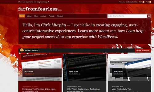
Image: farfromfearless
Painting is no longer limited on a painter’s canvas for you can already use them even in your computer to make it look like a painter’s obra. You can express yourself by using these brushes and you will surely smile after seeing a great outcome. The painter’s canvass are now in your computers and it depends on you on how you will use brushes to make it look completely creative and arty.
2. Use graphics and images brushes instead of clip-arts.
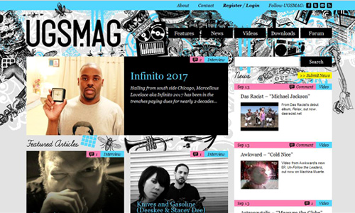
Image: ugsmag
These brushes look heavier for they use more lines. Images like animals , masks, vintage graphics , and many others can also be used as brushes. It gives a different touch to your designs than using clip-arts or vectors. Some may find it quite hard and challenging to use this brush but with practice, you can get a great result.
3. Use watercolour brushes for a more creative look.
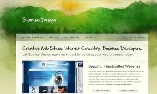
Image: sunrisedesign
Instead of merely using lines, colors, shades and other elements, you may try using watercolour brushes in your web design. It doesn’t only make it look creative but it also makes your design look livelier. These types of brushes when used well with the right color combinations could surely make your website unique.
4. Glowing lines can lighten up a design.

Image: simpleflame
For sure, you will love to use these glowing brushes not just to lighten up your work but also to add a slight radiance for the eyes of the readers. Your site will surely look chic if you add these brushes.
5. Try grunge brushes for a little filth.
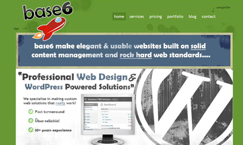
Image: base6design
If you are tired of neat and clean designs, you can add some filth to it by using grunge brushes. It depends on you if you use only a little of it or you would opt to use more grunge brush strokes. It will add a different touch to your website. It will not look dull rather it would look vivid.
6. City and building Landscapes brushes makes design more attractive.

Image: taxime
If you are planning to make something with a city and building landscape, use this kind of brush and you will get a great result. It looks perfectly well and can make your design look more attractive.
7. Letters and handwriting for a classic look.
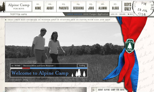
Image: alpinecamp
For those who would like to have a classic touch for their designs, you may use letters and handwriting brushes. Classic designs are still in these days and sometimes even have better impacts than the more trendy ones. You may try using vintage Photoshop brushes of handwritings in web designing. For sure, yours will be unique.
8. Abstract brushes can make simple designs look elegant.
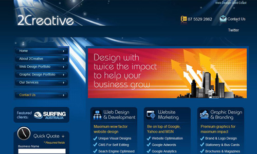
Image: 2creative
There are so many abstract brushes that you can use for your designs. Artists create more beautiful abstract brushes every year. You will surely enjoy using them for it brings your design to the next level. Since abstract brushes come in various styles, you can choose the ones that would suit the kind of look you want.
9. Paint and Ink drip splatter brushes for design enhancement.
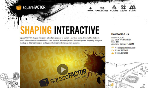
Image: squarefactor
Commonly, graphic artists use these brushes. It may look like smears or stains but it looks terrific when used well. They usually look awesome when used in dark colors and place a light or white colored text on top of it. But of course, it looks good with different colors, too. This adds a different twist in your design. Instead of merely using plain dark backgrounds for your texts, use splatters and it will look better.
10. Use halftone brushes for a subtle yet marvellous retro outcome.
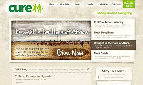
Image: cure
Halftones are also pleasing although they look simple. But when used properly, it gives an impressing stroke to your design. Some use just a little of it while others prefer to use more of it. It actually depends on how you work on the design. Halftones will still look good whatever way you choose. This also gives a retro look for your design. Even with the various trends in design these days, retro designs are still preferred by others, hence, you can still make use of this brush.
It is indeed impressive how Photoshop brushes could spice up designs with a simple touch. Well, never take these brushes for granted because for sure, once you try it, you will surely look for more. You’ll be truly pleased with the results every time you use it.


Great Article and well organized ..
How could we get by without Photoshop brushes? I remember just 5 or 10 years ago making web forum signatures were all the rage. Lol where did the times go…