Color is very important especially to designers. A design would certainly look dull without the element of colors. No doubt, colors are indeed very important. It has a great impact on a business, on marketing and even in one’s emotions. With the variety and infinite number of colors you could choose from, you might have a hard time creating a color palette for your designs especially that you have a lot of things to consider.
To help you with that, we will give you ten tips that can be your guide in creating your own color palettes. For designers, it is important to have your own color palette especially for creating a design for a company or for marketing purposes. It has to be unique and attractive so that people could remember it and be attracted to it. Here are the different approaches and techniques in creating a color palette:
1. Know the client and the project.

Image: shutterstock
This is the first thing you need to know so that the colors you will choose will be suitable for the project. If the client will give you some colors, you still use it but just add some other tones and shades to create a great palette. Remember also that there are different meanings of colors and color combinations. Like red and green may depict Christmas, red and blue are patriotic and others. So be sure to use the right colors.
2. Review color theories.

Image: shutterstock
Before you start creating and choosing a palette, review the basics of colors. You need to know the color wheel and the different color schemes you will find through it. We have the monochromatic, analogous, complementary, split-complementary, triadic, and double-complementary.Knowing these traditional color schemes will surely help you to determine if the color combinations are right.
3. Try custom color schemes.
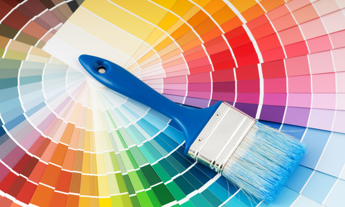
Image: shutterstock
When we say custom, you will do away with the usual, traditional schemes and make your own. When you do this, you do not follow certain formal rules but you rely on your own imagination and taste. But you need to keep in mind saturation, value and chroma of the colors in order to create an appealing color palette.
4. Use monochromatic color scheme as basis.

Image: shutterstock
Even if we have mentioned to do away with the traditional color scheme, this does not include monochromatic. When you choose a color palette, start by choosing a color which will be the primary color of your design. Then create a monochromatic palette with various tones of the color. From there, add neutral colors black and white and then look for another color that is not far from your chosen color.
5. Consider chroma and saturation.
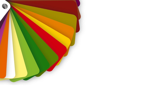
Image: shutterstock
Try colors that have the same chroma and saturation levels. This way, it can create cohesion for the colors. You may also use one color with a high chroma combined with colors with low chroma.
6. Consider tints, tones and shades.
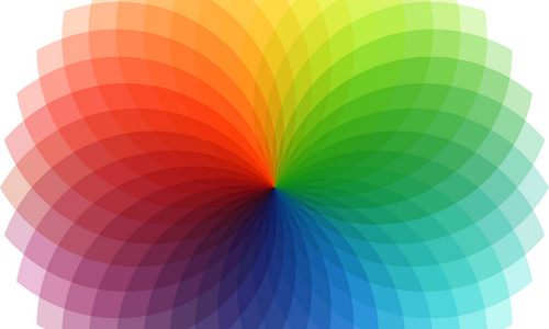
Image: shutterstock
These three would add a different life to your color palette. If you create one with the same levels of saturation and value, it would look boring. If you make use of tones, shades and tints, you are not merely looking at the color wheel with twelve colors but you have actually expanded it to a vast number of colors that you can use for your design. To do that, avoid the plain and pure color. Add some tones, shades and tints for a color and then look for another pure color that is three steps away from it. That second color could be your accent.
7. Add neutral colors.
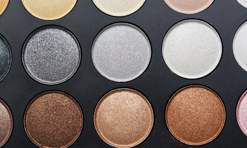
Image: shutterstock
To have some balance, consider adding some neutral colors. This includes black, white, brown, gray, off-white, and tan. You can use black and white as basis. When you have chosen your primary color and your accents, you can choose to use black and white or the other neutrals. You may use dark gray or dark brown in lieu of black and off-white and tan in lieu of white. This depends on the other colors you have chosen.
8. Use a picture as source of colors.

Image: shutterstock
You can do this option. You can let your client choose a picture that he likes considering the colors in it. Aside from pictures, you can also use paintings, and others. After choosing a photo, you may create the color palette using the eye dropper in Photoshop. If you have chosen a quite complicated picture, you can apply Mosaic or Crystallize to get the colors. Then pick the colors using eyedropper. You can now create your color palette.
9. Match colors with contrast and those that complement each other.

Image: shutterstock
In making your color palette, match colors that complement each other. Like if you use purple, you add a burgundy as an accent. Also, you may choose colors that contrast each other. This could help you create a limited color palette to save for printing cost.
10. Use color tools to create a palette.
There are many chromatic resources in the internet that will help you in creating a color palette. Try to choose among these tools so it could help you in your designs.
Kuler
Kuler could be one of the favourite tool for creating color palettes due to its many uses. You can even study other designer’s work through this and give them some comments. Using this, you can create a truly great color scheme.
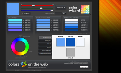
Colors on the Web
This certainly helps designers in creating a great color palette. You submit a base color and it gives you matching colors. It also helps you set hues, saturation, shades and tints.
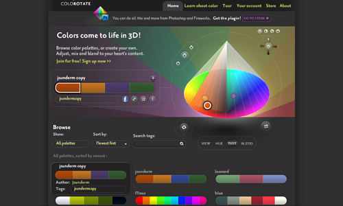
Color Rotate
You can also create a color palette using this. You could see a 3d rendering of the colors that makes it look attractive. It surely looks cool and is fun to use.
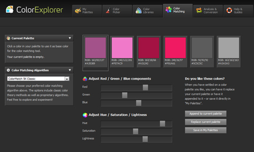
Color Explorer
You can easily manage and create color palettes through this online toolbox for a better design.
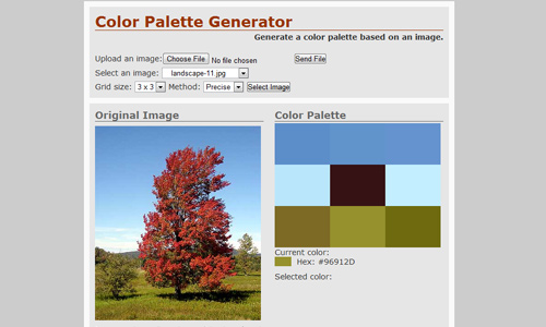
Color Palette Generator
This will help you especially if you want to use an image as a guide in creating a palette. You simply upload an image and it will generate a color palette for you.
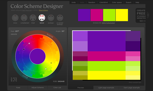
Color Scheme Designer
You will surely love this tool for it could easily generate a color palette for you that you will certainly adore.
With the different ways of creating a color palette, for sure, you will no longer have a hard time creating one. The tools you can find in the internet are also very helpful and could easily generate one for you. So, enjoy creating your color palettes and make an appealing design for your clients.




selecting colors is never an easy task with clients but good recommendations to use
Thanks for the tips, interesting info. and i enjoyed the color trend.
would prefer this as my guide on choosing right color combination
I’m going to use this as a guide for choosing colors from now on.
its the most difficult task to me.
Thanks