In this design tutorial you will be taken through an extensive step by step on how to create detailed 3D text that sits in created environment. We will map graphics onto our artwork, add lighting, texture and more utilizing Illustrator, Photoshop and a bit of patience. This tutorial assumes an Intermediate to Advanced level of knowledge in Photoshop and a Beginner to Intermediate level of knowledge in Illustrator.
This is a complicated tutorial, should you have trouble post a constructive and detailed explanation of your problem and I will be happy to work through any struggles!
Final Preview
You can see a preview of the completed work below. Click on it for a large scale version.
Step 1
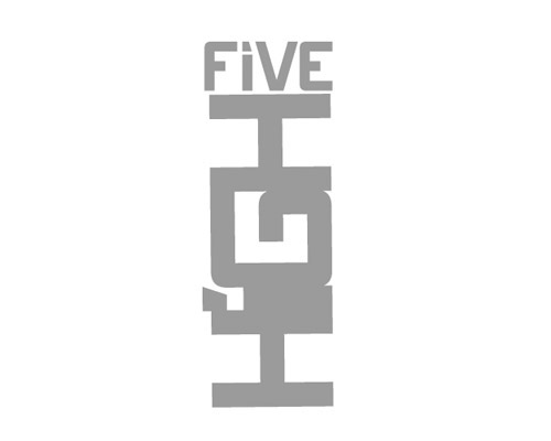
Open Illustrator and open a new Art Board. As we are working with Vectors, we don’t have to be overly concerned with the size, but to make our importation to Photoshop easier, lets keep the canvas sizes the same (3000×2250 @ 300 dpi). For the purpose of this tutorial, create two text blocks. One saying ‘HiGH’, the other saying ‘FiVE’. I used ‘Akashi’ font, if you do not have it you can acquire the outlines of a completed Step 1 here.
Rotate ‘HiGH’ Counter Clock Wise so it is standing on its side. Place ‘FiVE’ on top of the ‘H’ in ‘HiGH’ as seen in the image below. Finally, convert your text to outlines by choosing Object > Expand.
Step 2
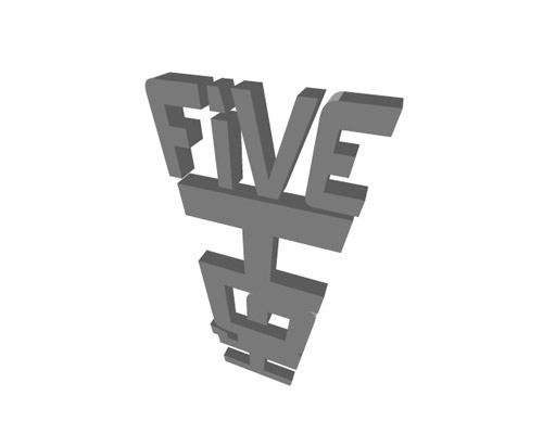
Next, go to Effects > 3D > Extrude & Bevel. Make sure you have Preview checked in the options panel.
To gain some comfort with the tool, try to adjust the angels, perspective and depth to match the image below – no worries, all the actual values are provided later.
Step 3
Now I don’t want both ‘HiGH’ and ‘FiVE’ to have the same depth and angles of each other. So, we are going to adjust our file so the 3D objects look like the image below.
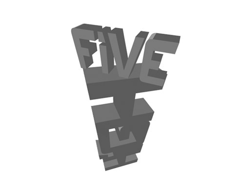
So, duplicate your text group through the layers panel. In the second, bottom, group delete the group containing ‘FiVE’ elements leaving only ‘HiGH’ outlines. In the first group turn the group containing ‘HiGH’s elements Opacity to 0% so we are left with ‘FiVE’ but technically still maintain the contents of ‘HiGH’. We are doing this so ‘FiVE’ doesn’t lose its context according to the 3D filter in relation to ‘HiGH’.
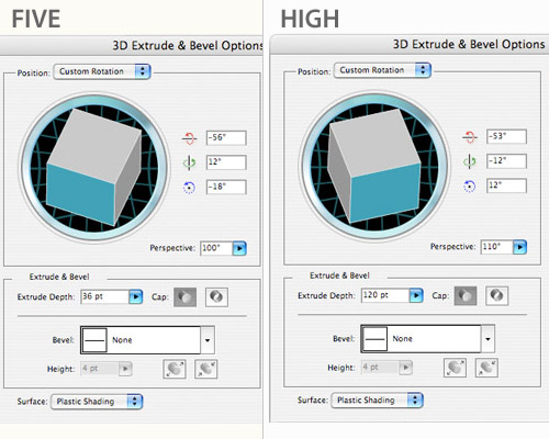
Look at the values in the image below to see how you should adjust the 3D effect on each of your groups.
Step 4
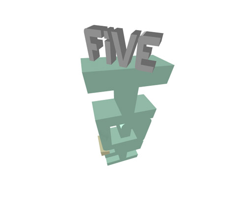
As you can see in the example image from Step 3 the ‘FiVE’ extends beyond the reaches of its ‘H’ platform.
So, using the Transform Tool (E), I am going to adjust the size relationship between the two. Use the image below, which also contains a green flat color (#D9FFE6) applied to ‘HiGH’ and yellow flat (#FFFCCC) applied to the dot of the i , as a reference.
Step 5
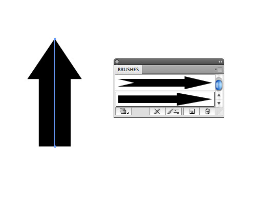
Using Illustrator’s packaged ‘Arrows’ brush set (Open Brush Library > Arrows > Arrows Standard) OR make your own brush. Using the Pen Tool (P) create a short line and apply your arrow brush as you can see in the image below.
Step 6
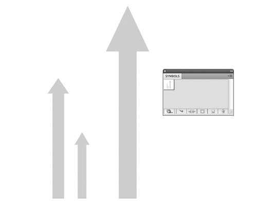
Expand your new brush line (Object > Expand Appearance) and make 3 arrows that look like the ones in the image below. Select your three new arrows and drag them into your Symbols panel. Alternatively, choose ‘Define Symbol‘ in the Symbols option menu.
Step 7
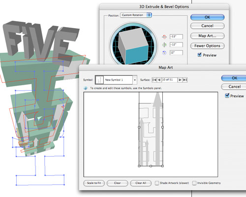
Finally, selecting your ‘HiGH’ layer, access your 3D Extrude effect in the Appearances Panel. Choose ‘Map Art…‘ and, once again, make sure the Preview is active. Cycle through your object faces until you get the front face, mine is 10.
In your Symbol drop down, select your new arrows symbol and adjust the size until it looks like the image below.
Step 8
Select your artwork’s containing layer and duplicate it. Hide the duplicate to back up your working shapes. Now select the still active layer paths, Edit > Copy (Command/? + C), and open up Photoshop.
Side Note: This is when your canvas size will matter, so if you choose to print this, make sure your canvas and resolution (300 dpi) are marked appropriately. If you remember from the beginning, I suggested you make your Illustrator canvas 3000×2250 @ 300 dpi. Do the same for your Photoshop canvas.
Now, assuming you copied your paths in Illustrator, Edit > Paste or Command/?+ V, and when prompted with your Paste Options choose SMART OBJECT. Since we have the same canvas sizes in both programs, you should be able to import at 100%.
Back in Illustrator, select your visible duplicate and choose Object > Expand Appearance. With your new editable shapes, un-Group your shapes and begin to color appropriately. Here is a breakdown of my color selections:
HiGH:
base: #529976
highlight: #9DD1B7
shadow: #498063
FiVE:
base: #DED238
highlight: #FFFBB8
shadow: #8C8750
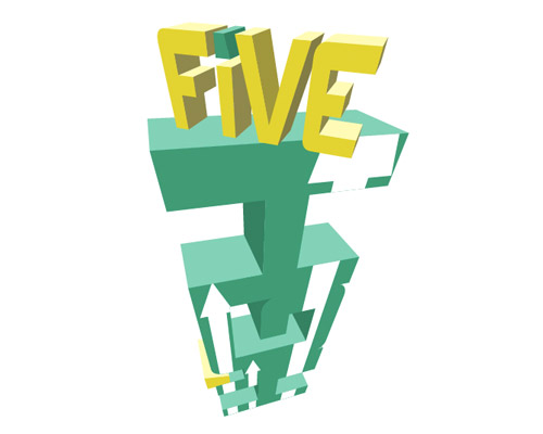
Step 9
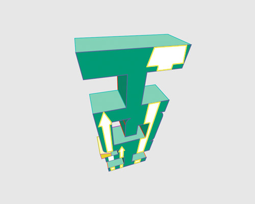
Now that we have our artwork broken into editable shapes, we need to group them into base, highlight and shadow sections so we can import to and work on those particular sections in Photoshop individually. In the image below, you will see my ‘HiGH’ artwork with various colored strokes applied to it. Do not replicate these strokes, they are merely to showcase the various pieces of our artwork I will be breaking out.
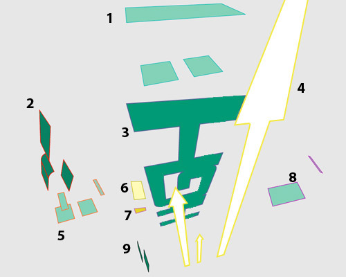
In the following image you will notice I have taken those new stroked groups, blown them out and labeled them to show the various selections (no particular order, just to show how many groups) I will be bringing into Photoshop. You can, if you choose, bring each individual shape in as its own Smart Object, however, I chose to import them like in these groups to make it manageable, yet still very editable.
Moving on to our ‘FiVE’ shapes, you will notice I did the same thing with the various stroke colors.
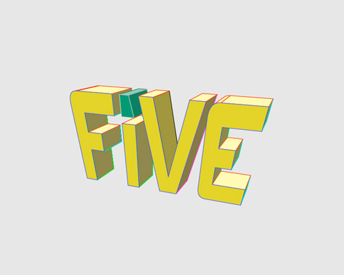
Once again, I have blown out the pieces to show the number of different groups I exported to Photoshop as Smart Objects.
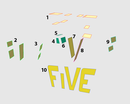
Finally, as a reminder, since we have the same canvas size in both programs, you should be able to import all of your different elements as Smart Objects at 100% Width and Height. Use your initital, Master artwork you imported as a guide as you begin to align and stitch together your various elements. The one special exception when you stitch your artwork together will be the arrows symbol you mapped to your ‘HiGH’ face. You will want to add this as a Clipping Mask (ALT+Command/?+G) to your ‘HiGH’ face, turn the Opacity to 90% and the Blend Mode to Overlay.
Side Note: Importing your elements as Smart Objects will allow you to double click on them in Photoshop to launch Illustrator and edit your artwork in its native program. Additionally, as these are vector, they can be resized without degrading in quality or sharpness.
Additionally, throughout this tutorial I will be using Clipping Masks. They allow you to add various different edits to your artwork without working about Group Masks or individual Layer masks while also providing the most accurate bounds for those edit layers.
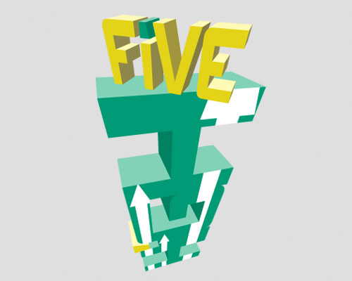
Step 10
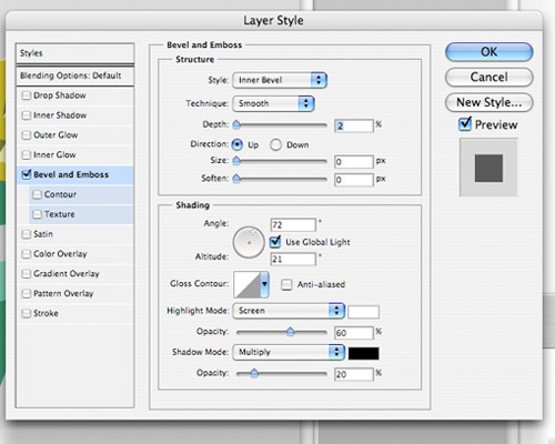
The first thing we are goin to do in Photoshop is add a Bevel (Layer > Layer Style > Bevel and Emboss) to our shapes.
Side Note: A small aside: You can add a bevel to your 3D Extrude when you are in the 3D Extrude & Bevel options panel. This method has the added advantage of rendering the bevel in the correct 3D perspective that your artwork is rendering in. However, for this tutorial, and the small size of the bevel we are going to add, I was much more inclined to add it in Photoshop where I can also adjust the softness, blend and opacity.
Using the image below, fill in the bevel values to your object.
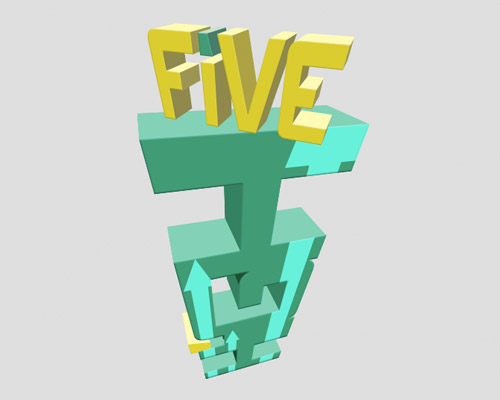
After applying the bevel to all your appropriate artwork, your image should look similar to the one below.
Step 11
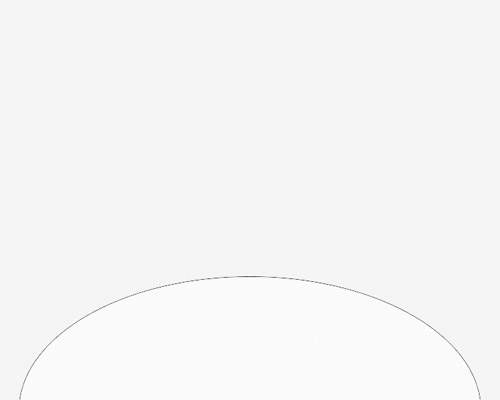
If you haven’t already filled your background color (Shift + F5 or Edit > Fill) a light grey, do so now (#dedede). Next, using the Ellipse Tool (U), create a perfect circle by holding Shift + Alt and dragging your tool with your mouse with a #e8e8e8 Fill. Next, press Command/? + T or Edit > Free Transform, and compress the circle’s height about 40-50%. Roughly match the size of your circle to the image below.
Next, apply an Outter Glow layer style to your circle based on the values in the image below and #e8e8e8 color.
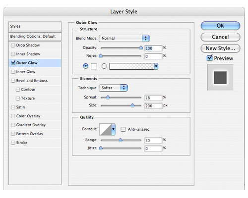
Now, duplicate this layer. Select the lower of the two layers and uniformly increase its size by 25% using Free Transform (Command/? + T). Change the Outer Glow layer style’s color to Black.
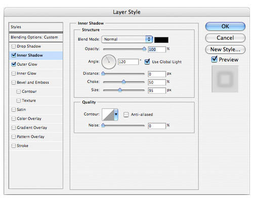
Finally, apply an Inner Shadow layer style to your circle based on the values in the image below.
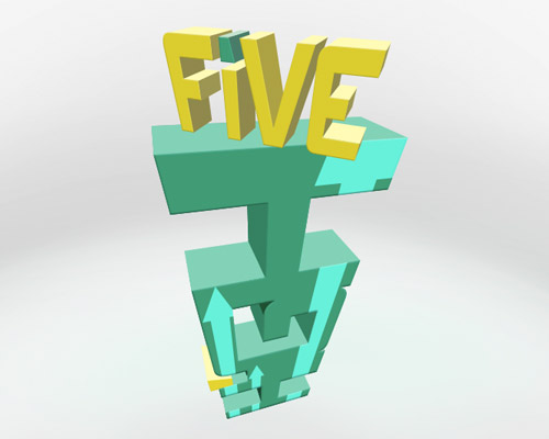
Your background should now look similar to the image below.
Side Note: Though you could also brush in this type of look, I have used this method because it allows me to maintain editability of my shapes through the use of vectors. Additionally, the layer styles maintain their characteristics regardless of if I change the size, skew, shape, etc.
Step 12
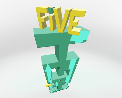
Command/? + Click on your ‘Master’ 3D artwork layer thumbnail to create a selection of your entire text block. Next, using your Polygonal Lasso tool (L) & holding your Alt key, cut away all but the base of your selection block as seen in the image below.
Step 13
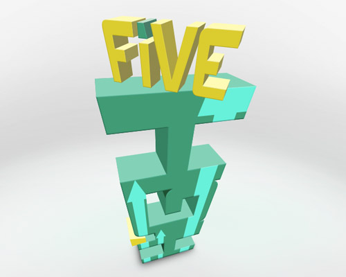
Shift + F6 or Select > Modify > Feather to bring up the feathering menu. Enter a value of 18 px. On a new layer above the background, choose Edit > Fill or Shift + F5 and fill your new selection with Black. Reduce the Opacity of this layer to 60%.
Step 14
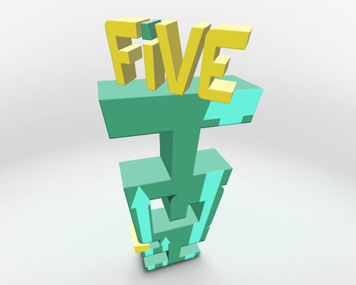
Using the the Brush Tool (B) at about 150-200px and 0% Hardness on a new layer, begin to stroke from the base of ‘HiGH’ towards the bottom of the canvas, fanning out from the base to form a soft cast shadow. Turn the layer Opacity down to 30-40%, roughly matching the image below.
Step 15
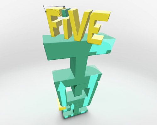
Using the the Pen Tool (P), begin to add highlight and shadow shapes to your different elements. The highlight base color should be white and the shadows black. Their blend modes should be Overlay with an Opacity between 20-30%. Apply these new highlights and shadows using Clipping Paths. Use the image below for a sample of the highlights and shadows I have applied to my elements.

Next, we want to add a fake bevel in between the letters of the word ‘HiGH’ to separate it and make it a bit more legible. So using your Vector Line tool (under your vector shapes tool set – U), draw 3 new lines to separate the H from the I, the I from the G and the G from the H. Change their Fill color to #3f7f5f and keep their Opacity at 100%. Apply the lines as Clipping Masks to your artwork’s face, using the image below as a guide for position.
Step 16
Once again, using the the Brush Tool (B), create new layers under your vector highlights and shadows. Begin brushing in some shadows and highlights using a combination of Overlays and Normal blending modes with Opacities under 30%. Reference the image below to see the layers, their values and general order they are arranged in for guidance.
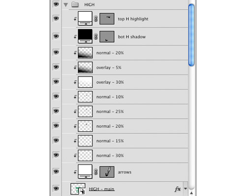
Notice I don’t shy away from multiple layers and combinations to achieve the desired effect.
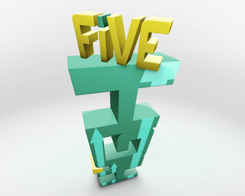
Step 17
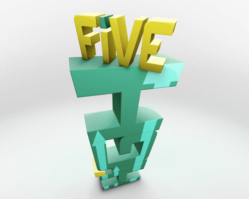
Now, similar to Step 14 when we created the cast shadows for the base of ‘HiGH’, we also need a cast shadow for the base of ‘FiVE’ sitting on ‘HiGH’.
So, begin by Command/? + Clicking on the all of your ‘FiVE’ Smart Objects until you have a selection of the word FiVE.
Side Note: For those who may not already know, holding the Shift Key while Command/? + Clicking will allow you to ADD that layer’s selection to your current selection. Conversely, holding the Alt Key and Command/? + Clicking will allow you to SUBTRACT from your current selection.
Once selected, use the Polygonal Lasso tool (L) and technique from Step 14 to cut away at your selection until you are left with the base of the ‘FiVE’. Once again, apply a Feather (Shift +F6) of 16px and fill it with Black. Turn the layer Opacity down to 20%. Reference the image below to see the number of layers and values I applied.
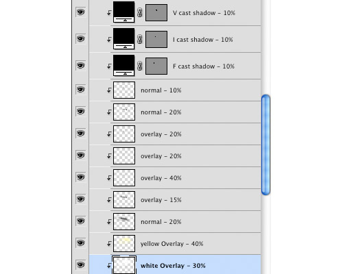
As you can see, you will also need to repeat the cast shadow step using your Brush Tool (B) with a smaller size. Reference the image below to see how these steps have worked to ground ‘FiVE’ on top of ‘HiGH’.
Step 18
I want to add a bit of noise to the bottom of our ‘HiGH’ artwork, start by creating a new Clipping Layer attached to ‘HiGH’. Select the Brush Tool (B) with the mode set to Dissolve and the Size, Opacity and Flow to the values seen in the image below. Begin to brush in some thick noise toward the bottom of your artwork only going about 1/3 to 1/2 of the way up.
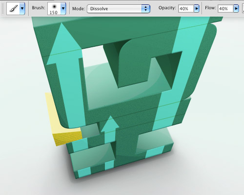
Using your Eraser Tool (E) with 0% hardness, begin to lighten the dissolve toward the top until you have a more gradual fill. Finally, turn the layer mode to Soft Light and the Opacity to 12%.
Step 19
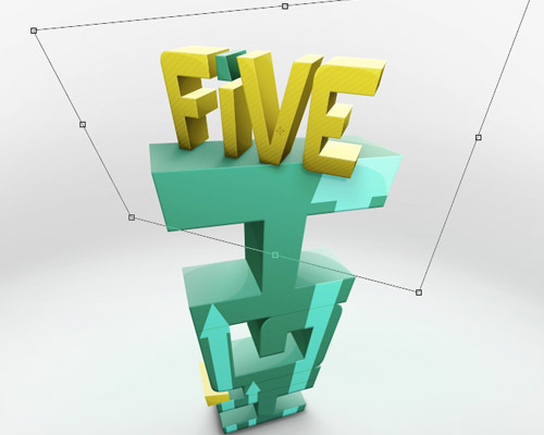
Create a new Pattern Fill layer (Layer > New Fill Layer > Pattern) and choose a diagonal scanline that is about 40x40px. You can download this pattern here. Rasterize your new pattern layer (Layer > Rasterize > Layer) so we can skew and shift its perspective using the Free Transform tool (Command/? + T or Edit > Free Transform). Apply your newly rasterized pattern as a Clipping Mask to the front face of your ‘FiVE’ artwork. Reference the image below for a general idea of how to skew this correctly. Change the Blend Mode to Overlay and drop the Opacity to 50%.
Step 20
Next, download this texture or one of your own choosing.
Following the same process as described in Step 19, try to match the skew and perspective seen in the image below.
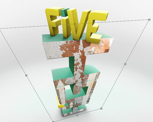
Side Note: For those wondering why this wouldn’t simply be mapped onto the 3D object in Illustrator in the initial steps, it is quite simply because the textures only need to roughly match perspective. As a result, I prefer to keep them in the rastor editing software where I can more easily apply the texture OVER the shadows, highlights and dissolves I’ve already created. This does not mean, however, that you can not do it. If you would like to continue experimenting with the 3D mapping feature you DO have your Master artwork with 3D effect on your hidden layer!
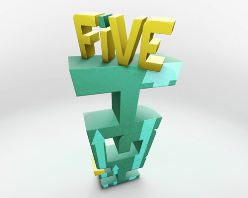
Finally, change your Blend Mode to Luminosity and drop the Opacity down to 10%.
Step 21
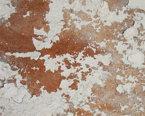
Next, download this texture or one of your own choosing.
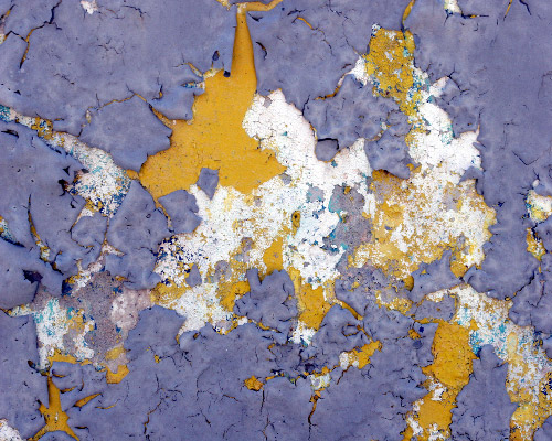
We are now going to add this texture to the ‘floor’. Following the same process as described in Step 19 & 20, try to match the skew seen in the image below.
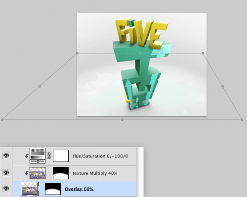
Once your texture is in place, Command/? + Click your vector circle layer we used to create the background gradient. Now, Feather the selection (Shift + F6) by about 150-175 px. Apply this selection as your layer mask, you can see the masking the image above where you will also notice the blend mode and opacity levels.
You will also notice I duplicated my texture and added it as a Clipping Mask to itself, changing the Blend Mode to Multiply in order to accent the depth of the shadows. Finally, I reduced the color saturation to make the texture apply on a grayscale.
Step 22
You’ll notice in the image below that we continue to utilize the texture from the previous step to bring out some cracks. So, duplicate the layer from Step 21 and turn the Mode to Overlay with 100% Opacity. Apply the Hue/Saturation seen in the image below.
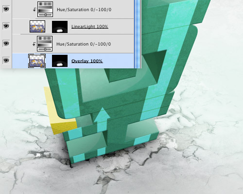
Begin to cut out the cracks in the texture using your Polygonal Lasso Tool (L), but only apply these selections to the layer’s mask so we don’t lose our image data. Use the image above for examples of how the masks are applied. Similar to the last step, duplicate the texture and change its Blend Mode to Linear Light and Opacity stays at 100% to enhance the darks.
Side Note: This process is very much up to you in terms of how you want the cracks to appear! Be experimental.
Step 23
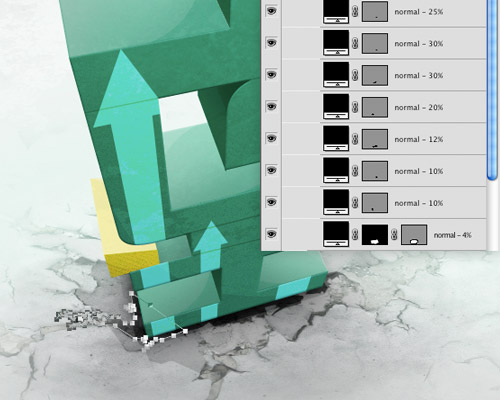
Finally, to bring some extra darkness and definition to the cracks, we will add our own using the Pen Tool (P). As you can see below, I use quite a few anchor points. Don’t be discouraged though, I was extremely loose and quick. I used the cracks we isolated in Steps 22 as a guide and haphazardly applied vector points from there. Repeat this process on a few of the detailed edge cracks and follow the Mode/Opacity listing in the image below.
Step 24
Switch back over to Illustrator and create three arrows that match the image below with a #ecf4ef Fill.
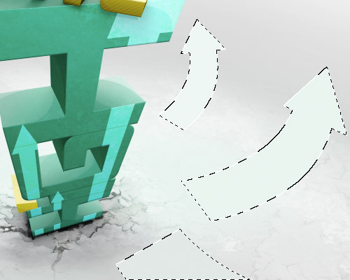
Create a new layer above the arrow, turn it into a Clipping Mask and switch to your Gradient Tool (G) with a White to Transparent gradient. Starting from the top right of the arrow, drag the gradient in the direction of the base of your arrow, ending about 2/3 of the way down your arrow. Now we need to create a mask on our arrow to blend it into the ground so it looks like the arrow is coming out of the floor. Using the Brush Tool (B) with 0% hardness, begin to blend away the bottom of your arrows until it looks like the image below. Repeat this for the remaining arrows.
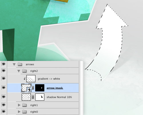
Next, still using your Brush Tool (B) with a 50% hardness on a new layer, brush out shadows below your arrows using the above image as reference. Turn this shadow layer’s Opacity to 10-15%. Finally, Command/? + Click on the arrow layer above your shadow. Invert the selection (Shift + F7 or Select > Inverse) and apply it as a mask to your shadow layer. This will prevent your shadow fill from showing up through the mask you created on your arrow.
Select your arrow layers and their corresponding gradient & shadows. Group them into a new Folder (Command/?+ G or Layer > Group Layer). Duplicate this group. With the duplicate still selected, choose Edit > Transform > Flip Horizontal. Move your mirrored arrow group into position on the left so your image looks like the one below.

Step 25
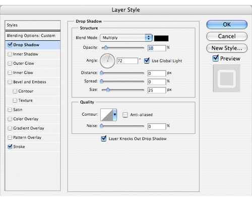
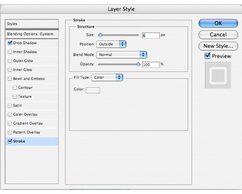
The end is in sight, I promise! For one of our final steps we will be adding a Stroke and faint Drop Shadow layer style to our ‘Master’ artwork. You can see the results below.

So, place your ‘Master’ layer below all of your ‘HiGH’ and ‘FiVE’ layers, but above all of your background layers (it helps if you have been grouping your layers into folders). Next apply the Stroke and Drop Shadow layer styles with the values you see in the image below.
Step 26
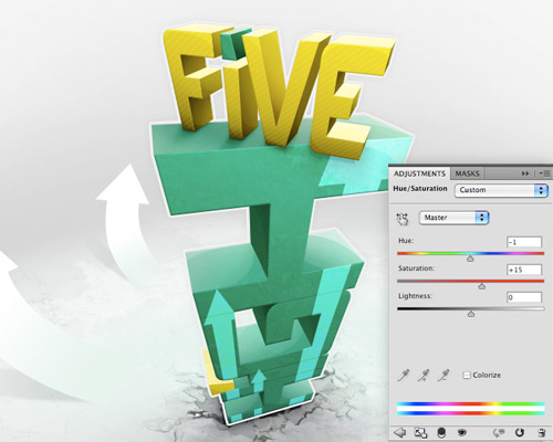
Now, create a new Saturation adjustment layer (Layer > New Adjustment Layer > Hue/Saturation) at the very top of your layers panel. Follow the values in the image below, or experiment a little, to bring out the brightness of the artwork.
Step 27
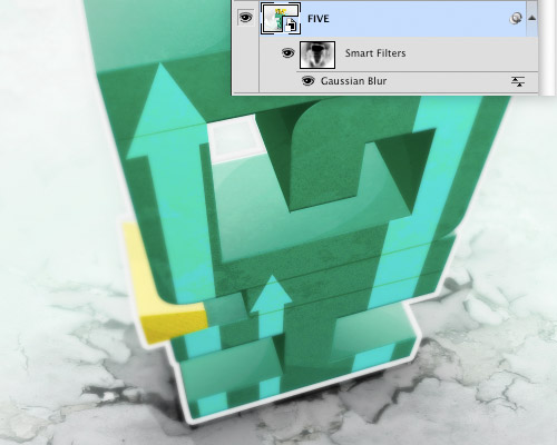
The final step of this tutorial is to Save this file (Command/? + S), then Save a new version (Command/?+ Shift + S) with the suffix ‘_FLAT’. Since all our hard work is now safe in another file, select all of your layers and Flatten the Image or Layer > Flatten Image. Convert your layer to a Smart Object, Layer > Smart Object > Convert to Smart Object.
Now apply a Gaussian Blur (Filter > Blur > Gaussian Blur) to your Smart Object of 2.0-3.0 px radius.
Since this is a Smart Object, we now have the Smart Filter Mask available to us! With a large Brush (B) and a foreground color set to Black, begin to brush away the blur at the top of your image. As ‘FiVE’ is closest to us, we want it to remain sharp along with the top 1/2 to 2/3 of our artwork. In addition to ‘FiVE’, you can see from the image below that I also went in and brushed away the blur on a lot of the detailed cracks we worked so hard to bring out.
Final Result
With a handful of minor tweaks and additions I have my final Image which you can click on below for a large scale version.
Once again, should you have run into any issues, please post a detailed explanation of your problem and I’ll follow up with explanation as best I can.
Downloadable Wallpapers:
For those that are interested, I also converted the image to some standard and phone wallpaper sizes:
• 1024×768
• 1280×1024
• 1600×1200
• Motorola Droid
• iPhone




This is a nice tutorial but why don’t you just use a 3d animation like 3d studio to do this and add your textures?
Great man!
Thanks!
Hey Jas.
Thanks for the comment!
Though 3D Max is a fantastic program, many professionals simply cannot justify the purchase of multiple thousand dollar program packages!
So, given the advances and popularity of the 3D tools within Illustrator, we offered a tutorial on how to create 3D text using the Adobe suite the large majority of our peers have!
It’s not just the cost of a 3D software but also have the time and a lot of effort you have to put together to learn how to use a 3D program. Many of us don’t have to use a 3D software but this tips and tutorials are very interesting.
Thanks for the tutorial.
Thanks for the tutorial! 🙂
Great Tutorial man!
Wow! Superb buddy. Great Work!
Nice work…
Will this work with a vector graphic as well as type?
I’m happy you’ve all enjoyed the tut! Hope it helps down the road.
Sergio – You’re absolutely right. I had learned both 3D Max and Maya back a few years. I can attest to the very steep learning curves with that software. The output is truly rewarding, but unless you are using it quite often it can be a challenge!
Chris – ABSOLUTELY! I have used the 3D extrude in the past to accent various illustrations with elements I created using this. For example, I’ve used it to create prop sunglasses at a number of different angles for an illustration.
Perhaps I’ll convince Ronald that I should post a follow up on using the 3D extrude for basics =)
@ Chris Fernandez I vow at your skills and talent. You made a such amazing tutorial. Sure your tuts contribution are warmly welcome in here =)
What a cool tutorial! It’s a shame I don’t have Illustrator.
Is there another tool I can use to replace what you are doing in Illustrator?
thanks
Decent tutorial but I’m confused as to your reasoning behind using both Illustrator and Photoshop. You state that you’re using the vector smart objects to make resizing/editing etc easier – but then texture your objects with raster images, add raster shadows, reflections, etc. So, really, you could (and perhaps should) have done it all in Photoshop – especially since you state that costing and time learning more apps than neccassary is an issue (re: using a 3D app instead)!
Simplemente, EXCELENTE!!!
Un poco laboreoso pero me dejas sin palabras… Saludos!!!
Hey Simon-
Valid points! Couple things I’ll try to clarify for you.
The monetary cost and time involved in learning a completely different interface and design software in 3d Max VS a sister program to Photoshop in Illustrator is quite large.
For one, of all the Adobe Creative Suites available, only Web Standard does not come with Illustrator, but then it also does not come with Photoshop – only Fireworks. And two, as they are both Adobe products, their interfaces share similarities in addition to being built to work seamlessly together.
As far as the editability of the vectors go, if you were to create this entirely in Photoshop and I were to write it that way I would still suggest creating the base artwork with Vector tools as they allow superior editability down the line. Yes the shadows, textures, etc are raster – but the idea is to have the most versatile and complete base off of which to work. Additionally, the 3D Extrude tool is an Illustrator effect and one of the key components and lessons of this tutorial.
Hopefully that helps clarify the use of both programs and the rational behind the overall process!
Cheers!
Hey Jogos!
There are other vector programs out there, the main program that comes to mind is CorelDraw. Though I haven’t used Corel in about a decade, I do know they have 3D extrude capabilities within the program – how good it is, I can not say. Also, the individual versions of Corel and Illustrator appear to run for nearly the same price.
Alternatively, you could try a free of either program and give it a try from there.
Lastly, if you’re simply hoping to get on with the tutorial, I can provide you with the completed ‘Step 9’ Photoshop file and you can run with it from there.
Just mention me on Twitter @c_illustrates asking for the file or follow me, then DM me.
I was really impressed your work, nice tutorial. thank you for the job!
Rather confusing with the masks, I get lost…in the part of the texture of the “floor”… Overlay 40% is not shown as a mask for me… ah Im just a loser trying to make it work but it doesnt.
Hi Danny-
Sorry that step became confusing!
First, make sure while working your texture is in Normal Blend Mode, 100% Opacity.
What I suggest doing is Command + Click on the vector circle layer you created at the beginning of Step 11. That will create a selection of that area. Now, Feather the selection (Shift + F6) by about 150-175 px.
NOW create a Layer Mask on your Textured Layer. Your Mask should look like the image in Step 21. Additionally, your texture should now have a soft edge surrounding it. Finally, change your Blend Mode to Overlay and the Opacity to 40%.
Follow the remainder of the directions in that step to continue on =)
NOTE: In the Tutorial, I say ‘Command/?’ a lot, the ‘?’ is supposed to be the Command symbol. Sorry that it isn’t rendering correctly, hope that didn’t confuse anyone!
Thanks to everyone for the positive comments, I enjoy the dialogue!
If anyone has any specific questions or request for files you can contact me on Twitter @c_illustrates
LOve this one…..not much tutorials have been written on the 3d extrude option of illustrator thanks friend…u have helped me a lot…..wid this one……
very inspiring, i love the touch with curved white arrovs rising up from the floor, that’s just amazing. It almost has kind of a web 0.2 look 🙂
thank you, i’m tweeting it.
Wonderful tutorial there, really like it. Thanks
hi Chris just a simple question. I have been doing web design now for some time and I just bought the Adobe Master Suite so I’m learning how to use their graphic programs. A friend of mine said that it should also be possible to do 3D in Photoshop as well? And if this is so what would the advantages of using Photshop’s 3D over Illustrator’s?
Great tutorial. In regards to the 3D software solution, if your printing this, vector vector is the best solution!
i am very like it… i will fun to learn…thanks…
Nice one
Great tutorial
So the whole switching from AI to photoshop needs to be bit more clear for me to follow through with this tutorial…
Great tutorial thanks
Hello,
I want to draw the any brand 3d floor graphic artwork in 3D. Can u make it if yes pls send me the link of that tutorial.
regards