Making use of colors for your business and marketing is an advantage. Bear in mind that colors are not just for appeal and aesthetics but it also play a vital role in marketing. Colors are of big importance when it comes to marketing materials that includes business cards. There are persuasive effects of colors and that can be explained through the different color meanings or color psychology. Not all may be aware of how color can affect people’s reactions and emotions but as designers, we should be aware of this.
Since colors are vital for attracting the clients, one should be able to use the right color for business card. We have already given you some tips on how to effectively use color psychology for web design. Now, we will help you to choose colors for your business card. Read on some tips below that would guide you on your steps towards selecting the apt colors for a business card design to be effective in your industry. Here they are:
1. Look into your industry.
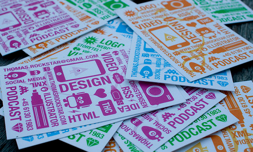
Image: Hicks Design
For every industry, there would be a different color to use because every industry or niche would use a different color for better identification. Like some would choose to use orange if the industry is for food or maybe for kids. Black is for apparels that show elegance or are luxurious. Every color shows a different industry. So, be sure you know what fits yours. Some may combine colors which can also be apt for arts and design.
2. Know the target audience.
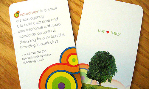
Image: Patrick Carter
Determine the group of people that you want to reach. This can help you to choose the colors that would be attractive for that audience. If you are targeting younger people, you can use bright colors and do away with brown or black because it looks boring for them. If your audience are for a specific industry, then choose a color that would suit it. Like if it is for a flower business, you can use red, yellow or orange or even a mixture of that.
3. Know the color psychology.
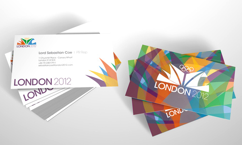
Image: Sisa Quadros
Color psychology refers to the meaning of colors and how it can affect those who look at it. Since every color has a different meaning, it should be used according to it. If not, your business card and your business as well might fail. So, look into the different color psychology and choose those that fit your business.
4. Know your company colors.
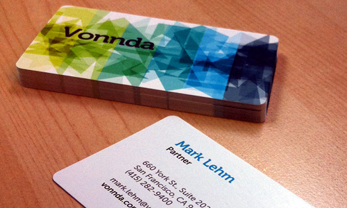
Image: Vonnda
If you already have company colors, then it would be a lot easier for you to choose which colors to use for your business card. You can use your company colors and just add some accent colors to it. Just highlight the company colors because this is part of the company’s branding.
5. Consider the color wheel.
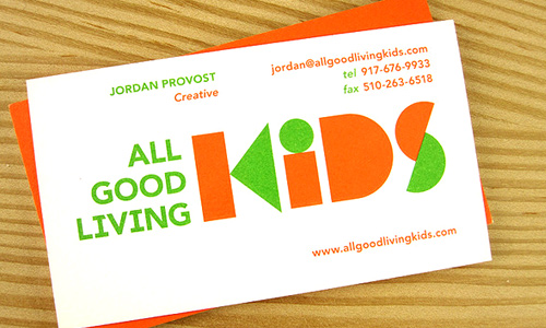
Image: Print Pinball
Well, when it comes to colors, you always need to consider the basis of how these colors are made and combined. Using the color wheel can guide you on what colors can create a good combination. You will never fail if you use this as your guide. There are color wheels that can be downloaded online. You will surely be able to use this a lot for designing. From that, choose the right color scheme for your design.
6. Choose a color that is timeless.

Image: CucuIonel
Along with choosing your colors is considering how long it would stay in the market. If you choose a color that is timeless, it will be able to give you a better identity. Clients could recognize your business even if you already exist for a long time. Using the right colors can help you acquire a more established and effective branding.
7. Determine how you want the client to react.

Image: David Fernández Huerta
Since every color has a different effect to those looking at it, you need to know how you want your clients to react. The reaction of the clients will also depend on the color you use. Decide if you want them to be amazed, motivated, valued, relaxed or anything. This can help you choose your colors.
8. Use your website colors.

Image: Synchronixe
Establish cohesion between your website and your business card by using your site’s colors. It would be a lot easier for your client to connect your business card to your site. It can give them easy recognition that would be good for your business. At least, when you do that, you will no longer have a hard time choosing colors. Also, if you use the same fonts, there would surely be a good brand identity for your business.
9. Decide on the overall image you to convey.

Image: KaixerGroup
You will be more successful if you have decided on the type of image you want to convey. But this should not only be incorporated in your business card. It should also be seen in all marketing materials for your business including leaflets, brochures, website, magazines, logo and others. After that, you can then choose a color that would be effective for that kind of image.
10. Look for inspiration.
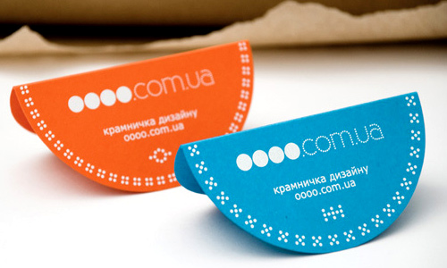
Image: Yurko Gutsulyak
Another good way of choosing good colors for your business card is by looking at other’s cards. But it doesn’t mean that you should imitate theirs. Use them as inspiration for your own business card. After seeing a showcase of different business cards, you will surely be inspired to make yours.
It’s Your Turn Now
Choosing colors is indeed very much important for a business card design. With the tips we have given above, we hope that you will be able to pick a color palette that would befitting to your business and industry. If you have succeeded to choose the right color, then you will surely be able to create an effective business card design. How about you? How do you choose colors for your business card?


Kareen again you are doing great job. I would like to add one more tips with your 10.
Why not we check company LOGO when design business card? Most of the company business card use logo in their card. So i think its one of important point with yours.
Let us know what do you think?