There are indeed numerous ways to design websites and to make them look appealing to many people. You may use textures, patterns, and many other elements. Some just play with colors and others just use black and white. Another way of making the website unique and to add visual appeal is to use character designs or character illustrations. Many websites use these to create an identity, representation and branding for their websites. No doubt, this is effective based on the examples of successful websites that we have below.
Character designs not only brighten up the design but it also makes them look captivating and inviting. It seems to give an environment that taps you in the shoulder and lets you sit in a comfortable couch. Yes, using characters make your site homey and friendly. But of course, you need to have good contents in your website in order to have consistent readers. Yet, the web design is always important since it is the entirety of the website that attracts visitors. With that, we will give you some tips in using character designs for your website so you will know how to effectively use it.
1. Use hand drawn style vector illustration.
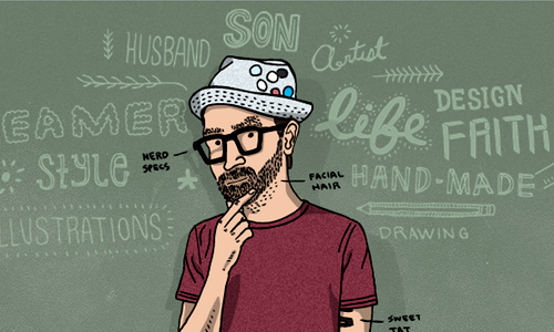
Image: kylesteed
Using hand drawn character designs give a different effect to the entire web design. It enhances the design with the choice of great colors and appropriate character. Another great thing is the personal touch that it gives to the website. This makes the website more accommodating, welcoming and friendly to the visitors and readers. You may use it for portfolios and blogs to show who owns the site.
2. Use a detailed character.

Image: cheekymonkeymedia
Using vector graphic, create a character that could enhance the aesthetics of the site and that will be closely linked to the website. If you place more details to it, it would be clearer to the viewers. They could also easily remember the character as well as the website.
3. Make an easily recognized character.
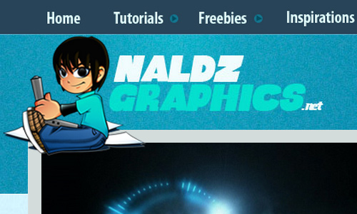
See to it that the character you make will mark the minds of the readers. You can effectively use it in portfolios. A character may represent the owner of the blog or website so that they can determine whose website it is and they could easily remember it.
4. Use it in simple websites.
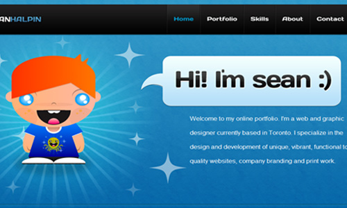
Image: seanhalpin
For sure, characters will bring life to a simple and minimal website. Use bright colors in making the character so that it will seemingly shine from the rest of the page. A website that uses a plain color for background will look great with a character illustration in the heading.
5. Use it to fill empty spaces in the website.
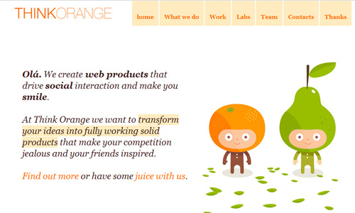
Image: thinkorange
Your character may be used not just in headings, but it can fill some parts of the web design. Instead of some ads, it can give more personality to your website. Also, you may let your characters relay a message by using speech bubbles, signs or just anything. Let it fill the empty spaces and set a good standard for the site.
6. Use it to show what the site is about.
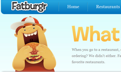
Image: fatburgr
Link your character to the website. Let it tell the viewers what the website is about by just one look at it. Paint a smile on the face of that character to create a friendly and inviting environment. Consider the example. The fat boy is eating a burger to represent Fatburgr.
7. Use a character with minimal design.
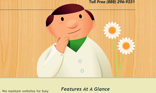
Image: enrichmint
Your character doesn’t have to be detailed all the time. You create a minimal design for it and make it look cuddly and cute. Even if they are not so detailed, they still give a great impact to the website. It could match a website with patterns and textures as background.
8. Use weird characters.
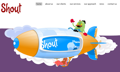
Image: shoutdigital
Not at all times that the character could be made like a human or an animal. Aliens and monsters can also work well. Just don’t make it look scary looking. Put a brush of gentleness and cuteness to the cartoon and it would be effective. It can brighten up your site especially if you use good colors. Just make sure that it will still represent your site well.
9. Use different angles of the character.
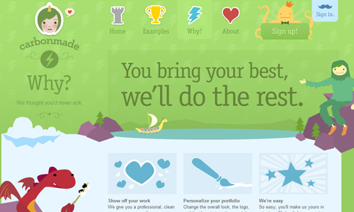
Image: carbonmade
When you opt to use a character, do not just use it once. Use it all over the web that in whatever page they see, the character is there. Also, use different angles and positions that the character seems to move and act. It would even give more impact to the viewers and would make it more memorable.
10. Use many characters.
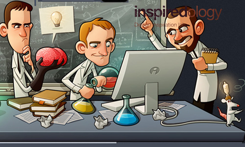
Image: inspiredology
Well, if one character is effective, two, three or more than that would still be effective. You can use them at different parts of your site. They do not have to go together all the time. They can be used differently. In whatever way you do it, make sure they play vital roles in the website design.
Of course, you will be pleased to see websites using character designs. It never fails to make you smile for it has that positive impact on you with those cute looking characters. Do you have other tips to share in using character designs for web design? Or do you know any websites that are as impressive as the examples above?


I own a website that has it’s own mascot – Dzoky. These are great tips. After reading them I realized how much i still have to do in implementing my mascot into the website’s design. Thanks!
Like 😀 amazing jobs!